NAME
Kubernetes::Comb::SVG - Render Kubernetes::Comb custom resources as an SVG honeycomb
VERSION
version 0.001
SYNOPSIS
use Kubernetes::Comb::SVG;

my $svg = Kubernetes::Comb::SVG->new(
  combs       => \@combs,
  title       => 'Lab',
  group_label => 'app.kubernetes.io/part-of',
  columns     => 4,
  link        => sub { '/combs/'.$_[0]->name },
  theme       => { Running => '#2da44e', bg => { light => '#fff', dark => '#000' } },
  blink       => ['Error']
)->render;

# A status monitor for a wall screen: packed, shaped for a 16:9 display
my $monitor = Kubernetes::Comb::SVG->new(
  combs  => \@combs,
  layout => 'packed',
  aspect => 16 / 9,
  blink  => [ 'Error', 'Blocked' ]
)->render;

# @combs: hashes in CR shape, e.g.
#   { metadata => { name => 'db', namespace => 'lab' },
#     spec     => { class => 'postgres' },
#     status   => { phase => 'Running' } }
#   { metadata => { name => 'nats' }, spec => { dependsOn => ['db'] } }
DESCRIPTION
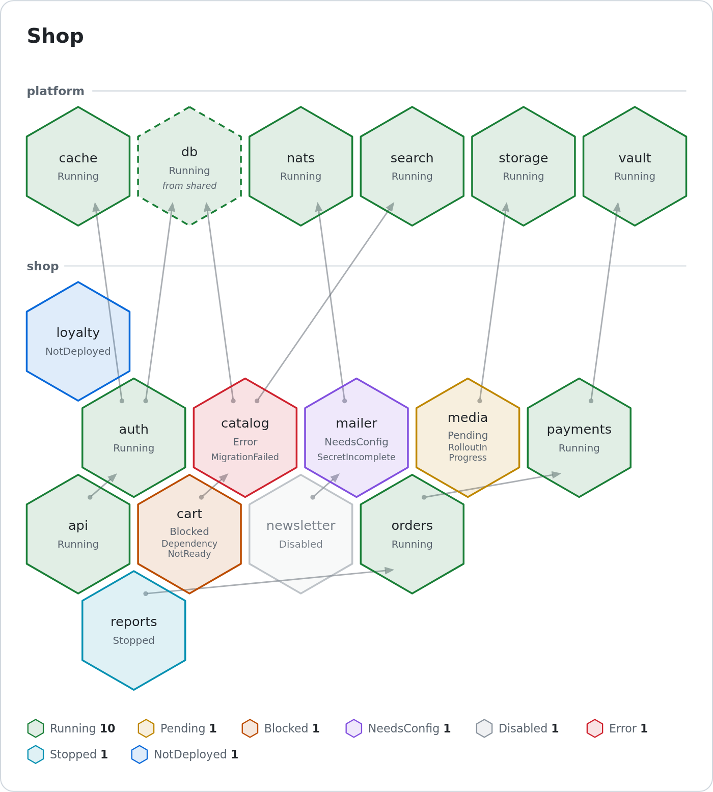
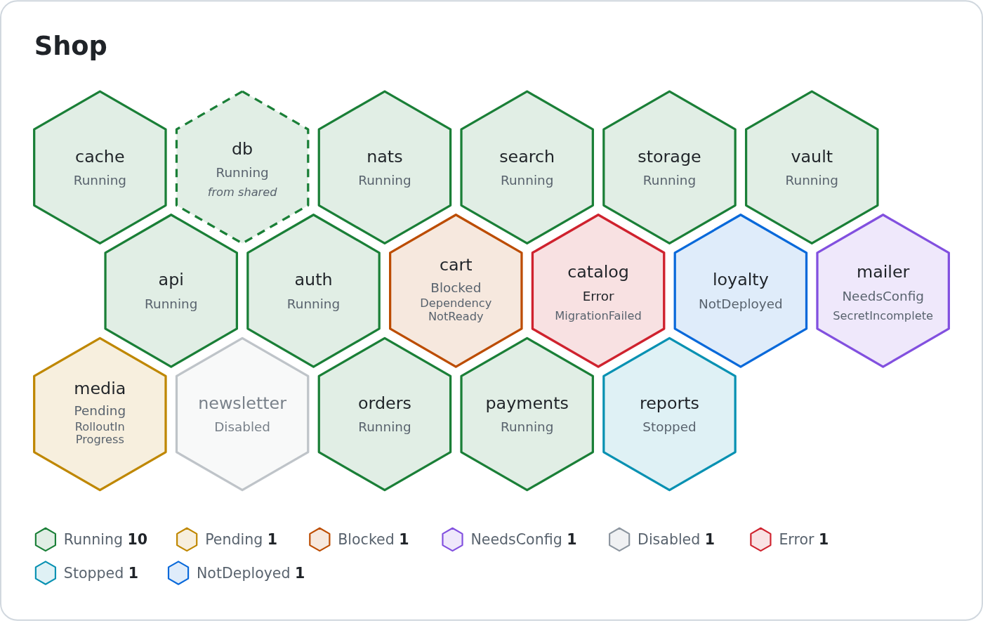
Draws a set of Kubernetes::Comb custom resources as one self-contained SVG document: a honeycomb with one hexagon per Comb, coloured by its phase, with the dependencies drawn between them and a legend of the phases that occur. The Combs are placed by dependency depth, or, as a status monitor, packed into one compact honeycomb, see "layout"; the colours follow the light or dark mode of the viewer and can be set by option or by the embedding page, see "theme" and "THE PICTURE". Data in, string out: the dist never talks to a cluster -- the caller fetches the custom resources (kubectl get combs -A -o json, a client library, a fixture) and hands them in. Kubernetes::Comb and IO::K8s are not dependencies; the input is duck-typed, see "combs".
The same input gives the same bytes: no timestamps, no generated ids, every hash sorted before it reaches the output. The picture carries no script and no reference to anything outside the document, and everything that comes from a custom resource is escaped, see "THE PICTURE".
Odd data never dies: an unknown phase is drawn as Unknown, a missing status is fine, a dependency on a name that is not in the input is listed as missing in the tooltip, a dependency cycle puts its cells on one row. Only a Comb without metadata.name is an error.
examples/demo.pl in the distribution renders examples/demo.json to examples/demo.svg, the picture the README shows. The command line equivalent is comb-svg.
combs
Required. The custom resources to draw, in any of these shapes:
an array reference of Comb custom resources
a
Listhash, a hash withitems, askubectl get combs -o jsonprints ita single custom resource (a hash without
items)
Each custom resource is a plain hash in CR shape (metadata, spec, status) or an object answering TO_JSON with such a hash, like the IO::K8s classes of Kubernetes::Comb. undef and an empty list give a valid picture with no cells.
combs => [ { metadata => { name => 'db' } }, $comb_object ]
combs => { items => \@combs }
Of two custom resources with the same namespace/name the first is kept. The input is read when the picture is first needed ("cells", "render"), not by the constructor; a Comb without metadata.name dies there. See "cells_from" in Kubernetes::Comb::SVG::Cell for what is read from each one.
title
Default Combs. The text of the heading above the honeycomb and of the <title> of the SVG (what a screen reader announces). The canvas widens if a long title needs it.
group_label
Optional, no default. A label key, for example app.kubernetes.io/part-of: the Combs are grouped by the value that label has in metadata.labels. Each group is drawn under its own heading, groups stacked top to bottom in name order, the Combs without the label in a last group without a name. Without it there is one group and no headings. No label key is built in; which one groups your Combs is your choice.
layout
Default depth: inside a group a Comb sits one row below its deepest dependency. packed is the status monitor for a wall screen: dependencies play no part in placement, the Combs are sorted by namespace/name and fill the rows left to right, top to bottom, as one compact honeycomb (one per group with "group_label"). A Comb keeps its place as long as the set of Combs is the same; a phase changing moves nothing. The grid of packed comes from "columns" when given, else from "rows", else from "aspect", and "edges" defaults to false there.
columns
Default 6, a positive integer. How many hexagons a row holds before it wraps into the next row. Wrapped rows stay in the group and in the dependency depth they belong to. In the packed "layout" it is the cells per row and counts only when given: the default leaves the grid to "rows" and "aspect".
rows
Optional, a positive integer, no default. packed "layout" only, and only when "columns" is not given: the number of rows of a block; the columns follow from the number of Combs. A block has fewer rows when its Combs do not fill them, and with "group_label" it holds for every group on its own.
aspect
Default 16/9, a positive number. packed "layout" only, and only when neither "columns" nor "rows" is given: width divided by height of the area the picture is to fill, 9/16 for an upright screen. The column count is the one whose picture -- all groups with their headings, plus padding, title and a legend of one row -- comes closest to that shape. A long title or a legend that wraps is not accounted for.
size
Default 56, a positive number. The radius of a hexagon, centre to corner, in SVG units. Fonts, gaps, stroke widths and the padding all derive from it, so the picture changes scale as a whole. The SVG has a viewBox and no fixed pixel size: it scales with the box that embeds it anyway.
edges
Default true, false in the packed "layout"; a given value wins in both. Draws one arrow per dependency, from the dependent Comb to the Comb it depends on. False leaves out the g.deps group; the placement of the cells does not change.
legend
Default true. Draws the legend below the honeycomb: one entry for each phase that occurs, with its colour and the number of Combs in it. False leaves out the g.legend group.
link
Optional coderef, no default. Called once per cell with its Kubernetes::Comb::SVG::Cell object; it returns the URL the cell links to, or undef for no link. A linked cell is wrapped in <a href="...">.
link => sub { my ( $cell ) = @_; '/combs/'.$cell->namespace.'/'.$cell->name }The result is used only when it is relative (/combs/db, db.html) or starts with http:// or https://, and carries no whitespace or control character; anything else (javascript:, data:, a reference, an empty string) draws the cell without a link. The value is escaped as an attribute. A callback that dies is caught: the cell is drawn without a link and a warning ("carp" in Carp) names it.
theme
Default {}. A hash from key to colour, merged over the built-in colours. The keys are the phase names (Running, Pending, Blocked, NeedsConfig, Disabled, Error, Stopped, NotDeployed, Unknown, see "phases") and the surfaces of the picture: bg (the panel), fg (text), muted (secondary text), border (panel outline and group rules) and edge (dependency edges). Keys are case-sensitive; any other key is ignored.
theme => {
  Running => '#2da44e',
  Error   => { light => 'crimson', dark => '#ff6b6b' },
  bg      => { light => '#ffffff', dark => '#000000' }
}
A value is one colour, used in light and in dark mode, or a hash with light and dark; a mode the hash leaves out keeps its built-in colour. The colour of a phase is the outline of the hexagon; its fill is the same colour at low opacity, so the text stays readable whatever colour is chosen. Accepted are #rgb, #rgba, #rrggbb, #rrggbbaa, a colour name (letters only) and rgb(), rgba(), hsl(), hsla() over plain numbers; any other value falls back to the built-in colour, for each mode on its own. Every colour ends up as a custom property, see "THE PICTURE".
The built-in colours, light / dark:
Running      #1a7f37 / #3fb950      bg      #ffffff / #0d1117
Pending      #bf8700 / #e3b341      fg      #1f2328 / #e6edf3
Blocked      #bc4c00 / #fb8f44      muted   #59636e / #9198a1
NeedsConfig  #8250df / #a371f7      border  #d0d7de / #30363d
Disabled     #8c959f / #6e7681      edge    #57606a / #9198a1
Error        #cf222e / #f85149
Stopped      #0891b2 / #39c5cf
NotDeployed  #0969da / #58a6ff
Unknown      #475569 / #94a3b8
blink
Default []. The phases (see "phases", case-sensitive) whose cells pulse, for a screen on which an Error has to catch the eye:
blink => [ 'Error', 'Blocked' ]The pulse is a CSS animation in the <style> of the picture, no script: fill and outline of the hexagon swell and settle, the texts stay as they are. Where the viewer asks for reduced motion nothing moves and the cell has a thicker outline instead. A name that is no phase is ignored; order and repeats do not matter. Without it the picture carries no animation at all.
blink_seconds
Default 1.2, a positive number. The period of the pulse of "blink" in seconds, there and back. Written with two decimals, 0.01 at the least.
cells
The Kubernetes::Comb::SVG::Cell objects read from "combs", in input order. Built on first use. Not a constructor argument.
cell_class
Returns the class name that reads the custom resources, Kubernetes::Comb::SVG::Cell. It must answer cells_from, known_phases and the cell accessors. Override in a subclass to read the custom resources differently.
layout_class
Returns the class name that places the cells, Kubernetes::Comb::SVG::Layout. It is built with cells, size, mode (the "layout"), aspect, frame_width, frame_height and, when given, columns and rows, and must answer layout and the geometry methods of Kubernetes::Comb::SVG::Layout. Override in a subclass to place the cells differently.
phases
my @phases = $svg->phases;Returns the phases a cell can be drawn in, in the fixed order of the legend: Running, Pending, Blocked, NeedsConfig, Disabled, Error, Stopped, NotDeployed, then Unknown for every other status.phase (and for a missing one). These are the keys "theme" understands.
render
my $svg = $svg->render;Returns the picture as one SVG document in a string: it starts with <svg (no XML declaration, so it can be inlined into HTML as well as served as image/svg+xml) and ends with a newline. The string is pure ASCII: what is outside ASCII is written as a character reference. Same input and options, same bytes. The document is self-contained, see "THE PICTURE".
Dies with Comb without metadata.name when an element of "combs" has no name; nothing else in the data is an error. The constructor dies, as Moo does, on an option of the wrong type. A dying "link" callback only warns.
THE PICTURE
What the document contains, so a page that embeds it can style or script against it. Everything is plain SVG; a page can query it with the DOM when the SVG is inlined.
Where the cells sit depends on "layout". With depth a cell is in the row of its dependency depth, so what has to be up first is above. With packed the cells are sorted by namespace/name and fill one compact honeycomb (one per group) whatever they depend on; the dependency edges are then left out unless "edges" is true. The elements below are the same in both.
The root is
<svg class="comb-svg" role="img">withxmlns, aviewBoxand no fixed width or height, labelled by<title id="comb-title">(from "title") and<desc id="comb-desc">, a generated summary such as3 Combs: 2 Running, 1 Blocked.One
<g class="comb phase-Running">per cell. The class iscomb,phase-<Phase>(see "phases"), plusborrowedwhen the Comb really takes its service from an upstream layer (dashed outline, a line naming the upstream context; see borrowed: an upstream is recorded, it is not unreachable, and the phase is Running or Pending) anddisabledfor a Disabled one. Attributes:data-name(metadata.name),data-id(namespace/name, or the name alone),data-phase. With "link" the group sits inside an<a>. Inside, in this order:<title>, the tooltip: id, namespace, class, phase, the message when the phase is not Running, endpoints, upstream, missing dependencies. The upstream line is there for every Comb that records one:upstream: <class>, context <context>, either part alone when the other is absent,upstream: recordedwith neither, followed by(not borrowing)when the cell is not borrowed; avia:line follows when the upstream names a chain. The tooltip also carries the full name of a cell whose drawn name had to be cut.polygon.hex, the hexagon.text.name, the name. A name that fits stays on one line. One that does not is broken into two after a hyphen, a dot or an underscore, each line a<tspan>insidetext.name, at the break that leaves the shortest longer line. When the two lines are still too wide the element has the classname-smallas well and a smaller font (13 characters a line instead of 11). Only what fits neither way is cut with an ellipsis, as is a too long name without such a character.text.phase, the phase, always written as text, never by colour alone.text.reason, only for a Comb that is not Running and says why: the reason of the cell in small text, 16 characters a line. It is what a wall screen shows in place of the tooltip; a Running cell never has it. A reason too long for one line is broken into two, each a<tspan>insidetext.reason: at a run of whitespace, which is dropped, or before an upper-case letter that follows a lower-case letter or a digit (Missing/Prerequisites), at the break that leaves the shortest longer line. When no break makes both lines fit, the last one whose first line fits is taken and the second line is cut with an ellipsis; a reason without such a break is cut on its one line. The six-line exception: a cell with no room for a sixth line of text -- a name on two lines, the phase, two reason lines and an upstream line -- cuts a too long reason on one line as well. Under a name on two lines the second reason line sits where the hexagon narrows and holds 14 characters, 15 under a name in the smaller font.text.upstream, only for a borrowed Comb:from <context>, orborrowedwhen no context is recorded.
A cell with a reason line and more than three lines of text sets them closer together, the phase a little further from the name than the name lines are from each other.
g.depsholds onepath.depper dependency, withdata-from(the dependent) anddata-to(the dependency) as ids, an arrowhead at the dependency, and acircle.dep-startmarking where it leaves the dependent. It is drawn before the cells, so cells stay on top; it is absent withedges => 0and when there are no edges.g.groupper group heading, withdata-group(the label value) unless it is the group without a name; holdstext.group-nameand a faintline.group-rule. Only present when the picture has headings, see "group_label".g.legendholds oneg.legend-item.phase-<Phase>per phase that occurs, withdata-phaseanddata-count.One
<style>element. Colours are CSS custom properties on.comb-svg, see "Styling from outside". A@media (prefers-color-scheme: dark)block gives the dark values. The font is the system sans stack.With "blink", the same
<style>holds@keyframes comb-blink, ananimationnamedcomb-blinkon.comb.phase-<Phase> .hexfor each blinking phase, and a@media (prefers-reduced-motion: reduce)block that turns the animation off and thickens the outline. Without "blink" none of this is in the document.
Styling from outside
When the SVG is inlined into a page, the CSS of that page can restyle it. The custom property names, the class names and the animation name are public interface; the rest of the markup is not promised to stay as it is.
Custom properties, set on .comb-svg (light values), and again inside @media (prefers-color-scheme: dark) (dark values):
--comb-bg,--comb-fg,--comb-muted,--comb-border,--comb-edge: the panel, the text, secondary text (group names, phase, reason and upstream line, legend), the outline of the panel and the group rules, and the dependency edges--comb-running,--comb-pending,--comb-blocked,--comb-needsconfig,--comb-disabled,--comb-error,--comb-stopped,--comb-notdeployed,--comb-unknown: the colour of each phase (the name is--comb-and the lower-case phase); it is the outline of the hexagon and, at low opacity, its fill--comb-tintand--comb-tint-muted: the fill opacity of a hexagon and of a Disabled one
Classes: .comb per cell with .phase-<Phase>, .borrowed and .disabled (the .phase-<Phase> class is also on the entries of the legend); inside it .hex, .name (with .name-small for a name on two lines in the smaller font; its rule is in the <style> only when a cell needs it), .phase, .reason (its rule, too, is there only when a cell has a reason line) and .upstream. Around them .panel, .heading, .group, .group-name and .group-rule; .deps with .dep, .arrow and .dep-start; .legend with .legend-item and .count. The animation is named comb-blink.
The built-in custom properties sit on .comb-svg itself, and the <style> is part of the document, so whether a page rule with the same selector wins depends on which comes later. Use a more specific selector, such as svg.comb-svg, to win regardless. The dark block is a rule of its own: a colour a page sets that way holds in dark mode too, unless the page sets the dark one in its own media query.
/* in the CSS of the embedding page */
svg.comb-svg {
  --comb-error: #ff0033;
  --comb-bg: #fafafa;
}
@media (prefers-color-scheme: dark) {
  svg.comb-svg { --comb-error: #ff6680; --comb-bg: #101010 }
}
/* dim the Combs that are fine */
svg.comb-svg .comb.phase-Running { opacity: .6 }
/* a different pulse: override animation on the hexagon of a blinking phase */
svg.comb-svg .comb.phase-Error .hex { animation-duration: .6s }
Setting "theme" instead needs no page CSS: it writes the same properties.
The picture is self-contained: no script, no web font, no stylesheet link, no image, no reference to anything outside the document (the arrowhead is a <marker> inside it). Every value that comes from a custom resource -- names, namespaces, messages, reasons, label values, upstream classes and contexts, a "link" result -- is escaped wherever it lands, in text, in <title> and in attributes, and the five XML special characters become entities. Characters XML 1.0 cannot carry are dropped, and everything outside ASCII becomes a numeric character reference. A Comb named </svg><script> comes out as text.
SEE ALSO
SUPPORT
Issues
Please report bugs and feature requests on GitHub at https://github.com/Getty/p5-kubernetes-comb-svg/issues.
IRC
Join #kubernetes on irc.perl.org or message Getty directly.
CONTRIBUTING
Contributions are welcome! Please fork the repository and submit a pull request.
AUTHOR
Torsten Raudssus <getty@cpan.org>
COPYRIGHT AND LICENSE
This software is copyright (c) 2026 by Torsten Raudssus <torsten@raudssus.de> https://raudssus.de/.
This is free software; you can redistribute it and/or modify it under the same terms as the Perl 5 programming language system itself.