NAME
Term::Fabulous::Widget::ProgressBar - How much of a task is done
SYNOPSIS
use Term::Fabulous::Widget::ProgressBar;

my $progress = Term::Fabulous::Widget::ProgressBar->new(
	id    => 'download',
	max   => $bytes_total,
	value => 0,
);
$progress->value($bytes_so_far);    # from a timer, a process, ...

# Unknown duration: a runner bounces across the bar until you know more.
my $busy = Term::Fabulous::Widget::ProgressBar->new( indeterminate => 1 );
$busy->indeterminate(0);
$busy->value(100);

# Several parts in one bar:
my $disk = Term::Fabulous::Widget::ProgressBar->new(
	max      => 500,
	segments => [ { value => 210, color => '#98c379' }, { value => 90, color => '#e5c07b' }, { value => 40, color => '#e06c75' } ],
);
DESCRIPTION
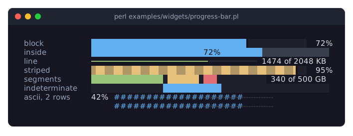
The picture shows progress bars in their forms: a block bar with its percentage, one with the percentage inside the bar, a thin line bar with a label of its own, a striped bar, a bar of three colored segments, an indeterminate bar with its runner, and a two-row bar in the ASCII style. The program is examples/widgets/progress-bar.pl.
A progress bar shows a value between min and max as a bar filled from the left, and the value as text next to it:
████████▌░░░░░░░░░░░ 42%The bar is drawn in one of three styles: block (the default) fills cells with blocks and, with fractional, draws the last cell as a partial block so that the bar moves in eighths of a cell; line is a thin line like a slider's track; ascii uses # and -. Any glyph can replace the style's. striped alternates two glyphs along the filled part and animated moves the stripes, which shows that work is going on. An indeterminate bar, for a task whose extent is not known, shows no value but a runner bouncing from end to end. The bar segments can stack several values in their own colors, for example the parts of a disk, with a cell of track between them when separated.
The value label is the percentage by default, placed right of the bar; it can go left of it or inside it, where it is written over the bar, and value_format formats it as a sprintf string of the percentage or with code that gets the value.
A progress bar takes no input. It is a Term::Fabulous::Widget::Display, so it is painted again only when something about it changed, and the animations run on the application's clock without a timer of their own (see "ANIMATION" in Term::Fabulous::Widget::Display). Unless the layout sizes it, the bar is one row high and preferred_columns plus the label wide; a taller layout gives a thicker bar.
CONSTRUCTOR
new
my $progress = Term::Fabulous::Widget::ProgressBar->new(%parameters);Accepts the parameters of "CONSTRUCTOR" in Term::Fabulous::Widget::Box (id, layout, background_color, the border parameters, ...) and the ones below. All are optional; unknown parameters die.
min-
A finite number. Default: 0. The value of an empty bar. Must be less than
max, or the constructor dies. max-
A finite number. Default: 100. The value of a full bar.
value-
A finite number in
min..max. Default:min. Dies if outside the range. Givevalueorsegments, not both. segments-
An array reference of hash references
{ value => $n, color => $c }, the parts of a stacked bar from the left, eachvaluea non-negative number in the units ofmin..maxandcoloroptional (the bar'scolor). Default: none, a bar of one value. What goes pastmaxis cut off. indeterminate-
A boolean. Default: 0. True shows the runner instead of a value and hides the label. Stored as 1 or 0; a reference dies.
show_value-
A boolean. Default: 1. Whether the value label is shown.
value_position-
right(the default),leftorinside: where the label is placed. Inside, the bar is drawn with background colors and the label is centered over it, dark on the filled part and intext_coloron the rest. Anything else dies. value_format-
How the value is shown: a
sprintfformat string that gets the percentage, such as'%.1f%%', or a code reference that gets the value and the fraction (0 to 1) and returns the text. Default:undef, the percentage without decimals and a percent sign. Anything other than a string, a code reference orundefdies. The label is as wide as the widest of the lowest, the highest and the current value, so the bar keeps its length.value_format => sub ( $bytes, $fraction ) { sprintf '%d of %d MB', $bytes / 1e6, $total / 1e6 }, preferred_columns-
A positive integer. Default: 20. The length of the bar in columns when the
layoutgives the widget no width. The label and one space are added to it. style-
block(the default),lineorascii: the glyphs of the fill, the track and the stripes.block:█,░and▓;line:━,─and┅;ascii:#,-and=. Anything else dies. fill_glyphtrack_glyphstripe_glyph-
A single character one column wide, or
undef. Default:undef, the glyph ofstyle. Each replaces one of the style's glyphs. fractional-
A boolean. Default: 1. Whether the last filled cell is drawn as a partial block when the fill glyph is the full block (
blockstyle), so that the bar moves in eighths of a cell. With other glyphs the bar moves in whole cells. striped-
A boolean. Default: 0. Whether the filled part alternates the fill glyph and the stripe glyph, two cells each.
animated-
A boolean. Default: 0. Whether the stripes move, a few times per second, while the bar is
striped. separated-
A boolean. Default: 0. Whether a cell of track is left between two segments.
color-
The color of the filled part, in any format "Colors" in Term::Fabulous::Widget::Canvas accepts. Default: the theme's
progress.color,[97, 175, 239, 255]in the dark theme, the blue of the input widgets' accent. track_color-
The color of the empty part. Default: the theme's
progress.track,[58, 63, 75, 255]in the dark theme, a dark gray. text_color-
The color of the value label. Default: the theme's
progress.text,[220, 223, 228, 255]in the dark theme. inside_text_color-
The color of the label where it lies over the filled part, with
value_position => 'inside'. Default: the theme'sprogress.inside_text,[16, 18, 22, 255]in the dark theme, a near black.
METHODS
The methods of Term::Fabulous::Widget::Display (mark_changed, the Box and Canvas methods), plus:
value
my $number = $progress->value;
$progress->value(42);
Accessor. Returns the current value: the value set, or, for a bar with segments, min plus their sum (at most max). Writing sets a single value, drops any segments, marks the bar changed (so the next frame paints it) and returns the value. Dies if the new value is not a finite number in min..max.
fraction
my $done = $progress->fraction; # 0.42The value as a fraction of the range, from 0 to 1. Read-only.
percent
my $done = $progress->percent; # 42The value as a percentage of the range. Read-only.
segments
my $parts = $progress->segments;
$progress->segments( [ { value => 30, color => '#98c379' }, { value => 20 } ] );
$progress->segments(undef);    # back to a single value
Accessor. The reader returns a new array reference of copies of the segments (empty for a bar of one value). Writing replaces them, checked as new checks them, resets the single value to min and marks the bar changed. undef removes them.
add_segment
$progress->add_segment( { value => 10, color => '#e06c75' } );Appends a segment. Returns the bar.
min
$progress->min(0);max
$progress->max($total);Accessors for the ends of the range. Writing moves the value into the new range if needed, marks the bar changed and returns the new end. Dies, leaving the range as it was, unless the new min is a finite number less than max (or the new max greater than min). To move a range past its other end, use "set_range".
set_range
$progress->set_range( min => 1000, max => 2000 );Changes min and max together, so a range can move anywhere in one call. Moves the value into the new range if needed, marks the bar changed and returns the bar. Dies, leaving the range as it was, when min is not less than max, a part is not a finite number, or another name is given.
format_value
my $text = $progress->format_value(42); # '42%'A value formatted as the bar shows it (see value_format).
indeterminate
$progress->indeterminate(1);Accessor for the indeterminate parameter. Returns 1 or 0.
show_value
$progress->show_value(0);Accessor for the show_value parameter. Returns 1 or 0.
value_position
$progress->value_position('inside');Accessor for the value_position parameter: left, right or inside.
value_format
$progress->value_format('%.1f%%');Accessor for the value_format parameter. Anything other than a string, a code reference or undef dies and leaves the old format.
preferred_columns
$progress->preferred_columns(40);Accessor for the preferred_columns parameter; the new length takes effect at the next frame.
style
$progress->style('line');Accessor for the style parameter: block, line or ascii.
fill_glyph
$progress->fill_glyph("\x{2593}");
$progress->fill_glyph(undef);    # back to the style's glyph
Accessor for the fill_glyph parameter. A value that is not a single one-column character or undef dies and leaves the old glyph.
track_glyph
$progress->track_glyph(' ');Accessor for the track_glyph parameter; works like "fill_glyph".
stripe_glyph
$progress->stripe_glyph('+');Accessor for the stripe_glyph parameter; works like "fill_glyph".
fractional
$progress->fractional(0);Accessor for the fractional parameter. Returns 1 or 0.
striped
$progress->striped(1);Accessor for the striped parameter. Returns 1 or 0.
animated
$progress->animated(1);Accessor for the animated parameter. Returns 1 or 0. The stripes move only while the bar is also striped.
separated
$progress->separated(1);Accessor for the separated parameter. Returns 1 or 0.
color
$progress->color('#98c379');Accessor for the color parameter. The reader returns [r, g, b, a]. An invalid color dies and leaves the old one.
track_color
$progress->track_color( [ 40, 44, 52 ] );Accessor for the track_color parameter; works like "color".
text_color
$progress->text_color('#ffffff');Accessor for the text_color parameter; works like "color".
inside_text_color
$progress->inside_text_color('#000000');Accessor for the inside_text_color parameter; works like "color".
Every writer marks the bar changed, so the next frame paints the new look.
glyphs
my ( $fill, $track, $stripe ) = $progress->glyphs;The three glyphs in use: those given one by one, else those of the style. Read-only.
EVENTS
A progress bar fires no events of its own. It paints every cell of its bar, so it receives Mouse events for clicks on it.
KDL PROPERTIES
The properties of "KDL PROPERTIES" in Term::Fabulous::Widget::Box, plus min, max, value, value_position, value_format (a format string only; code references cannot be written in KDL), preferred_columns, style, fill_glyph, track_glyph and stripe_glyph; the booleans indeterminate, show_value, fractional, striped, animated and separated (#true / #false); the colors color, track_color, text_color and inside_text_color; and segment value=N color="..." nodes, one per segment, which add to the segments given before:
use Term::Fabulous::Widget::ProgressBar as ProgressBar

ProgressBar "download" {
	max 2048
	value 860
	value_format "%.1f%%"
	sizing width=grow
}

ProgressBar "disk" {
	max 500
	segment value=210 color="#98c379"
	segment value=90 color="#e5c07b"
	separated #true
}
min and max are applied together, through "set_range", and before value and the segments, so they may come in any order.
EXAMPLES
A download that reports bytes
my $progress = Term::Fabulous::Widget::ProgressBar->new(
	max          => $total,
	value_format => sub ( $bytes, $fraction ) { sprintf '%.1f of %.1f MB', $bytes / 1e6, $total / 1e6 },
	layout       => { sizing => { width => sizing_grow() } },
);
$process->on_read( sub { $progress->value( List::Util::min( $total, $progress->value + length $chunk ) ) } );
Busy until the first byte arrives
my $progress = Term::Fabulous::Widget::ProgressBar->new( indeterminate => 1 );
# When the size becomes known:
$progress->max($size);
$progress->indeterminate(0);
A color that follows the value
sub show ($done) {
	$progress->value($done);
	$progress->color( $done < 50 ? '#e06c75' : $done < 90 ? '#e5c07b' : '#98c379' );
	return;
}
SEE ALSO
Term::Fabulous::Widget::Display, Term::Fabulous::Widget::Spinner, Term::Fabulous::Widget::Slider, "PROGRESS BARS" in Term::Fabulous::Manual::Feedback.