NAME
Term::Fabulous::Widget::RadioButton - One choice of a radio group
SYNOPSIS
use Term::Fabulous::Widget::RadioGroup;
use Term::Fabulous::Widget::RadioButton;

my $size = Term::Fabulous::Widget::RadioGroup->new( value => 'm' );
$size->add_child(
	Term::Fabulous::Widget::RadioButton->new( label => 'Small',  value => 's' ),
	Term::Fabulous::Widget::RadioButton->new( label => 'Medium', value => 'm' ),
	Term::Fabulous::Widget::RadioButton->new( label => 'Large',  value => 'l' ),
);
DESCRIPTION
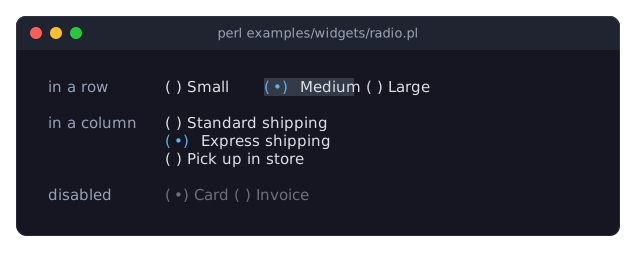
The picture shows three radio groups: one with its buttons in a row, which has the focus (the selected button is on the focus_background_color), one in a column, and a disabled one. The program is examples/widgets/radio.pl.
A radio button is one choice of a Term::Fabulous::Widget::RadioGroup. It shows a mark and a label:
(*) Medium
( ) Large
(the selected mark is U+2022 BULLET by default, shown here as *).
A radio button only works inside a radio group, as a child of the group or deeper inside it (for example in a box that lays out several buttons in a row). The group keeps track of which button is selected, takes the keyboard focus for all its buttons and fires the Change event; the button itself never takes the focus and fires no Change. A button is selected when its value equals the group's value.
A click on a button selects it and focuses its group. Clicking a radio button that is not inside a radio group dies.
A radio button is disabled when it or its group is disabled. Disabled buttons are painted in disabled_color and skipped by the arrow keys.
CONSTRUCTOR
new
my $button = Term::Fabulous::Widget::RadioButton->new(%parameters);Accepts the parameters of "CONSTRUCTOR" in Term::Fabulous::Widget::Input (id, layout, background_color, the border parameters, disabled, text_color, disabled_color, accent_color, focus_background_color, the other Box parameters) and the ones below. can_focus is accepted but has no effect: a radio button never takes the focus. Unknown parameters die.
label-
A character string. Default:
''(no label). The text after the mark. Dies if not a string. value-
A string or a number. Default:
undef, which means "the same as the label". The value the group takes when this button is selected. The buttons of one group should have different values: the group selects every button whose value equals its own. Dies if given a reference. selected_mark-
A character string. Default:
"(\x{2022})", a bullet in parentheses. The mark of the selected button, painted inaccent_color. unselected_mark-
A character string. Default:
'( )'. The mark of the other buttons, painted intext_color.
METHODS
The methods of "METHODS" in Term::Fabulous::Widget::Input (disabled, is_enabled, the color accessors, mark_changed), plus:
value
my $value = $button->value;
$button->value('xl');
Accessor. Returns the button's value, or its label when no value was given or the value was set to undef. Writing marks the input changed and returns the value as the reader would ($button->value(undef) returns the label). A reference dies and leaves the value unchanged. Changing the value of the selected button does not change the group's value, so the button is no longer selected afterwards.
label
my $label = $button->label;
$button->label('Extra large');
Accessor for the label. Writing marks the input changed and returns the new label. A value that is not a string dies and leaves the label unchanged.
selected_mark
$button->selected_mark('[*]');Accessor for the selected_mark parameter. Writing marks the input changed and returns the new mark. A value that is not a string dies and leaves the mark unchanged.
unselected_mark
$button->unselected_mark('[ ]');Accessor for the unselected_mark parameter; works like "selected_mark".
group
my $group = $button->group;The nearest Term::Fabulous::Widget::RadioGroup among the button's ancestors, or undef when there is none.
is_selected
if ( $button->is_selected ) { ... }1 when the button's group has a value equal to the button's value (compared as strings), 0 otherwise or when the button has no group.
is_enabled
if ( $button->is_enabled ) { ... }True when neither the button nor its group is disabled.
KEYS
A radio button uses no keys itself: it never has the focus. Its radio group handles the keys; see "KEYS" in Term::Fabulous::Widget::RadioGroup.
MOUSE
A click (left button pressed and released over the button) selects the button, as "choose" in Term::Fabulous::Widget::RadioGroup does, and the press focuses the group. Nothing happens while the button or its group is disabled.
EVENTS
A radio button fires no Change event of its own; the group fires it.
KDL PROPERTIES
The properties of "KDL PROPERTIES" in Term::Fabulous::Widget::Input, plus label, value, selected_mark and unselected_mark. Radio buttons are written as children of a radio group; see "KDL PROPERTIES" in Term::Fabulous::Widget::RadioGroup.
SEE ALSO
Term::Fabulous::Widget::RadioGroup, Term::Fabulous::Widget::Input, the radio button section of the forms guide, "Build a form from a KDL file (text fields, radio buttons, dropdown, slider, checkbox)" in Term::Fabulous::Cookbook::Forms, "Choose from options in Perl (Dropdown, RadioGroup, Slider)" in Term::Fabulous::Cookbook::Forms.