NAME
Term::Fabulous::Widget::RadioGroup - A group of radio buttons of which one is selected
SYNOPSIS
use Clay::UI::Enum::Result;
use Term::Fabulous::Widget::RadioGroup;
use Term::Fabulous::Widget::RadioButton;

my $size = Term::Fabulous::Widget::RadioGroup->new( id => 'size', value => 'm' );
$size->add_child( Term::Fabulous::Widget::RadioButton->new( label => $_->[0], value => $_->[1] ) )
	foreach [ Small => 's' ], [ Medium => 'm' ], [ Large => 'l' ];

$size->on( Change => sub ($event) {
	say 'size: ', $event->value;    # 's', 'm' or 'l'
	return Clay::UI::Enum::Result->CONTINUE;
} );

$size->value('l');    # programmatic: selects "Large", fires no Change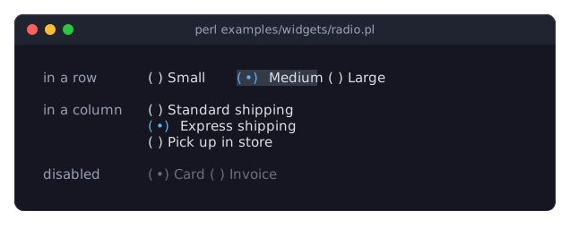
DESCRIPTION
The picture shows three radio groups: one with its buttons in a row, which has the focus (the selected button is on the focus_background_color), one in a column, and a disabled one. The program is examples/widgets/radio.pl.
A radio group lets the user choose exactly one of several options, all visible at once. It is a Term::Fabulous::Widget::Box that holds Term::Fabulous::Widget::RadioButtons, directly or inside other boxes. The group's value is the value of the selected button; at most one button is selected (or several, if you gave several buttons the same value). Buttons inside a nested radio group belong to that inner group.
The group, not its buttons, takes the keyboard focus, so Tab moves past the whole group in one step, and the arrow keys move the selection. While the group has the focus, the button the keyboard is on (the selected one, or the first enabled one when none is selected) is painted on focus_background_color.
The buttons are laid out from top to bottom unless the layout sets a layout_direction. Use CLAY_LEFT_TO_RIGHT for buttons side by side:
use Clay::XS qw(CLAY_LEFT_TO_RIGHT);

my $size = Term::Fabulous::Widget::RadioGroup->new(
	value  => 'm',
	layout => { layout_direction => CLAY_LEFT_TO_RIGHT, child_gap => 2 },
);
A radio group is not an Term::Fabulous::Widget::Input; it has its own disabled and value, and no colors (the buttons have them).
CONSTRUCTOR
new
my $group = Term::Fabulous::Widget::RadioGroup->new(%parameters);Accepts the parameters of Term::Fabulous::Widget::Box (id, layout, background_color, bordered, border_color, border_style, ...) and the ones below. Unknown parameters die.
value-
A string, a number or
undef. Default:undef(no button selected). The value of the button to select. A reference dies. disabled-
A boolean. Default: 0. A disabled group cannot take the focus, ignores keys and clicks, and all its buttons are painted in their
disabled_color. can_focus-
A boolean. Default: 1. Whether the group may take the keyboard focus. It counts while the group is enabled: a disabled group cannot take the focus, whatever this says (see "can_focus").
METHODS
The methods of Term::Fabulous::Widget::Box (add_child, remove_child, children, layout, on, ...), plus:
value
my $value = $group->value;
$group->value('l');
$group->value(undef);    # select nothing
Accessor. Returns the value of the selected button, or undef. Writing selects the button(s) whose value equals the new value (compared as strings), or no button when none has it; the next frame shows it on the buttons. Writing fires no Change event. Returns the new value. A reference dies and leaves the value unchanged.
disabled
my $is_disabled = $group->disabled;
$group->disabled(1);
Accessor, from Clay::UI::Role::Interaction::Disableable. Returns 1 or 0; writing returns the new value. Writing a true value disables the group: its buttons are painted disabled, keys and clicks are ignored (Clay::UI presses none of its buttons), can_focus reads 0 and the group gives up the focus at once if it had it. Writing a false value enables it again: it can take the focus when can_focus was last set to a true value, through new, a layout file or the accessor, also while the group was disabled. Writing the value the group already has changes nothing.
can_focus
$group->can_focus(0);
if ( $group->can_focus ) { ... }
Whether the group can take the focus now: 1 when the last value written (through new, a layout file or this accessor) was true and the group is enabled, 0 otherwise. Writing records whether the group may take the focus and returns what reading returns now; writing a false value to the focused group takes the focus away at once. The order of can_focus and disabled does not matter. From Clay::UI::Role::Interaction::Focusable.
is_enabled
if ( $group->is_enabled ) { ... }True when the group is not disabled.
buttons
my @buttons = $group->buttons;The group's radio buttons, in tree order (top to bottom as they were added), including buttons inside boxes in the group but not buttons inside a nested radio group.
selected_button
my $button = $group->selected_button;The first button whose value equals the group's value, or undef.
cursor_button
my $button = $group->cursor_button;The button the keyboard is on: the selected button if it is enabled, otherwise the first enabled button, or undef when there is none.
choose
$group->choose($button);Selects one of the group's buttons as the user does: sets the group's value to the button's value and fires a Change event, unless that button is already selected (then nothing happens). Works even while the group is disabled. Dies if $button is not one of "buttons". Returns the group.
holds_value
if ( $group->holds_value('m') ) { ... }True when the group's value is defined and equals the given value (compared as strings).
KEYS
While the group has the focus and is enabled:
Up,Left-
Select the previous enabled button. From the first one, wrap around to the last one. With nothing selected, the "current" button is the first enabled one, so
Upselects the last. Down,Right-
Select the next enabled button, wrapping around from the last to the first. With nothing selected,
Downselects the second enabled button. Home,End-
Select the first or last enabled button.
Space,Enter-
Select the button the keyboard is on (see "cursor_button"). Useful when nothing is selected yet; on a selected button they change nothing.
Each of these keys is used (it does not bubble), even when it changes nothing. All other keys, including Tab, bubble to the group's ancestors. Disabled buttons are skipped. When the group has no enabled button at all, every key bubbles.
MOUSE
A click on a button (left button pressed and released over it) selects it, and the press focuses the group. Clicks are ignored while the group or the button is disabled.
EVENTS
Change-
Term::Fabulous::Event::Change, fired on the group (not on the button) when the user selects another button, or when "choose" selects one;
$event->valueis the new value. Writingvaluefires nothing. OnFocus,OnBlur-
Fired by Clay::UI when the group gains or loses the focus.
KDL PROPERTIES
The properties of "KDL PROPERTIES" in Term::Fabulous::Widget::Box, plus value (a string or number), disabled and can_focus (#true / #false). The radio buttons are written as child nodes:
use Term::Fabulous::Widget::RadioGroup as RadioGroup
use Term::Fabulous::Widget::RadioButton as RadioButton

RadioGroup "size" {
	value "m"
	layout direction=right gap=2
	RadioButton { label "Small"; value "s"; }
	RadioButton { label "Medium"; value "m"; }
	RadioButton { label "Large"; value "l"; }
}
The value may come before the buttons: it is only compared with the buttons' values when they are painted.
EXAMPLES
Enable a text field for the choice "Other"
my $source = Term::Fabulous::Widget::RadioGroup->new( value => 'web' );
$source->add_child( Term::Fabulous::Widget::RadioButton->new( label => $_ ) ) foreach qw(web friend other);
my $other = Term::Fabulous::Widget::TextField->new( disabled => 1, placeholder => 'Where?' );

$source->on( Change => sub ($event) {
	$other->disabled( $event->value ne 'other' );
	return;
} );
SUBCLASS INTERFACE
handle_key
class My::RadioGroup :isa(Term::Fabulous::Widget::RadioGroup) {
	method handle_key :override ($event) {
		if ( ( $event->main_key_name // '' ) eq 'Delete' ) {
			$self->value(undef);    # clear the selection
			return 1;
		}
		return $self->SUPER::handle_key($event);
	}
}
Called with every Term::Fabulous::Event::KeyPress fired on the group (or bubbling up to it) while the group is enabled. Returns true when it used the key, which then stops bubbling, and false to let the key bubble on. Override it to add keys; call SUPER::handle_key for the keys above.
SEE ALSO
Term::Fabulous::Widget::RadioButton, Term::Fabulous::Event::Change, the radio button section of the forms guide, "Choose from options in Perl (Dropdown, RadioGroup, Slider)" in Term::Fabulous::Cookbook::Forms.