NAME
Term::Fabulous::Widget::StarRating - Rate something with a row of stars
SYNOPSIS
use Clay::UI::Enum::Result;
use Term::Fabulous::Widget::StarRating;

my $rating = Term::Fabulous::Widget::StarRating->new(
	id         => 'rating',
	max        => 5,
	value      => 3,
	show_value => 1,
);
$rating->on( Change => sub ($event) {
	save_rating( $event->value );
	return Clay::UI::Enum::Result->CONTINUE;
} );

say $rating->value;    # 3
$rating->value(4);     # programmatic: fires no Change

# Shown, not edited:
my $stars = Term::Fabulous::Widget::StarRating->new( value => 4.5, half => 1, read_only => 1 );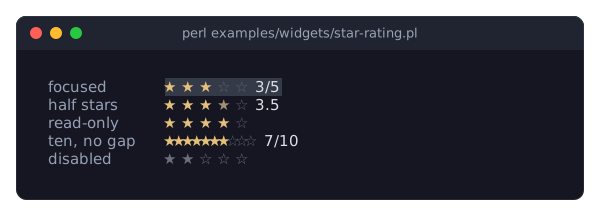
DESCRIPTION
The picture shows star ratings in their forms: a focused one with three of five stars, one with half stars that shows its value, a read-only one, one with ten stars and no gap between them, and a disabled one. The program is examples/widgets/star-rating.pl.
A star rating shows max stars (five by default), the first value of them filled, and optionally the value as text:
★ ★ ★ ☆ ☆ 3/5The user chooses a value with the arrow keys, Home and End, the digit keys, by clicking a star or with the mouse wheel. While the pointer is over a star, the stars up to it are shown filled as a preview; the value changes only with a click. With half the value moves in half stars, and a half star is drawn as the half_glyph in half_color; without a glyph of its own, it is the full star in a color halfway between the filled and the empty stars.
A read-only rating (read_only) shows a value without letting the user change it: it takes no focus, no keys and no clicks, and keeps its colors (a disabled rating is gray). Use it in lists and cards.
Disabling, colors, focus and sizing are described in Term::Fabulous::Widget::Input. The filled stars are painted in accent_color, which defaults to a yellow for this widget, the empty stars in inactive_color. The rating is one row high and, unless the layout sizes it, as wide as its stars with their gaps and the value label.
CONSTRUCTOR
new
my $rating = Term::Fabulous::Widget::StarRating->new(%parameters);Accepts the parameters of "CONSTRUCTOR" in Term::Fabulous::Widget::Input (id, layout, background_color, the border parameters, disabled, can_focus, text_color, disabled_color, accent_color, focus_background_color, the other Box parameters) and the ones below. Unknown parameters die.
max-
A positive integer. Default: 5. The number of stars.
value-
A number from 0 to
max. Default: 0. The initial value; it is rounded to whole stars, or to half stars withhalf. Dies if outside the range. half-
A boolean. Default: 0. Whether the value moves in half stars (0.5) instead of whole ones. Stored as 1 or 0; a reference dies.
read_only-
A boolean. Default: 0. A read-only rating shows its value and ignores the user: it cannot take the focus, and keys, clicks and the wheel do nothing. Unlike
disabled, it keeps its colors. show_value-
A boolean. Default: 0. Whether the value is shown as text right of the stars, formatted with
value_format. value_format-
How the value is shown: a
sprintfformat string such as'%.1f', or a code reference that gets the value and returns the text. Default:undef, which shows3/5(or3.5/5withhalf). Anything other than a string, a code reference orundefdies. The label is as wide as the widest value, so the stars stay in place. gap-
A non-negative integer. Default: 1. The columns between two stars.
full_glyph-
A single character one column wide. Default:
"\x{2605}"(black star). A filled star. empty_glyph-
A single character one column wide. Default:
"\x{2606}"(white star). An empty star. half_glyph-
A single character one column wide, or
undef. Default:undef, which draws a half star withfull_glyphinhalf_color. Fonts rarely have a half-filled star;"\x{2BEA}"(star with left half black) is one where they do. inactive_color-
The color of the empty stars, in any format "Colors" in Term::Fabulous::Widget::Canvas accepts. Default: the theme's
input.inactive,[90, 96, 110, 255]in the dark theme, a gray. half_color-
The color of a half star, or
undef. Default: the theme'sinput.half, none in the built-in themes: a color halfway betweenaccent_colorandinactive_color. accent_color-
As for every input, but it comes from the theme's
input.star,[229, 192, 123, 255]in the dark theme, a yellow, when it is not given.
The glyph parameters die unless they are exactly one grapheme cluster one column wide.
METHODS
The methods of "METHODS" in Term::Fabulous::Widget::Input (disabled, is_enabled, the color accessors, mark_changed), plus:
value
my $stars = $rating->value;
$rating->value(4);
Accessor. Returns the current value, a number. Writing rounds the new value to whole or half stars, marks the input changed, and returns the stored value. Dies if the new value is not a finite number in 0..max. Writing fires no Change event.
max
my $stars = $rating->max;
$rating->max(10);
Accessor for the number of stars. Writing moves the value into the new range if needed (without a Change event), marks the input changed and returns the new max. Dies unless it is a positive integer.
half
$rating->half(1);Accessor for the half parameter. Writing rounds the value to the new grid (without a Change event) and returns 1 or 0.
set_range
$rating->set_range( max => 10, half => 1 );Changes max and half together, as a layout does (see Term::Fabulous::Role::HasRange): the value moves onto the new grid without a Change event. Unknown parts die. Returns the rating.
step
my $step = $rating->step; # 1, or 0.5 with halfHow far one key press or wheel notch moves the value. Read-only.
read_only
$rating->read_only(1);Accessor for the read_only parameter. Writing a true value takes the focus away from the rating if it has it; writing a false value lets it take the focus again. Returns 1 or 0.
show_value
$rating->show_value(1);Accessor for the show_value parameter. Returns 1 or 0.
value_format
$rating->value_format('%.1f stars');Accessor for the value_format parameter. Anything other than a string, a code reference or undef dies and leaves the old format.
format_value
my $text = $rating->format_value(3.5);A number formatted as the rating shows it (see value_format).
gap
$rating->gap(0);Accessor for the gap parameter; the new width takes effect at the next frame.
full_glyph
$rating->full_glyph('*');Accessor for the full_glyph parameter. A value that is not a single one-column character dies and leaves the old glyph.
empty_glyph
$rating->empty_glyph('.');Accessor for the empty_glyph parameter; works like "full_glyph".
half_glyph
$rating->half_glyph("\x{2BEA}");
$rating->half_glyph(undef);
Accessor for the half_glyph parameter; undef returns to the full glyph in half_color.
inactive_color
$rating->inactive_color('#444444');Accessor for the inactive_color parameter. The reader returns [r, g, b, a]. An invalid color dies and leaves the old one.
half_color
$rating->half_color('#a08040');
$rating->half_color(undef);
Accessor for the half_color parameter; undef returns to the computed color.
Every writer marks the input changed, so the next frame paints the new look.
KEYS
While the rating has the focus, is enabled and not read-only:
Left,Down-
One star (or half star) less.
Right,Up-
One star (or half star) more.
Home-
No stars (0).
End-
All stars (
max). 0to9-
That many stars, when the digit is not more than
max.
The value never leaves 0..max; at either end these keys do nothing (but are still used). All other keys, and digits above max, bubble to the ancestors.
MOUSE
- Hover
-
While the pointer is over a star, the stars up to it are shown filled (and the value label shows that value) as a preview of a click. The preview goes when the pointer leaves the widget. A read-only or disabled rating shows no preview. The terminal reports pointer motion only while the program runs with the mouse enabled.
- Click
-
A click on a star sets the value to that star. With
half, a click withShiftheld sets it to half a star less (Shift+click on the third star gives 2.5). Clicks on the gaps and the value label do nothing but focus the rating. - Wheel
-
Each notch moves the value by one step: up increases, down decreases. A notch that cannot move the value (down at 0, up at
max) is not used: inside a Term::Fabulous::Widget::ScrollBox it scrolls the scroll box instead.
EVENTS
Change-
Term::Fabulous::Event::Change whenever the user moves the value to a different number of stars;
$event->valueis the new number. Programmatic writes tovalue,maxandhalffire nothing.
KDL PROPERTIES
The properties of "KDL PROPERTIES" in Term::Fabulous::Widget::Input, plus max, value, gap, value_format (a format string only; code references cannot be written in KDL), full_glyph, empty_glyph, half_glyph, half, read_only and show_value (#true / #false), and inactive_color and half_color (color strings):
use Term::Fabulous::Widget::StarRating as StarRating

StarRating "rating" {
	max 5
	half #true
	value 3.5
	show_value #true
}
max and half are applied before value, so they may come in any order.
EXAMPLES
A rating in a list
my $stars = Term::Fabulous::Widget::StarRating->new( value => 4, read_only => 1, gap => 0 );Words instead of numbers
my @words  = qw(unrated poor fair good very_good excellent);
my $rating = Term::Fabulous::Widget::StarRating->new(
	show_value   => 1,
	value_format => sub ($stars) { $words[$stars] =~ tr/_/ /r },
);
SEE ALSO
Term::Fabulous::Widget::Input, Term::Fabulous::Event::Change, the star rating section of the forms guide.