NAME
Prima::Spinner - spinner animation widget
SYNOPSIS
  use Prima qw(Application Buttons Spinner);

  my $mw = Prima::MainWindow->new(
	size      => [200, 400],
	text      => 'Button Example'
  );

  my $spinner = $mw->insert('Spinner',
	style     => 'drops',
	size      => [200,400],
	growMode  => gm::Center
  );

  my $button = $mw->insert(
	'Button',
	text      => 'Start/Stop',
	checkable => 1,
	checked   => 1,
	origin    => [0,0],
	onClick   => sub { $spinner->toggle },
	growMode  => gm::XCenter
  );

  Prima->run;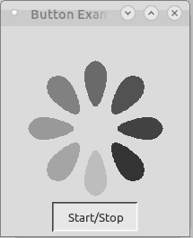
DESCRIPTION
Prima::Spinner provides a simple spinning animation in three different designs and the opportunity to specify the colors of the spinning animation. This is useful to show the progress of a running process.
USAGE
Properties
- active [BOOLEAN]
-
Manages whether the spinning animation is active or not.
- color COLOR
-
Inherited from Prima::Widget.
colormanages the basic foreground color. For the spinner widget, this means the background color of the circle or the color of the drops. - hiliteColor COLOR
-
Inherited from Prima::Widget. The color is used to draw alternate foreground areas with high contrast. For the spinner widget, this defines the color of the arc. Only for the circle style.
- showPercent BOOLEAN
-
If set, displays completion percent as text. Only for the circle style.
- start
-
Same as
active(1) - stop
-
Same as
active(0) - style STRING
-
stylecan be 'drops', 'circle' or 'spiral'.dropsshows drops with fading colors. Thecirclestyle features an arc moving around a circle.spiralshows a spinning spiral. The default is 'drops'. - value INT
-
An integer value between 0 and 100, shows completion percentage. Only for the circle style.
- toggle
-
Same as
active(!active)
SEE ALSO
Prima. Prima::Widget, examples/spinner.pl
AUTHOR
Maximilian Lika