NAME
Clay::Manual - user guide for Clay::XS and Clay::UI
ABOUT THIS MANUAL
This manual explains how to lay out user interfaces, images and documents from Perl with the Clay layout engine. It introduces every concept once, in an order that builds on itself, and shows each one with a short piece of code. It is meant to be read from top to bottom the first time, and searched afterwards.
The other documents of the distribution are:
- Clay::Cookbook
-
Short, task-oriented recipes ("How do I make a tooltip?").
- Clay::XS
-
Reference for the low-level binding: every function and constant.
- Clay::XS::Structs
-
Reference for every key of an element declaration and every other struct (hash) Clay reads or returns.
- Clay::UI
-
Reference for the widget layer, starting with the
Clay::UIclass. Every widget class and role has its own reference page, listed in "Widget roles". - The examples/ directory
-
Runnable scripts. "FEATURE INDEX" lists which script shows which feature.
To find one topic quickly, search the headings of this manual, or grep the distribution: every function, method, attribute and struct key has a heading or an =item of its own, spelled exactly as you type it in code.
perldoc Clay::Manual                     # read this manual
grep -rnE '^=(head.|item) (C<)?betweenChildren' lib/   # find a struct key
grep -rln 'Features:.*floating' examples/   # find an example
INTRODUCTION
What Clay does
Clay is a layout engine written in C (https://github.com/nicbarker/clay, version 0.14 is vendored in this distribution). You describe a tree of rectangular elements - boxes that contain other boxes and text - with rules such as "grow to fill the space", "16 pixels of padding" or "children from top to bottom". Clay computes where every element goes and how big it is, and returns a flat list of render commands: "draw a rectangle here", "draw this text there", "start clipping".
Clay does not draw anything, open windows, load fonts or read the keyboard. Your program, the renderer, turns the render commands into pixels, PDF operators, SVG elements, terminal cells or whatever output you need. Because of that, the same layout code can produce a PNG image, a PDF page and a live window.
Clay is fast enough to recompute the whole layout every time something changes ("immediate mode"). You do not update elements; you describe the whole tree again and Clay works out the result.
The two layers
The distribution contains two Perl APIs on top of Clay:
- Clay::XS - the low-level binding
-
Every Clay function under its exact C name (
Clay_BeginLayout,Clay_GetElementData, ...). You declare elements one by one, in order, on every frame. Structs are Perl hashes with Clay's camelCase field names (backgroundColor,childGap). Use it when you want full control, want to port C examples, or prefer to describe the whole tree in code on every frame. - Clay::UI - the widget layer
-
A tree of long-lived Perl objects (widgets) built from Object::Pad roles. You build the tree once, change it when your data changes, and call
$ui->renderfor every frame. Clay::UI also turns pointer input into events (hover, press, release, scroll), manages keyboard focus, and tells you when a frame needs to be redrawn. Attribute names are snake_case (background_color,child_gap).
Both layers produce the same render commands, so a renderer works with either. Clay::UI is built on Clay::XS; you can mix the two, for example call a Clay::XS function on the render commands Clay::UI returns.
Choosing a layer:
You want to ...                                  Use
-----------------------------------------------  ---------------------------
render a document or image from data             either; Clay::UI is shorter
build an interactive UI with events and focus    Clay::UI
animate elements with transitions                either
port a C Clay example                            Clay::XS
reuse a tree between frames                      Clay::UI
INSTALLATION
perl Makefile.PL
make
make test
make install
You need Perl 5.26 or later, a C99 compiler (GCC or Clang), the patch program, ExtUtils::MakeMaker 7.12 or later, Object::Pad 0.800 or later and Object::PadX::Enum. Clay itself is included; there is no system library to install. The tests need Test2::V0 and JSON::PP.
To run a script against the freshly built, not yet installed module, add the build directories to Perl's include path:
perl -Ilib -Iblib/lib -Iblib/arch examples/01-minimal.plGETTING STARTED
A first layout with Clay::UI
The script below lays out a 400x200 area with a header bar and two coloured columns, and prints the render commands.
use v5.22;
use warnings;
use feature 'signatures';
no warnings 'experimental::signatures';

use Object::Pad 0.800;
use Clay::XS qw(:all);
use Clay::UI;
use Clay::UI::Box;
use Clay::UI::Text;

# 1. Widget classes. Clay::UI ships roles, not classes: a class
#    is one line that composes the role you want.
class My::Box  :strict(params) :does(Clay::UI::Box)  {}
class My::Text :strict(params) :does(Clay::UI::Text) {}

# 2. The widget tree.
my $root = My::Box->new(
	id     => 'root',
	layout => {
		sizing           => { width => sizing_grow(), height => sizing_grow() },
		layout_direction => CLAY_TOP_TO_BOTTOM,
		padding          => padding_all(8),
		child_gap        => 8,
	},
	background_color => [240, 240, 240, 255],
);
my $header = My::Box->new(
	layout           => { sizing => { width => sizing_grow() }, padding => padding_all(8) },
	background_color => [40, 60, 90, 255],
);
$header->add_child(My::Text->new(
	text       => 'Hello, Clay',
	font_size  => 20,
	text_color => [255, 255, 255, 255],
));

my $columns = My::Box->new(
	layout => {
		sizing    => { width => sizing_grow(), height => sizing_grow() },
		child_gap => 8,
	},
);
$columns->add_child(
	My::Box->new(
		layout => {
			sizing => { width => sizing_fixed(120), height => sizing_grow() },
		},
		background_color => [200, 80, 60, 255],
	),
	My::Box->new(
		layout => {
			sizing => { width => sizing_grow(), height => sizing_grow() },
		},
		background_color => [60, 160, 90, 255],
	),
);
$root->add_child($header, $columns);

# 3. A Clay::UI owns the Clay context and lays the tree out.
my $ui       = Clay::UI->new(width => 400, height => 200, root => $root);
my $commands = $ui->render;

# 4. Your renderer would draw these. Here we print them.
for my $command (@$commands) {
	my $box = $command->{boundingBox};
	printf "%-10s %-14s x=%3d y=%3d w=%3d h=%3d\n",
		ref $ui->widget_for($command->{userData}),
		command_name($command->{commandType}),
		@$box{qw(x y width height)};
}

sub command_name ($type) {
	return $type == CLAY_RENDER_COMMAND_TYPE_RECTANGLE ? 'RECTANGLE'
	     : $type == CLAY_RENDER_COMMAND_TYPE_TEXT      ? 'TEXT'
	     :                                               "type $type";
}
Output:
My::Box    RECTANGLE      x=  0 y=  0 w=400 h=200
My::Box    RECTANGLE      x=  8 y=  8 w=384 h= 36
My::Text   TEXT           x= 16 y= 16 w=220 h= 20
My::Box    RECTANGLE      x=  8 y= 52 w=120 h=140
My::Box    RECTANGLE      x=136 y= 52 w=256 h=140
What happened:
sizing_grow()made the root fill the 400x200 viewport, and the green column fill what the fixed-width red column left over.The header has no height rule, so it uses the default,
FIT: it is as tall as its content (the text) plus its padding.The text is 220 units wide because Clay::UI's default text measurement assumes every character is
font_sizewide (11 characters x 20). A real program installs a measure function that asks its font library; see "TEXT".widget_formaps each render command back to the widget that produced it. To ask where an element widget ended up, call$ui->bounding_box($widget); text widgets have no bounding box of their own, their position is theboundingBoxof theirTEXTcommands.
The same layout with Clay::XS
With the low-level binding you create a context yourself and declare every element, in order, between Clay_BeginLayout and Clay_EndLayout. Each element is opened, configured once, given its children, and closed:
use v5.22;
use warnings;
use feature 'signatures';
no warnings 'experimental::signatures';

use Clay::XS qw(:all);

my $ctx = Clay_Initialize(
	Clay_MinMemorySize(),
	{ width => 400, height => 200 },
	sub ($error, $userdata) { die "Clay error: $error->{errorText}\n" },
);
Clay_SetMeasureTextFunction(sub ($text, $config, $userdata) {
	return { width => length($text) * $config->{fontSize}, height => $config->{fontSize} };
});

sub element ($id, $declaration, $children = sub {}) {
	Clay__OpenElementWithId(Clay_GetElementId($id));
	Clay__ConfigureOpenElement($declaration);
	$children->();
	Clay__CloseElement();
}

Clay_BeginLayout();
element(root => {
	layout => {
		sizing          => { width => sizing_grow(), height => sizing_grow() },
		layoutDirection => CLAY_TOP_TO_BOTTOM,
		padding         => padding_all(8),
		childGap        => 8,
	},
	backgroundColor => [240, 240, 240, 255],
}, sub {
	element(header => {
		layout => {
			sizing  => { width => sizing_grow() },
			padding => padding_all(8),
		},
		backgroundColor => [40, 60, 90, 255],
	}, sub {
		Clay__OpenTextElement('Hello, Clay', {
			fontSize  => 20,
			textColor => [255, 255, 255, 255],
		});
	});
	element(columns => {
		layout => {
			sizing   => { width => sizing_grow(), height => sizing_grow() },
			childGap => 8,
		},
	}, sub {
		element(red => {
			layout => {
				sizing => { width => sizing_fixed(120), height => sizing_grow() },
			},
			backgroundColor => [200, 80, 60, 255],
		});
		element(green => {
			layout => {
				sizing => { width => sizing_grow(), height => sizing_grow() },
			},
			backgroundColor => [60, 160, 90, 255],
		});
	});
});
my $commands = Clay_EndLayout();

printf "%d render commands\n", scalar @$commands;    # 5
Note the differences: keys are camelCase (layoutDirection, childGap, backgroundColor), and an element that should keep its identity between frames needs an id from Clay_GetElementId. The helper sub element plays the role of Clay's C CLAY() macro; see "MAPPING C MACROS TO PERL" in Clay::XS.
FRAMES
What a frame is
A frame is one complete layout computation. With Clay::XS it is everything from Clay_BeginLayout() to Clay_EndLayout($delta_time), which returns the render commands. With Clay::UI it is one call of $ui->render(%input).
Clay keeps a little state from one frame to the next: the bounding box of every element (used for pointer tests), scroll positions, hover callbacks and running transitions. Everything else - the tree itself, sizes, colours, text - is declared fresh in every frame. To change what is shown, declare something different in the next frame (Clay::XS) or change the widgets before the next render (Clay::UI).
For a static image or document, one frame is all you need. An interactive program runs one frame per input event or per display refresh.
The order of a Clay::XS frame
Clay_SetLayoutDimensions(\%size);          # only when the viewport changed
Clay_SetPointerState(\%position, $down);   # pointer input, tested against the previous frame
Clay_UpdateScrollContainers($drag, \%wheel, $delta_time);   # scrolling
Clay_BeginLayout();
# ... open, configure and close elements ...
my $commands = Clay_EndLayout($delta_time);
# ... draw $commands ...
Pointer and scroll functions work on the layout of the last completed frame, so they croak between Clay_BeginLayout and Clay_EndLayout. See "ELEMENTS AND FRAMES" in Clay::XS for every rule.
The order of a Clay::UI frame
$ui->render(pointer_state => ..., scroll_delta => ..., delta_time => ...) does all of this in one call:
Hands the pointer position and the scroll wheel to Clay, which tests them against the layout of the previous
render.Fires widget events:
OnHoverStopped,OnHoverStart,OnPress,OnRelease,OnScroll. Your listeners may change the widget tree here.Lets widgets that asked for it rebuild their children (Clay::UI::Role::Core::Preparable).
Declares the whole widget tree to Clay (the layout pass) and returns the render commands.
Changes made in steps 2 and 3 show up in the commands of the same render. Details are in "render" in Clay::UI.
COORDINATES AND UNITS
Clay works in abstract layout units. They become whatever your renderer says: pixels for a PNG, points (1/72 inch) for a PDF, CSS pixels for SVG. Clay never converts units; the measure function and the renderer only have to agree.
The origin (0, 0) is the top left corner of the layout area. X grows to the right, Y grows downwards. A bounding box is a hash { x, y, width, height } with x and y at its top left corner. All four values are floating point numbers; they are often, but not always, whole numbers. Renderers that draw into a Y-up coordinate system (PDF) must flip the Y axis: $pdf_y = $page_height - $box->{y} - $box->{height}.
The size of the layout area (the viewport) is passed to Clay_Initialize or Clay::UI->new(width => ..., height => ...) and can be changed later with Clay_SetLayoutDimensions or $ui->width($w) / $ui->height($h). Elements may extend beyond it; Clay only omits render commands for elements that lie completely outside it (see "Culling").
Colours are four numbers [r, g, b, a]. Clay does not interpret them; by convention each channel is 0 to 255, and every example in this distribution uses that convention.
THE LAYOUT MODEL
This section explains how Clay decides where elements go. The keys named here belong to the layout part of an element declaration. The full list, with types, ranges and defaults, is in "layout" in Clay::XS::Structs. In Clay::UI, you pass them in the layout attribute (Clay::UI::Role::Layout::HasLayout), spelled in snake_case.
Clay::XS (camelCase)   Clay::UI (snake_case)
---------------------  ---------------------
sizing                 sizing
padding                padding
childGap               child_gap
childAlignment         child_alignment
layoutDirection        layout_direction
lineGap                line_gap
lineSizing             line_sizing
Elements and children
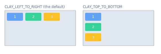
Every element is a rectangle. Its children are placed inside it, after each other along one axis, the layout axis (often called the main axis elsewhere). layoutDirection picks that axis:
CLAY_LEFT_TO_RIGHT(the default)-
Children form a row, left to right.
CLAY_TOP_TO_BOTTOM-
Children form a column, top to bottom.
CLAY_LEFT_TO_RIGHT_WRAP-
Children form rows that wrap onto a new line when the next child does not fit. See "Flow layout".
CLAY_BACK_TO_FRONT-
Children are stacked on top of each other. See "Stack layout".
The other axis is the off axis (the cross axis). A text element is a leaf: it has no children and its size comes from the measure function (see "TEXT").
Sizing: FIT, GROW, FIXED and PERCENT
Each axis of an element has a sizing rule, given as sizing => { width => ..., height => ... }. Build the rules with these helper functions from Clay::XS (the defaults of $min and $max are 0, and a $max of 0 means "no maximum"):
sizing_fit($min, $max)- FIT (the default)-
The element is as large as its content: its children, the gaps between them and its padding. It is never smaller than
$minor larger than$max. sizing_grow($min, $max)- GROW-
The element first takes the size of its content, like FIT, then takes its share of the free space left in its parent along the parent's layout axis. On the off axis it fills the parent's inner size. Several GROW siblings share the free space: Clay grows the smallest ones first, so GROW siblings with small content end up the same size.
sizing_fixed($size)- FIXED-
Exactly
$size, whatever the content.sizing_fixed(0)is the exception: a maximum of 0 means "no maximum", so it behaves like FIT. Use a tiny size such as 1 for an element that must take no space. sizing_percent($fraction)- PERCENT-
A fraction (0 to 1) of the parent's inner size: the parent's size minus its padding and, on the layout axis, minus all its child gaps.
0.5is 50%. A value above 1 is reported to the error handler asCLAY_ERROR_TYPE_PERCENTAGE_OVER_1.
Example: a 300 wide row with 10 units of padding and childGap 10 and four children (GROW, FIXED 50, PERCENT 0.5, GROW with a maximum of 30) gives:
inner width            300 - 2*10 padding = 280
space for children     280 - 3*10 gaps    = 250
PERCENT 0.5            0.5 * 250          = 125
FIXED                                     =  50
GROW (max 30)                             =  30
GROW                   250 - 125 - 50 - 30 = 45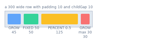
When the content of a parent is larger than the parent (for example a FIXED parent with too many children), Clay compresses the children along the layout axis: it shrinks the largest FIT and GROW children first, never below their $min and never below their minimum content size (the longest word wide, one line of text tall). If they still do not fit, the content overflows the parent. Clip the parent (see "Clipping and scrolling") if overflow must not be visible.
Padding and childGap
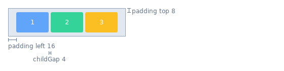
padding is empty space between an element's edge and its children: { left, right, top, bottom }, each an integer 0 to 65535. padding_all($n) builds one with the same value on all four sides.
childGap (Clay::UI: child_gap) is the space between neighbouring children along the layout axis. There is no gap before the first or after the last child.
layout => { padding => { left => 16, right => 16, top => 8, bottom => 8 }, childGap => 4 }Padding and gaps count as content: a FIT element includes them in its size.
childAlignment
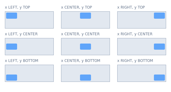
childAlignment => { x => ..., y => ... } (Clay::UI: child_alignment) positions the children inside the element when they do not fill it:
x: CLAY_ALIGN_X_LEFT (default), CLAY_ALIGN_X_CENTER, CLAY_ALIGN_X_RIGHT
y: CLAY_ALIGN_Y_TOP  (default), CLAY_ALIGN_Y_CENTER, CLAY_ALIGN_Y_BOTTOM
Along the layout axis the children move as one block; along the off axis each child is aligned on its own. To right-align the content of a table cell, give the cell child_alignment => { x => CLAY_ALIGN_X_RIGHT }.
Flow layout
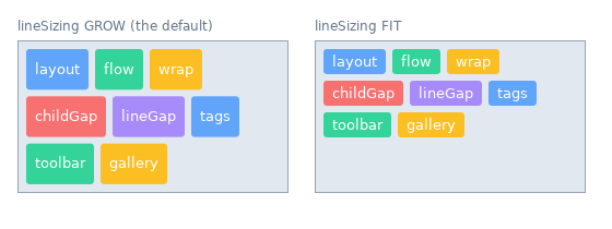
CLAY_LEFT_TO_RIGHT_WRAP lays children out left to right and starts a new line whenever the next child does not fit into the remaining width, like words in a paragraph. It is meant for tag lists, toolbars and galleries. Two extra layout keys control the lines:
lineGap(Clay::UI:line_gap)-
Vertical space between lines.
childGapis still the space between neighbours on a line. lineSizing(Clay::UI:line_sizing)-
What happens when the container is taller than its lines:
CLAY_LINE_SIZING_GROW(the default) adds an equal share of the extra height to every line;CLAY_LINE_SIZING_FITkeeps every line as tall as its tallest child.
A wrap container whose width is FIT prefers a single line. Give it a GROW, FIXED or PERCENT width to make it wrap inside its parent. Wrapping is horizontal only. The full rules (alignment per line, borders between children) are in "FLOW LAYOUT" in Clay::XS; see examples/07-ui-flow.pl.
Stack layout
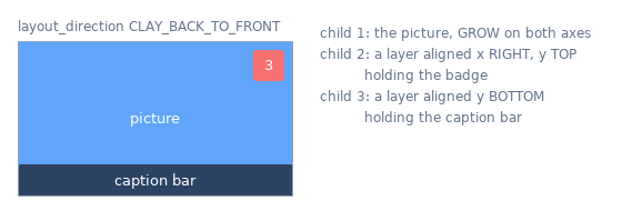
CLAY_BACK_TO_FRONT places all children on top of each other inside the padding. Later children are drawn over earlier ones; childGap is ignored. A FIT stack is as large as its largest child. childAlignment positions each child on both axes, so a stack is the tool for "badge in the top right corner of an avatar" or "caption at the bottom of a picture". See "STACK LAYOUT" in Clay::XS and examples/08-ui-stack.pl.
Floating elements
A floating element is taken out of the normal layout: it does not take space in its parent, and its siblings do not move for it. It is positioned relative to another element (or the layout root) and drawn above the normal content. Tooltips, dropdown menus, modal dialogs and badges are floating elements.
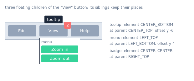
floating => {
	attachTo     => CLAY_ATTACH_TO_PARENT,
	attachPoints => {
		element => CLAY_ATTACH_POINT_LEFT_TOP,
		parent  => CLAY_ATTACH_POINT_LEFT_BOTTOM,
	},
	offset       => { x => 0, y => 4 },
	zIndex       => 10,
}
This places the element's top left corner 4 units below its parent's bottom left corner - a dropdown. The keys:
attachTo-
What to attach to:
CLAY_ATTACH_TO_PARENT(the element it is declared in),CLAY_ATTACH_TO_ELEMENT_WITH_ID(any element, named byparentId),CLAY_ATTACH_TO_ROOT(the layout area) orCLAY_ATTACH_TO_NONE(the default: the element is not floating). attachPoints-
Which point of the floating element (
element) meets which point of the target (parent). Each is one of the nineCLAY_ATTACH_POINT_*constants (LEFT_TOP...RIGHT_BOTTOM). offset,expand-
Move the element after attaching (
{ x, y }), and enlarge it ({ width, height }). zIndex-
Drawing order between floating elements; higher is on top. Render commands carry it as
zIndex. pointerCaptureMode,clipTo,parentId-
Whether the pointer passes through to elements below, whether a clipping ancestor also clips the floating element, and the target for
CLAY_ATTACH_TO_ELEMENT_WITH_ID.
Every key is described in "floating" in Clay::XS::Structs. In Clay::UI, give the widget the Clay::UI::Role::Layout::HasFloating role (a Clay::UI::Box has it) and pass floating with snake_case keys (attach_to, attach_points, z_index, ...). A tooltip is usually added as a child of the widget it describes when the pointer enters it, and removed when the pointer leaves; see "Show a tooltip on hover" in Clay::Cookbook.
Clipping and scrolling
clip => { horizontal => $bool, vertical => $bool } makes an element a clip container: nothing of its children is drawn outside its bounding box on the clipped axes. Clay wraps the children's render commands in a SCISSOR_START / SCISSOR_END pair that your renderer turns into a clip region.
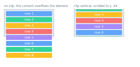
childOffset shifts all children by { x, y }; that is how scrolling works. Clay can track the offset for you:
Give the element an id and
clip => { vertical => 1, childOffset => Clay_GetScrollOffset() }.Clay_GetScrollOffsetreturns the stored offset of the element that is currently open.Before each frame, call
Clay_SetPointerStateandClay_UpdateScrollContainers($drag_enabled, \%wheel_delta, $delta_time). The container under the pointer scrolls by ten times the wheel delta (a delta of{ y => -4 }moves the content 40 units up); Clay keeps the position within the content. Wheel input moves the content at once; with drag scrolling enabled, a drag that is released keeps gliding for a few frames (momentum).Clay_GetScrollContainerData($id)reports position, visible size and content size;set_scroll_position($id, \%position)scrolls from code.
In Clay::UI all of that is automatic for widgets with the Clay::UI::Role::Layout::HasScroll role: pass scroll_delta (and optionally enable_drag_scrolling) to render, read $ui->scroll_state($widget), move with $ui->scroll_to($widget, { y => ... }), and listen for OnScroll. Scroll positions are 0 at the top left and become negative as the content moves up (scrolling down).
Aspect ratio
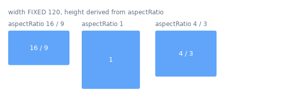
aspectRatio => $width_divided_by_height keeps an element's proportions: Clay derives one axis from the other. A 16:9 video box is aspectRatio => 16 / 9 with a GROW or FIXED width. Give the element a width (from GROW, FIXED or PERCENT sizing, or from its content) or a FIXED height; an empty FIT element without a FIXED height comes out 0 x 0. It is usually combined with image. See "aspectRatio" in Clay::XS::Structs.
Sizing groups
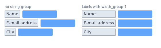
A sizing group makes elements that are not siblings equally wide (or tall): every element with the same non-zero sizingGroup => { width => $id } gets the width of the widest member. Use it to line up form labels in separate rows, or columns of a table. This is an extension of Clay added by this distribution; see "SIZING GROUPS" in Clay::XS. In Clay::UI every widget has width_group and height_group attributes (Clay::UI::Role::Layout::HasSizingGroup), and Clay::UI::Grid uses them to build tables.
Grids and tables
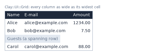
Clay::UI::Grid builds a table from rows of widgets. Each column is as wide as its widest cell and each row as tall as its tallest cell, computed in one layout pass. Grids support styled cells (Clay::UI::Grid::Cell), rows that span all columns, sorting rows without rebuilding them, and several grids sharing their column widths (a fixed header above a scrolling body). See examples/05-ui-grid.pl and examples/16-invoice-pdf.pl.
STYLING
Clay knows a few visual properties. It passes them on to the renderer in the render commands; it never draws them itself. All of them are described in Clay::XS::Structs.
backgroundColor(Clay::UI:background_color)-
Fills the element's box. Produces a
RECTANGLErender command. An element without a background colour (or with alpha 0) produces no rectangle. The same holds foroverlayColor: alpha 0 produces no overlay commands. cornerRadius(Clay::UI:corner_radius)-
Rounds the corners of the background and the border: a number for all corners, or
{ topLeft, topRight, bottomLeft, bottomRight }.corner_radius_all($r)builds the hash. border(Clay::UI:border_color,border_width)-
A line along the inside of the element's edges:
{ color => [...], width => { left, right, top, bottom, betweenChildren } }. Borders are drawn inside the box, over the content; they do not take space, so add padding if content must not be covered. ABORDERcommand is emitted whenever a width is above 0, even when the colour's alpha is 0; to hide a border, set its width to 0.betweenChildrendraws separator lines between children; Clay emits those as ordinaryRECTANGLEcommands, so your renderer needs nothing extra for them.border_outside($w)builds a width hash for the four edges;border_all($w)also setsbetweenChildren. overlayColor-
Tints an element and its children with a colour (for example a semi-transparent white for a "hovered" highlight). Clay brackets the affected commands with
OVERLAY_COLOR_START/OVERLAY_COLOR_END. image-
image => { imageData => $key }marks the element as an image. Clay emits anIMAGErender command instead of aRECTANGLE.$keyis an unsigned integer that Clay hands back unchanged; use it to look the picture up in your own table; it must not be 0 (Clay emits no command forimageData => 0). Combine withaspectRatio. Do not give an image element abackgroundColor: Clay then emits aRECTANGLEafter theIMAGEcommand, which covers the picture (put the background on a parent instead; the same holds forcustom). custom-
custom => { customData => $key }produces aCUSTOMrender command: anything your renderer knows how to draw (a chart, a QR code, a logo). LikeimageData,$keyis your own integer.
Clay::UI covers backgroundColor, cornerRadius, border and floating through roles. For image, custom, aspectRatio and overlayColor a widget class adds a method of its own; see "Writing your own widget class".
TEXT
Text elements
A text element shows one string. With Clay::XS:
Clay__OpenTextElement('Total: 42 EUR', { fontSize => 14, textColor => [0, 0, 0, 255] });With Clay::UI, compose Clay::UI::Text into a class and add it as a child:
$box->add_child(My::Text->new(text => 'Total: 42 EUR', font_size => 14));The text configuration keys ("Clay_TextElementConfig" in Clay::XS::Structs):
Clay::XS        Clay::UI          Meaning
--------------  ----------------  ------------------------------------------------
fontId          font_id           your number for a font; Clay passes it on
fontSize        font_size         font size in layout units
textColor       text_color        [r, g, b, a]
letterSpacing   letter_spacing    extra space between characters
lineHeight      line_height       height of one line; 0 = measured height
wrapMode        wrap_mode         CLAY_TEXT_WRAP_WORDS (default), _NEWLINES, _NONE
textAlignment text_alignment CLAY_TEXT_ALIGN_LEFT (default), _CENTER, _RIGHTfontId, fontSize, letterSpacing and lineHeight are integers from 0 to 65535 (Clay stores them as 16-bit numbers); a fractional size such as 8.5 is rejected. If you need fractional sizes, scale your layout units, for example lay out a PDF in tenths of a point and divide by 10 in the renderer. Border widths are integers too.
Text is Perl character strings, any Unicode. Clay breaks lines only at ASCII spaces and newlines.
Measuring text
Clay cannot know how wide a piece of text is in your font, so it asks a measure function you provide. The function receives the text and its configuration and returns the size:
Clay_SetMeasureTextFunction(sub ($text, $config, $userdata) {
	my $font = $fonts{ $config->{fontId} };
	return {
		width  => $font->width($text) * $config->{fontSize},
		height => $config->{fontSize},
	};
});
In Clay::UI, pass it to the constructor: Clay::UI->new(measure_text => sub ($text, $config, $userdata) { ... }, ...). The $config hash has camelCase keys (fontSize, fontId, ...) in both layers.
Clay calls the function for single words and caches the results, so it must return the same size for the same input. A Clay::XS context without a measure function makes Clay_EndLayout croak (Clay::XS: text measured but no measure_text function is installed for this context) as soon as it lays out text. Clay::UI has a default that estimates every character as fontSize wide and one line as fontSize tall; it is good enough for tests, not for real output.
Measure functions for common Perl libraries:
# Imager (raster images)
my $bbox = $imager_font->bounding_box(string => $text, size => $size);
return { width => $bbox->advance_width, height => $size };

# PDF::Builder / PDF::API2 (PDF)
return { width => $pdf_font->width($text) * $size, height => $size };
See examples/15-og-card.pl and examples/16-invoice-pdf.pl for complete versions. The measure function runs inside Clay; it must not call Clay functions that change state (see "What a callback may do" in Clay::XS). If it dies, the frame's Clay_EndLayout (or render) dies with that error.
Wrapping and line breaks
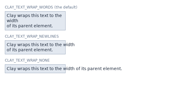
With CLAY_TEXT_WRAP_WORDS (the default), a text element that does not fit into its parent's width breaks at spaces and at newline characters. With CLAY_TEXT_WRAP_NEWLINES, it breaks only at newlines. With CLAY_TEXT_WRAP_NONE, it never breaks: the whole text, newlines included, is one line.
Each line becomes its own TEXT render command with its own bounding box, so a renderer simply draws every TEXT command at its position. A parent with a FIT width takes the width of the longest line it does not have to break; give the parent a FIXED, GROW or PERCENT width (or a $max on FIT) to make text wrap.
Fonts
fontId is a number with no meaning to Clay. Pick one per font face or weight (0 = regular, 1 = bold, ...), use it to choose the font in the measure function, and use the same mapping in the renderer, which finds fontId and fontSize in each TEXT command's renderData.
RENDER COMMANDS AND RENDERERS
The render command list
Clay_EndLayout and $ui->render return an array reference of hashes. Each hash describes one drawing step:
{
	commandType => CLAY_RENDER_COMMAND_TYPE_RECTANGLE,
	boundingBox => { x => 8, y => 8, width => 384, height => 36 },
	renderData  => {
		backgroundColor => { r => 40, g => 60, b => 90, a => 255 },
		cornerRadius    => { ... },
	},
	id          => 2307226574,    # the element id number
	zIndex      => 0,
	userData    => 0,             # set by you (Clay::XS) or by Clay::UI
}
The complete description of every command type and its renderData is in "RENDER COMMANDS" in Clay::XS.
Writing a renderer
A renderer is a loop over the commands, in array order, with one branch per commandType:
for my $command (@$commands) {
	my ($type, $box, $data) = @$command{qw(commandType boundingBox renderData)};
	if ($type == CLAY_RENDER_COMMAND_TYPE_RECTANGLE) {
		fill_rounded_rect($box, $data->{backgroundColor}, $data->{cornerRadius});
	}
	elsif ($type == CLAY_RENDER_COMMAND_TYPE_BORDER) {
		stroke_border($box, $data->{color}, $data->{width}, $data->{cornerRadius});
	}
	elsif ($type == CLAY_RENDER_COMMAND_TYPE_TEXT) {
		draw_text($box, $data);
	}
	elsif ($type == CLAY_RENDER_COMMAND_TYPE_IMAGE) {
		draw_image($box, $images{ $data->{imageData} });
	}
	elsif ($type == CLAY_RENDER_COMMAND_TYPE_CUSTOM) {
		$painters{ $data->{customData} }->($box);
	}
	elsif ($type == CLAY_RENDER_COMMAND_TYPE_SCISSOR_START) {
		push_clip($box);
	}
	elsif ($type == CLAY_RENDER_COMMAND_TYPE_SCISSOR_END) {
		pop_clip();
	}
}
Rules that keep a renderer correct:
Draw in array order. Clay has already sorted the commands: parents before children, and floating elements after the normal content in increasing
zIndex. You do not need to sort byzIndexyourself.Clip regions nest. Keep a stack:
SCISSOR_STARTpushes its bounding box (intersected with the current clip),SCISSOR_ENDpops. TheSCISSOR_ENDcommand's bounding box is not meaningful.A
BORDERcommand comes after the element's children and is drawn inside the element's bounding box: a left border of width 2 covers the two leftmost columns of the box.OVERLAY_COLOR_START/OVERLAY_COLOR_ENDbracket the commands that should be tinted. A renderer that does not support tinting may ignore them.Ignore types you do not understand, and
CLAY_RENDER_COMMAND_TYPE_NONE.
The distribution contains complete renderers you can copy: SVG (examples/03-svg-render.pl, examples/11-xs-images-custom.pl), PNG with Imager (examples/06-png-render.pl, examples/15-og-card.pl) and PDF with PDF::Builder (examples/16-invoice-pdf.pl).
Finding the element behind a command
Every command carries the numeric id of the element that produced it, and userData, an unsigned integer copied from the element's declaration. Clay::UI fills userData for you: $ui->widget_for($command->{userData}) returns the widget, so a renderer can ask the widget for anything it needs (for example which picture to draw, or a style that Clay does not know about). With Clay::XS, set userData to a key into a table of your own.
Culling
Clay leaves out the render commands of elements that are completely outside the viewport. This is called culling and is on by default. Turn it off with Clay_SetCullingEnabled(0) when you lay out a page larger than the viewport on purpose. Culling compares with the viewport, not with clip containers: children of a clip container that lie inside the viewport are still emitted, and the scissor region hides them. A clip container emits its scissor commands even when it is culled itself, so such children stay clipped.
ELEMENT IDS
An element id identifies an element across frames. Clay needs one to remember an element's bounding box, scroll position, hover callback or transition. With Clay::XS:
my $id = Clay_GetElementId('sidebar');               # from a string
my $id = Clay_GetElementIdWithIndex('row', $i);      # 'row' + index, for lists
Clay__OpenElementWithId($id);
An id is a hash { id, offset, baseId, stringId }; id is the number Clay uses (it appears in render commands). The same string always gives the same id. Two elements with the same id in one frame are an error (CLAY_ERROR_TYPE_DUPLICATE_ID). Elements opened with Clay__OpenElement (no id) get an automatic id that can change between frames.
Ids are also how you ask Clay about an element:
my $data = Clay_GetElementData(Clay_GetElementId('sidebar'));
say "sidebar is $data->{boundingBox}{width} wide" if $data->{found};
In Clay::UI, the id attribute is optional. A widget without one gets an id derived from its position in the tree, which stays the same as long as no widget is inserted or removed before it or before one of its id-less ancestors. Give an id to every widget whose identity matters across tree changes; scroll containers require one. User ids must not start with anon:. Duplicate ids make render die.
POINTER INPUT
How Clay tests the pointer
Clay checks the pointer against the bounding boxes of the previous completed frame: the layout the user is looking at when they click. A consequence: an element can only be hovered from the frame after it was first laid out. Tests and scripts that simulate clicks therefore render one frame before they send pointer input.
With Clay::XS
Clay_SetPointerState({ x => $mouse_x, y => $mouse_y }, $button_down);

if (Clay_PointerOver(Clay_GetElementId('save'))) { ... }   # one element
my $ids = Clay_GetPointerOverIds();                       # all elements under the pointer
While declaring an element you can also ask Clay_Hovered() (is the pointer over the element that is open now) or register a callback with Clay_OnHover(sub ($id, $pointer, $userdata) { ... }). The pointer hash passed to the callback has a state: one of CLAY_POINTER_DATA_PRESSED_THIS_FRAME, CLAY_POINTER_DATA_PRESSED, CLAY_POINTER_DATA_RELEASED_THIS_FRAME and CLAY_POINTER_DATA_RELEASED. Hover callbacks must be registered again in every frame.
With Clay::UI: events
Pass the pointer to render and listen on widgets:
$button->on(OnPress => sub ($event) {
	say "pressed at ", $event->x, ",", $event->y;
	return Clay::UI::Enum::Result->HANDLED;
});

my $commands = $ui->render(pointer_state => { x => $x, y => $y, down => $down });
Which widgets receive which events depends on their roles:
Role                                       Events
-----------------------------------------  ------------------------------
Clay::UI::Role::Interaction::Hoverable     OnHoverStart, OnHoverStopped
Clay::UI::Role::Interaction::Pressable     OnPress, OnRelease (and hover)
Clay::UI::Role::Interaction::Focusable     OnFocus, OnBlur
Clay::UI::Role::Layout::HasScroll          OnScroll
OnHoverStart / OnHoverStopped: the pointer entered / left the widget. Every hovered widget gets its own event; hover events do not travel to ancestors.
OnPress: the pointer went down. Exactly one widget gets it: the Pressable under the pointer that is drawn on top (a button inside a pressable card, not the card).
OnRelease: the pointer went up over a Pressable that the press started on - a completed click. There is no separate "click" event.
OnScroll: a scroll container moved; the event carries
delta_xanddelta_y.
Bubbling
OnPress, OnRelease, OnScroll, OnFocus and OnBlur bubble: after the listeners of the target widget have run, the event may travel to the widget's parent, then the grandparent, and so on. By default it travels on only when every listener of the current widget returned Clay::UI::Enum::Result->CONTINUE. Returning anything else, including nothing (undef), stops it. So a listener that handles an event simply returns; a listener that only observes returns CONTINUE.
$card->on(OnPress => sub ($event) {
	say "something inside the card was pressed: ", $event->target->id;
	return Clay::UI::Enum::Result->CONTINUE;
});
The rules, and how to fire events of your own, are in Clay::UI::Role::Events::Emitter and Clay::UI::Events::Event.
Interaction states
Widgets do not store hover or press flags. Ask the UI instead: $widget->is_hovered, $widget->is_pressed, $widget->is_focused, or $ui->interaction (a Clay::UI::Interaction). Widgets with Clay::UI::Role::Style::HasStates also answer $widget->has_state('hovered') for the derived states hovered, pressed, focused and disabled, next to states you set yourself ($widget->add_state('selected')). A widget class can use them to pick its colours; see "Style a widget by its hover and pressed state" in Clay::Cookbook.
FOCUS AND KEYBOARD
Clay has no keyboard support, and neither does Clay::UI: your program reads keys from its window toolkit or terminal. Clay::UI manages focus - which widget keys should go to - so your key handler can route keys:
my $interaction = $ui->interaction;
if    ($key eq 'Tab')       { $interaction->focus_next }
elsif ($key eq 'Shift-Tab') { $interaction->focus_previous }
elsif (my $focused = $interaction->get_focused_widget) {
	$focused->handle_key($key) if $focused->can('handle_key');    # your own method
}
Only widgets with the Clay::UI::Role::Interaction::Focusable role can take the focus. The default Tab order is the order of the widget tree (depth first); a container with Clay::UI::Role::Interaction::HasFocusOrder can define its own order. A widget with Clay::UI::Role::Interaction::Disableable that is disabled cannot take the focus and cannot be pressed (a press over it goes to the nearest enabled Pressable under the pointer instead). Focus changes fire OnBlur on the old and OnFocus on the new widget. Clicking does not move the focus by itself; call set_focused_widget from an OnPress listener if you want that. See "FOCUS" in Clay::UI::Interaction.
The tracker also answers questions about a part of the tree, a focus scope: $interaction->has_focus_within($panel) tells whether the focused widget is $panel or below it, and $interaction->focusables(within => $panel) lists the widgets below it that can take the focus now. A modal dialog keeps Tab inside itself by stepping within its own subtree:
class My::Dialog :strict(params)
	:does(Clay::UI::Box)
	:does(Clay::UI::Role::Interaction::HasFocusOrder)
{
	method get_next_focus ()     { return $self->default_next_focus(within => $self) }
	method get_previous_focus () { return $self->default_previous_focus(within => $self) }
}
A widget class whose accepts_focus answer depends on its own state calls focus_eligibility_changed when that state changes (see "focus_eligibility_changed" in Clay::UI::Role::Interaction::Focusable).
WIDGETS
Widget classes are built from roles
Apart from Clay::UI::Grid::Cell, Clay::UI ships no ready-made widget classes. It ships roles (Object::Pad roles, similar to mixins) that each add one ability, and three ready-made combinations of roles. A widget class is an Object::Pad class that composes the roles it needs:
use Object::Pad 0.800;
use Clay::UI::Box;
use Clay::UI::Role::Interaction::Pressable;
use Clay::UI::Role::Interaction::Focusable;

class My::Button :strict(params)
	:does(Clay::UI::Box)
	:does(Clay::UI::Role::Interaction::Pressable)
	:does(Clay::UI::Role::Interaction::Focusable) {}
:strict(params) makes a misspelled constructor argument die instead of being ignored; use it on every widget class.
Note: Object::Pad's class block starts a new package, so functions imported with use Clay::XS qw(...) at the top of the file are not visible inside it. Call them fully qualified (Clay::XS::sizing_grow()) or import them inside the class block.
Widget roles
The three ready-made combinations:
- Clay::UI::Box
-
A styled container: children,
layout,background_color,border_color,border_width,corner_radius,floating, andfire_event. Most widgets start from it. - Clay::UI::Text
-
A text leaf:
text,font_id,font_size,text_color,letter_spacing,line_height,wrap_mode,text_alignment. - Clay::UI::Grid
-
A table that sizes columns and rows to their content.
The roles they are made of, which you can also compose directly:
Role                                         Adds
-------------------------------------------  -----------------------------------------------------
Clay::UI::Role::Core::Element                id, children, to_config (every element widget)
Clay::UI::Role::Core::Container              add_child, remove_child, clear_children, ...
Clay::UI::Role::Core::TextNode               base of text widgets
Clay::UI::Role::Core::Stateful               requires an id
Clay::UI::Role::Core::Preparable             rebuild children once per frame
Clay::UI::Role::Layout::HasLayout            layout
Clay::UI::Role::Layout::HasFloating          floating
Clay::UI::Role::Layout::HasScroll            scroll container (horizontal, vertical, child_offset)
Clay::UI::Role::Layout::HasSizingGroup       width_group, height_group (every element widget)
Clay::UI::Role::Layout::HasParent            parent, root, ui (every widget)
Clay::UI::Role::Layout::GridCell             marks a widget as a grid cell
Clay::UI::Role::Style::HasBackground         background_color
Clay::UI::Role::Style::HasBorder             border_color, border_width
Clay::UI::Role::Style::HasCornerRadius       corner_radius
Clay::UI::Role::Style::HasStates             add_state, has_state, states, ...
Clay::UI::Role::Interaction::Hoverable       is_hovered, OnHoverStart/Stopped
Clay::UI::Role::Interaction::Pressable       is_pressed, OnPress/OnRelease
Clay::UI::Role::Interaction::Focusable       can_focus, is_focused, OnFocus/OnBlur
Clay::UI::Role::Interaction::HasFocusOrder   custom Tab order for a subtree
Clay::UI::Role::Interaction::Disableable     disabled, is_enabled
Clay::UI::Role::Events::Listener             on (every widget)
Clay::UI::Role::Events::Emitter              fire_event
Building and changing the tree
Widgets are created empty and connected with the methods of Clay::UI::Role::Core::Container:
$panel->add_child($title, $body);         # returns $panel, so calls chain
$panel->remove_child($body);              # the widget itself
$panel->remove_child_with_id('body');     # by id
$panel->remove_children_with(sub { ($_->id // '') =~ /^tmp-/ });   # text widgets: id undef
$panel->clear_children;
A widget has at most one parent. Attaching a widget that still has a parent dies; remove it first. Removed widgets can be attached again. Every attribute is a read/write accessor ($box->background_color([255, 0, 0, 255])); values are checked when they are set, so mistakes die at the line that made them, not later in render. Only problems Clay detects during layout make render die instead: a sizing_percent above 1, duplicate ids, sizing-group cycles and too many elements. Changes take effect at the next render.
Writing your own widget class
A widget's element declaration is assembled by its to_config method from methods named contribute_name: each role adds one (for example HasBackground's adds background_color), and to_config calls all of them. A class can add its own to put anything Clay supports into the declaration - for example an image with a fixed aspect ratio:
class My::Picture :strict(params) :does(Clay::UI::Box) {
	field $image_key :param :reader;     # key into the renderer's image table
	field $ratio     :param = 1;

	method contribute_picture ($config) {
		$config->{image}        = { image_data => $image_key };
		$config->{aspect_ratio} = $ratio;
		return;
	}
}
Write keys in snake_case, the spelling stored slices use; Clay::UI converts them to Clay's camelCase. The methods run in alphabetical order of their names, so two methods must not write the same key: the result would depend on that order. In particular, a class that writes background_color itself must not also use the background_color attribute. The one exception is layout: the built-in methods merge their keys into it, so your method may add keys to $config->{layout} as well. The name must not clash with a contribute_ method of a composed role (contribute_layout, contribute_background, contribute_border, contribute_corner_radius, contribute_floating, contribute_clip, contribute_sizing_group, contribute_grid_defaults); Object::Pad dies on such a clash. A setter that changes what such a method returns must call $self->mark_changed so renderers that skip unchanged frames notice. Do not set user_data: Clay::UI uses it to map render commands back to widgets. Full details: "to_config" in Clay::UI::Role::Core::Element.
A widget whose children follow from its own data (a list, a table) composes Clay::UI::Role::Core::Preparable: its setters call request_prepare, and render calls its prepare_layout once before the layout pass, however many changes came before.
A widget that must react when its place in a tree changes (it joined a tree, left one, or its tree became a UI) overrides the hook tree_changed in a subclass. Clay::UI calls it on every widget of the moved subtree once the move is complete, so parent and ui already answer the new place. A class cannot override a method of a role it composes itself, so the override goes into a subclass:
class My::ListBase :strict(params)
	:does(Clay::UI::Box)
	:does(Clay::UI::Role::Core::Preparable)
{
	method prepare_layout () { return }    # builds the items
}

class My::List :strict(params) :isa(My::ListBase) {
	method tree_changed :override () {
		$self->SUPER::tree_changed;
		$self->request_prepare;    # rebuild the items for the new place
		return;
	}
}
See "tree_changed" in Clay::UI::Role::Layout::HasParent for the details.
TRANSITIONS
Clay can animate changes of an element's position, size and colours between frames. The steps below use Clay::XS; the Clay::UI variant follows them.
Give the element a stable id and a
transitiondeclaration, which says how long the animation takes and which properties it animates:transition => { duration => 0.3, properties => CLAY_TRANSITION_PROPERTY_BACKGROUND_COLOR | CLAY_TRANSITION_PROPERTY_POSITION, }Install one set of handlers for the context. The handler moves
$args->{current}towards$args->{target};Clay_EaseOutdoes the arithmetic for you:Clay_SetTransitionHandlers(sub ($args, $userdata) { my $eased = Clay_EaseOut($args); $args->{current} = $eased->{current}; return $eased->{complete}; });Pass the time since the previous frame, in seconds, to
Clay_EndLayout($delta_time), and run frames until the animation is done.
Every frame that animates an element moves the revision (see "REDRAWING ONLY WHEN SOMETHING CHANGED"), so a renderer that redraws only on a changed revision keeps drawing until the animation is over.
Without handlers nothing is animated: the transition key does nothing, and a changed value shows at once.
An element whose transition has an exit part stays on screen after it is no longer declared, until its exit animation ends. Clay keeps a copy of every such element, with its subtree, between frames; the copies count against the element count, and a frame whose elements and copies do not fit drops the exit animations (see "FUNCTIONS: TRANSITIONS" in Clay::XS).
With Clay::UI, add the transition key from a contribute_ method (see "Writing your own widget class"), give the widget an id, and install the handlers right after Clay::UI->new, while the new UI's context is current; they stay with that context. Pass delta_time to every render:
class My::FadingBox :strict(params) :does(Clay::UI::Box) {
method contribute_transition ($config) {
$config->{transition} = {
duration => 0.3,
properties => Clay::XS::CLAY_TRANSITION_PROPERTY_BACKGROUND_COLOR(),
};
return;
}
}
my $ui = Clay::UI->new(width => 400, height => 300, root => $root);
Clay_SetTransitionHandlers(sub ($args, $userdata) {
	my $eased = Clay_EaseOut($args);
	$args->{current} = $eased->{current};
	return $eased->{complete};
});
$ui->render(delta_time => 1 / 60) while $running;Elements can also animate when they appear (enter) and disappear (exit). See "CALLBACKS" in Clay::XS, "transition" in Clay::XS::Structs and examples/10-xs-transitions.pl.
REDRAWING ONLY WHEN SOMETHING CHANGED
An interactive program does not have to redraw when nothing changed. Clay::UI keeps a process-wide counter, the revision (Clay::UI::Revision), that grows whenever something that affects a frame changes: a widget attribute, the children, a hover or press state, a scroll position. Call render for every input event (it is what turns input into events), but draw only when the revision moved:
my $drawn = -1;
while (my $input = next_input()) {
	my $commands = $ui->render(%$input);
	next if $ui->laid_out_revision == $drawn;
	$drawn = $ui->laid_out_revision;
	draw($commands);
}
laid_out_revision is the revision the last render laid out, including changes made by event listeners during that render.
A running transition (see "TRANSITIONS") moves the revision in every frame that animates an element, so this loop redraws the animation too.
ERRORS AND VALIDATION
The distribution checks input where it enters, so a mistake dies at the line that made it, with a message that names the problem.
- Wrong struct values
-
In Clay::XS, a wrong type or an out-of-range number dies with a
Clay::XS::StructErrorobject whose message names the path, for exampleClay_ElementDeclaration.layout.padding.left: expected an integer in 0..65535, got '-8'. In Clay::UI, attribute setters and constructors die with a plain string that names the attribute path, for exampleClay::UI: 'layout.padding.left' expected an integer in 0..65535, got '-5'; an unknown key also dies there, and the message lists the allowed keys.check_structvalidates a hash without laying anything out. See "STRUCT ERRORS" in Clay::XS. - Misuse of the frame API
-
Closing more elements than were opened, configuring an element twice, or sending pointer input in the middle of a frame croaks with a message naming the function.
- Errors Clay reports
-
Clay reports layout problems (duplicate ids, too many elements, a percentage over 1) to the error handler passed to
Clay_InitializeorClay::UI->new(error_handler => ...). Clay::UI's default handler dies withClay error: .... - Exceptions in your callbacks
-
An exception in a measure function, error handler, hover callback, transition handler or event listener is not lost: it is held while Clay finishes its work and then re-thrown by the function you called (usually
Clay_EndLayoutorrender). See "ERRORS FROM CALLBACKS" in Clay::XS and "render" in Clay::UI.
PERFORMANCE AND LIMITS
- Element count
-
A context holds a fixed number of elements, 8192 by default. Every element and every text element counts. Raise it with
Clay_SetMaxElementCountbeforeClay_Initialize, while no context is current (with a context current, the setter changes that context's count and makes it unusable until it is initialised again), or withClay::UI->new(max_element_count => $n).Clay_MinMemorySizereports the memory needed for the current settings. - Text measurement cache
-
Clay caches measured words;
Clay_SetMaxMeasureTextCacheWordCountsizes the cache (16384 words by default, twice the element count), orClay::UI->new(max_measure_text_cache_word_count => $n). Every text laid out in a frame counts, visible or not, and the words of the last few frames stay cached; past the capacity Clay reportsCLAY_ERROR_TYPE_TEXT_MEASUREMENT_CAPACITY_EXCEEDEDand lays the rest out with no size. Clay also wraps at most as many text lines per frame as the element count allows and silently stops wrapping past that. After changing fonts, callClay_ResetMeasureTextCache(Clay::UI does this when you setmeasure_text). - Debug view
-
Clay_SetDebugModeEnabled(1)makes Clay add its own inspector panel to the render commands. Your renderer draws it like any other content; it needs a working measure function. - Threads
-
A context belongs to the Perl interpreter (thread) that created it. Several contexts can be used from one thread, one at a time; see "CONTEXTS" in Clay::XS.
FEATURE INDEX
Each line names a feature, where its reference documentation is, and the examples that use it ("-" when none does). "XS" is Clay::XS, "Structs" is Clay::XS::Structs, "UI" is Clay::UI, "Cookbook" is Clay::Cookbook; role names are short for Clay::UI::Role::....
Feature                       Reference                                     Examples
----------------------------  --------------------------------------------  -----------------------------
aspect ratio                  Structs aspectRatio                           11, 14, 15
background colour             Structs backgroundColor; HasBackground        most
borders                       Structs border; HasBorder                     01, 03, 05-08, 11, 14, 15, 16
borders between children      Structs betweenChildren; HasBorder            07, 11
bounding box of an element    UI bounding_box; XS Clay_GetElementData       09, 12-18
bubbling events               Manual Bubbling; Events::Event bubble_mode    12
check a struct                XS check_struct                               11, 14, 15
clipping                      Structs clip                                  09, 11, 13, 15, 16
contexts, several             XS CONTEXTS; XS Clay_SetCurrentContext        17
corner radius                 Structs cornerRadius; HasCornerRadius         01, 03, 06-08, 11, 15, 16
culling                       XS Clay_SetCullingEnabled                     17
custom elements               Structs custom                                11, 16
custom events                 Events::Event; Events::Emitter fire_event     12
custom widget classes         Core::Element to_config; Manual WIDGETS       12, 14, 15, 16
debug view                    XS Clay_SetDebugModeEnabled                   17
disabled widgets              Interaction::Disableable                      12
element ids                   XS Clay_GetElementId; Manual ELEMENT IDS      01-03, 14, 17
error handler                 XS Clay_Initialize; UI new error_handler      01, 04-08, 14, 17
external scroll handling      XS Clay_SetExternalScrollHandlingEnabled      17
floating elements             Structs floating; HasFloating                 09, 13, 14, 17, 18
flow layout (wrap)            XS FLOW LAYOUT; Structs layoutDirection       07, 15
focus and Tab order           Interaction FOCUS; HasFocusOrder              12, 18
focus inside a subtree        Interaction has_focus_within                  -
focus scopes (modal Tab)      Interaction Focus scopes; HasFocusOrder       -
grids and tables              Clay::UI::Grid                                05, 16, 18
hover                         XS Clay_PointerOver; Hoverable                09, 12, 13, 18
images                        Structs image                                 11, 14, 15
internal children             Core::Element add_internal_children           14, 18
max element count             XS Clay_SetMaxElementCount; UI new            14, 17
measure text                  XS Clay_SetMeasureTextFunction; Manual TEXT   06, 14, 15, 16, 18
overlay colour                Structs overlayColor                          10, 11, 14, 15
pagination                    Cookbook "Split a long document into pages"   16
PDF output                    Cookbook "Render to a PDF document"           16
PNG output                    Cookbook "Render to a PNG image"              06, 15
pointer events                UI EVENTS; UI HOW A FRAME WORKS               12, 13, 18
preparation (rebuild once)    Core::Preparable                              12
press and release             Pressable; Events::OnPress                    12, 18
redraw only on change         Clay::UI::Revision; UI laid_out_revision      12, 14, 18
render commands               XS RENDER COMMANDS                            01, 03, 09, 11
resize the viewport           XS Clay_SetLayoutDimensions; UI width         17, 18
scrolling                     XS Clay_UpdateScrollContainers; HasScroll     09, 13
sizing (fit/grow/fixed/%)     Structs sizing                                all
sizing groups                 XS SIZING GROUPS; HasSizingGroup              14, 18
stack layout                  XS STACK LAYOUT                               08, 15
states (user and derived)     Style::HasStates                              12, 18
subtree of a widget           Core::Element descendants                     -
subtree test (is X below Y)   Layout::HasParent contains                    -
tree changes (joined/left)    Layout::HasParent tree_changed                -
SVG output                    Cookbook "Render to SVG"                      03, 05, 07, 08, 11, 13
text wrapping                 Structs wrapMode; Text wrap_mode              06, 15, 16, 17
tooltips                      Cookbook "Show a tooltip on hover"            09, 13
transitions                   XS Clay_SetTransitionHandlers; TRANSITIONS    10
validation errors             XS STRUCT ERRORS; UI KEYS AND VALIDATION      11, 14, 15
The examples by number:
01-minimal.pl               smallest Clay::XS program, render commands as JSON
02-sidebar-demo.pl          Clay's README layout with Clay::XS, pointer queries
03-svg-render.pl            an SVG renderer
04-ui-sidebar.pl            02 rebuilt with Clay::UI widgets
05-ui-grid.pl               Clay::UI::Grid tables, rendered to SVG
06-png-render.pl            a PNG renderer with Imager and real fonts
07-ui-flow.pl               flow layout (CLAY_LEFT_TO_RIGHT_WRAP)
08-ui-stack.pl              stack layout (CLAY_BACK_TO_FRONT)
09-xs-floating-scroll.pl    Clay::XS floating elements, scrolling, pointer
10-xs-transitions.pl        Clay::XS transitions and easing
11-xs-images-custom.pl      images, custom elements, aspect ratio, overlay, struct checks
12-ui-interaction.pl        events, bubbling, focus, disabled widgets, states, redraw on change
13-ui-scroll-floating.pl    Clay::UI scroll containers and tooltips
14-ui-custom-widgets.pl     widget classes, internal children, sizing groups, errors
15-og-card.pl               a social media preview card as PNG
16-invoice-pdf.pl           a multi-page invoice PDF from a data template
17-xs-contexts-debug.pl     contexts, capacity, culling, debug view, external scrolling, ids
18-ui-tree-editing.pl       click-to-focus, states, editing children and grids, resizing
GLOSSARY
- bounding box
-
The rectangle an element occupies after layout:
{ x, y, width, height }. - context
-
One independent Clay instance (a
Clay::XS::Context), with its own memory, viewport, callbacks and state. A Clay::UI owns one. - declaration
-
The hash passed to
Clay__ConfigureOpenElementthat describes an element's layout and style. Its keys are listed in Clay::XS::Structs. - derived state
-
A widget state computed from interaction (
hovered,pressed,focused,disabled) rather than stored. - element
-
A rectangle in Clay's layout tree. A text element is a leaf that shows text.
- frame
-
One layout computation:
Clay_BeginLayouttoClay_EndLayout, or one$ui->render. - layout pass
-
The part of
$ui->renderthat declares the widget tree to Clay and collects the render commands. - measure function
-
Your callback that tells Clay how large a piece of text is.
- render command
-
One drawing instruction in the list a frame returns.
- renderer
-
Your code that draws render commands.
- revision
-
Clay::UI's counter of changes, used to skip drawing unchanged frames.
- viewport
-
The layout area, given as width and height.
- widget
-
A Clay::UI object in the widget tree. An element widget becomes a Clay element; a text widget becomes a text element.
SEE ALSO
Clay::Cookbook, Clay::XS, Clay::XS::Structs, Clay::UI, https://github.com/nicbarker/clay (upstream Clay and its documentation of the C API).