NAME
Term::Fabulous::Widget::Button - A box that can be clicked, focused and activated
SYNOPSIS
use Term::Fabulous::Widget::Button;
use Term::Fabulous::Widget::Text;
use Term::Fabulous::Enum::BorderStyle;
use Clay::XS qw(sizing_fit);

my $save = Term::Fabulous::Widget::Button->new(
	id               => 'save',
	background_color => [ 40, 60, 90, 255 ],
	bordered         => 1,
	border_color     => [ 90, 110, 140, 255 ],
	border_style     => Term::Fabulous::Enum::BorderStyle->Round,
	layout           => {
		sizing  => { width => sizing_fit(), height => sizing_fit() },
		padding => { left => 1, right => 1 },
	},
);
$save->add_child( Term::Fabulous::Widget::Text->new( text => 'Save', text_color => [ 255, 255, 255, 255 ] ) );

# A click, or Enter or Space while the button has the focus.
$save->on( Activate => sub ($event) { save_document(); return } );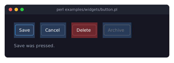
The program is examples/widgets/button.pl.
DESCRIPTION
A Button is a Term::Fabulous::Widget::Box that can take the keyboard focus, notices when the mouse button is pressed and released over it, and tracks whether the mouse pointer is over it. Put a Term::Fabulous::Widget::Text (or anything else) inside it as its label.
A Button fires one event for everything that counts as pressing it: Activate (Term::Fabulous::Event::Activate), for a click (the left mouse button pressed and released over the Button) and for Enter or Space while it has the focus. The lower-level events are still there: OnPress and OnRelease for the mouse, KeyPress for every key.
A Button shows its state by itself:
while it is pressed (the left mouse button held down over it), it is drawn in reverse video: the foreground and background colors of every cell it paints, label included, are swapped.
pressed_background_colorreplaces that with a background color, or switches it off;while it has the focus, its border is drawn in
focus_border_color, the blue the input widgets use for their accent. A Button without a border shows nothing: give itbordered => 1(or let the theme give every button a border withbutton.border.enabled), and the theme supplies the style (Roundin the built-in themes) and the color, or change its background in anOnFocuslistener;hovering changes nothing by default.
is_hoveredand theOnHoverStartandOnHoverStoppedevents follow the pointer, so a hover look is one listener away;while it is disabled ("disabled"), its border and the Term::Fabulous::Widget::Text widgets inside it are drawn in
disabled_color, the gray a disabled input draws its text in, and it is never drawn focused or pressed.
Under Term::Fabulous, Tab and Shift+Tab move the focus to and from Buttons, and pressing the left mouse button on a cell the Button paints (its background or its border) focuses it; see "MOUSE".
CONSTRUCTOR
new
my $button = Term::Fabulous::Widget::Button->new(%parameters);All parameters are optional; unknown parameters die. A Button takes every parameter of Term::Fabulous::Widget::Box (id, layout, background_color, bordered, border_color, border_style, ...; see "new" in Term::Fabulous::Widget) plus:
can_focus-
A boolean, stored as 1 or 0. Default: 1. With 0 the Button is skipped by Tab and Shift+Tab, a click does not focus it, and
$ui->interaction->set_focused_widget($button)dies. Mouse clicks still fireOnPress,OnReleaseandActivate. disabled-
A boolean, stored as 1 or 0. Default: 0. A disabled Button ignores clicks,
EnterandSpace(noOnPress,OnReleaseorActivate), cannot take the focus and is drawn disabled; see "disabled". disabled_color-
The color of the border and of the text of a disabled Button, in any format Term::Fabulous::Color accepts. Default: the theme's
button.border.colorin thedisabledstate (the text takesbutton.textin that state),[ 108, 112, 120, 255 ]in the built-in dark theme. See "THEMES" in Term::Fabulous::Manual::Looks. focus_border_color-
The color of the border while the Button has the focus, in any format Term::Fabulous::Color accepts, or
undeffor no focus look. Default: the theme'sbutton.border.colorin thefocusedstate, the accent[ 97, 175, 239, 255 ]in the built-in dark theme. It only shows on the sides the Button has a border on (bordered, or the theme'sbutton.border.enabled) whose style, the theme's or the widget's own, is notBlank. pressed_background_color-
What the Button looks like while it is pressed: the string
reversedraws it in reverse video, a color in any format Term::Fabulous::Color accepts replaces the background with that color, andundefleaves the Button unchanged while pressed. Default: the theme'sbutton.backgroundin thepressedstate,reversein the built-in themes.The background, the border color and the border style of the Button itself come from the theme's
buttonfamily when they are not given (see "new" in Term::Fabulous::Widget); so does the color of the Text widgets inside it that have notext_color. The three looks above return to the theme with "reset_look" in Term::Fabulous::Widget.
METHODS
A Button has all methods of Term::Fabulous::Widget plus these:
activate
$button->activate;Fires Activate on the Button, as a click or Enter would, and returns what fire_event returns. Use it to trigger a button from code, for example from an application shortcut. It fires also while the Button is disabled: only the user's clicks and keys are ignored then.
focus_border_color
$button->focus_border_color('#ffffff');
$button->focus_border_color(undef);
Accessor for the constructor parameter of the same name. Without an argument it returns the color in use, the given one or the theme's, as [r, g, b, a] (or undef for no focus look); with an argument it sets the value and returns the stored form. An invalid color dies.
pressed_background_color
$button->pressed_background_color('reverse');
$button->pressed_background_color( [ 60, 90, 160, 255 ] );
$button->pressed_background_color(undef);
Accessor for the constructor parameter of the same name. Returns the look in use, the given one or the theme's: the string reverse, a [r, g, b, a], or undef.
reverse_video
my $swapped = $button->reverse_video;1 while the Button is pressed and pressed_background_color is reverse, 0 otherwise. The renderer calls it for every widget; see "A box that takes the focus and reacts to the mouse" in Term::Fabulous::Manual::CustomWidgets.
disabled
$button->disabled(1);
if ( $button->is_enabled ) { ... }
Accessor from Clay::UI::Role::Interaction::Disableable. Returns 1 or 0; a write takes any plain boolean value and returns the new value. Disabling a Button takes the focus away from it if it has it, and ends a press that is in progress; is_enabled is the opposite. The Button also has the derived state disabled.
disabled_color
$button->disabled_color('#555555');Accessor for the constructor parameter of the same name; returns the color in use, the given one or the theme's, as [r, g, b, a]. An invalid color dies.
child_text_color
my $color = $button->child_text_color($explicit_color);The color a Text widget inside the Button is drawn in, given the color the Text was given (or undef): the disabled color while the Button is disabled, otherwise the given color or the theme's button.text for the Button's state. Term::Fabulous::Widget::Text asks its nearest ancestor that has this method.
can_focus
$button->can_focus(0);Accessor. Reads whether the Button can take the focus now: 1 when the last value written (through new, a layout file or this accessor) was true and the Button is enabled. A write records the value and returns what reading returns now; turning it off takes the focus away from a Button that has it. From Clay::UI::Role::Interaction::Focusable.
is_focused
if ( $button->is_focused ) { ... }1 while the Button has the keyboard focus, 0 otherwise (also while it is not part of a Term::Fabulous). To give it the focus, call $ui->interaction->set_focused_widget($button).
is_hovered
if ( $button->is_hovered ) { ... }1 while the mouse pointer is over the Button, as of the last frame.
is_pressed
if ( $button->is_pressed ) { ... }1 while the left mouse button, pressed over this Button, is held down and the pointer is still over it.
EVENTS
All events are delivered to listeners registered with $button->on( $name => sub ($event) { ... } ); see "EVENTS" in Term::Fabulous::Manual::Events for how listener return values decide whether an event continues to the Button's ancestors.
Activate(Term::Fabulous::Event::Activate)-
The user activated the Button: a click (
OnReleaseover the Button afterOnPresson it), orEnter(also the keypad's Enter) orSpacewithout modifiers while the Button has the focus.$event->targetis the Button. Fired by the Button itself, from its ownOnReleaseandKeyPresslisteners, which run before any listener you add. So a listener on an ancestor seesActivatebefore theOnReleaseit came from bubbles up to it. OnPress(Clay::UI::Events::OnPress)-
The left mouse button went down over the Button. When Buttons are nested, only the innermost one under the pointer gets it.
$event->xand$event->yare the pointer position in cells, as the center of the cell (column + 0.5, row + 0.5). The event is fired while the next frame is drawn, up to 1/30 second after the click. OnRelease(Clay::UI::Events::OnRelease)-
The left mouse button went up over the Button after it was pressed over it: a completed click. Releasing elsewhere fires nothing. Carries
xandylikeOnPress. OnFocus,OnBlur(Clay::UI::Events::OnFocus, Clay::UI::Events::OnBlur)-
The Button got or lost the keyboard focus.
OnHoverStart,OnHoverStopped(Clay::UI::Events::OnHoverStart, Clay::UI::Events::OnHoverStopped)-
The pointer entered or left the Button. These events do not bubble.
KeyPress(Term::Fabulous::Event::KeyPress)-
A key was pressed while the Button had the focus.
EnterandSpaceare used by the Button (they fireActivateand do not bubble); every other key bubbles on to the ancestors. Mouse(Term::Fabulous::Event::Mouse)-
Any mouse event over the Button (press, release, drag, wheel), when the Button paints the cell under the pointer (it needs a background color or a border there).
KEYS
Enter (also the keypad's Enter) and Space activate the focused Button, unless it is disabled. With a modifier (Ctrl+Enter, Shift+Space, ...) they bubble on like every other key. A disabled Button cannot have the focus; keys fired at it from code bubble on. Tab and Shift+Tab always move the focus away (see "FOCUS" in Term::Fabulous::Manual::Events).
MOUSE
Pressing the left button on a cell the Button paints (its background or its border) focuses the Button, unless can_focus is 0. A disabled Button is neither focused nor pressed by the mouse. A Button without a background color paints only its border (or nothing), so the cells in between are transparent: there the Mouse event and the focus go to the widget behind the Button. OnPress, OnRelease and Activate do not depend on painting: they fire for any cell inside the Button's box.
Pressing fires OnPress; releasing over the Button fires OnRelease and then Activate. Releasing anywhere else cancels the click. While the button is held with the pointer dragged off the Button, is_pressed is 0 and the pressed look disappears; dragging back onto it makes it 1 again, and releasing there still fires OnRelease and Activate.
KDL PROPERTIES
The properties of "KDL PROPERTIES" in Term::Fabulous::Widget::Box, plus can_focus and disabled (#true or #false), focus_border_color (a color string, or #null for no focus look), pressed_background_color (a color string, "reverse", or #null for no pressed look) and disabled_color (a color string):
use Term::Fabulous::Widget::Button as Button
use Term::Fabulous::Widget::Text as Text

Button "save" {
	background_color "#283c5a"
	border style=Round color="#5a6b8c"
	bordered #true
	padding left=1 right=1
	pressed_background_color "#3d5a85"
	Text { text "Save"; text_color "#ffffff"; }
}
Listeners cannot be given in KDL; attach them in Perl after building the layout.
SEE ALSO
Term::Fabulous::Widget::Box, Term::Fabulous::Event::Activate, "FOCUS" in Term::Fabulous::Manual::Events, "MOUSE" in Term::Fabulous::Manual::Events, Clay::UI::Role::Interaction::Pressable, Clay::UI::Role::Interaction::Focusable, Clay::UI::Role::Interaction::Hoverable, "Add buttons for the mouse and the keyboard (Button)" in Term::Fabulous::Cookbook::KeyboardAndMouse, the example programs examples/widgets/button.pl and examples/buttons-and-keys.pl.