NAME
Matplotlib::Simple - Access Matplotlib from Perl; providing consistent user interface between different plot types
Synopsis
Take a data structure in Perl, and automatically write a Python3 script using matplotlib to generate an image. The Python3 script is saved in the system's temporary directory (File::Spec->tmpdir, which is /tmp on unix), to be edited at the user's discretion. Depends on Python 3 and matplotlib. The script is run with python3; on Windows, where a standard install has no python3, it is run with the first of python, py -3 and python3 that reports itself as Python 3 (as of version 0.315 -- before that, the module could not run its script on Windows at all). To run a different interpreter -- a venv, or a newer Python on a cluster whose system python3 is too old -- set the environment variable MATPLOTLIB_SIMPLE_PYTHON to its path, such as export MATPLOTLIB_SIMPLE_PYTHON=~/mpl/bin/python3 (as of version 0.317). The generated scripts cannot run with a matplotlib older than 3.5, which does not accept the constrained layout they ask for; the test suite is written against 3.10 and newer, and skips its drawing checks with anything older. Pass execute => 0 to write the script without running it.
My aim is to simplify the most common tasks as much as possible. In my opinion, using this module is much easier than matplotlib itself.
Single Plots
Simplest use case:
use Matplotlib::Simple;
bar(
   output_file       => '/tmp/gospel.word.counts.png',
   data              => {
      Matthew => 18345,
      Mark    => 11304,
      Luke    => 19482,
      John    => 15635,
   }
);
A more complete (and slightly faster execution):
use Matplotlib::Simple;
plt(
   output_file       => '/tmp/gospel.word.counts.png',
   plot_type         => 'bar',
   data              => {
      Matthew => 18345,
      Mark    => 11304,
      Luke    => 19482,
      John    => 15635,
   }
);
Multiple Plots
Having a plots argument as an array lets the module know to create subplots:
use Matplotlib::Simple 'plt';
plt(
    output_file     => 'svg/pies.png',
    plots             => [
    {
            data    => {
             Russian => 106_000_000,  # Primarily European Russia
             German => 95_000_000,    # Germany, Austria, Switzerland, etc.
            },
            plot_type => 'pie',
            title       => 'Top Languages in Europe',
            suptitle    => 'Pie in subplots',
        },
        {
            data    => {
             Russian => 106_000_000,  # Primarily European Russia
             German => 95_000_000,    # Germany, Austria, Switzerland, etc.
            },
            plot_type => 'pie',
            title       => 'Top Languages in Europe',
        },
    ],
    ncols    => 2,
);
which produces the following subplots image:
bar, barh, boxplot, hexbin, hist, hist2d, imshow, pie, plot, scatter, and violinplot all match the methods in matplotlib itself. venn_proportional_area additionally wraps the Lhttps://pypi.org/project/matplotlib-venn/ library (see #venn_proportional_area).
Everything that belongs to one subplot goes in that subplot's hash. The top of the call takes only what belongs to the whole figure: output_file, show, execute, ncols/nrows, scale/scalex/scaley, sharex/sharey, shared_colorbar (with cbpad to place it), the figure's own methods such as set_figwidth and supxlabel, and those of pyplot's that act on the whole figure: suptitle, figtext, figlegend, figimage, subplots_adjust and tight_layout. Anything else there is refused, naming where it belongs: a title or an xscale at the top would act on whichever subplot was drawn last, and a color or an add would reach none of them. plot_type and data are a single plot, and are refused beside plots.
The p argument
p is a single, uniform way to describe one or many subplots, so you no longer need a top-level plot_type (or the older plots array). Each plot is a hash, exactly like a single-plot call, and p collects the subplots into one array.
The rule is simple: one element of p is one subplot.
A hash element is a subplot containing a single plot.
An array of hashes element is a single subplot whose plots are drawn on the same axes: the first hash is the base plot and the rest are additions (overlays), exactly like
add.
The two forms may be mixed freely in the same p. The first (or only) hash of a subplot supplies that subplot's axes-level options (title, xlabel, ylabel, legend, …).
If you don't give a grid, the subplots are laid out automatically on a near-square grid. Give ncol/nrow (aliases for ncols/nrows) to control it; supplying only one dimension derives the other (so ncols => 1 stacks the subplots in a single column), and supplying both is honored as given.
p cannot be combined with plot_type, data, plots, or add.
> Arguments are now passed as a plain list — C<plt( ... )> — though the older
> C<plt({ ... })> form still works.
One subplot, several plots overlaid
Wrap the plots in an inner array and they all land on a single subplot (the first is the base plot, the rest are additions):
plt(
    p => [
        [
            {
                data => {
                    E => [ 55, @{$x}, 160 ],
                    B => [ @{$y}, 140 ],
                },
                plot_type => 'boxplot',
                title       => 'Single Box Plot: Specified Colors',
                colors      => { E => 'yellow', B => 'purple' },
            },
            {
                data => {
                    A => [ 55, @{$z} ],
                    E => [ @{$y} ],
                    B => [ 122, @{$z} ],
                },
                plot_type => 'violinplot',
                title       => 'Single Violin Plot: Specified Colors',
                colors      => { E => 'yellow', B => 'purple', A => 'green' },
            },
        ],
    ],
    output_file => '1plot.svg',    # note: no C<plot_type> needed
);
Multiple subplots
Give each subplot as its own element. A bare hash is a one-plot subplot, so two hashes make two subplots; with ncol => 2 they sit side by side:
plt(
    p => [
        {
            data => {
                E => [ 55, @{$x}, 160 ],
                B => [ @{$y}, 140 ],
            },
            plot_type => 'boxplot',
            title       => 'Box Plot: Specified Colors',
            colors      => { E => 'yellow', B => 'purple' },
        },
        {
            data => {
                A => [ 55, @{$z} ],
                E => [ @{$y} ],
                B => [ 122, @{$z} ],
            },
            plot_type => 'violinplot',
            title       => 'Violin Plot: Specified Colors',
            colors      => { E => 'yellow', B => 'purple', A => 'green' },
        },
    ],
    ncol          => 2,
    output_file => '2plots.svg',
);
To overlay extra plots on any one subplot, make that element an array of hashes instead of a bare hash (the first is the plot, the rest are additions). Bare hashes and inner arrays may be intermixed in the same p, for example p => [ \%single, [ \%base, \%overlay ], \%another ].
Options
sharex and sharey are both implemented at the plot, rather than subplot, level. Each takes True or False (or 1 or 0), or one of Matplotlib's words row, col, all and none, such as sharey => 'row'. See Matplotlib's documentation for more clarity.
A number in data may be NaN or infinite. Such a value is drawn as Matplotlib draws it -- a NaN is a gap in a line, an empty cell of an imshow or colored_table -- and it does not count towards any range this module works out, such as a color scale. boxplot and violin leave NaN out as they leave out an undefined value, and hist, pie and violin refuse an infinite value, since there is nothing finite to bin, size or draw a density for.
Quoting text: commas and apostrophes
title, suptitle, xlabel, ylabel, set_title, set_xlabel and set_ylabel are quoted for you, unless the text is already Python of your own. Text is taken to be Python when it holds a comma or a quote and opens the way Python does: with a string literal, which may carry a prefix such as r or f, or with a keyword argument. That is what makes a raw string such as
xlabel => 'r"$\it{anno}$ $\it{domini}$"', # italics, via mathtextpossible, along with options after the text:
title => '"Two groups, mean and s.d.", fontsize = 20',Anything else is prose, and is quoted, comma, apostrophe and all:
title => 'Two groups, mean and s.d.',     # quoted for you
title => "war's end",                     # likewise
Up to 0.318 any text holding a comma, an apostrophe or a double quote was passed through, so prose like the two lines above had to carry its own quotes, and without them the script was a syntax error. Quoting it yourself still works.
Either kind of quote will do. Up to 0.3131 a single plot wrote its figure-wide options twice — suptitle came out once for the subplot and once for the figure — and the second pass ran its own quoting rules over text the first had already quoted, turning suptitle => "'a, b'" into plt.suptitle(''a, b''), a syntax error. Double quotes were the documented way round it. Each option is now written once, and text that already carries a quote of its own is left alone.
Every other option is passed through as written, so text inside legend, text and friends is Python syntax throughout: legend => 'loc = "upper left"'.
The exception is an option written as a plt. call, such as xscale, ylim or axhline, at a single plot and at a subplot alike. A word is quoted for you, so xscale => 'log' becomes plt.xscale('log'). A value that is already Python is left as it is: a number, a list of numbers such as ylim => '0, 10', None, True or False, one bracketed group such as ylim => '(0, 10)', one function call, a keyword argument such as axhline => 'y = 0.5', or anything holding a quote of its own.
An option that isn't defined
Each plot type has its own list of options, so an option is only ever right or wrong for the plot type you asked for. An option that isn't on that list dies, naming what you wrote and what it resembles:
bar(
   output_file => 'counts.svg',
   data          => { Matthew => 18345, Mark => 11304 },
   xlim          => '0, 20000',
);

"xlim" isn't defined for plot_type "bar", perhaps you meant one of these
defined keywords: (clim, ylim, set_xlim)
The suggestions come from the list that plot type actually accepts, so the same misspelling gets different answers at different plot types — bins_ is offered bins at a hist and is not offered it at a boxplot, which has no bins. Separators are ignored when matching, so key.order finds key_order, and two transposed characters count as one mistake, so widht finds width.
An option that is real but belongs elsewhere is the commonest case, and says so rather than leaving you to wonder whether the documentation lied:
plot( ..., notch => 'True' );

"notch" isn't defined for plot_type "plot"
        "notch" is a defined keyword, but for plot_type boxplot
A plot_type that isn't defined
plot_type is the one argument whose value comes from a fixed list, and a misspelling in it is answered the same way:
plt(
   output_file => 'counts.svg',
   plot_type     => 'barr',
   data          => { Matthew => 18345, Mark => 11304 },
);

"barr" isn't a defined plot_type, perhaps you meant one of these defined
plot types: (bar, barh)
The type is checked before the options are, because an unrecognised type leaves no per-type list to check them against. A type given for a subplot, or for an add graph, says which one it was:
"violn" isn't a defined plot_type at subplot 1, perhaps you meant one of
these defined plot types: (violin)

"pye" isn't a defined plot_type for an "add" graph at subplot 1, perhaps
you meant one of these defined plot types: (pie)
Color Bars (colorbars)
Colarbar args attempt to match matplotlib closely
| Option | Description | Example |
| -------- | ------- | ------- |
cbdrawedges | Whether to draw lines at color boundaries | cbdrawedges => 1 |
cblabel | The label on the colorbar's long axis | cblabel => 1 |
cblocation | of the colorbar None or {'left', 'right', 'top', 'bottom'} | |
cborientation | # None or {vertical, horizontal} | |
cbpad | pad : float, default: 0.05 if vertical, 0.15 if horizontal; Fraction of original Axes between colorbar and new image Axes | |
cb_logscale | color on a log scale: 'True' or 'False' (in any case), or 1 or 0. Works for colored_table, hexbin, hist2d, imshow and scatter, though not for an imshow with a stringmap, whose colors are categories. The bottom of the scale is the smallest value above 0 unless cb_min or vmin says otherwise | cb_logscale => 1 |
cb_min, cb_max | the bottom and top of the color scale, taken from the data where not given. For hexbin, hist2d and imshow these are the same as vmin and vmax, and only one of the two may be given for each end | cb_min => 0, cb_max => 10 |
shared_colorbar | share colorbar between different plots: specify plot indices. Each subplot listed must be one that draws a colorbar: colored_table, hexbin, hist2d, imshow or scatter. The subplots listed are put on one color scale, running from the lowest bottom of any of them to the highest top, so that one color means one value in all of them | shared_colorbar => [0,1] |
Every switch among the options -- cb_logscale, colorbar_on, show_colorbar, show_legend, show_numbers, mirror, stacked, log, notch, showcaps, showfliers, showmeans, medians, whiskers, marginals, density and execute -- takes 'True' or 'False' in any case, or a number, where 0 is off. Anything else, such as 'yes', is refused by name, since it could mean either. logscale for bar is the one exception, and takes Perl truth.
Size/Dimensions of output file
| Option | Description | Example |
| -------- | ------- | ------- |
scale | scale/multiply the size of the output figure; this and the two below must be finite and above 0 | scale => 2.4 |
scalex | scale/multiply the x-axis only | scalex => 2.4 |
scaley | scale/multiply the y-axis only | scalex => 1.4 |
Examples/Plot Types
Every plot type can be called two ways: through plt with 'plot_type' => 'bar', or through the same-named helper subroutine, bar( ... ), which is a thin wrapper that fills in 'plot_type' and calls plt for you. Everything documented for a plot type therefore works in either form, and works identically whether the plot is alone or one panel of a plots grid.
Which helper takes which data?
The fastest way to pick a plot type is to start from the shape of the data you already have in Perl:
data you have | Helpers that take it | Notes |
| -------- | ------- | ------- |
hash of numbers, A => 1 | bar, barh, pie | one bar/wedge per key |
hash of array refs, A => [1,2,3] | boxplot, violin, hist, hexbin, hist2d, scatter, venn_proportional_area | one distribution/series per key; hexbin and hist2d need exactly 2 keys (x and y), scatter 2 or 3, venn_proportional_area 2 or 3 |
hash of hashes, A => { X => 1 } | bar, barh, colored_table | grouped/stacked bars, or a matrix |
hash of [ \@x, \@y ] pairs | plot | one labelled line per key |
hash of arrays of [ \@x, \@y ] pairs | wide | repeated runs of the same curve, summarised |
| hash of hashes of array refs | scatter | several labelled sets, each with its own x/y (and colour) |
hash of hashes of numbers, A => { X => 1, Y => 2 } | scatter | one labelled point per key |
| a single array ref | hist, boxplot, violin | the one-series shorthand |
array of [ \@x, \@y ] pairs | plot, wide | unlabelled lines |
| 2-D array (array of array refs) | imshow | a raster/heatmap; strings allowed via stringmap |
a data frame (df) in any of Stats::LikeR's four shapes | every type but imshow, venn_proportional_area and wide | name the columns with x, y and by; see [Plotting a data frame](#plotting-a-data-frame-with-df) |
A few conventions hold across all of them:
Keys are used in sorted order unless you say otherwise.
key_orderis accepted bybar,barh,boxplot,violin,hexbin,hist2d,pie,plotandvenn_proportional_area;scatterspells the same ideakeys; andcolored_tableusesrow_labels/col_labels.histandwidetake no ordering option at all, andimshowhas no keys to order.An ordering option naming a key that
datadoes not have is an error naming that key. It used to reach the writer as an undefined value and die asUse of uninitialized value in join or string, which named neither the key nor the option it came from.title,xlabel,ylabel,suptitle,set_xlim,legendand the rest of Matplotlib'sax/fig/pltmethods are accepted by every plot type; see #options.Anything that is not recognised is reported as an error listing the arguments that are accepted, rather than being silently ignored.
Consider the following helper subroutines to generate data to plot:
sub linspace { # mostly written by Grok
   my ($start, $stop, $num, $endpoint) = @_; # endpoint means include $stop
   $num = defined $num ? int($num) : 50; # Default to 50 points
   $endpoint = defined $endpoint ? $endpoint : 1; # Default to include endpoint
   return () if $num < 0; # Return empty array for invalid num
   return ($start) if $num == 1; # Return single value if num is 1
   my (@result, $step);

   if ($endpoint) {
       $step = ($stop - $start) / ($num - 1) if $num > 1;
       for my $i (0 .. $num - 1) {
         $result[$i] = $start + $i * $step;
       }
  } else {
     $step = ($stop - $start) / $num;
     for my $i (0 .. $num - 1) {
        $result[$i] = $start + $i * $step;
     }
  }
   return @result;
}

sub generate_normal_dist {
    my ($mean, $std_dev, $size) = @_;
    $size = defined $size ? int $size : 100; # default to 100 points
    my @numbers;
    for (1 .. int($size / 2) + 1) {# Box-Muller transform
        my $u1 = rand();
        my $u2 = rand();
        my $z0 = sqrt(-2.0 * log($u1)) * cos(2.0 * 3.141592653589793 * $u2);
        my $z1 = sqrt(-2.0 * log($u1)) * sin(2.0 * 3.141592653589793 * $u2); # Scale and shift to match mean and std_dev
        push @numbers, ($z0 * $std_dev + $mean, $z1 * $std_dev + $mean);
    } # Trim to exact size if needed
    @numbers = @numbers[0 .. $size - 1] if @numbers > $size;
    @numbers = map {sprintf '%.1f', $_} @numbers;
    return \@numbers;
}
sub rand_between {
    my ($min, $max) = @_;
    return $min + rand($max - $min)
}
Plotting a data frame with df
A table read with Stats::LikeR's read_table, or built by hand, can be given whole as df instead of data, with the columns to draw named by role. The module rearranges the columns into the data the plot type takes, so every other option works as it does with data:
use Stats::LikeR 'read_table';
my $d = read_table('main.table.csv');
bar(
    output_file => 'bedroc.svg',
    df            => $d,
    x             => 'Method',          # one bar per row, labelled by this column
    y             => 'BEDROC(32.2)',    # and as tall as this one
);
df can be any of the four shapes Stats::LikeR uses. It is recognised by its structure, so Stats::LikeR itself is not needed:
| shape | example | rows are taken |
| -------- | ------- | ------- |
| array of hashes | [ { name => 'Al', age => 30 }, ... ] | in array order |
| hash of arrays | { name => ['Al', ...], age => [30, ...] } | in array order; every column used must be the same length, except by hist and violin without by |
| hash of hashes | { Al => { age => 30 }, ... } | in the sorted order of the row names, as Stats::LikeR's vals takes them |
| array of arrays | [ [ 'Al', 30 ], ... ] | in array order; columns are 0-based positions, negative from the end |
The roles each plot type reads:
| plot type | x | y | by |
| -------- | ------- | ------- | ------- |
bar, barh | the labels; leave it out of a hash of hashes to label by row name | the heights; several columns make grouped bars | one bar per group within each label |
pie | the labels, as for bar | the sizes | |
hist | the values; several columns make several histograms; every column of numbers if left out | one histogram per group | |
boxplot | the values; several columns make several boxes | one box per group | |
violin | the values, as for boxplot; every column of numbers if left out | one violin per group | |
scatter | x | y | one set of points per group |
plot | x | y; several columns make several lines | one line per group |
hist2d, hexbin | x | y | |
colored_table | the row labels, as for bar | the columns of the table; every column but x if left out |
scatter also reads color_key as the name of a column, which colors each point and gets a colorbar:
scatter(
    output_file => 'people.svg',
    df            => $d,
    x             => 'height',
    y             => 'weight',
    color_key     => 'age',
    by            => 'sex',     # one marker per sex, on one shared color scale
);
Things df does for you:
x is drawn on the x axis.
scatter,hist2dandhexbinotherwise assign axes by the sorted order of the keys, sokeysand (forhist2dandhexbin)key_orderare refused alongsidedf.The axes are labelled with the column names, unless you give
xlabelorylabel.Bars and wedges are in the order of the rows, and groups made by
byare in numeric order when every group is a number (2 before 10) and in string order otherwise. An explicitkey_orderstill wins.plotdraws each line in the order of x, so a table need not be sorted first.A row with no value (an
undef) in a column the plot uses is left out, with a warning saying how many rows were dropped and from which columns, as ggplot2 does. Columns ofhist,boxplotandviolinare filtered independently, so a gap in one column does not cost the others a value.colored_tablekeeps such cells, and draws them as undefined. A row that is itselfundef, in an array of arrays or of hashes, is a row with no values.A color hash keyed by group or column works for grouped bars.
histandviolindraw every column of numbers whenxoryis left out, as pandas'DataFrame.histdoes: a column holding anything but numbers, such as names, is passed over. The columns are in numeric order when every name is a number, and in string order otherwise. Each column is one distribution, so withoutbythe columns of a hash of arrays need not be the same length. That is the shapeStats::LikeR'sgroup_byreturns, one column per group, and it can be drawn whole:my $mpg_by_cyl = group_by( $mtcars, 'mpg', 'cyl' ); # { 4 => [...], 6 => [...], 8 => [...] } violin( output_file => 'mpg.svg', df => $mpg_by_cyl, # one violin per number of cylinders );
And things it refuses, by name:
a column the frame does not have, with the closest names it does have;
a label repeated in
bar,barhorpie, or a label and group pair repeated in a groupedbar.dfdoes not aggregate: useStats::LikeR'saggorpivot_tablefirst;a grouped
barmissing a value for some label and group;a column named twice, a role the plot type does not read, and several columns where only one makes sense;
dftogether withdata.
df works the same in a subplot and in an add graph, each with its own frame. venn_proportional_area, imshow and wide do not take it.
Barplot/bar/barh
Plot a hash, a hash of arrays, or a hash of hashes as a bar chart. bar draws vertical bars, barh horizontal ones; every option below applies to both.
Entering data
data accepts three shapes, and the shape alone decides whether you get one bar per key or a group of bars per key:
1. One bar per key (hash of numbers). The simplest case — the key is the tick label:
bar(
    output_file => '/tmp/simple.svg',
    data          => { Mon => 73, Tue => 93, Wed => 77 },
);
2. Groups of bars (hash of array refs). Each key becomes a group; index i of every array is one series, so color and label are arrays indexed the same way:
bar(
    output_file => '/tmp/grouped.svg',
    data          => {
        1941 => [ 6.6, 6.2 ],    # UK, US
        1942 => [ 7.6, 26.4 ],
    },
    color         => [ 'blue', 'gray' ],    # index 0, index 1
    label         => [ 'UK',   'US'   ],    # legend entries
);
3. Groups of bars (hash of hashes). The same picture as (2), but the series are named by the inner keys rather than by position, so no label is needed:
bar(
    output_file => '/tmp/grouped.hoh.svg',
    data          => {
        1941 => { UK => 6.6, US => 6.2 },
        1942 => { UK => 7.6, US => 26.4 },
    },
);
Both grouped forms accept stacked => 1 to pile the series on top of one another instead of placing them side by side.
Error bars
yerr (natural for bar) and xerr (natural for barh) take either one number for every bar, an array of one number per bar (in the order of key_order, or of the sorted keys), an array of two such arrays (the lower errors, then the upper), or a hash keyed by the data keys. In the hash, each value is one number, or a two-element array giving asymmetric [ lower, upper ] errors:
bar(
    output_file => '/tmp/warheads.svg',
    data          => { USA => 5277, Russia => 5449 },
    yerr          => {
        USA    => [ 15,  29   ],    # -15, +29
        Russia => [ 199, 1000 ],
    },
    log           => 'True',
    ylabel        => '# of Nuclear Warheads',
);
Options
| Option | Description | Example |
| -------- | ------- | ------- |
| color | :mpltype:color or list of :mpltype:color, optional; The colors of the bar faces. This is an alias for *facecolor*. If both are given, *facecolor* takes precedence # if entering multiple colors, quoting isn't needed; as of version 0.23, colors can be given as a hash, whose keys are the bars of a simple hash or the *inner* keys (the series) of a hash of hashes. A hash of arrays has no series names to key a color hash by, and says so rather than ignoring it | color => ['red', 'orange', 'yellow', 'green', 'blue', 'indigo', 'fuchsia'], or a single color for all bars color => 'red', or as of version 0.23 color => {A => 'red', B => 'green'} |
| edgecolor | :mpltype:color or list of :mpltype:color, optional; The colors of the bar edges. For a simple hash, may also be a hash of one color per key, as color may; a grouped plot refuses a hash, since each of its bars is one key of one series | edgecolor => 'black' |
| key_order | define the keys in an order (an array reference) | key_order => ['Sun','Mon','Tue','Wed','Thu','Fri','Sat'], |
| label | an array of legend labels for grouped bar plots, indexed like the data arrays; only meaningful for the hash-of-arrays form, since the hash-of-hashes form takes its labels from the inner keys | label => ['North', 'South'], |
| linewidth | float or array of one per bar, optional; Width of the bar edge(s). If 0, don't draw edges. Only does anything with defined edgecolor | linewidth => 2, |
| log | bool, default: False; If *True*, set the y-axis to be log scale. Give 'True' or 'False' (or 1 or 0); anything else is refused, and 'False' turns the log scale off | log = 'True', |
| logscale | a synonym for log taking a Perl true/false value rather than Python's 'True'/'False'. Unlike the logscale of boxplot, hist, hist2d, plot, scatter and violin, this one is a scalar and not an array of axis names | logscale => 1, |
| stacked | stack the groups on top of one another; 'True' or 1 for on, default off | stacked => 1, |
| width | float only, default: 0.8; The width of the bars (their height, for barh). width will be deactivated with grouped, non-stacked bar plots | width => 0.4, |
| xerr | float or array-like of shape(N,) or shape(2, N), optional. If not *None*, add horizontal / vertical errorbars to the bar tips. The values are +/- sizes relative to the data: - scalar: symmetric +/- values for all bars # - shape(N,): symmetric +/- values for each bar # - shape(2, N): Separate - and + values for each bar. First row # contains the lower errors, the second row contains the upper # errors. # - *None*: No errorbar. (Default) | yerr => {'USA' => [15,29], 'Russia' => [199,1000],} |
| yerr | same as xerr, but better with bar |
an example of multiple plots, showing many options:
single, simple plot
use Matplotlib::Simple 'plt';
plt(
    output_file             => 'output.images/single.barplot.png',
    data    => { # simple hash
        Fri => 76, Mon  => 73, Sat => 26, Sun => 11, Thu    => 94, Tue  => 93, Wed  => 77
    },
    plot_type => 'bar',
    xlabel      => '# of Days',
    ylabel      => 'Count',
    title       => 'Customer Calls by Days'
);
where xlabel, ylabel, title, etc. are axis methods in matplotlib itself. plot_type, data, fh are all specific to MatPlotLib::Simple.
multiple plots
plt(
    fh                  => $fh,
    execute                => 0,
    output_file     => 'output.images/barplots.png',
    plots                   => [
    { # simple plot
            data    => { # simple hash
                Fri => 76, Mon  => 73, Sat => 26, Sun => 11, Thu    => 94, Tue  => 93, Wed  => 77
            },
            plot_type => 'bar',
           key_order        => ['Sun','Mon','Tue','Wed','Thu','Fri','Sat'],
            suptitle            => 'Types of Plots', # applies to all
            color               => ['red', 'orange', 'yellow', 'green', 'blue', 'indigo', 'fuchsia'],
            edgecolor       => 'black',
            set_figwidth    => 40/1.5, # applies to all plots
            set_figheight   => 30/2, # applies to all plots
            title               => 'bar: Rejections During Job Search',
            xlabel          => 'Day of the Week',
            ylabel          => 'No. of Rejections'
        },
        { # grouped bar plot
            plot_type => 'bar',
            data    => {
                1941 => {
                   UK       => 6.6,
                   US       => 6.2,
                   USSR     => 17.8,
                   Germany => 26.6
                },
                1942 => {
                  UK      => 7.6,
                  US      => 26.4,
                  USSR    => 19.2,
                  Germany => 29.7
                },
                1943 => {
                 UK      => 7.9,
                  US      => 61.4,
                  USSR    => 22.5,
                  Germany => 34.9
                },
                1944 => {
                  UK      => 7.4,
                  US      => 80.5,
                  USSR    => 27.0,
                  Germany => 31.4
                },
                1945 => {
                  UK      => 5.4,
                  US      => 83.1,
                  USSR    => 25.5,
                  Germany => 11.2 #Rapid decrease due to war's end <br />
                },
            },
            stacked => 0,
            title       => 'Hash of Hash Grouped Unstacked Barplot',
            width       => 0.23,
            xlabel  => 'r"$\it{anno}$ $\it{domini}$"', # italic
            ylabel  => 'Military Expenditure (Billions of $)'
        },
         { # grouped bar plot
            plot_type => 'bar',
            data    => {
                1941 => {
                  UK      => 6.6,
                  US      => 6.2,
                  USSR    => 17.8,
                  Germany => 26.6
                },
                1942 => {
                  UK      => 7.6,
                  US      => 26.4,
                  USSR    => 19.2,
                  Germany => 29.7
                },
                1943 => {
                  UK      => 7.9,
                  US      => 61.4,
                  USSR    => 22.5,
                  Germany => 34.9
                },
                1944 => {
                  UK      => 7.4,
                  US      => 80.5,
                  USSR    => 27.0,
                  Germany => 31.4
                },
                1945 => {
                  UK      => 5.4,
                  US      => 83.1,
                  USSR    => 25.5,
                   Germany => 11.2 #Rapid decrease due to war's end
                },
            },
            stacked => 1,
            title       => 'Hash of Hash Grouped Stacked Barplot',
            xlabel  => 'r"$\it{anno}$ $\it{domini}$"', # italic
            ylabel  => 'Military Expenditure (Billions of $)'
        },
        {# grouped barplot: arrays indicate Union, Confederate which must be specified in options hash
            data                    => { # 4th plot: arrays indicate Union, Confederate which must be specified in options hash
             'Antietam'             => [ 12400, 10300 ],
             'Gettysburg'           => [ 23000, 28000 ],
             'Chickamauga'          => [ 16000, 18000 ],
             'Chancellorsville' => [ 17000, 13000 ],
             'Wilderness'           => [ 17500, 11000 ],
             'Spotsylvania'     => [ 18000, 12000 ],
             'Cold Harbor'          => [ 12000, 5000  ],
             'Shiloh'               => [ 13000, 10700 ],
             'Second Bull Run'  => [ 10000, 8000  ],
             'Fredericksburg'       => [ 12600, 5300  ],
            },
            plot_type => 'barh',
            color       =>  ['blue', 'gray'], # colors match indices of data arrays
            label       => ['North', 'South'], # colors match indices of data arrays
            xlabel  => 'Casualties',
            ylabel  => 'Battle',
            title       => 'barh: hash of array'
        },
        { # 5th plot: barplot with groups
            data    => {
                1942 => [ 109867,  310000, 7700000 ], # US, Japan, USSR
                1943 => [ 221111,  440000, 9000000 ],
                1944 => [ 318584,  610000, 7000000 ],
                1945 => [ 318929, 1060000, 3000000 ],
            },
            color       => ['blue', 'pink', 'red'], # colors match indices of data arrays
            label       => ['USA', 'Japan', 'USSR'], # colors match indices of data arrays
            'log'       => 1,
            title       => 'grouped bar: Casualties in WWII',
            ylabel  => 'Casualties',
            plot_type => 'bar'
        }, <br />
        { # nuclear weapons barplot
            plot_type       => 'bar',
            data => {
                'USA'               => 5277, # FAS Estimate
                'Russia'            => 5449, # FAS Estimate
                'UK'                => 225, # Consistent estimate
                'France'            => 290, # Consistent estimate
                'China'         => 600, # FAS Estimate
                'India'         => 180, # FAS Estimate
                'Pakistan'      => 130, # FAS Estimate
                'Israel'            => 90, # FAS Estimate
                'North Korea'   => 50, # FAS Estimate
            },
            title       => 'Simple hash for barchart with yerr',
            xlabel  => 'Country',
            yerr                        => {
                'USA'               => [15,29],
                'Russia'            => [199,1000],
                'UK'                => [15,19],
                'France'            => [19,29],
                'China'         => [200,159],
                'India'         => [15,25],
                'Pakistan'      => [15,49],
                'Israel'            => [90,50],
                'North Korea'   => [10,20],
            },
            ylabel  => '# of Nuclear Warheads',
            'log'                       => 'True', #    linewidth               => 1,
        }
    ],
    ncols   => 3,
    nrows   => 4
);
which produces the plot:
colors for each hash key defined by hash
plt(
    plots => [
        {
            color        => {
                A => 'red', B => 'green', C => 'blue'
            },
            data => {
                A => 1, B => 2, C => 3
            },
            plot_type     => 'bar'
        },
        {
            color        => {
                A => 'red', B => 'green', C => 'blue'
            },
            data => {
                A => 1, B => 2, C => 3
            },
            plot_type     => 'barh'
        },
    ],
    ncols         => 2,
    output_file => '/tmp/key.colors.bar.svg',
);
which produces the plot
boxplot
Plot a hash of arrays as a series of boxplots: one box per key, labelled with the key and the number of points it holds.
Entering data
Ordinarily data is a hash of array refs, one array per box:
boxplot(
    output_file => '/tmp/boxes.svg',
    data          => { A => \@a, B => \@b, C => \@c },
);
A bare array ref is the one-box shorthand; the box gets an empty label:
boxplot(
    output_file => '/tmp/one.box.svg',
    data          => \@a,
);
Undefined values are dropped rather than fatal, so a column read out of a spreadsheet with blank cells can be handed over as-is; a value that is present but not a number is an error naming the offending key. (#violin takes exactly these two shapes as well — swapping 'plot_type' => 'boxplot' for 'plot_type' => 'violinplot' is a one-word change — but it drops non-numeric values silently instead of dying.)
options
| Option | Description | Example |
| -------- | ------- | ------- |
color | a single color for all boxes | color => 'pink' |
colors | a hash pairing each data key with its own color. Every key in data must appear, otherwise the call dies naming the keys that have no color | colors => { A => 'orange', E => 'yellow', B => 'purple' }, |
key_order | order that the keys in the entry hash will be plotted | key_order => ['A', 'E', 'B'] |
logscale | an array of the axes to put on a log scale; only x and y are accepted | logscale => ['y'] |
notch | draw a notched box ('True') instead of a rectangular one | notch => 'True' |
orientation | orientation of the plot, by default vertical | orientation => 'horizontal' |
showcaps | Show the caps on the ends of whiskers; default True | showcaps => 'False', |
showfliers | Show the outliers beyond the caps; default True | showfliers => 'False' |
showmeans | show means; default = True | showmeans => 'False' |
showcaps, showfliers, showmeans and notch take Python's 'True'/'False', in any case, or 1 or 0; anything else is refused by name. The whiskers switch belongs to #violin, not to boxplot.
single, simple plot
my $x = generate_normal_dist( 100, 15, 3 * 10 );
my $y = generate_normal_dist( 85,  15, 3 * 10 );
my $z = generate_normal_dist( 106, 15, 3 * 10 );
single plots are simple
use Matplotlib::Simple 'barplot';
boxplot(
    output_file => 'output.images/single.boxplot.png',
    data              => {                                     # simple hash
        E => [ 55,    @{$x}, 160 ],
        B => [ @{$y}, 140 ],

        #       A => @a
    },
    title        => 'Single Box Plot: Specified Colors',
    colors       => { E => 'yellow', B => 'purple' },
    fh           => $fh,
    execute      => 0,
);
which makes the following image:
multiple plots
plt(
    output_file => 'output.images/boxplot.png',
    execute           => 0,
    fh                => $fh,
    plots             => [
        {
            data => {
                A => [ 55, @{$z} ],
                E => [ @{$y} ],
                B => [ 122, @{$z} ],
            },
            title       => 'Simple Boxplot',
            ylabel      => 'ylabel',
            xlabel      => 'label',
            plot_type => 'boxplot',
            suptitle    => 'Boxplot examples'
        },
        {
            color => 'pink',
            data  => {
                A => [ 55, @{$z} ],
                E => [ @{$y} ],
                B => [ 122, @{$z} ],
            },
            title       => 'Specify single color',
            ylabel      => 'ylabel',
            xlabel      => 'label',
            plot_type => 'boxplot'
        },
        {
            colors => {
                A => 'orange',
                E => 'yellow',
                B => 'purple'
            },
            data => {
                A => [ 55, @{$z} ],
                E => [ @{$y} ],
                B => [ 122, @{$z} ],
            },
            title       => 'Specify set-specific color; showfliers = False',
            ylabel      => 'ylabel',
            xlabel      => 'label',
            plot_type => 'boxplot',
            showmeans   => 'True',
            showfliers  => 'False',
            set_figwidth => 12
        },
        {
            colors => {
                A => 'orange',
                E => 'yellow',
                B => 'purple'
            },
            data => {
                A => [ 55, @{$z} ],
                E => [ @{$y} ],
                B => [ 122, @{$z} ],
            },
            title       => 'Specify set-specific color; showmeans = False',
            ylabel      => 'ylabel',
            xlabel      => 'label',
            plot_type => 'boxplot',
            showmeans   => 'False',
        },
        {
            colors => {
                A => 'orange',
                E => 'yellow',
                B => 'purple'
            },
            data => {
                A => [ 55, @{$z} ],
                E => [ @{$y} ],
                B => [ 122, @{$z} ],
            },
            title       => 'Set-specific color; orientation = horizontal',
            ylabel      => 'ylabel',
            xlabel      => 'label',
            orientation => 'horizontal',
            plot_type => 'boxplot',
        },
        {
            colors => {
                A => 'orange',
                E => 'yellow',
                B => 'purple'
            },
            data => {
                A => [ 55, @{$z} ],
                E => [ @{$y} ],
                B => [ 122, @{$z} ],
            },
            title       => 'Notch = True',
            ylabel      => 'ylabel',
            xlabel      => 'label',
            notch       => 'True',
            plot_type => 'boxplot',
        },
        {
            colors => {
                A => 'orange',
                E => 'yellow',
                B => 'purple'
            },
            data => {
                A => [ 55, @{$z} ],
                E => [ @{$y} ],
                B => [ 122, @{$z} ],
            },
            title         => 'showcaps = False',
            ylabel        => 'ylabel',
            xlabel        => 'label',
            showcaps      => 'False',
            plot_type     => 'boxplot',
            set_figheight => 12,
        },
    ],
    ncols => 3,
    nrows => 3,
);
which makes the following plot:
Colored Table
Plot a hash of hashes as a matrix, coloring each cell by its value.
Entering data
data is a hash of hashes: the outer key is the row, the inner key is the column, and the value is the number that picks the cell's color.
colored_table(
    output_file => '/tmp/matrix.svg',
    data          => {
        H => { H => 432, Cl => 427, Br => 363 },
        C => { H => 413, Cl => 339, Br => 276 },
    },
);
The matrix does not have to be complete. Cells with no value are left out of the color scale and drawn in undef_color (gray by default), and a table that only fills one triangle — the usual shape of a pairwise-comparison table — can be completed by reflecting it across the diagonal with mirror => 1, so that $data{A}{B} also supplies $data{B}{A}.
The rows are the outer keys and the columns every inner key, each in sorted order, so the table above has rows C and H and columns Br, Cl and H. With mirror, which makes the table symmetric, rows and columns are both every key. col_labels chooses which keys are drawn and in what order, as the rows and the columns both, which is how the bond-dissociation example below shows the halogens only out of a larger table; row_labels supplies the text down the left-hand side, so it should list the same keys in the same order, and must have one label per row.
options
| Option | Description | Example |
| -------- | ------- | ------- |
cb_logscale | color the cells on a log scale | cb_logscale => 1 |
cb_min, cb_max | clamp the ends of the color scale instead of taking them from the data, so several tables can be compared directly | cb_min => 100, cb_max => 500 |
cblabel | the label on the colorbar | cblabel => 'kJ/mol' |
cmap | the colormap used for coloring the cells | cmap => 'viridis' |
col_labels | array ref: which keys to draw, in order â this selects the rows and the columns of the matrix, not just the heading text | col_labels => ['H', 'F', 'Cl', 'Br', 'I'] |
colorbar_on | draw the colorbar; on by default, 0 turns it off, cblabel or no cblabel | colorbar_on => 0 |
mirror | treat the table as symmetric: $data{A}{B} also fills $data{B}{A} | mirror => 1 |
row_labels | array ref of the labels printed down the left side; give it the same keys, in the same order, as col_labels | row_labels => ['H', 'F', 'Cl', 'Br', 'I'] |
show_numbers | print each cell's value in the cell; off by default | show_numbers => 1 |
undef_color | the color for cells that have no value; gray by default | undef_color => 'white' |
default_undefined | the value a cell with no value takes, instead of being left empty. It counts towards the color scale like any other value, so undef_color no longer applies to those cells | default_undefined => 0 |
The colorbar options in #color-bars-colorbars — cbdrawedges, cblocation, cborientation, cbpad — work here too.
Single, simple plot
the bond dissociation energy table can be plotted:
# https://labs.chem.ucsb.edu/zakarian/armen/11---bonddissociationenergy.pdf and https://chem.libretexts.org/Bookshelves/Physical_and_Theoretical_Chemistry_Textbook_Maps/Supplemental_Modules_(Physical_and_Theoretical_Chemistry)/Chemical_Bonding/Fundamentals_of_Chemical_Bonding/Bond_Energies
my %bond_dissociation = (
    Br =>  {
      Br =>  193
    },
    C  =>  {
        Br =>  276, C  =>  347, Cl =>  339, F   => 485, H  =>  413, I  =>  240,
        N  =>  305, O  =>  358, S  =>  259
    },
    Cl =>  {
        Br =>  218, Cl =>  239
    },
    F =>   {
        I => 280, Br =>  237, Cl  => 253, F   => 154
    },
    H  =>  {
        Br =>  363, Cl =>  427, F  =>  565, H   => 432, I   => 295
    },
    I  =>  {
        Br  => 175, Cl =>  208, I  =>  149
    },
    N  =>  {
        Br =>  243, Cl  => 200, F   => 272, H  =>  391, N  =>  160, O  =>  201
    },
    O =>   {
        Cl =>  203, F  =>  190, H  =>  467, I  =>  234, O  =>  146
    },
    S  =>  {
        Br => 218,  Cl => 253,  F  => 327,  H  => 347,  S  => 266
    },
    Si => {
        C  => 360, H  => 393, O  => 452,    Si => 340
    }
);
and the plot itself:
colored_table(
    'cblabel'     => 'kJ/mol',
    col_labels    => ['H', 'F', 'Cl', 'Br', 'I'],
    data          => \%bond_dissociation,
    execute       => 0,
    fh            => $fh,
    mirror        => 1,
    output_file => 'output.images/single.tab.png',
    row_labels    => ['H', 'F', 'Cl', 'Br', 'I'],
    show_numbers=> 1,
    set_title     => 'Bond Dissociation Energy'
);
which makes the following image:
Multiple Plots
plt(
    output_file => 'output.images/tab.multiple.png',
    execute       => 0,
    fh            => $fh,
    plots         => [
        {
            data          => \%bond_dissociation,
            output_file => '/tmp/single.bonds.svg',
            plot_type     => 'colored_table',
            set_title     => 'No other options'
        },
        {
            data          => \%bond_dissociation,
            cblabel       => 'Average Dissociation Energy (kJ/mol)',
            col_labels    => ['H', 'C', 'N', 'O', 'F', 'Si', 'S', 'Cl', 'Br', 'I'],
            mirror        => 1,
            output_file => '/tmp/single.bonds.svg',
            plot_type     => 'colored_table',
            row_labels    => ['H', 'C', 'N', 'O', 'F', 'Si', 'S', 'Cl', 'Br', 'I'],
            show_numbers=> 1,
            set_title     => 'Showing numbers and mirror with defined order'
        },
        {
            data          => \%bond_dissociation,
            cblabel       => 'Average Dissociation Energy (kJ/mol)',
            col_labels    => ['H', 'C', 'N', 'O', 'F', 'Si', 'S', 'Cl', 'Br', 'I'],
            mirror        => 1,
            output_file => '/tmp/single.bonds.svg',
            plot_type     => 'colored_table',
            row_labels    => ['H', 'C', 'N', 'O', 'F', 'Si', 'S', 'Cl', 'Br', 'I'],
            show_numbers=> 1,
            set_title     => 'Set undefined color to white',
            undef_color => 'white'
        }
    ],
    ncols         => 3,
    set_figwidth  => 14,
    suptitle      => 'Colored Table options'
);
which makes the following plot:
hexbin
Plot a hash of arrays as a hexbin see https://matplotlib.org/stable/api/asgen/matplotlib.pyplot.hexbin.html
A hexbin answers the question a scatterplot stops answering once there are tens of thousands of points: instead of drawing every point and letting them pile up into an indistinguishable blob, the plane is tiled with hexagons and each one is colored by how many points fell inside it.
Entering data
data is a hash of exactly two array refs of equal length — the first key (sorted) is the x-axis, the second is the y-axis, and both become the axis labels. Use key_order to say which is which rather than relying on the sort:
hexbin(
    output_file => '/tmp/hex.svg',
    data          => { Height => \@heights, Weight => \@weights },
    key_order     => [ 'Weight', 'Height' ],    # Weight on x
    cblabel       => 'people per cell',
);
options
| Option | Description | Example |
| -------- | ------- | ------- |
| cb_logscale | colorbar log scale from matplotlib.colors import LogNorm | default 0, any value > 0 enables |
| cblabel | the label on the colorbar, i.e. what the cell counts mean; Density if not given | cblabel => 'observations' |
| cmap | The Colormap instance or registered colormap name used to map scalar data to colors | default gist_rainbow |
| key_order | define the keys in an order (an array reference) | key_order => ['X-rays', 'Yak Butter'], |
| marginals | integer, by default off = 0 | marginals => 1 |
| mincnt | int >= 0, default: None; If not None, only display cells with at least mincnt number of points in the cell. | mincnt => 2 |
| vmax | the cell count at the top of the color scale; taken from the data if not given | vmax => 50 |
| vmin | the cell count at the bottom of the color scale; taken from the data if not given | vmin => 1 |
| xbins | integer that accesses horizontal gridsize | default is 15 |
| xscale_hexbin | 'linear', 'log'}, default: 'linear': Use a linear or log10 scale on the horizontal axis | xscale_hexbin => 'log' |
| ybins | integer that accesses vertical gridsize | default is 15 |
| yscale_hexbin | 'linear', 'log'}, default: 'linear': Use a linear or log10 scale on the vertical axis | yscale_hexbin => 'log' |
With cb_logscale, vmin and vmax set the ends of the LogNorm that draws the log-scaled colorbar, as they do for hist2d.
single, simple plot
plt(
    data    => {
        E   => generate_normal_dist(100, 15, 3*210),
        B   => generate_normal_dist(85, 15, 3*210)
    },
    output_file     => 'output.images/single.hexbin.png',
    plot_type => 'hexbin',
    set_figwidth => 12,
    title           => 'Simple Hexbin',
);
which makes the following plot:
multiple plots
plt(
    fh => $fh,
    execute           => 0,
    output_file => 'output.images/hexbin.png',
    plots             => [
        {
            data => {
            E => @e,
            B => @b
            },
            plot_type    => 'hexbin',
            title        => 'Simple Hexbin',
        },
        {
            data => {
                E => @e,
                B => @b
            },
            plot_type => 'hexbin',
            title       => 'colorbar logscale',
            cb_logscale => 1
        },
        {
            cmap => 'jet',
            data => {
                E => @e,
                B => @b
            },
            plot_type    => 'hexbin',
            title        => 'cmap is jet',
            xlabel       => 'xlabel',
        },
         {
            data => {
                E => @e,
                B => @b
            },
            key_order    => ['E', 'B'],
            plot_type    => 'hexbin',
            title        => 'Switch axes with key_order',
        },
         {
            data => {
                E => @e,
                B => @b
            },
            plot_type    => 'hexbin',
            title        => 'vmax set to 25',
            vmax         => 25
        },
         {
            data => {
                E => @e,
                B => @b
            },
            plot_type    => 'hexbin',
            title        => 'vmin set to -4',
            vmin         => -4
        },
        {
            data => {
                E => @e,
                B => @b
            },
            plot_type    => 'hexbin',
            title        => 'mincnt set to 7',
            mincnt       => 7
        },
        {
            data => {
                E => @e,
                B => @b
            },
            plot_type    => 'hexbin',
            title        => 'xbins set to 9',
            xbins        => 9
        },
        {
            data => {
                E => @e,
                B => @b
            },
            plot_type    => 'hexbin',
            title        => 'ybins set to 9',
            ybins        => 9
        },
        {
            data => {
                E => @e,
                B => @b
            },
            plot_type    => 'hexbin',
            title        => 'marginals = 1',
            marginals    => 1
        },
        {
            data => {
                E => @e,
                B => @b
            },
            plot_type    => 'hexbin',
            title        => 'xscale_hexbin = 1',
            xscale_hexbin => 'log'
        },
        {
            data => {
                E => @e,
                B => @b
            },
            plot_type    => 'hexbin',
            title        => 'yscale_hexbin = 1',
            yscale_hexbin => 'log'
        },
    ],
    ncols        => 4,
    nrows        => 3,
    scale        => 5,
    suptitle     => 'Various Changes to Standard Hexbin: All data is the same'
);
which produces the following image:
hist
Plot a hash of arrays as a series of histograms, one per key, drawn over each other in the same axes — alpha defaults to 0.5 so that the overlaps stay readable. A single array ref is the one-set shorthand. Values must be numeric: unlike boxplot and violin, a non-numeric value here is an error.
Each set is binned separately, so with bins => 50 two sets covering different ranges get 50 bins each over their own range rather than a common set of edges. When the sets must line up exactly — which is what makes the bar heights comparable — pass the edges themselves rather than a count:
hist(
    output_file => '/tmp/hist.svg',
    data          => { E => \@e, B => \@b },
    bins          => [ map { 10 * $_ } 0 .. 20 ],    # shared edges, 0..200
);
bins and color also accept a hash keyed by set, for when one distribution wants different treatment from the others:
bins  => { E => 50, B => 20 },
color => { E => 'orange', B => 'black' },
The legend is on by default when there is more than one set and off when there is only one; show_legend overrides that either way.
Every subplot drawn with hist reports the range of its bin heights on STDOUT, over all of the sets drawn into it, as
plot 0 hist range = [1, 12]where the number is the subplot's index — plot 1 is the second subplot of a figure — and the range is [shortest bar, tallest bar]. The heights are matplotlib's, counted as the figure is drawn: this module does not bin the data, so there is no way to know them without asking. Nothing about the figure changes because they are reported; the file written to output_file is the same either way.
options
| Option | Description | Example |
| -------- | ------- | ------- |
alpha | opacity of the bars, default 0.5; the same value is used for all sets | alpha => 0.25 |
bins | int or sequence or str, default: :rc:hist.bins. If *bins* is an integer, it defines the number of equal-width bins in the range. If *bins* is a sequence, it defines the bin edges, including the left edge of the first bin and the right edge of the last bin; in this case, bins may be unequally spaced. All but the last (righthand-most) bin is half-open. May also be a hash keyed by set | bins => 50 |
color | either one color for every set, or a hash pairing each data key with its own color. A key of the hash that is not a set of data is refused, and so is one of a bins hash | color => { X => 'blue', Y => 'orange' } |
key_order | the order the sets are drawn in, and so the order of the legend; sorted by name by default | key_order => ['Y', 'X'] |
logscale | an array of the axes to put on a log scale, useful when one set is orders of magnitude rarer than another. It must be an array reference â logscale => 1 is an error | logscale => ['y'] |
orientation | {'vertical', 'horizontal'}, default: 'vertical'; one for every set, which share an axes | orientation => 'horizontal' |
show_legend | on when data holds more than one set, off when it holds one; set it explicitly to override | show_legend => 0 |
single, simple plot
as of version 0.26, single arrays can be given to hist instead of a hash, simplifying the call:
hist(
    data          => [0..9],
    output_file => '/tmp/hist.arr.svg',
);
for slightly more complex data sets, hashes are taken:
use Matplotlib::Simple 'hist';

my @e = generate_normal_dist( 100, 15, 3 * 200 );
my @b = generate_normal_dist( 85,  15, 3 * 200 );
my @a = generate_normal_dist( 105, 15, 3 * 200 );

hist(
    fh => $fh,
    execute           => 0,
    output_file => 'output.images/single.hist.png',
    data              => {
        E => @e,
        B => @b,
        A => @a,
    }
);
which makes the following simple plot:
multiple plots
plt(
    fh => $fh,
    execute           => 0,
    output_file => 'output.images/histogram.png',
   set_figwidth => 15,
   suptitle          => 'hist Examples',
    plots             => [
        { # 1st subplot
            data => {
                E => @e,
                B => @b,
                A => @a,
            },
            plot_type => 'hist',
            alpha       => 0.25,
            bins        => 50,
            title       => 'alpha = 0.25',
            color       => {
                B => 'Black',
                E => 'Orange',
                A => 'Yellow',
            },
            scatter => '['
              . join( ',', 22 .. 44 ) . '],['  # x coords
              . join( ',', 22 .. 44 )          # y coords
              . '], label = "scatter"',
            xlabel   => 'Value',
            ylabel   => 'Frequency',
        },
        { # 2nd subplot
            data => {
                E => @e,
                B => @b,
                A => @a,
            },
            plot_type => 'hist',
            alpha       => 0.75,
            bins        => 50,
            title       => 'alpha = 0.75',
            color       => {
                B => 'Black',
                E => 'Orange',
                A => 'Yellow',
            },
            xlabel   => 'Value',
            ylabel   => 'Frequency',
        },
        { # 3rd subplot
            add               => [ # add secondary plots/graphs/methods
            { # 1st additional plot/graph
                data              => {
                    'Gaussian'       => [
                        [40..150],
                        [map {150 * exp(-0.5*($_-100)**2)} 40..150]
                    ]
                },
                plot_type => 'plot',
                set_options => {
                    'Gaussian' =>  'color = "red", linestyle = "dashed"'
                }
            }
            ],
           data => {
                E => @e,
                B => @b,
                A => @a,
            },
            plot_type => 'hist',
            alpha       => 0.75,
            bins        => {
                A => 10,
                B => 25,
                E => 50
            },
            title => 'Varying # of bins',
            color => {
                B => 'Black',
                E => 'Orange',
                A => 'Yellow',
            },
            xlabel       => 'Value',
            ylabel       => 'Frequency',
        },
        {# 4th subplot
            data => {
                E => @e,
                B => @b,
                A => @a,
            },
            plot_type => 'hist',
            alpha       => 0.75,
            color       => {
                B => 'Black',
                E => 'Orange',
                A => 'Yellow',
            },
            orientation  => 'horizontal',    # assign x and y labels smartly
            title        => 'Horizontal orientation',
            ylabel       => 'Value',
            xlabel       => 'Frequency',                #               'log'                   => 1,
        },
    ],
    ncols => 3,
    nrows => 2,
);
hist2d
Make a 2-D histogram from a hash of arrays: like #hexbin, data is a hash of exactly two equal-length array refs, the first (sorted) key giving the x-axis and the second the y-axis, and the plane is divided into rectangular cells colored by how many points landed in each. hexbin and hist2d are interchangeable on the same data — hexagons tile the plane without the visual grid artefacts of squares, while square bins are easier to read off against the axes.
single, simple plot
plt(
    output_file => 'output.images/single.hist2d.png',
    data              => {
        E => @e,
        B => @b
    },
    plot_type    => 'hist2d',
    title        => 'title',
    execute      => 0,
    fh => $fh,
);
makes the following image:
the range for the density min and max is reported to stdout
options
| Option | Description | Example |
| -------- | ------- | ------- |
cb_logscale | make the colorbar log-scale | cb_logscale => 1 |
cblabel | the label on the colorbar, i.e. what the cell counts mean; Density if not given | cblabel => 'observations' |
cmap | color map for coloring # "gist_rainbow" by default | |
'cmax', cmin | All bins that has count < *cmin* or > *cmax* will not be displayed. cmin => 1 is the usual way to leave empty cells blank instead of coloring them as zero | cmin => 1 |
| 'density' | density : bool, default: False; normalise the counts so the plot shows a probability density instead of raw counts, which is what makes two plots of different-sized samples comparable | density => 'True' |
| 'key_order' | define the keys in an order (an array reference), i.e. which key is the x-axis | key_order => ['Y', 'X'] |
| 'logscale' | an array of the axes that will get a log scale | logscale => ['x'] |
| 'show_colorbar' | self-evident, 0 or 1; a synonym for colorbar_on, either of which suppresses the colorbar (before 0.3132 only this one did) | show_colorbar => 0 |
| 'vmax' | When using scalar data and no explicit *norm*, *vmin* and *vmax* define the data range that the colormap cover | |
| 'vmin' | # When using scalar data and no explicit *norm*, *vmin* and *vmax* define the data range that the colormap cover | |
| 'xbins' | # default 15 | |
| 'xmin', 'xmax', | ||
| 'ymin', 'ymax', | ||
| 'ybins' | default 15 |
multiple plots
plt(
    fh => $fh,
    execute           => 1,
    ncols             => 3,
    nrows             => 3,
    suptitle          => 'Types of hist2d plots: all of the data is identical',
    plots => [
        {
            data => {
            X => $x,    # x-axis
            Y => $y,    # y-axis
            },
            plot_type => 'hist2d',
            title       => 'Simple hist2d',
        },
        {
            data => {
                X => $x,    # x-axis
                Y => $y,    # y-axis
            },
            plot_type => 'hist2d',
            title       => 'cmap = terrain',
            cmap        => 'terrain'
        },
        {
            cmap => 'ocean',
            data => {
                X => $x,    # x-axis
                Y => $y,    # y-axis
            },
            plot_type => 'hist2d',
            title => 'cmap = ocean and set colorbar range with vmin/vmax',
            set_figwidth => 15,
            vmin         => -2,
            vmax         => 14
        },
        {
            data => {
                X => $x,    # x-axis
                Y => $y,    # y-axis
            },
            plot_type => 'hist2d',
            title       => 'density = True',
            cmap        => 'terrain',
            density     => 'True'
        },
        {
            data => {
                X => $x,    # x-axis
                Y => $y,    # y-axis
            },
            plot_type => 'hist2d',
            title       => 'key_order flips axes',
            cmap        => 'terrain',
            key_order => [ 'Y', 'X' ]
        },
        {
            cb_logscale => 1,
            data => {
                X => $x,    # x-axis
                Y => $y,    # y-axis
            },
            plot_type => 'hist2d',
            title       => 'cb_logscale = 1',
        },
        {
            cb_logscale => 1,
            data => {
                X => $x,    # x-axis
                Y => $y,    # y-axis
            },
            plot_type => 'hist2d',
            title       => 'cb_logscale = 1 with vmax set',
            vmax        => 2.1,
            vmin        => 1
        },
        {
            data => {
                X => $x,    # x-axis
                Y => $y,    # y-axis
            },
            plot_type       => 'hist2d',
            show_colorbar => 0,
            title           => 'no colorbar',
        },
        {
            data => {
                X => $x,    # x-axis
                Y => $y,    # y-axis
            },
            plot_type       => 'hist2d',
            title           => 'xbins = 9',
            xbins           => 9
        },
    ],
    output_file => 'output.images/hist2d.png',
);
makes the following image:
imshow
Plot 2D array of numbers as an image
Entering data
data is a 2-D array — an array of array refs — and nothing else; a hash is an error. The generated call leaves Matplotlib's origin at its default, so row 0 is drawn at the top; use invert_yaxis if your first row is meant to be the bottom of the picture:
my @grid;
foreach my $i (0 .. 360) {
    foreach my $j (0 .. 360) {
        push @{ $grid[$i] }, sin($i * $pi/180) * cos($j * $pi/180);
    }
}
imshow(
    output_file => '/tmp/grid.svg',
    data          => \@grid,
    cblabel       => 'sin(x) * cos(x)',
);
The cells may hold strings instead of numbers, as long as stringmap gives the meaning of each one — without it, non-numeric data is an error. Each string is assigned an integer, the image is drawn with one discrete color per string, and the colorbar's ticks are labelled with the names from stringmap rather than with numbers. (cmap is dropped, with a warning, when strings are in play, since the palette has to be a discrete one.) This is what makes imshow usable for categorical rasters — sequence annotation, land cover, state-over-time diagrams — and there is a worked example under #secondary-structure-prediction-dssp.
Because imshow produces a colorbar per subplot, shared_colorbar is often worth setting when several panels show the same quantity: it gives them one colorbar, and hence one color scale, so the panels can be compared.
options
| Option | Description | Example |
| -------- | ------- | ------- |
cblabel | colorbar label | cblabel => 'sin(x) * cos(x)', |
cbdrawedges | draw edges for colorbar | |
cblocation | 'left', 'right', 'top', 'bottom' | cblocation => 'left', |
cborientation | None, or 'vertical', 'horizontal' | |
cbpad | fraction of the original axes between the image and the colorbar; the default 0.05 is often too big for a short, wide image | cbpad => 0.01, |
cmap | # The Colormap instance or registered colormap name used to map scalar data to colors. | |
colorbar_on | draw the colorbar; on by default, 0 turns it off | colorbar_on => 0 |
shared_colorbar | 0-based indices of the subplots that should share one colorbar, and therefore one color scale | shared_colorbar => [0,1] |
stringmap | a hash giving the meaning of each string used in data, which also makes string data legal | stringmap => { H => 'Alpha helix' } |
vmax | float | |
vmin | float |
single, simple plot
my @imshow_data;
foreach my $i (0..360) {
    foreach my $j (0..360) {
        push @{ $imshow_data[$i] }, sin($i * $pi/180)*cos($j * $pi/180);
    }
}
plt(
    data              => \@imshow_data,
    execute           => 0,
   fh => $fh,
    output_file => 'output.images/imshow.single.png',
    plot_type         => 'imshow',
    set_xlim          => '0, ' . scalar @imshow_data,
    set_ylim          => '0, ' . scalar @imshow_data,
);
which makes the following image:
multiple plots
plt(
    plots  => [
        {
            data => \@imshow_data,
            plot_type         => 'imshow',
            set_xlim          => '0, ' . scalar @imshow_data,
            set_ylim          => '0, ' . scalar @imshow_data,
            title             => 'basic',
        },
        {
            cblabel           => 'sin(x) * cos(x)',
            data => \@imshow_data,
            plot_type         => 'imshow',
            set_xlim          => '0, ' . scalar @imshow_data,
            set_ylim          => '0, ' . scalar @imshow_data,
            title             => 'cblabel',
        },
        {
            cblabel           => 'sin(x) * cos(x)',
            cblocation        => 'left',
            data              => \@imshow_data,
            plot_type         => 'imshow',
            set_xlim          => '0, ' . scalar @imshow_data,
            set_ylim          => '0, ' . scalar @imshow_data,
            title             => 'cblocation = left',
        },
        {
            cblabel           => 'sin(x) * cos(x)',
            data              => \@imshow_data,
            add               => [ # add secondary plots
            { # 1st additional plot
                data              => {
                    'sin(x)'       => [
                        [0..360],
                        [map {180 + 180*sin($_ * $pi/180)} 0..360]
                    ],
                    'cos(x)'       => [
                        [0..360],
                        [map {180 + 180*cos($_ * $pi/180)} 0..360]
                    ],
                },
                plot_type => 'plot',
                set_options => {
                    'sin(x)'    =>  'color = "red", linestyle = "dashed"',
                    'cos(x)'    =>  'color = "blue", linestyle = "dashed"',
                }
            }
            ],
            plot_type         => 'imshow',
            set_xlim          => '0, ' . scalar @imshow_data,
            set_ylim          => '0, ' . scalar @imshow_data,
            title             => 'auxiliary plots',
        },
    ],
    execute         => 0,
  fh              => $fh,
    output_file     => 'output.images/imshow.multiple.png',
    ncols           => 2,
    nrows           => 2,
    set_figheight   => 6*3,# 4.8
    set_figwidth    => 6*4 # 6.4
);
which makes the following image:
Secondary Structure Prediction (DSSP)
Sometimes strings instead of numbers can be entered into a 2-D array, one example is protein secondary structure. Protein secondary structure can be plotted thus, with a key in stringmap to show which strings become which integers in a minimal working example:
plt(
    cbpad       => 0.01,          # default 0.05 is too big
    data        => [              # imshow gets a 2D array
        [' ', ' ', ' ', ' ', 'G'], # bottom
        ['S', 'I', 'T', 'E', 'H'], # top
    ],
    plot_type => 'imshow',
    stringmap   => {
        'H' => 'Alpha helix',
        'B' => 'Residue in isolated β-bridge',
        'E' => 'Extended strand, participates in β ladder',
        'G' => '3-helix (3/10 helix)',
        'I' => '5 helix (pi helix)',
        'T' => 'hydrogen bonded turn',
        'S' => 'bend',
        ' ' => 'Loops and irregular elements'
    },
    output_file => 'output.images/dssp.single.png',
    scalex        => 2.4,
    set_ylim      => '0, 1',
    title         => 'Dictionary of Secondary Structure in Proteins (DSSP)',
    xlabel        => 'xlabel',
    ylabel        => 'ylabel'
);
or for multiple plots, where the colorbar can be spread across multiple plots now:
plt(
    cbpad       => 0.01,          # default 0.05 is too big
    plots       => [
        { # 1st plot
            data    => [
                [' ', ' ', ' ', ' ', 'G'], # bottom
                ['S', 'I', 'T', 'E', 'H'], # top
            ],
            plot_type => 'imshow',
            set_xticklabels=> '[]', # remove x-axis labels
            set_ylim    => '0, 1',
            stringmap   => {
                'H' => 'Alpha helix',
                'B' => 'Residue in isolated β-bridge',
                'E' => 'Extended strand, participates in β ladder',
                'G' => '3-helix (3/10 helix)',
                'I' => '5 helix (pi helix)',
                'T' => 'hydrogen bonded turn',
                'S' => 'bend',
                ' ' => 'Loops and irregular elements'
            },
            title         => 'top plot',
            ylabel        => 'ylabel'
        },
        { # 2nd plot
            data    => [
                [' ', ' ', ' ', ' ', 'G'], # bottom
                ['S', 'I', 'T', 'E', 'H'], # top
            ],
            plot_type => 'imshow',
            set_ylim    => '0, 1',
            stringmap   => {
                'H' => 'Alpha helix',
                'B' => 'Residue in isolated β-bridge',
                'E' => 'Extended strand, participates in β ladder',
                'G' => '3-helix (3/10 helix)',
                'I' => '5 helix (pi helix)',
                'T' => 'hydrogen bonded turn',
                'S' => 'bend',
                ' ' => 'Loops and irregular elements'
            },
            title         => 'bottom plot',
            xlabel        => 'xlabel',
            ylabel        => 'ylabel'
        }
    ],
    nrows             => 2,
    output_file       => 'output.images/dssp.multiple.png',
    scalex            => 2.4,
    shared_colorbar => [0,1], # plots 0 and 1 share a colorbar
    suptitle          => 'Dictionary of Secondary Structure in Proteins (DSSP)',
);
which makes the following plot:
pie
Plot a hash of numbers as a pie chart: one wedge per key, sized by its share of the total. data is the same simple hash that bar takes, so the two are interchangeable — reach for pie when the reader should see parts of a whole, and for bar when they should compare the parts with each other.
Wedges are laid out in sorted key order unless key_order says otherwise, and a key_order that names only some of the keys draws only those wedges. No legend is added — the wedges carry their own labels — so show_legend is not among the options pie accepts.
options
| Option | Description | Example |
| -------- | ------- | ------- |
autopct | a Python format string for the share printed inside each wedge; omit it and no numbers are drawn | autopct => '%1.1f%%' |
key_order | array ref: the order the wedges are laid out in. Naming only some of the keys draws only those wedges | key_order => ['Fri','Sat','Sun'] |
labeldistance | where the key label sits, as a fraction of the radius: 0 is the centre, 1 the edge, above 1 outside the pie | labeldistance => 0.6 |
pctdistance | the same scale, for the autopct text. Swapping the two â labels in, percentages out â is a readable arrangement when the labels are long | pctdistance => 1.25 |
single, simple plot
plt(
    output_file => 'output.images/single.pie.png',
    data              => {                                 # simple hash
        Fri => 76,
        Mon => 73,
        Sat => 26,
        Sun => 11,
        Thu => 94,
        Tue => 93,
        Wed => 77
    },
    plot_type    => 'pie',
    title        => 'Single Simple Pie',
    fh           => $fh,
    execute      => 0,
);
which makes the image:
multiple plots
plt(
    output_file => 'output.images/pie.png',
    plots             => [
        {
            data => {
                'Russian' => 106_000_000,    # Primarily European Russia
                'German'  =>
                  95_000_000,    # Germany, Austria, Switzerland, etc.
                'English' => 70_000_000,      # UK, Ireland, etc.
                'French' => 66_000_000, # France, Belgium, Switzerland, etc.
                'Italian'   => 59_000_000,    # Italy, Switzerland, etc.
                'Spanish'   => 45_000_000,    # Spain
                'Polish'    => 38_000_000,    # Poland
                'Ukrainian' => 32_000_000,    # Ukraine
                'Romanian'  => 24_000_000,    # Romania, Moldova
                'Dutch'     => 22_000_000     # Netherlands, Belgium
            },
            plot_type => 'pie',
            title       => 'Top Languages in Europe',
            suptitle    => 'Pie in subplots',
        },
        {
            data => {
                'Russian' => 106_000_000,     # Primarily European Russia
                'German'  =>
                  95_000_000,    # Germany, Austria, Switzerland, etc.
                'English' => 70_000_000,      # UK, Ireland, etc.
                'French' => 66_000_000, # France, Belgium, Switzerland, etc.
                'Italian'   => 59_000_000,    # Italy, Switzerland, etc.
                'Spanish'   => 45_000_000,    # Spain
                'Polish'    => 38_000_000,    # Poland
                'Ukrainian' => 32_000_000,    # Ukraine
                'Romanian'  => 24_000_000,    # Romania, Moldova
                'Dutch'     => 22_000_000     # Netherlands, Belgium
            },
            plot_type => 'pie',
            title       => 'Top Languages in Europe',
            autopct     => '%1.1f%%',
        },
        {
            data => {
                'United States'  => 86,
                'United Kingdom' => 33,
                'Germany'        => 29,
                'France'         => 10,
                'Japan'          => 7,
                'Israel'         => 6,
            },
            title         => 'Chem. Nobels: swap text positions',
            plot_type     => 'pie',
            autopct       => '%1.1f%%',
            pctdistance   => 1.25,
            labeldistance => 0.6,
        }
    ],
    fh => $fh,
    execute      => 0,
   set_figwidth  => 12,
    ncols        => 3,
);
plot
A line plot of one or more series of (x, y) points. Each series needs an x array and a y array of equal length.
Entering data
data accepts three shapes:
1. Labeled series (hash). Use this when you want a legend — each key becomes a line label. The value is a [ \@x, \@y ] pair:
{
    plot_type => 'plot',
    data        => {
        A => [ [5..9], [5..9] ],
        B => [ [5..9], [1..5] ],
    },
}
2. Several unlabeled series (array of pairs). A list of [ \@x, \@y ] pairs, one per line, with no legend labels:
{
    plot_type => 'plot',
    data        => [
        [ [5..9], [5..9] ],
        [ [5..9], [1..5] ],
    ],
}
3. A single unlabeled series (two bare arrays). The simplest form: just the x array and the y array, with no enclosing pair-array and no key:
{
    plot_type => 'plot',
    data        => [
        [5..9],
        [5..9],
    ],
}
Form 3 is shorthand for form 2 with a single line — it is promoted internally to [ [ \@x, \@y ] ]. Because there is no key, the line is unlabeled; if you need a legend entry, use the hash form (1).
> How the forms are told apart: in the multi-line form (2) C<< data-E<gt>[0] >> is itself
> a C<[ \@x, \@y ]> pair, so C<< data-E<gt>[0][0] >> is an array ref; in the single-line
> form (3) C<< data-E<gt>[0] >> is the x array, so C<< data-E<gt>[0][0] >> is a number. A 2-element
> C<data> whose first element starts with a number is therefore always read as a
> single line.
Setting line options with set_options
set_options is passed straight through to Matplotlib's .plot(x, y, ...), so anything plot accepts works (color, linewidth, linestyle, marker, alpha, …). How you supply it depends on the data shape:
A scalar applies to every line. This is the natural partner of the single-line data form — the one option string is used for the only series:
{
    plot_type     => 'plot',
    show_legend => 0,
    data          => [
        [ min(vals($df, 'experiment')) .. max(vals($df, 'experiment')) ],
        [ min(vals($df, 'experiment')) .. max(vals($df, 'experiment')) ],
    ],
    set_options => 'color = "red"',
}
The same scalar also works with the multi-line array form, where it is applied to all lines at once:
{
    plot_type     => 'plot',
    data          => [
        [ [5..9], [5..9] ],
        [ [5..9], [1..5] ],
    ],
    set_options => 'linewidth = 2',    # both lines
}
An array sets options per line (positional). With array data, give one string per line; entry i styles line i. You may supply fewer entries than lines, but not more:
{
    plot_type     => 'plot',
    data          => [
        [ [5..9], [5..9] ],
        [ [5..9], [1..5] ],
    ],
    set_options => [
        'color = "red"',
        'color = "blue", linestyle = "--"',
    ],
}
A hash sets options per key. With hash data, key the options by the same data keys (any key may be omitted):
{
    plot_type     => 'plot',
    data          => {
        A => [ [5..9], [5..9] ],
        B => [ [5..9], [1..5] ],
    },
    set_options => {
        A => 'color = "red"',
        B => 'color = "blue", marker = "o"',
    },
}
Note the pairing rule: a scalar set_options goes with any data shape; an array set_options goes with array data; a hash set_options goes with hash data. Mismatches (for example a hash of options with array data) are rejected with an explanatory error.
Other options
show_legend— on by default (1); set to0to suppress labels. Only the hash form produces labels in the first place.key_order— array of keys (hash form) fixing the draw/legend order; defaults to the keys sorted alphabetically.logscale— array of axes to put on a log scale, e.g.[ 'x', 'y' ].twinx— draw selected series against a secondary y-axis.hash data: a single key, or a hash whose keys are the series to twin;
array data: an integer index, or an array of indices.
twinx_args— a hash keyed by data key (hash form) or index (array form); each value is a hash of axis options (e.g.ylabel,set_ylim) applied to that twin axis.
Common axes options such as title, xlabel, ylabel, and legend are accepted here too, exactly as for the other plot types.
Two y-axes with twinx
Series measured in different units, or on wildly different scales, flatten each other when they share a y-axis. twinx moves the named series onto a second y-axis on the right, and twinx_args labels it:
plt(
    output_file => '/tmp/twinx.svg',
    plot_type     => 'plot',
    data          => {
        Temperature => [ [@t], [@celsius] ],
        Pressure    => [ [@t], [@hPa]     ],
    },
    twinx         => 'Pressure',                        # onto the right axis
    twinx_args    => { Pressure => { ylabel => 'hPa' } },
    ylabel        => 'degrees C',                       # the left axis
    xlabel        => 'hour',
);
twinx => 'Pressure' is shorthand for the single-series case. To twin more than one series, pass a hash whose keys are the series to move:
twinx => { Pressure => 1, Humidity => 1 },The twinned series share the one right-hand axis, so a twinx_args of each applies to that axis. Every series, on either axis, is listed in the one legend. Up to 0.318 each twinned series had a right-hand axis of its own, with limits of its own and its ticks drawn over the others', and none of them was in the legend.
With array data the same options are given by index instead of by key:
plt(
    output_file => '/tmp/twinx.arr.svg',
    plot_type     => 'plot',
    data          => [
        [ [@t], [@celsius] ],    # index 0, left axis
        [ [@t], [@hPa]     ],    # index 1
    ],
    twinx         => 1,                              # index 1 goes right
    twinx_args    => { 1 => { ylabel => 'hPa' } },
);
An index past the last line is refused.
A plot spec is an ordinary plot hash, so it can be dropped straight into the #the-p-argument argument — on its own for a single subplot, or alongside other hashes to overlay or to fill a grid of subplots.
single, simple
data can be given as a hash, where the hash key is the label:
plt(
    fh => $fh,
    execute           => 0,
    output_file => 'output.images/plot.single.png',
    data              => {
        'sin(x)' => [
            [@x],                     # x
            [ map { sin($_) } @x ]    # y
        ],
        'cos(x)' => [
            [@x],                     # x
            [ map { cos($_) } @x ]    # y
        ],
    },
    plot_type => 'plot',
    title       => 'simple plot',
    set_xticks  =>
    "[-2 * $pi, -3 * $pi / 2, -$pi, -$pi / 2, 0, $pi / 2, $pi, 3 * $pi / 2, 2 * $pi"
     . '], [r\'$-2\pi$\', r\'$-3\pi/2$\', r\'$-\pi$\', r\'$-\pi/2$\', r\'$0$\', r\'$\pi/2$\', r\'$\pi$\', r\'$3\pi/2$\', r\'$2\pi$\']',
    set_options => {    # set options overrides global settings
        'sin(x)' => 'color="blue", linewidth=2',
        'cos(x)' => 'color="red",  linewidth=2'
    }
);
or as an array of arrays:
plt(
    fh => $fh,
    execute           => 0,
    output_file => 'output.images/plot.single.arr.png',
    data              => [
        [
            [@x],                     # x
            [ map { sin($_) } @x ]    # y
        ],
        [
            [@x],                     # x
            [ map { cos($_) } @x ]    # y
        ],
    ],
    plot_type => 'plot',
    title       => 'simple plot',
    set_xticks  =>
    "[-2 * $pi, -3 * $pi / 2, -$pi, -$pi / 2, 0, $pi / 2, $pi, 3 * $pi / 2, 2 * $pi"
     . '], [r\'$-2\pi$\', r\'$-3\pi/2$\', r\'$-\pi$\', r\'$-\pi/2$\', r\'$0$\', r\'$\pi/2$\', r\'$\pi$\', r\'$3\pi/2$\', r\'$2\pi$\']',
    set_options => [    # set options overrides global settings; indices match data array
        'color="blue", linewidth=2, label = "sin(x)"', # labels aren't added automatically when using array here
        'color="red",  linewidth=2, label = "cos(x)"'
    ],
);
both of which make the following "plot" plot:
multiple sub-plots
which makes
my $epsilon = 10**-7;
my (%set_opt, %d);
my $i = 0;
foreach my $interval (
    [-2*$pi, -$pi],
    [-$pi, 0],
    [0, $pi],
    [$pi, 2*$pi]
) {
    my @th = linspace($interval->[0] + $epsilon, $interval->[1] - $epsilon, 99, 0);
    @{ $d{csc}{$i}[0] } = @th;
    @{ $d{csc}{$i}[1] } = map { 1/sin($_) } @th;
    @{ $d{cot}{$i}[0] } = @th;
    @{ $d{cot}{$i}[1] } = map { cos($_)/sin($_) } @th;
    if ($i == 0) {
        $set_opt{csc}{$i} = 'color = "red", label = "csc(θ)"';
        $set_opt{cot}{$i} = 'color = "violet", label = "cot(θ)"';
    } else {
        $set_opt{csc}{$i} = 'color = "red"';
        $set_opt{cot}{$i} = 'color = "violet"';
    }
    $i++;
}
$i = 0;
foreach my $interval (
    [-2 * $pi, -1.5 * $pi],
    [-1.5*$pi, -0.5*$pi],
    [-0.5*$pi, 0.5 * $pi],
    [0.5 * $pi, 1.5 * $pi],
    [1.5 * $pi, 2 * $pi]
) {
    my @th = linspace($interval->[0] + $epsilon, $interval->[1] - $epsilon, 99, 0);
    @{ $d{sec}{$i}[0] } = @th;
    @{ $d{sec}{$i}[1] } = map { 1/cos($_) } @th;
    if ($i == 0) {
        $set_opt{sec}{$i} = 'color = "blue", label = "sec(θ)"';
        $set_opt{tan}{$i} = 'color = "green", label = "tan(θ)"';
    } else {
        $set_opt{sec}{$i} = 'color = "blue"';
        $set_opt{tan}{$i} = 'color = "green"';
    }
    @{ $d{tan}{$i}[0] } = @th;
    @{ $d{tan}{$i}[1] } = map { sin($_)/cos($_) } @th;
    $i++;
}
mkdir 'svg' unless -d 'svg';
my $xticks = "[-2 * $pi, -3 * $pi / 2, -$pi, -$pi / 2, 0, $pi / 2, $pi, 3 * $pi / 2, 2 * $pi"
        . '], [r\'$-2\pi$\', r\'$-3\pi/2$\', r\'$-\pi$\', r\'$-\pi/2$\', r\'$0$\', r\'$\pi/2$\', r\'$\pi$\', r\'$3\pi/2$\', r\'$2\pi$\']';
my ($min, $max) = (-9,9);
plt(
    fh => $fh,
    execute           => 0,
    output_file => 'output.images/plots.png',
    plots         => [
    { # sin
        data          => {
            'sin(θ)' => [
                [@x],
                [map {sin($_)} @x]
            ]
        },
        plot_type     => 'plot',
        set_options => {
            'sin(θ)' => 'color = "orange"'
        },
        set_xticks    => $xticks,
        set_xlim      => "-2*$pi, 2*$pi",
        xlabel        => 'θ',
        ylabel        => 'sin(θ)',
    },
    { # sin
        data          => {
            'cos(θ)' => [
                [@x],
                [map {cos($_)} @x]
            ]
        },
        plot_type     => 'plot',
        set_options => {
            'cos(θ)' => 'color = "black"'
        },
        set_xticks    => $xticks,
        set_xlim      => "-2*$pi, 2*$pi",
        xlabel        => 'θ',
        ylabel        => 'cos(θ)',
    },
    { # csc
        data          => $d{csc},
        plot_type     => 'plot',
        set_options => $set_opt{csc},
        set_xticks    => $xticks,
        set_xlim      => "-2*$pi, 2*$pi",
        set_ylim      => "$min,$max",
        show_legend => 0,
        vlines        => [ # asymptotes
            "-2*$pi, $min, $max, color = 'gray', linestyle = 'dashed'",
            "-$pi, $min, $max, color = 'gray', linestyle = 'dashed'",
            "0, $min, $max, color = 'gray', linestyle = 'dashed'",
            "$pi, $min, $max, color = 'gray', linestyle = 'dashed'",
            "2*$pi, $min, $max, color = 'gray', linestyle = 'dashed'",
        ],
        xlabel        => 'θ',
        ylabel        => 'csc(θ)',
    },
    { # sec
        data          => $d{sec},
        plot_type     => 'plot',
        set_options => $set_opt{sec},
        set_xticks    => $xticks,
        set_xlim      => "-2*$pi, 2*$pi",
        set_ylim      => "$min,$max",
        show_legend => 0,
        vlines        => [ # asymptotes
            "-1.5*$pi, $min, $max, color = 'gray', linestyle = 'dashed'",
            "-.5*$pi, $min, $max, color = 'gray', linestyle = 'dashed'",
            ".5*$pi, $min, $max, color = 'gray', linestyle = 'dashed'",
            "1.5*$pi, $min, $max, color = 'gray', linestyle = 'dashed'",
#           "2*$pi, $min, $max, color = 'gray', linestyle = 'dashed'",
        ],
        xlabel        => 'θ',
        ylabel        => 'sec(θ)',
    },
        { # csc
        data          => $d{cot},
        plot_type     => 'plot',
        set_options => $set_opt{cot},
        set_xticks    => $xticks,
        set_xlim      => "-2*$pi, 2*$pi",
        set_ylim      => "$min,$max",
        show_legend => 0,
        vlines        => [ # asymptotes
            "-2*$pi, $min, $max, color = 'gray', linestyle = 'dashed'",
            "-$pi, $min, $max, color = 'gray', linestyle = 'dashed'",
            "0, $min, $max, color = 'gray', linestyle = 'dashed'",
            "$pi, $min, $max, color = 'gray', linestyle = 'dashed'",
            "2*$pi, $min, $max, color = 'gray', linestyle = 'dashed'",
        ],
        xlabel        => 'θ',
        ylabel        => 'cot(θ)',
    },
    { # sec
        data          => $d{tan},
        plot_type     => 'plot',
        set_options => $set_opt{tan},
        set_xticks    => $xticks,
        set_xlim      => "-2*$pi, 2*$pi",
        set_ylim      => "$min,$max",
        show_legend => 0,
        vlines        => [ # asymptotes
            "-1.5*$pi, $min, $max, color = 'gray', linestyle = 'dashed'",
            "-.5*$pi, $min, $max, color = 'gray', linestyle = 'dashed'",
            ".5*$pi, $min, $max, color = 'gray', linestyle = 'dashed'",
            "1.5*$pi, $min, $max, color = 'gray', linestyle = 'dashed'",
#           "2*$pi, $min, $max, color = 'gray', linestyle = 'dashed'",
        ],
        xlabel        => 'θ',
        ylabel        => 'tan(θ)',
    },
    ], # end
    ncols        => 2,
    nrows        => 3,
    set_figwidth => 8,
    suptitle     => 'Basic Trigonometric Functions'
);
scatter
Plot points from a hash of arrays. Beyond x and y, a scatterplot can carry a third number per point as color, which is where most of scatter's options go.
Entering data
data takes three shapes, and which one you passed is worked out from whether the values are arrays or hashes.
1. One set (hash of 2 or 3 array refs). All the arrays must be the same length. Keys are taken in case-insensitive sorted order: the first is x, the second y, and a third — if present — is the value each point is colored by, which also gets a colorbar. Exactly 2 or 3 keys are allowed; anything else is an error. The keys become the axis labels, so naming them for the quantity they hold pays off:
scatter(
    output_file => '/tmp/scatter.svg',
    data          => {
        Height => \@height,    # x
        Weight => \@weight,    # y
        Age    => \@age,       # colour + colorbar
    },
    color_key     => 'Age',    # say so rather than relying on the sort
    cmap          => 'viridis',
);
Sorted order is convenient but fragile — rename a key and the axes swap. Use keys to fix the roles positionally, or color_key to name the color column explicitly, as above:
keys => [ 'Weight', 'Height', 'Age' ], # x, y, colour2. Several labelled sets (hash of hashes of array refs). The outer key is the set's legend label; each inner hash is a set of 2 or 3 arrays read exactly as in form 1. This is the form to use for "the same measurement, split by group":
scatter(
    output_file => '/tmp/by.group.svg',
    data          => {
        Male   => { Height => \@mh, Weight => \@mw },
        Female => { Height => \@fh, Weight => \@fw },
    },
    set_options => {
        Male   => 'marker = "v", color = "blue"',
        Female => 'marker = "o", color = "red"',
    },
);
With three inner keys, every set is colored by its own third column, on one scale running from the smallest to the largest color value of all the sets, and the figure gets a single colorbar for that scale. A set whose set_options give their own vmin, vmax or norm keeps them instead. Since color then says nothing about which set a point belongs to, each such set is drawn with its own marker -- o, s, ^, D, v and on, in the sorted order of the set names -- unless its set_options name a marker, which no other set is then given. color_key then names an inner key, and it must exist in every set: naming a key that is not there is an error rather than being quietly ignored.
3. One point per set (hash of hashes of numbers). An inner hash whose values are all plain numbers is a single point, read as in form 2 and labelled with the set's name in the legend. This suits one summary per group, such as the scores of several models:
scatter(
    output_file => '/tmp/models.svg',
    data          => {
        catboost   => { MAE => 0.41, MSE => 0.30, R2 => 0.83 },
        elasticnet => { MAE => 0.60, MSE => 0.55, R2 => 0.61 },
    },
    keys          => [ 'MAE', 'R2', 'MSE' ],    # x, y, colour
);
A set cannot mix the two: numbers for some keys and arrays for others is an error.
options
| Option | Description | Example |
| -------- | ------- | ------- |
cmap | the colormap used when a third key colors the points; gist_rainbow by default | cmap => 'viridis' |
color_key | which key of data holds the color values, rather than letting the sort decide. For the multi-set form this is an inner key, and it must be present in every set | color_key => 'Age' |
colorbar_on, cblabel and the other colorbar options | the colorbar drawn when a third key colors the points, as listed under Color Bars; cblabel defaults to the color key's name, and colorbar_on => 0 leaves the colorbar out | cblabel => 'Age (years)' |
key_order | the multi-set form only: the order the sets are drawn in, and so of the legend and of the markers each is given; sorted by name by default | key_order => ['catboost', 'xgboost'] |
keys | array ref fixing the roles of the keys positionally: x, y, then color. In either form, the single-set or the multi-set, naming only x and y of three keys leaves the third as the color | keys => ['Weight', 'Height', 'Age'] |
logscale | an array of the axes to put on a log scale | logscale => ['x', 'y'] |
set_options | arguments passed straight to Matplotlib's ax.scatter: marker, color, alpha, s, ⦠A **scalar** for the single-set form; a **hash keyed by set name** for the multi-set form; the other shape is refused. Options for a set that has no data are an error. A label here replaces the set's name in the legend | set_options => 'marker = "v", alpha = 0.4' |
show_legend | the multi-set form only: label each set with its name, for the legend; on by default | show_legend => 0 |
x, y and the color key of a set must hold the same number of values; a set that does not is refused, naming its axes and their lengths.
xlabel and ylabel default to the names of the keys used for x and y; set them explicitly to override. The colorbar is labelled with the name of the color key itself, and takes cbdrawedges and cbpad from #color-bars-colorbars.
single, simple plot
scatter(
    fh            => $fh,
    data          => {
        X => [@x],
        Y => [map {sin($_)} @x]
    },
    execute       => 0,
    output_file => 'output.images/single.scatter.png',
);
makes the following image:
options
multiple plots
plt(
    fh => $fh,
    output_file => 'output.images/scatterplots.png',
    execute           => 0,
    nrows             => 2,
    ncols             => 3,
    set_figheight     => 8,
    set_figwidth      => 16,
    suptitle          => 'Scatterplot Examples',            # applies to all
    plots             => [
        {    # single-set scatter; no label
            data => {
                X => @e,    # x-axis
                Y => @b,    # y-axis
                Z => @a     # color
            },
            title     => '"Single Set Scatterplot: Random Distributions"',
            color_key => 'Z',
            set_options => 'marker = "v"'
            , # arguments to ax.scatter: there's only 1 set, so "set_options" is a scalar
            text        => [ '100, 100, "text1"', '100, 100, "text2"', ],
            plot_type => 'scatter',
        },
        {     # multiple-set scatter, labels are "X" and "Y"
            data => {
                X => {    # 1st data set; label is "X"
                    A => @a,    # x-axis
                    B => @b,    # y-axis
                },
                W => {    # 2nd data set; label is "Y"
                    A => generate_normal_dist( 100, 15, 210 ),    # x-axis
                    B => generate_normal_dist( 100, 15, 210 ),    # y-axis
                }
            },
            plot_type     => 'scatter',
            title         => 'Multiple Set Scatterplot',
            set_options =>
            {    # arguments to ax.scatter, for each set in data
              X => 'marker = ".", color = "red"',
              W => 'marker = "d", color = "green"'
            },
        },
        {          # multiple-set scatter, labels are "X" and "Y"
            data => {    # 8th plot,
                X => {    # 1st data set; label is "X"
                    A => @e,    # x-axis
                    B => @b,    # y-axis
                    C => @a,    # color
                },
                Y => {    # 2nd data set; label is "Y"
                    A => generate_normal_dist( 100, 15, 210 ),    # x-axis
                    B => generate_normal_dist( 100, 15, 210 ),    # y-axis
                    C => generate_normal_dist( 100, 15, 210 ),    # color
                },
            },
            plot_type     => 'scatter',
            title         => 'Multiple Set Scatter w/ colorbar',
            set_options => {    # arguments to ax.scatter, for each set in data
                X => 'marker = "."',    # point
                Y => 'marker = "d"'     # diamond
            },
            color_key => 'C', # an inner key, present in both sets
        }
    ]
);
which makes the following figure:
venn_proportional_area
Draw an area-proportional Venn diagram, where the size of each region is scaled to the number of elements it contains. This plot type wraps the Lhttps://pypi.org/project/matplotlib-venn/ library, so that library must be installed in addition to matplotlib:
python3 -m pip install matplotlib-venndata is a hash of array references; each key is a set and its array is the set's members (duplicates within a set are collapsed, exactly like a mathematical set). Because matplotlib_venn only draws proportional-area diagrams for two or three sets, data must contain either 2 or 3 keys. By default the sets are labelled and ordered alphabetically by key; use key_order to override that.
options
| Option | Description | Example |
| -------- | ------- | ------- |
alpha | opacity of the set regions, 0â1 (default 0.4) | alpha => 0.5 |
key_order | array ref giving the order (and hence label positions) of the sets; each set exactly once | key_order => ['Right','Left'] |
set_colors | array ref of colors, one per set, and so of the same length as data | set_colors => [qw(skyblue lightgreen salmon)] |
title | the subplot title | title => 'Gospels vs. Synoptics' |
single, simple plot
venn_proportional_area is a single-plot wrapper around plt, so it can be called directly:
venn_proportional_area(
    output_file => 'output.images/single.venn.png',
    title         => 'Gospels vs. Synoptics',
    data          => {
        Gospels  => [qw(Matthew Mark Luke John)],
        Synoptic => [qw(Matthew Mark Luke)],
    },
);
which makes the image:
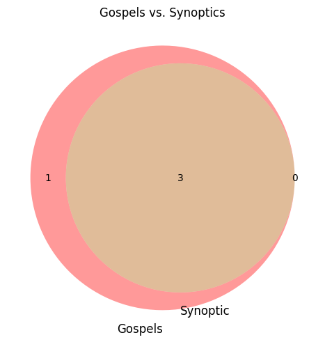
multiple plots
Like every other plot type, it can also be one panel among several via plt and the plots array; here a two-set diagram sits beside a colored three-set diagram:
plt(
    output_file => 'output.images/venn.png',
    ncols         => 2,
    suptitle      => 'Proportional-area Venn diagrams',
    plots => [
        {
            plot_type => 'venn_proportional_area',
            title       => 'Two sets',
            data        => {
                Perl   => [qw(regex hashes CPAN sigils)],
                Python => [qw(regex hashes pip indentation)],
            },
        },
        {
            plot_type    => 'venn_proportional_area',
            title        => 'Three sets with colors',
            set_colors   => [qw(skyblue lightgreen salmon)],
            alpha        => 0.5,
            data         => {
                Mammals => [qw(bat whale dog cat human platypus)],
                Aquatic => [qw(whale shark octopus platypus)],
                Legged  => [qw(dog cat human bat platypus shark)],
            },
        },
    ],
);
which makes the following figure:
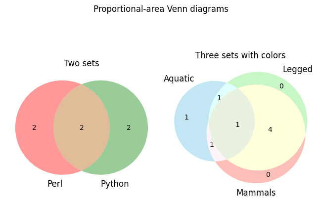
violin
Plot a hash of array refs as violins: one kernel-density silhouette per key, with the quartile box, the whiskers and a red dot at the mean drawn over it. Where a boxplot summarises a distribution in five numbers, a violin shows its shape, so bimodal data that a boxplot would hide is visible.
violin and violinplot are the same subroutine under two names, and both accept the two data shapes described under #boxplot — a hash of array refs, or a bare array ref for a single violin. Non-numeric and undefined values are dropped silently. Each x-axis label carries the number of points that went into it, so a violin drawn from very few points announces itself.
options
| Option | Description | Example |
| -------- | ------- | ------- |
color | a single color for every violin | color => 'red' |
colors | a hash pairing each data key with its own color; every key in data must appear | colors => { E => 'yellow', B => 'purple', A => 'green' } |
edgecolor | the color of the outline of every violin; black by default | edgecolor => 'none' |
key_order | determine key order display on x-axis | key_order => ['B', 'A', 'E'] |
logscale | an array of the axes to put on a log scale; only x and y are accepted. Note this is an array reference, not the log => 1 scalar that bar takes | logscale => ['y'] |
orientation | 'vertical', 'horizontal'}, default: 'vertical' | orientation => 'horizontal' |
medians | draw a line at each median; on by default, 0 or 'False' for off | medians => 0 |
whiskers | draw the quartile bar and whiskers over the silhouette; on by default, 0 leaves the bare violin | whiskers => 0 |
single, simple plot
plt(
    output_file => 'output.images/single.violinplot.png',
    data              => {                                     # simple hash
        A => [ 55, @{$z} ],
        E => [ @{$y} ],
        B => [ 122, @{$z} ],
    },
    plot_type    => 'violinplot',
    title        => 'Single Violin Plot: Specified Colors',
    colors       => { E => 'yellow', B => 'purple', A => 'green' },
    fh => $fh,
    execute      => 0,
);
which makes:
multiple plots
plt(
    fh                => $fh,
    execute           => 0,
    output_file       => 'output.images/violin.png',
    plots             => [
        {
            data => {
                E => @e,
                B => @b
            },
            plot_type    => 'violinplot',
            title        => 'Basic',
            xlabel       => 'xlabel',
            set_figwidth => 12,
            suptitle     => 'Violinplot'
        },
        {
            data => {
                E => @e,
                B => @b
            },
            plot_type => 'violinplot',
            color       => 'red',
            title       => 'Set Same Color for All',
        },
        {
            data => {
                E => @e,
                B => @b
            },
            plot_type => 'violinplot',
            colors      => {
                E => 'yellow',
                B => 'black'
            },
            title => 'Color by Key',
        },
        {
            data => {
                E => @e,
                B => @b
            },
            orientation => 'horizontal',
            plot_type => 'violinplot',
            colors      => {
                E => 'yellow',
                B => 'black'
            },
            title => 'Horizontal orientation',
        },
        {
            data => {
                E => @e,
                B => @b
            },
            whiskers    => 0,
            plot_type => 'violinplot',
            colors      => {
                E => 'yellow',
                B => 'black'
            },
            title => 'Whiskers off',
        },
    ],
    ncols => 3,
    nrows => 2,
);
wide
Summarise several runs of the same curve. Every run is drawn as a faint line, the mean of the runs as a solid one, and one standard deviation either side of the mean as a translucent ribbon. This is the plot for repeated measurements — replicate experiments, repeated simulations, one trace per subject — where a plot of every line on top of the others would be an unreadable thicket and a plot of the mean alone would hide how much the runs disagree.
The runs do not have to share an x grid: each group's runs are interpolated onto 101 evenly spaced points spanning that group's own x range before the mean and the standard deviation are taken, so runs of different lengths, or sampled at different x values, can be summarised together. A run is first sorted by x, so it may be entered in any order; and it counts towards the mean and the ribbon only between its own first and last x, so a run that stops early narrows the summary to the runs that continue rather than being held flat at its last value.
Entering data
1. Labelled groups (hash). Each key is a group and becomes the legend label; its value is an array of runs, and each run is a [ \@x, \@y ] pair — the same pair #plot uses:
my @x = 0 .. 100;
my %runs;
foreach my $group ('Clinical', 'HGI') {
    my $shift = $group eq 'HGI' ? 1 : 0;
    foreach my $replicate (1 .. 3) {
        push @{ $runs{$group} }, [
            [@x],                                                       # x
            [ map { $shift + sin($_/10) + rand_between(-0.2, 0.2) } @x ] # y
        ];
    }
}
wide(
    output_file => 'output.images/single.wide.png',
    data          => \%runs,
    color         => {          # one color per group
        Clinical => 'blue',
        HGI      => 'green',
    },
    title         => 'Visualization of similar lines plotted together',
    xlabel        => 'time',
    ylabel        => 'signal',
);
which makes the image:
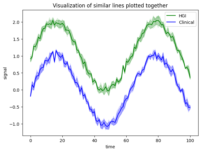
2. One unlabelled group (array). Drop the enclosing hash and pass one group's array of runs directly; color is then a single color rather than a hash:
wide(
    output_file => 'output.images/single.array.png',
    data          => $runs{Clinical},
    color         => 'red',
);
A group with a single run is legal — it just produces a line with a zero-width ribbon — which is convenient when one group has replicates and another does not.
options
| Option | Description | Example |
| -------- | ------- | ------- |
color | for hash data, a hash of one color per group; for array data, a single color. Groups with no entry take the next color of Matplotlib's default cycle (C0, C1, ...), in the sorted order of the group names, so a partial hash is allowed; before version 0.315 they were all b (blue) | color => { Clinical => 'blue', HGI => 'green' } |
show_legend | on by default, and only the hash form has labels to show; 0 suppresses it | show_legend => 0 |
wide accepts the usual axes options — title, xlabel, ylabel, set_xlim and the rest — but not logscale or key_order. For a log axis use Matplotlib's own set_yscale => '"log"'. There is no key_order: as of version 0.315 the groups are drawn, and listed in the legend, in the sorted order of their names, so the same data draws the same picture every time. Before that they were drawn in Perl's hash order, which differs between runs.
single, simple plot
Both calls above go through the wide wrapper; naming the type explicitly to plt is equivalent and takes exactly the same options:
plt(
    output_file => 'output.images/single.wide.png',
    plot_type     => 'wide',
    data          => \%runs,
    color         => { Clinical => 'blue', HGI => 'green' },
);
multiple plots
As an element of plots, a wide panel is just another plot hash — here the labelled groups sit beside one group on its own:
plt(
    output_file => 'output.images/wide.png',
    ncols         => 2,
    suptitle      => 'Replicate runs, summarised',
    plots         => [
        {
            plot_type => 'wide',
            data        => \%runs,               # hash of groups of runs
            color       => { Clinical => 'blue', HGI => 'green' },
            title       => '"Two groups, mean +/- 1 s.d."', # comma: quoted
            xlabel      => 'time',
            ylabel      => 'signal',
        },
        {
            plot_type     => 'wide',
            data          => $runs{Clinical},    # just the runs, unlabelled
            color         => 'red',
            show_legend => 0,
            title         => 'One group with no legend',
        },
    ],
);
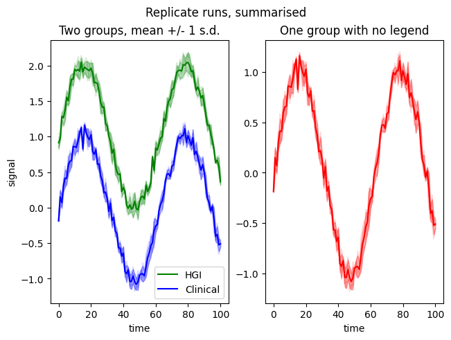
Because a wide panel collapses many lines into one summary, it also composes well with a plot type that shows the same data another way. Here the runs are summarised on the left and the distribution of their final values is drawn beside them:
my %endpoints;
foreach my $group (keys %runs) {
    @{ $endpoints{$group} } = map { $_->[1][-1] } @{ $runs{$group} };
}
plt(
    output_file => 'output.images/wide.and.violin.png',
    ncols         => 2,
    plots         => [
        {
            plot_type => 'wide',
            data        => \%runs,
            color       => { Clinical => 'blue', HGI => 'green' },
            title       => 'Runs over time',
        },
        {
            plot_type => 'violinplot',
            data        => \%endpoints,    # hash of arrays, same keys
            colors      => { Clinical => 'blue', HGI => 'green' },
            title       => 'Final values',
        },
    ],
);
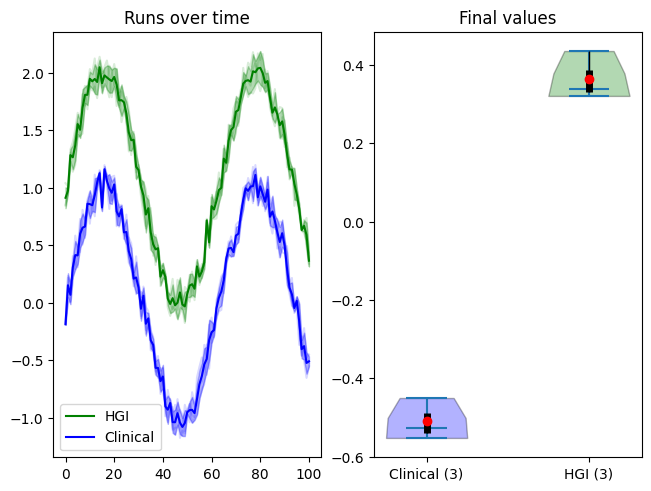
The three images above are written by wide.example.pl in the git repository (it is not shipped in the CPAN distribution); re-run it from the repository root with perl -Ilib wide.example.pl to regenerate them.
Advanced
Notes in Files
all files that can have notes with them, give notes about how the file was written. For example, SVG files have the following:
<dc:title>made/written by /mnt/ceph/dcondon/ui/gromacs/tut/dup.2puy/1.plot.gromacs.pl called using "plot" in /mnt/ceph/dcondon/perl5/perlbrew/perls/perl-5.42.0/lib/site_perl/5.42.0/x86_64-linux/Matplotlib/Simple.pm version 0.318 with Perl 5.42.0, Python 3.12.3, matplotlib 3.10.7</dc:title>The Perl version is the one that wrote the script; the Python and matplotlib versions are the ones that ran it, read by the script itself, so they are right even when a script written with execute => 0 is run later or elsewhere.
Speed
To improve speed, all data can be written into a single temp python3 file thus:
use File::Spec;
use File::Temp;
my $fh = File::Temp->new( DIR => File::Spec->tmpdir, SUFFIX => '.py', UNLINK => 0 );
all files will be written to $fh->filename; be sure to put execute => 0 unless you want the file to be run, which is the last step.
plt(
    data => {
        Clinical => [
            [
                [@xw],    # x
                [@y]      # y
            ],
            [ [@xw], [ map { $_ + rand_between( -0.5, 0.5 ) } @y ] ],
            [ [@xw], [ map { $_ + rand_between( -0.5, 0.5 ) } @y ] ]
        ],
        HGI => [
            [
                [@xw],                            # x
                [ map { 1.9 - 1.1 / $_ } @xw ]    # y
            ],
            [ [@xw], [ map { $_ + rand_between( -0.5, 0.5 ) } @y ] ],
            [ [@xw], [ map { $_ + rand_between( -0.5, 0.5 ) } @y ] ]
        ]
    },
    output_file => 'output.images/single.wide.png',
    plot_type         => 'wide',
    color             => {
        Clinical => 'blue',
        HGI      => 'green'
    },
    title        => 'Visualization of similar lines plotted together',
    fh => $fh,
    execute      => 0,
);
# the last plot should have C<< execute =E<gt> 1 >>
plt(
    data => [
        [
            [@xw],    # x
            [@y]      # y
        ],
        [ [@xw], [ map { $_ + rand_between( -0.5, 0.5 ) } @y ] ],
        [ [@xw], [ map { $_ + rand_between( -0.5, 0.5 ) } @y ] ]
    ],
    output_file => 'output.images/single.array.png',
    plot_type         => 'wide',
    color             => 'red',
    title             => 'Visualization of similar lines plotted together',
    fh                => $fh,
    execute           => 1,
);
COPYRIGHT AND LICENSE
This software is free. It is licensed under the same terms as Perl itself
Thanks
A lot of this work used Claude AI, which was paid for by the University of Idaho's IMCI