NAME
Prima::tutorial - introductory tutorial
DESCRIPTION
Programming of the graphic interfaces is often considered a somewhat boring business, and not without a cause. There is little pride in knowing that your buttons and scrollbars work exactly as millions of other buttons and scrollbars do, so whichever GUI toolkit is chosen, it is usually regarded as a tool of small importance, and the less it is obtrusive, the better. Given that, and trying to live up to the famous Perl 'making easy things easy and hard things possible' mantra, this manual page is an introductory tutorial meant to show how to write the easy things easy. The hard things are explained in the other Prima manual pages ( see Prima ).
Introduction - a "Hello world" program
Prima is written and is expected to be used in some traditions of Perl coding, such as DWIM ( do what I mean ) or TMTOWTDI ( there is more than one way to do it). Perl itself is the language (arguably) most effective in small programs, as the programmer doesn't need to include lines and lines of prerequisite code before even getting to the problem itself. Prima can't compete with that, but the introductory fee is low; a minimal working 'Hello world' can be written in just three lines of code:
use Prima qw(Application);
Prima::MainWindow-> new( text => 'Hello world!');
run Prima;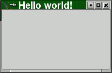
Line 1 is the invocation of modules Prima and Prima::Application. One can also explicitly invoke both use Prima and use Prima::Application, but since the module Prima doesn't export any method names, the syntax in the code example above allows one to write programs in a more concise style.
Line 2 creates a new window object, and instance of the Prima::MainWindow class, which is visualized as a window rectangle on the screen, with the title 'Hello world'. The class terminates the application (and the program) when the window is closed; this is the only difference from the windows that are objects instances of the Prima::Window class, which do nothing after they are closed by the user.
( Note: In this tutorial the Prima:: prefix in class names will be omitted and will be used only when necessary, such as in code examples ).
Line 3 enters the Prima event loop. The loop is terminated when the only instance of the Application class (that is created by the use Prima::Application invocation) and stored in $::application scalar, is destroyed.
Strictly speaking, a minimal 'hello world' program can be written even in two lines:
use Prima;
Prima::message('Hello world');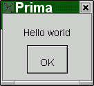
but it is not very illustrative and not useful. The Prima::message call is rarely used and is one of the few methods contained in the Prima:: namespace. To display a message, the MsgBox module is often preferred, with its control over text in the buttons and with its appropriate usage of some pre-defined icons. If using this module instead the code above can be rewritten as this:
use Prima qw(Application MsgBox);
message('Hello world');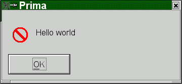
but where Prima::message accepts only text scalar parameters, Prima::MsgBox::message can do a lot more. For example the code
use Prima qw(Application MsgBox);
message('Hello world', mb::OkCancel|mb::Information);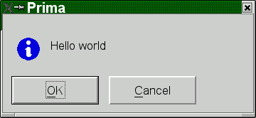
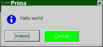
displays two buttons and an icon. A small achievement, but the following code is a bit more interesting:
use Prima qw(Application MsgBox);
message('Hello world', mb::OkCancel|mb::Information,
	buttons => {
		mb::Cancel => {
			# there are predefined color constants to use
			backColor => cl::LightGreen,
			# but RGB integers are also o.k.
			color     => 0xFFFFFF,
		},
		mb::Ok => {
			text 	=> 'Indeed',
		},
	}
);
Defining many object properties at once is a major feature of Prima and is seen throughout the toolkit. Returning to the very first example we can demonstrate the manipulation of the window properties in the same fashion:
use Prima qw(Application);
my $window = Prima::MainWindow-> new(
	text => 'Hello world!',
	backColor => cl::Yellow,
	size => [ 200, 200],
);
run Prima;
Note that the size property is a two-integer array, and the color constant is registered in the cl:: namespace. In Prima, there are many similar two- and three-letter namespaces containing (usually integer) constants for various purposes. The design reason for choosing such syntax over the string constants ( as f ex in Perl-Tk, such as color => 'yellow' ) is that the syntax is checked on the compilation stage, thus narrowing the possibility of a bug.
There are over a hundred properties, such as color, text, or size, declared on descendants of the Widget class. These can be set in a new ( alias create ) call, or changed later, either individually
$window-> size( 300, 150);or in a group
$window-> set(
	text => 'Hello again',
	color => cl::Black,
);
In addition to these, there are also more than 30 events called whenever a certain action is performed; the events' syntax is identical to the properties' syntax.
Now, back to the code. Here, if we change it again, we can now catch a mouse click on the window:
use Prima qw(Application MsgBox);
my $window = Prima::MainWindow-> new(
	text => 'Hello world!',
	size => [ 200, 200],
	onMouseDown => sub {
		my ( $self, $button, $mod, $x, $y) = @_;
		message("Aww! You've clicked me right in $x:$y!");
	},
);
run Prima;
While an interesting concept, it is not really practical if the only thing you want is to catch a click, and this is the part where the standard button widget should probably be used instead:
use Prima qw(Application Buttons MsgBox);
my $window = Prima::MainWindow-> new(
	text     => 'Hello world!',
	size     => [ 200, 200],
);
$window-> insert( Button =>
	text     => 'Click me',
	growMode => gm::Center,
	onClick  => sub { message("Hello!") }
);
run Prima;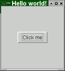
For those who know Perl-Tk and prefer its ways of positioning a widget, Prima provides the pack and place interfaces. Here one can replace the line
growMode => gm::Center,with this line:
pack => { expand => 1 },where both produce the same effect.
Overview of the widget classes
Prima contains a set of standard ( in GUI terms ) widgets, such as buttons, input lines, list boxes, scroll bars, etc. These are diluted with the other more exotic widgets, such as the POD viewer or docking windows. Technically, these are collected in Prima/*.pm modules and each contains its own manual page, but for informational reasons here is the full table of the widget modules, an excerpt from the Prima manpage:
Prima::Buttons - buttons and button grouping widgets
Prima::Calendar - calendar widget
Prima::ComboBox - combo box widget
Prima::DetailedList - multi-column list viewer with a controlling header widget
Prima::DetailedOutline - a multi-column outline viewer with controlling header widget
Prima::DockManager - advanced dockable widgets
Prima::Docks - dockable widgets
Prima::Edit - text editor widget
Prima::ExtLists - listbox with checkboxes
Prima::FrameSet - frameset widget class
Prima::Grids - grid widgets
Prima::Widget::Header - multi-column header widget
Prima::ImageViewer - bitmap viewer
Prima::InputLine - input line widget
Prima::Label - static text widget
Prima::Lists - user-selectable item list widgets
Prima::MDI - top-level windows emulation classes
Prima::Notebooks - multipage widgets
Prima::Outlines - tree view widgets
Prima::PodView - POD browser widget
Prima::ScrollBar - scroll bars
Prima::Sliders - sliding bars, spin buttons, dial widget, etc.
Prima::TextView - rich text browser widget
Building a menu
In Prima, a tree-like menu is built by building a set of nested arrays, where each array corresponds to a single menu entry. Such as, to modify the hello-world program to contain a simple menu, it is enough to write the code like this:
use Prima qw(Application MsgBox);
my $window = Prima::MainWindow-> new(
	text => 'Hello world!',
	menuItems => [
		[ '~File' => [
			['~Open', 'Ctrl+O', '^O', sub { message('open!') }],
			['~Save as...', sub { message('save as!') }],
			[],
			['~Exit', 'Alt+X', km::Alt | ord('x'), sub { shift-> close } ],
		]],
	],
);
run Prima;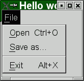
Each of the five arrays here in the example is written using different semantics, to represent either a text menu item, a sub-menu entry, or a menu separator. Strictly speaking, menus can also display images, but that syntax is practically identical to the text item syntax.
The idea behind all this complexity is to be able to tell what exactly the menu item is, just by looking at the number of items in each array. So, zero or one item is treated as a menu separator:
[],
[ 'my_separator' ]
The one-item syntax is needed when the separator menu item needs to be addressed explicitly. This means that each menu item after it is created is assigned a (unique) identifier, and that identifier looks like '#1', '#2', etc., unless it is given by the programmer. Here, for example, it is possible to delete the separator, after the menu is created:
$window-> menu-> remove('my_separator');It is also possible to assign the identifier to any menu item, not just to separators. The other types (text, image, sub-menu) are differentiated by looking at the type of scalars they contain. Thus, a two-item array with the last item an array reference (or, as before, three-item for the explicit ID set), is a sub-menu. The reference, as in the example, may contain even more menu items:
menuItems => [
	[ '~File' => [
		[ '~Level1' => [
			[ '~Level2' => [
				[ '~Level3' => [
					[]
				]],
			]],
		]],
	]],
],
Finally, text items, with the most complex syntax, can be constructed with three to six items in the array. One can set the left-aligned text string for the item, the right-aligned text string for the display of the hotkey, if any, the definition of the hotkey itself, and the action to be taken if the user has pressed either the menu item or the hotkey combination. Also, as in the previous cases, an explicit menu item ID can be set, and also an arbitrary data scalar, for the generic needs of the programmer.
Here are the combinations of scalars in an array that are allowed for defining a text menu item:
Three items - [ ID, text, action ]
Four items - [ text, hotkey text, hotkey, action ]
Five items - [ ID, text, hotkey text, hotkey, action ]
Six items - [ ID, text, hotkey text, hotkey, action, data ]
The image menu items are fully analogous to the text items, except that instead of the text string, an image object is supplied:
use Prima qw(Application MsgBox);
use Prima::Utils qw(find_image);

my $i = Prima::Image-> load( find_image( 'examples/Hand.gif'));
$i ||= 'No image found or can be loaded';

my $window = Prima::MainWindow-> new(
	text => 'Hello world!',
	menuItems => [
		[ '~File' => [
			[ $i, sub {} ],
		]],
	],
);
run Prima;
The action item of the menu description array points to the code executed when the menu item is selected. It is either an anonymous subroutine, as it is shown in all the examples above, or a string. The latter case will cause the method of the menu owner ( in this example, the window ) to be called. This can be useful when constructing a generic class where the menu actions could be overridden:
use Prima qw(Application);

package MyWindow;
use vars qw(@ISA);
@ISA = qw(Prima::MainWindow);

sub action
{
	my ( $self, $menu_item) = @_;
	print "hey! $menu_item called me!\n"
}

my $window = MyWindow-> new(
	menuItems => [
		[ '~File' => [
			['~Action', q(action) ],
		]],
	],
);

run Prima;
All actions are called with the menu item identifier passed in as a string parameter.
Another useful trick here is how to define a hotkey. While the description of the hotkey can be an arbitrary string, which will be displayed as is, the definition of the hotkey is not that simple because one needs to encode the key combination that would trigger the menu item action. A hotkey can be defined in two ways. The hotkey definition scalar should either be a literal string such as ^A for Control+A, or @B for Alt+B, or ^@#F10 for Control+Alt+Shift+F10. Or it should be a combination of the km:: constants with the base key that is either the ordinal of the character letter, or the keycode, represented by one of the kb:: constants. The latter method produces a less readable code, but is more explicit and powerful:
[ '~Reboot', 'Ctrl+Alt+Delete', km::Alt | km::Ctrl | kb::Delete, sub {
	print "wow!\n";
}],
[ '~Or not reboot?', 'Ctrl+Alt+R', km::Alt | km::Ctrl | ord('r'), sub {}],
This concludes the short tutorial on menus. To read more, see Prima::Menu .
Adding help to your program
The toolkit comes with the POD viewer program podview which can be easily incorporated into any application. This is meant to be rather straightforward so you can write an application manual directly in the POD format.
First, add some pod content to your main script, such as f ex:
#!/usr/bin/env perl
...
=pod

=head1 NAME

My program

=cut
exactly as if you wanted
perldocto display it.Second, add the invocation code, possibly inside the menu:
['~Help' => 'F1' => 'F1' => sub {
	$::application-> open_help("file://$0|DESCRIPTION");
}],
The
open_helpmethod can also take the standardL<link>syntax so for example the codeopen_help("My::Module/help")is also okay.
Finally, consider if the text-only POD is okay for you or if you need any images embedded in the pod documentation. This is somewhat tricky because the perl maintainers actively reject the idea of having images in the pod format, while metacpan.org can display images in the perl documentation just fine, and so does Prima, however, both use different syntaxes.
Here is an example of the mixed content that shows graphics when the graphic display is available, and just plain text otherwise:
=for podview <img src="illustration.gif" cut=1 title="Horizontal font measurements">

=for html <p>
<figure>
<img src="https://raw.githubusercontent.com/dk/Prima/master/pod/Prima/leadings.gif">
<figcaption>Horizontal font measurements</figcaption>
</figure>
<!--

   .. plain text illustration ..

=for html -->

=for podview </cut>
The GIF image format is chosen because Prima keeps all of its internal images as multi-frame GIFs, so in a way, it is also the safest fallback. However, any other image file format will do too.
If you don't need the text fallback, just just this:
=for podview <img src="illustration.gif">

=for html <p><img src="https://raw.githubusercontent.com/me/myproject/master/illustration.gif">
AUTHOR
Dmitry Karasik, <dmitry@karasik.eu.org>.