NAME
Term::Fabulous::Cookbook::ChartStyles - Recipes: curves, markers, colors, line styles and hover of charts
DESCRIPTION
This page is part of Term::Fabulous::Cookbook. Previous page: Term::Fabulous::Cookbook::ChartTechniques. Next page: Term::Fabulous::Cookbook::Canvases.
The recipes on this page change how a chart looks and reacts, whatever its data: the curves that connect the points, the characters a chart draws with (markers), light backgrounds, palettes and colors of your own, line styles, gaps, bar widths, stack groups and grid lines, and the details of the point under the mouse pointer. Each recipe is a complete program, shipped in examples/cookbook/, with a picture and notes on every feature it uses. Term::Fabulous::Cookbook::Charts introduces each chart type with a recipe of its own, and Term::Fabulous::Cookbook::ChartTechniques shows time axes, live data, logarithmic axes, transforms, charts in KDL layouts and printed reports.
Most recipes use Term::Fabulous::Widget::LineChart, Term::Fabulous::Widget::AreaChart and Term::Fabulous::Widget::BarChart, whose series options and axes are described on Term::Fabulous::Widget::XYChart. Titles, legends, colors and hover are common to all charts and described on Term::Fabulous::Widget::Chart. The concepts are explained in the charts chapter of the manual, and curves, markers and palettes have pages of their own: Term::Fabulous::Chart::Curve, Term::Fabulous::Chart::Marker and Term::Fabulous::Chart::Palette.
The recipes on this page:
"Line styles, gaps, bar widths, stack groups and grid lines"
"Show details of the point under the pointer (SeriesHover, highlight)"
Connect points with curves and easings (curve)
Goal: see how the curve option connects the same seven points in six ways, to choose one that suits the data.
This program is shipped as examples/cookbook/chart-curves.pl.
use v5.32;
use warnings;
use feature 'signatures';
no warnings 'experimental::signatures';

use Term::Fabulous;
use Term::Fabulous::Widget::Box;
use Term::Fabulous::Widget::LineChart;
use Clay::XS qw(sizing_grow sizing_percent CLAY_LEFT_TO_RIGHT_WRAP);

my $root = Term::Fabulous::Widget::Box->new(
	layout => {
		layout_direction => CLAY_LEFT_TO_RIGHT_WRAP,
		sizing           => { width => sizing_grow(), height => sizing_grow() },
		padding          => { left  => 2, right => 2, top => 1, bottom => 1 },
		child_gap        => 3,
		line_gap         => 1,
	},
);

# The same points, connected six ways.
my @data = ( 2, 6, 3, 9, 8, 4, 5 );
foreach my $curve (qw(linear step monotone catmull-rom ease-in-out-sine ease-out-bounce)) {
	$root->add_child(
		Term::Fabulous::Widget::LineChart->new(
			title  => $curve,
			curve  => $curve,
			points => 1,
			x_axis => { visible => 0 },
			y_axis => { visible => 0, min => 0, max => 10 },
			series => [ { name => $curve, data => \@data } ],
			layout => { sizing => { width => sizing_percent(0.31), height => sizing_percent(0.47) } },
		)
	);
}

Term::Fabulous->new( root => $root, width => 100, height => 26 )->run;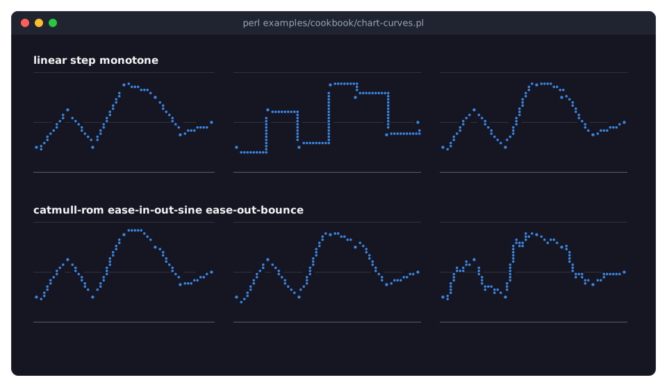
curvedecides how a line or the edge of an area runs from one point to the next; every curve passes through all points. Given to the chart, it applies to all its series; a series can have its own. See Term::Fabulous::Chart::Curve.linear, the default, draws straight lines: it adds nothing to the data.stepholds a value until the next point, right for counters and states that change at a moment;step-beforeandstep-middlejump at the start of an interval or halfway.monotoneis the smooth curve for data: between two points it stays between their values, and it is flat at highs and lows, so it never shows a peak that is not in the data.catmull-romandnaturalare smooth too, but may overshoot;tension(0 to 1) tightenscatmull-rom.An easing name, such as
ease-in-out-sineorease-out-bounce, shapes every segment like an animation (see Term::Fabulous::Chart::Easing), and a code reference is an easing of your own. They are for looks:ease-out-bouncedraws wiggles that are not in the data. See "Curves" in Term::Fabulous::Widget::XYChart.CLAY_LEFT_TO_RIGHT_WRAPplaces the six charts in rows that wrap, andline_gapkeeps the rows apart; each chart takes 31% of the width and 47% of the height.visible => 0hides both axes, and the sameminandmaxgive all six charts one scale. Each chart has one series, so it shows no legend; the title names it.
Draw with Braille, blocks or box lines (marker)
Goal: compare the characters a chart can draw its series with: Braille dots, block elements and box drawing lines.
This program is shipped as examples/cookbook/chart-styles.pl.
use v5.32;
use warnings;
use feature 'signatures';
no warnings 'experimental::signatures';

use Term::Fabulous;
use Term::Fabulous::Widget::AreaChart;
use Term::Fabulous::Widget::BarChart;
use Term::Fabulous::Widget::Box;
use Term::Fabulous::Widget::LineChart;
use Clay::XS qw(sizing_grow sizing_percent CLAY_LEFT_TO_RIGHT_WRAP);

my $root = Term::Fabulous::Widget::Box->new(
	layout => {
		layout_direction => CLAY_LEFT_TO_RIGHT_WRAP,
		sizing           => { width => sizing_grow(), height => sizing_grow() },
		padding          => { left  => 2, right => 2, top => 1, bottom => 1 },
		child_gap        => 3,
		line_gap         => 1,
	},
);

my @wave  = map { 5 + 3 * sin( $_ / 3 ) + 1.2 * sin( $_ * 1.3 ) } 0 .. 30;
my %small = (
	x_axis => { visible => 0 },
	y_axis => { visible => 0, min => 0, max => 10 },
	layout => { sizing  => { width => sizing_percent(0.31), height => sizing_percent(0.31) } },
);

# Lines in each style a line can take...
foreach my $marker (qw(braille half quadrant sextant box)) {
	$root->add_child( Term::Fabulous::Widget::LineChart->new( %small, title => "line: $marker", marker => $marker, series => [ { name => $marker, data => \@wave } ] ) );
}

# ... an area in eighth blocks, and bars in quadrants and in blocks.
$root->add_child( Term::Fabulous::Widget::AreaChart->new( %small, title => 'area: block', series => [ { name => 'block', data => \@wave, color => '#d95926' } ] ) );
my @bars = map { $wave[ 3 * $_ ] } 0 .. 10;
$root->add_child( Term::Fabulous::Widget::BarChart->new( %small, title => 'bars: quadrant', marker => 'quadrant', series => [ { name => 'quadrant', data => \@bars, color => '#199e70' } ] ) );
$root->add_child( Term::Fabulous::Widget::BarChart->new( %small, title => 'bars: block',    series => [ { name => 'block', data => \@bars, color => '#199e70' } ] ) );
$root->add_child( Term::Fabulous::Widget::BarChart->new( %small, title => 'bars: braille',  marker => 'braille', series => [ { name => 'braille', data => \@bars, color => '#199e70' } ] ) );

Term::Fabulous->new( root => $root, width => 100, height => 32 )->run;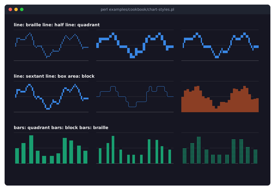
A terminal cell holds one character, but a chart draws on a finer grid of subpixels by choosing the character that shows the subpixels of a cell. The
markerchooses the set of characters. See Term::Fabulous::Chart::Marker.braillehas 2 x 4 dots per cell, the finest grid, but only one color per cell: where lines cross, a cell takes the color of the dot drawn last.half(1 x 2, about square),quadrant(2 x 2) andsextant(2 x 3) are block elements, which show two colors per cell.blockuses the eighth blocks, which place the top of a bar or an area to an eighth of a cell.boxdraws a line with box drawing characters, one row per column.Without a
marker, lines and points are drawn in Braille, areas and bars in blocks. Not every marker suits every series type: lines takebraille,half,quadrant,sextantandbox; areas and bars takeblock,braille,half,quadrantandsextant; scatter series takebraille,half,quadrantandsextant. Amarkergiven to the chart applies only to the series that can draw with it. Horizontal bars use the matching horizontal blocks. See "Rendering styles" in Term::Fabulous::Widget::XYChart.The sextant characters come from the "Symbols for Legacy Computing", which not every font has. Terminals that draw block characters themselves (kitty, WezTerm, foot, Ghostty and others) show them everywhere; elsewhere, test them before you rely on them.
%smallholds the parameters all nine charts share: no axes, the same y range, and a third of the width and the height each, so the charts fill three rows of three.
Light backgrounds, palettes and colors of your own
Goal: a chart on a light background, and a chart whose colors are all chosen by the program, including a reference line over its bars.
This program is shipped as examples/cookbook/chart-colors.pl.
use v5.32;
use warnings;
use feature 'signatures';
no warnings 'experimental::signatures';

use Term::Fabulous;
use Term::Fabulous::Enum::BorderStyle;
use Term::Fabulous::Widget::BarChart;
use Term::Fabulous::Widget::Box;
use Term::Fabulous::Widget::LineChart;
use Clay::XS qw(sizing_grow);

my $root = Term::Fabulous::Widget::Box->new(
	layout => {
		sizing    => { width => sizing_grow(), height => sizing_grow() },
		padding   => { left  => 2, right => 2, top => 1, bottom => 1 },
		child_gap => 2,
	},
);

my @months = qw(Jan Feb Mar Apr May Jun);

# A chart with a light background of its own: the theme follows it, so
# the text turns dark and the palette takes its steps for light ones.
$root->add_child(
	Term::Fabulous::Widget::LineChart->new(
		title            => 'Light background',
		title_align      => 'center',
		background_color => '#fcfcfb',
		layout           => { padding => { left => 1, right => 1, top => 1 } },
		labels           => \@months,
		legend           => 'bottom',
		x_axis           => { grid => 'dotted' },
		y_axis           => { grid => 'dotted' },
		series           => [ { name => 'North', data => [ 3, 5, 4, 7, 8, 9 ] }, { name => 'South', data => [ 4, 4, 6, 5, 7, 6 ] } ],
	)
);

# Colors of your own: a palette, one series' color, and the chrome.
$root->add_child(
	Term::Fabulous::Widget::BarChart->new(
		title        => 'Colors of your own',
		bordered     => 1,
		border_style => Term::Fabulous::Enum::BorderStyle->Round,
		border_color => '#3a4152',
		layout       => { padding => { left => 1, right => 1 } },
		labels       => \@months,
		palette      => [ '#61afef', '#c678dd', '#98c379' ],
		title_color  => '#e5c07b',
		label_color  => '#7f848e',
		grid_color   => '#2c313a',
		axis_color   => '#5c6370',
		series       => [
			{ name => 'Plan',   data => [ 5, 5, 6, 6, 7, 7 ] },
			{ name => 'Actual', data => [ 4, 6, 6, 5, 8, 9 ] },
			{ name => 'Target', data => [ 6, 6, 6, 6, 6, 6 ], type => 'line', color => '#e06c75', line_style => 'dashed' },
		],
	)
);

Term::Fabulous->new( root => $root, width => 100, height => 22 )->run;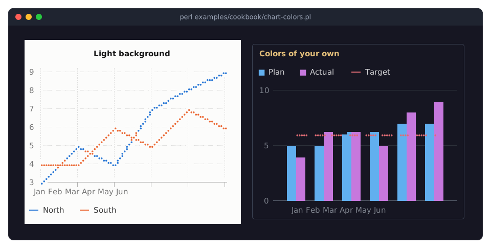
A chart has no background of its own by default: it is drawn on the background of its parent.
background_colorgives it one, here almost white, and thepaddingin itslayoutkeeps the plot off the edges of it. A chart has every parameter of a Term::Fabulous::Widget::Box, also theborder_*parameters of the second chart.theme => 'auto', the default, looks at the background and chooses dark text and the palette's colors for light backgrounds on a light one. Setthemetodarkorlightto choose yourself. The title, legend, tick labels, axis and grid lines are drawn in colors mixed from the background, so they suit any background. See "Colors and themes" in Term::Fabulous::Widget::Chart.palettetakes the name of a palette (default,classic,pastelorvivid; see "Palettes" in Term::Fabulous::Chart::Palette) or a list of colors of your own, which the series take in order and which are used as they are on any background. A series' owncolorwins: the third series is red, not the palette's third color.title_color,text_color(the legend),label_color(tick labels and axis titles),axis_color(axis lines and the baseline) andgrid_colorreplace the mixed colors of the chrome.The
Targetseries is a dashed line in a bar chart: a series can have atypeof its own, so a bar chart can also draw lines, areas and points, for example a reference line over its bars.There is no second y axis, on purpose: two scales in one chart invite the reader to compare heights that mean nothing, and the crossing points of the lines depend only on how the two scales were chosen. To compare series of very different sizes, index them to a common start with the
indextransform (see "Smooth noisy data and index it to 100 (transforms)" in Term::Fabulous::Cookbook::ChartTechniques), or draw two charts, side by side or one above the other.Only the
defaultpalette was checked for readers with color vision deficiencies. With colors of your own, help them with the legend, value labels or different line styles.
Line styles, gaps, bar widths, stack groups and grid lines
Goal: compare the smaller options of XY charts side by side: dashed and dotted lines, gaps in the data, an area with a line and points, narrow bars, bars in two stack groups, and grid lines along both axes.
This program is shipped as examples/cookbook/chart-options.pl.
use v5.32;
use warnings;
use feature 'signatures';
no warnings 'experimental::signatures';

use Term::Fabulous;
use Term::Fabulous::Widget::AreaChart;
use Term::Fabulous::Widget::BarChart;
use Term::Fabulous::Widget::Box;
use Term::Fabulous::Widget::LineChart;
use Clay::XS qw(sizing_grow sizing_percent CLAY_LEFT_TO_RIGHT_WRAP);

my $root = Term::Fabulous::Widget::Box->new(
	layout => {
		layout_direction => CLAY_LEFT_TO_RIGHT_WRAP,
		sizing           => { width => sizing_grow(), height => sizing_grow() },
		padding          => { left  => 2, right => 2, top => 1, bottom => 1 },
		child_gap        => 3,
		line_gap         => 1,
	},
);

my @wave   = map { 5 + 2 * sin( $_ / 2 ) } 0 .. 12;
my @labels = qw(Mon Tue Wed Thu Fri);
my %small  = ( layout => { sizing => { width => sizing_percent(0.31), height => sizing_percent(0.48) } } );

# Three line styles.
$root->add_child(
	Term::Fabulous::Widget::LineChart->new(
		%small,
		title  => 'line_style',
		series => [
			{ name => 'solid',  data => [ map { $_ + 3 } @wave ] },
			{ name => 'dashed', data => \@wave,                   line_style => 'dashed' },
			{ name => 'dotted', data => [ map { $_ - 3 } @wave ], line_style => 'dotted' },
		],
	)
);

# Missing values: a gap, or a line across it.
my @holes = map { $_ >= 5 && $_ <= 7 ? undef : $wave[$_] } 0 .. $#wave;
$root->add_child(
	Term::Fabulous::Widget::LineChart->new(
		%small,
		title  => 'gaps and span_gaps',
		series => [
			{ name => 'gap', data => [ map { defined ? $_ + 2 : undef } @holes ] },
			{ name => 'span_gaps', data => [ map { defined ? $_ - 2 : undef } @holes ], span_gaps => 1 },
		],
	)
);

# An area with a line along its top and a mark on every point.
$root->add_child(
	Term::Fabulous::Widget::AreaChart->new(
		%small,
		title  => 'area: line and points',
		line   => 1,
		points => 1,
		series => [ { name => 'visits', data => [ 3, 6, 4, 8, 7, 9, 6 ] } ],
	)
);

# Narrow bars: together they take 0.4 of their slot.
$root->add_child(
	Term::Fabulous::Widget::BarChart->new(
		%small,
		title     => 'bar_width 0.4',
		bar_width => 0.4,
		labels    => \@labels,
		series    => [ { name => 'orders', data => [ 18, 24, 21, 30, 34 ] } ],
	)
);

# Two stack groups side by side in every slot.
$root->add_child(
	Term::Fabulous::Widget::BarChart->new(
		%small,
		title  => 'stack groups',
		labels => [qw(Q1 Q2 Q3)],
		series => [
			{ name => 'shop 2025', data => [ 12, 15, 11 ], stack => '2025' },
			{ name => 'app 2025',  data => [ 6,  8,  9 ],  stack => '2025' },
			{ name => 'shop 2026', data => [ 14, 16, 15 ], stack => '2026' },
			{ name => 'app 2026',  data => [ 9,  12, 14 ], stack => '2026' },
		],
	)
);

# Grid lines at the ticks of both axes.
$root->add_child(
	Term::Fabulous::Widget::LineChart->new(
		%small,
		title  => 'grid',
		x_axis => { grid => 'dashed' },
		y_axis => { grid => 'solid' },
		series => [ { name => 'wave', data => \@wave } ],
	)
);

Term::Fabulous->new( root => $root, width => 100, height => 30 )->run;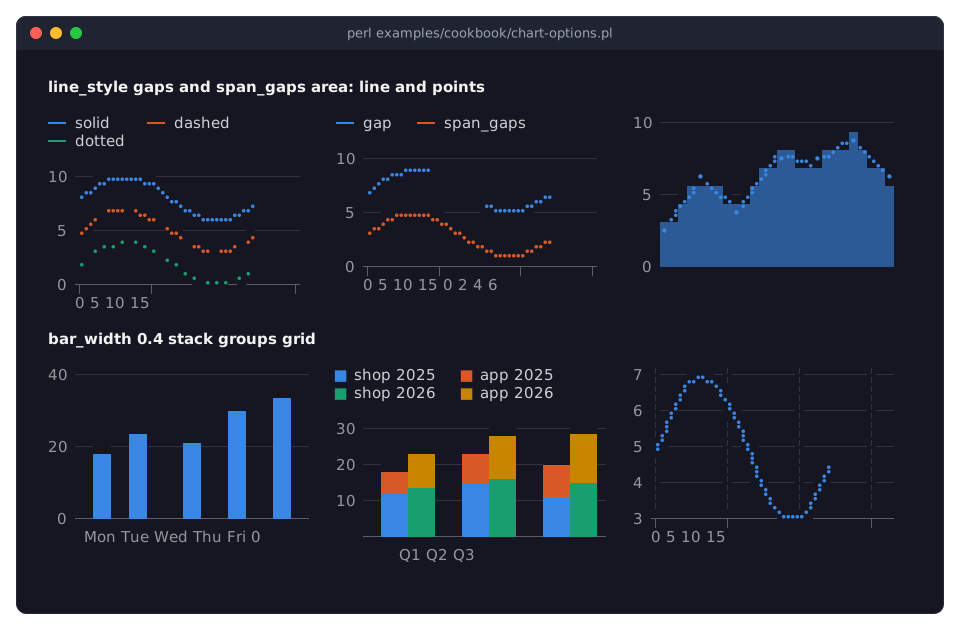
line_styledraws a linesolid,dashedordotted. The pattern runs on from one segment to the next, so it keeps an even rhythm around corners.undefin the data is a missing value. A line stops before it and starts again after it; withspan_gaps => 1the line runs across.An area has no line along its top unless
lineis true;pointsmarks every data point of a line or an area. Both are given to the chart here, so they apply to all of its series.bar_widthis the share of a category slot the bars of the slot take together (default 0.7).Series with the same
stackname stack on each other; different names stand side by side in the slot.stackedis not needed for this.gridin an axis hash draws grid lines at its ticks:solid,dashedordotted. The value axis has solid grid lines by default, the x axis none.All options are described in the series keys and the axis keys of XYChart.
Show details of the point under the pointer (SeriesHover, highlight)
Goal: show the values under the mouse pointer in a status line, and emphasize a series from the keyboard.
This program is shipped as examples/cookbook/chart-hover.pl.
use v5.32;
use warnings;
use feature 'signatures';
no warnings 'experimental::signatures';

use Term::Fabulous;
use Term::Fabulous::Widget::AreaChart;
use Term::Fabulous::Widget::Box;
use Term::Fabulous::Widget::Text;
use Clay::XS qw(sizing_grow CLAY_TOP_TO_BOTTOM);

my $root = Term::Fabulous::Widget::Box->new(
	layout => {
		layout_direction => CLAY_TOP_TO_BOTTOM,
		sizing           => { width => sizing_grow(), height => sizing_grow() },
		padding          => { left  => 2, right => 2, top => 1, bottom => 1 },
		child_gap        => 1,
	},
);

my @teams = qw(Backend Frontend Mobile);
my $chart = Term::Fabulous::Widget::AreaChart->new(
	title   => 'Closed issues per week',
	labels  => [ map { "W$_" } 1 .. 12 ],
	stacked => 1,
	series  => [
		{ name => 'Backend',  data => [ 12, 15, 11, 18, 21, 17, 16, 22, 25, 19, 23, 27 ] },
		{ name => 'Frontend', data => [ 8,  9,  12, 10, 13, 15, 14, 12, 16, 18, 17, 20 ] },
		{ name => 'Mobile',   data => [ 5,  4,  6,  9,  7,  8,  11, 10, 9,  12, 14, 13 ] },
	],
);
my $status = Term::Fabulous::Widget::Text->new( text => 'Point at the chart, or press 1-3 to emphasize a team (0: none, q: quit).', text_color => [ 150, 160, 180, 255 ] );
$root->add_child( $chart, $status );

# What the pointer is on: a point of a series, a legend entry, or nothing.
$chart->on(
	SeriesHover => sub ($event) {
		my $series = $event->series;
		$status->text(
			  !defined $series       ? 'Point at the chart, or press 1-3 to emphasize a team (0: none, q: quit).'
			: !defined $event->index ? "$series: " . join( ', ', map { $_ // 0 } $chart->series($series)->{data}->@* )
			:                          sprintf( '%s closed %d issues in week %s', $series, $event->value, $event->label )
		);
		return;
	}
);

my $ui = Term::Fabulous->new( root => $root, width => 80, height => 24 );

# Emphasis from the program, as if the pointer were on the series.
$root->on(
	KeyPress => sub ($event) {
		my $key = $event->key_name // return;
		$ui->loop->stop if $key eq 'q';
		$chart->highlight( $key eq '0' ? undef : $teams[ $key - 1 ] ) if $key =~ /\A[0-3]\z/;
		return;
	}
);

$ui->run;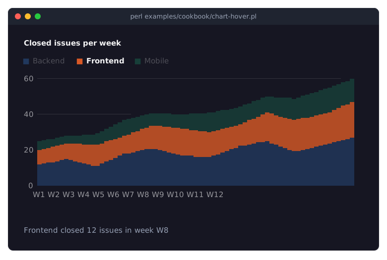
The picture shows the program with the mouse pointer over the chart.
Charts have no tooltips. Instead, a chart fires a
SeriesHoverevent (Term::Fabulous::Event::SeriesHover) whenever the pointer moves onto another data point, series, slice or legend entry, or off them. That event is how a program shows details: in a status line, as here, in a panel beside the chart, or in a table.$event->seriesis the name of the series,undefwhen the pointer left everything.$event->indexis the position of the data point in the series (after itstransform),undefon a legend entry.labelis the category (or the x value as text),valuethe point's own value, not the top of its stack, andxthe x value. The listener tells the three cases apart.$chart->series($name)returns a description of a series with itsdataas it was given, here to list all values of a series whose legend entry is under the pointer. Data may holdundeffor gaps, hence the// 0.While the pointer is on a series, the chart emphasizes it: the series keeps its color, the others fade towards the background (by
hover_fade, 0.7 by default), and its legend entry turns bold. In a stacked area, the pointer finds the point nearest to it in the area it is on.$chart->highlight($name)emphasizes a series from the program the same way, for example the one selected in a list;undefends the emphasis. The pointer wins while it is on a series.hover => 0turns the hover effects and the events off;highlightstill works then. See "Hover and emphasis" in Term::Fabulous::Widget::Chart.
SEE ALSO
This page is part of Term::Fabulous::Cookbook. Previous page: Term::Fabulous::Cookbook::ChartTechniques. Next page: Term::Fabulous::Cookbook::Canvases.
Term::Fabulous::Widget::XYChart - series options, axes, curves and markers of line, area, bar and scatter charts.
Term::Fabulous::Widget::Chart - titles, legends, colors, themes and hover of all charts.
Term::Fabulous::Chart::Curve, Term::Fabulous::Chart::Easing, Term::Fabulous::Chart::Marker, Term::Fabulous::Chart::Palette - the curves, easings, markers and palettes.
Term::Fabulous::Cookbook::Charts - one recipe per chart type.
Term::Fabulous::Cookbook::ChartTechniques - time axes, live data, logarithmic axes, transforms, KDL and printed reports.