NAME
Term::Fabulous::Cookbook::Charts - Recipes: one for each chart type
DESCRIPTION
This page is part of Term::Fabulous::Cookbook. Previous page: Term::Fabulous::Cookbook::TableStyles. Next page: Term::Fabulous::Cookbook::ChartTechniques.
This page has one recipe for each chart type: line, bar, pie and donut, scatter, area, histogram, radar and polar area charts, and sparklines in table cells. Each recipe is a complete program with a picture of what it shows, followed by notes on the parameters it uses. Techniques that work with several chart types are on the next two pages: Term::Fabulous::Cookbook::ChartTechniques (time axes, live data, logarithmic axes, transforms, KDL layouts and printed reports) and Term::Fabulous::Cookbook::ChartStyles (curves, markers, colors, line styles and hover).
The recipes on this page:
The recipes use the chart widgets. Term::Fabulous::Widget::Chart describes what all of them have in common: the title, the legend, the colors and what happens under the mouse pointer. Term::Fabulous::Widget::XYChart is the base of the charts with an x and a y axis (Term::Fabulous::Widget::LineChart, Term::Fabulous::Widget::BarChart, Term::Fabulous::Widget::AreaChart, Term::Fabulous::Widget::ScatterPlot and Term::Fabulous::Widget::Histogram) and describes their axes, series and data. The round charts are Term::Fabulous::Widget::PieChart, Term::Fabulous::Widget::DonutChart, Term::Fabulous::Widget::RadarChart and Term::Fabulous::Widget::PolarAreaChart, and Term::Fabulous::Widget::Sparkline is a chart one row high. For the concepts behind them (series, how a chart is drawn, hover events), read the charts chapter of the manual first.
A chart draws itself: give it data, and it lays out its title, legend, axes and plot in the room the layout gives it, and draws them again whenever the data, an option or its size changes. Without a sizing in its layout, a chart grows to the room its parent leaves, in both directions. To draw a chart of your own, pixel by pixel, see "Plot data on a pixel canvas (PixelCanvas)" in Term::Fabulous::Cookbook::Canvases.
Draw a line chart with labels and points (LineChart)
Goal: draw several series of numbers as lines over named categories, here the average temperature of three cities in each month, with a dot on every data point and a unit on the y axis.
This program is shipped as examples/cookbook/chart-line.pl.
use v5.32;
use warnings;
use utf8;
use feature 'signatures';
no warnings 'experimental::signatures';

use Term::Fabulous;
use Term::Fabulous::Widget::Box;
use Term::Fabulous::Widget::LineChart;
use Clay::XS qw(sizing_grow);

my $root = Term::Fabulous::Widget::Box->new(
	layout => {
		sizing  => { width => sizing_grow(), height => sizing_grow() },
		padding => { left  => 2, right => 2, top => 1, bottom => 1 },
	},
);

# One label per category, one value per label in each series.
my $chart = Term::Fabulous::Widget::LineChart->new(
	title  => 'Average temperature',
	labels => [qw(Jan Feb Mar Apr May Jun Jul Aug Sep Oct Nov Dec)],
	points => 1,
	y_axis => { title => '°C', format => '%d°' },
	series => [
		{ name => 'Lisbon', data => [ 11.6, 12.6, 14.9, 16.2, 18.6, 21.9, 23.8, 24.2, 22.6, 19.4, 15.2, 12.6 ] },
		{ name => 'Berlin', data => [  0.6,  2.3, 5.1,  10.2, 14.8, 17.9, 20.3, 19.7, 15.3, 10.5, 5.2,   1.8 ] },
		{ name => 'Oslo',   data => [ -2.9, -2.6, 1.0,  5.6,  11.0, 15.0, 17.6, 16.2, 11.6, 6.1,  1.4,  -2.3 ] },
	],
);
$root->add_child($chart);

Term::Fabulous->new( root => $root, width => 80, height => 24 )->run;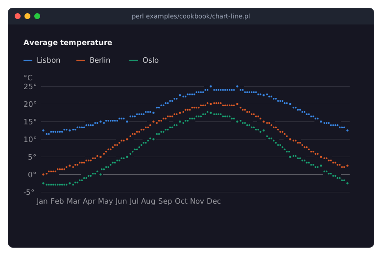
labelsnames the categories along the x axis. Each series'datais then a plain list of numbers, and the first number belongs to the first label, the second to the second, and so on. Withoutlabels, a line chart numbers the points 0, 1, 2 and so on, on a numeric x axis.Every series is a hash with a
nameand itsdata. The name is shown in the legend and reported by hover events, so it must be unique within the chart. The series take the colors of the palette in order (blue, orange, aqua, ...); give a series acolorto choose one yourself. See "Colors and themes" in Term::Fabulous::Widget::Chart.points => 1draws a dot on every data point. Given to the chart, it applies to every series that does not set it itself. The same holds for the other series options a chart takes, such ascurve,line_styleandmarker.The
y_axishash describes the y axis. Itstitleis written above the values. Itsformatwrites the tick labels: a string with a%is asprintfformat,si,integerandpercentare named formats, and a code reference formats each value itself; see Term::Fabulous::Chart::Format. Thex_axishash takes the same keys; the axis keys section of XYChart lists them all.A line chart's y axis spans the data, here from below 0 (Oslo in January) to the warmest month; it does not have to include 0. Give the
y_axisaminand amax, orzero => 1, to choose the range yourself.The legend appears at the top because the chart has more than one series: with
legend => 'auto', the default, a chart with a single series shows no legend, and its title names the series. Moving the mouse over a line or its legend entry emphasizes the series and fades the others.The program says
use utf8because its source contains the degree sign. Without it, Perl reads the sign as two bytes, and the labels come out wrong. See "Show non-ASCII text (umlauts, CJK, combining accents)" in Term::Fabulous::Cookbook::GettingStarted.
Grouped, stacked and horizontal bars (BarChart)
Goal: compare values per category in the three common forms of bar charts: bars side by side, bars stacked to a total, and horizontal bars for long category names.
This program is shipped as examples/cookbook/chart-bars.pl.
use v5.32;
use warnings;
use feature 'signatures';
no warnings 'experimental::signatures';

use Term::Fabulous;
use Term::Fabulous::Widget::BarChart;
use Term::Fabulous::Widget::Box;
use Clay::XS qw(sizing_grow sizing_percent CLAY_TOP_TO_BOTTOM);

my $root = Term::Fabulous::Widget::Box->new(
	layout => {
		layout_direction => CLAY_TOP_TO_BOTTOM,
		sizing           => { width => sizing_grow(), height => sizing_grow() },
		padding          => { left  => 2, right => 2, top => 1, bottom => 1 },
		child_gap        => 1,
	},
);
my $top = Term::Fabulous::Widget::Box->new( layout => { sizing => { width => sizing_grow(), height => sizing_percent(0.6) }, child_gap => 4 } );
$root->add_child($top);

my @weekdays = qw(Mon Tue Wed Thu Fri);

# Several series side by side in each category, with their values.
$top->add_child(
	Term::Fabulous::Widget::BarChart->new(
		title        => 'Orders',
		labels       => \@weekdays,
		value_labels => 1,
		series       => [ { name => 'Shop', data => [ 18, 24, 21, 30, 34 ] }, { name => 'App', data => [ 12, 15, 19, 17, 26 ] } ],
	)
);

# The same kind of data on top of each other: the total and its parts.
$top->add_child(
	Term::Fabulous::Widget::BarChart->new(
		title   => 'Support tickets',
		labels  => \@weekdays,
		stacked => 1,
		series  => [
			{ name => 'Closed',  data => [ 9, 11, 10, 12, 14 ] },
			{ name => 'Pending', data => [ 3, 2,  4,  3,  5 ] },
			{ name => 'Open',    data => [ 5, 7,  3,  8,  6 ] },
		],
	)
);

# Horizontal bars leave room for long category names.
$root->add_child(
	Term::Fabulous::Widget::BarChart->new(
		title        => 'Top pages (views)',
		horizontal   => 1,
		value_labels => 1,
		labels       => [ '/pricing', '/docs/getting-started', '/blog/release-2-0', '/contact' ],
		series       => [ { name => 'Views', data => [ 8240, 6120, 4975, 1310 ], color => '#9085e9' } ],
	)
);

Term::Fabulous->new( root => $root, width => 100, height => 34 )->run;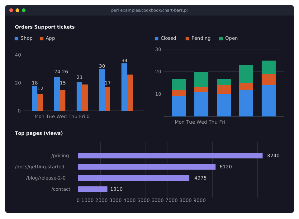
A bar chart draws one bar per value in the slot of its category. With several series, the bars of a category stand side by side, in the order of the series. Together they take
bar_widthof the slot (0.7 by default), so a gap separates the categories.value_labels => 1writes the value of every bar above it, or to its right in a horizontal chart. A plot of six rows or more keeps a row free above the highest bar for them. A label that would touch one drawn before it is left out, so narrow bars may lose some of theirs: in the picture, the App bar of Wednesday has no label. See "Value labels" in Term::Fabulous::Widget::XYChart.stacked => 1puts the bars of a category on top of each other, the first series at the bottom: the stack is the total, its parts are the series. Stack only parts of one whole; withvalue_labels, a stack shows its total. To show shares instead of amounts, usestacked => 'percent'; see "Stacked areas and shares of 100% (AreaChart)" and "STACKING" in Term::Fabulous::Widget::XYChart.Bars grow from 0, so the y axis of a bar chart includes 0 by default: bars that start above 0 make small differences look large. Give the
y_axiszero => 0only if you really want that.horizontal => 1turns the bars on their side: the categories go down the left, the values along the bottom. They_axishash still describes the values and thex_axishash the categories, wherever they are drawn. The category labels take at most a third of the chart's width; longer ones are cut. A horizontal chart shows only bar series: adding a line or area series to it dies. See "Horizontal bars" in Term::Fabulous::Widget::XYChart.The horizontal chart has a single series, so it shows no legend (the title names it), and its
colorreplaces the palette's first color.The box at the top takes 60% of the height (
sizing_percent(0.6)) and its two charts share its width; the horizontal chart takes the rest of the height. The charts themselves need nosizing: they grow.
Show shares as a pie or donut (PieChart, DonutChart)
Goal: show how a whole splits into parts: a pie chart of disk usage, and a donut chart of sales by region, with the small regions folded together and the number of orders in the middle.
This program is shipped as examples/cookbook/chart-pie.pl.
use v5.32;
use warnings;
use feature 'signatures';
no warnings 'experimental::signatures';

use Term::Fabulous;
use Term::Fabulous::Widget::Box;
use Term::Fabulous::Widget::DonutChart;
use Term::Fabulous::Widget::PieChart;
use Clay::XS qw(sizing_grow);

my $root = Term::Fabulous::Widget::Box->new(
	layout => {
		sizing    => { width => sizing_grow(), height => sizing_grow() },
		padding   => { left  => 2, right => 2, top => 1, bottom => 1 },
		child_gap => 4,
	},
);

# Values with labels from a separate array; the largest slice first.
my $pie = Term::Fabulous::Widget::PieChart->new(
	title  => 'Disk usage',
	labels => [qw(Photos Music Documents System Other)],
	data   => [ 182, 64, 21, 48, 9 ],
	sort   => 'desc',
	legend => 'bottom',
);

# [ label, value ] pairs; slices below 5 % are folded into "Other",
# the legend shows amounts, and the middle says what the total is.
my $donut = Term::Fabulous::Widget::DonutChart->new(
	title         => 'Sales by region',
	data          => [ [ Europe => 412 ], [ 'North America' => 365 ], [ Asia => 290 ], [ 'South America' => 44 ], [ Africa => 21 ], [ Oceania => 18 ] ],
	other         => 0.05,
	other_label   => 'Rest of world',
	legend_values => 'value',
	format        => '%dk',
	center_text   => "1150k\norders",
	legend        => 'bottom',
);
$root->add_child( $pie, $donut );

Term::Fabulous->new( root => $root, width => 100, height => 26 )->run;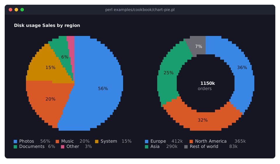
The
dataof a pie takes three forms: plain numbers named by a separatelabelsarray (the pie),[ label, value ]pairs (the donut), or hashes withlabel,valueandcolor. Every label must be unique, and values must be 0 or more. See "Data" in Term::Fabulous::Widget::PieChart.The first slice starts at 12 o'clock and the slices follow clockwise.
sort => 'desc'puts the largest slice first, which makes a pie much easier to read; withoutsort, the slices keep the order of the data.start_angleturns the whole pie by a number of degrees.A pie writes the percentage on every slice that has room for it (
slice_labels), and the legend lists the percentages as well (legend_values). Pie, donut and polar area charts put the legend on the right by default;legend => 'bottom'takes rows instead of columns from the circle, which suits two charts side by side.other => 0.05folds all slices below 5% of the total into one slice, drawn in a neutral gray and labeled withother_label(Otherby default). It folds only when at least two slices are that small: here South America, Africa and Oceania become "Rest of world". The data itself keeps all six regions.legend_values => 'value'shows the amounts in the legend instead of the percentages;bothshows both,noneneither.formatwrites the amounts, here withsprintfand the suffixk.A Term::Fabulous::Widget::DonutChart is a pie with a
holeof 0.6 of the radius. The hole shows the total and the wordTotal, and, while the mouse pointer is on a slice, that slice's share and label.center_textreplaces both with text of your own;\nseparates its lines, and the first line is bold. The text stays as it is: when the data changes, set it again with$donut->center_text(...). See "The text in the hole" in Term::Fabulous::Widget::DonutChart.
A scatter plot with trend lines (ScatterPlot)
Goal: show how two measurements relate, here the length and width of the petals of three species of flowers, with a trend line through two of the species.
This program is shipped as examples/cookbook/chart-scatter.pl.
use v5.32;
use warnings;
use feature 'signatures';
no warnings 'experimental::signatures';

use Term::Fabulous;
use Term::Fabulous::Widget::Box;
use Term::Fabulous::Widget::ScatterPlot;
use Clay::XS qw(sizing_grow);

my $root = Term::Fabulous::Widget::Box->new(
	layout => {
		sizing  => { width => sizing_grow(), height => sizing_grow() },
		padding => { left  => 2, right => 2, top => 1, bottom => 1 },
	},
);

# Measurements of three species: [ x, y ] pairs, both numbers.
srand 11;

sub flowers ( $count, $length, $width, $slope ) {
	return map {
		my $petal = $length + ( rand() - 0.5 ) * 2;
		[ $petal, $width + $slope * ( $petal - $length ) + ( rand() - 0.5 ) * 0.7 ];
	} 1 .. $count;
}

my $plot = Term::Fabulous::Widget::ScatterPlot->new(
	title  => 'Petal size',
	x_axis => { title => 'length (cm)', grid => 'dotted' },
	y_axis => { title => 'width (cm)' },
	series => [
		{ name => 'Setosa',     data => [ flowers( 15, 1.5, 0.4, 0.1 ) ] },
		{ name => 'Versicolor', data => [ flowers( 15, 4.3, 1.3, 0.4 ) ], trend => 1 },
		{ name => 'Virginica',  data => [ flowers( 15, 5.6, 2.0, 0.3 ) ], trend => 1, point => "\x{25C6}" },
	],
);
$root->add_child($plot);

Term::Fabulous->new( root => $root, width => 80, height => 24 )->run;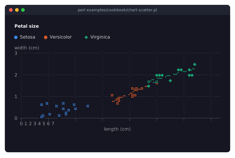
Every data point is an
[ x, y ]pair of numbers, and the x axis is a numeric axis. A scatter plot draws the points only, without lines between them, so their order does not matter.By default a point is a small square of Braille dots.
pointtakes a character instead, here a diamond, written as"\x{25C6}"so the source stays ASCII; the legend shows it too. A character fills a whole cell, so it is placed less precisely than dots.point => 'dot'draws a single Braille dot, for many points. See "Points" in Term::Fabulous::Widget::XYChart.trend => 1draws the least-squares straight line through the series' points, dashed and in the series' color, from its smallest to its largest x. It shows the direction of a relation, not whether the relation is really a straight line. A trend line is easiest to see when the points scatter around it, as here; in a dense cloud of points of the same color it is hard to tell apart.grid => 'dotted'in thex_axisadds dotted vertical lines at the x ticks. The y axis has solid horizontal grid lines by default; agridtakes0,1(solid),solid,dashedordotted. Thetitleof the x axis is centered below it, that of the y axis is written above the values.srand 11makes the made-up measurements the same on every run, so the picture stays the same. Real programs leave it out.Neither axis of a scatter plot has to include 0. Here the axes start at 0 only because 0 is the nearest round tick below the smallest values.
Stacked areas and shares of 100% (AreaChart)
Goal: show how parts make up a total over the years: once as amounts that add up to the total, once as each part's share of it.
This program is shipped as examples/cookbook/chart-stacked-areas.pl.
use v5.32;
use warnings;
use feature 'signatures';
no warnings 'experimental::signatures';

use Term::Fabulous;
use Term::Fabulous::Widget::AreaChart;
use Term::Fabulous::Widget::Box;
use Clay::XS qw(sizing_grow);

my $root = Term::Fabulous::Widget::Box->new(
	layout => {
		sizing    => { width => sizing_grow(), height => sizing_grow() },
		padding   => { left  => 2, right => 2, top => 1, bottom => 1 },
		child_gap => 4,
	},
);

my @years  = 2016 .. 2026;
my @series = (
	{ name => 'Coal',  data => [ 41, 40, 38, 37, 35, 36, 35, 33, 31, 29, 27 ] },
	{ name => 'Gas',   data => [ 22, 23, 23, 24, 24, 23, 22, 22, 22, 21, 21 ] },
	{ name => 'Wind',  data => [ 7,  8,  9,  10, 12, 12, 14, 16, 17, 19, 21 ] },
	{ name => 'Solar', data => [ 2,  2,  3,  3,  4,  5,  6,  8,  10, 12, 14 ] },
);

# The parts add up to the total...
$root->add_child(
	Term::Fabulous::Widget::AreaChart->new(
		title   => 'Electricity (TWh)',
		labels  => \@years,
		stacked => 1,
		curve   => 'monotone',
		series  => \@series,
	)
);

# ... or to 100 %: each part's share of the total, year by year.
$root->add_child(
	Term::Fabulous::Widget::AreaChart->new(
		title   => 'Share of the mix',
		labels  => \@years,
		stacked => 'percent',
		curve   => 'monotone',
		legend  => 'none',
		series  => \@series,
	)
);

Term::Fabulous->new( root => $root, width => 100, height => 22 )->run;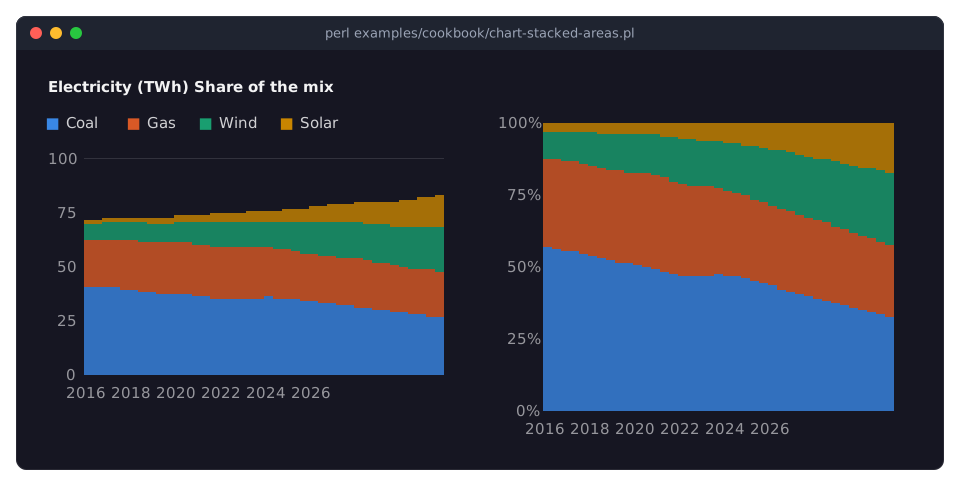
An area chart fills the room between each series and the baseline. With
stacked => 1, every series lies on the one before it, the first at the bottom, and the top edge of the last series is the total. The order matters: put the steadiest series at the bottom, because the shapes of the others are read against a moving floor.stacked => 'percent'divides every value by the total of its year, so the stack always reaches 100%. It shows how the shares change, and hides how the total changes; show both, as here, when both matter. The y axis writes its labels as percentages unless it has aformatof its own. See "STACKING" in Term::Fabulous::Widget::XYChart.Areas that are not stacked overlap, so they are translucent; stacked areas do not, so they are filled more densely.
fill_opacity(0 to 1) sets the opacity yourself, for a series or the whole chart.curve => 'monotone'draws smooth edges that never overshoot the data, so a stack shows no bump that is not in the numbers. See "Connect points with curves and easings (curve)" in Term::Fabulous::Cookbook::ChartStyles.The years are
labels, so they are categories, evenly spaced. As[ x, y ]points with the years as x values, they would be numbers on a numeric axis instead.The second chart has the same series in the same order, so its colors match the first chart's legend;
legend => 'none'saves its rows. Both charts take the same@series: a chart copies the series hashes and their data when it adds them, so the two charts share nothing, and changing the data of one later does not change the other.
How values are distributed (Histogram)
Goal: show how 600 exam scores are distributed: how many fall into each range of points, and what share of the students scored below the end of each range.
This program is shipped as examples/cookbook/chart-histogram.pl.
use v5.32;
use warnings;
use feature 'signatures';
no warnings 'experimental::signatures';

use Term::Fabulous;
use Term::Fabulous::Widget::Box;
use Term::Fabulous::Widget::Histogram;
use Clay::XS qw(sizing_grow);

my $root = Term::Fabulous::Widget::Box->new(
	layout => {
		sizing    => { width => sizing_grow(), height => sizing_grow() },
		padding   => { left  => 2, right => 2, top => 1, bottom => 1 },
		child_gap => 4,
	},
);

# 600 exam scores from 0 to 100, most of them around 62 points.
srand 5;
my @scores = map { 62 + 14 * ( rand() + rand() + rand() - 1.5 ) * 1.4 } 1 .. 600;

# Bins chosen from the data...
$root->add_child(
	Term::Fabulous::Widget::Histogram->new(
		title  => 'Exam scores',
		x_axis => { title => 'points' },
		series => [ { name => 'Students', data => \@scores } ],
	)
);

# ... or fixed, 10 points wide from 0 to 100, counted up as percentages.
$root->add_child(
	Term::Fabulous::Widget::Histogram->new(
		title      => 'Share below ... points',
		bin_width  => 10,
		range      => [ 0, 100 ],
		measure    => 'percent',
		cumulative => 1,
		x_axis     => { title => 'points' },
		series     => [ { name => 'Students', data => \@scores, color => '#199e70' } ],
	)
);

Term::Fabulous->new( root => $root, width => 100, height => 20 )->run;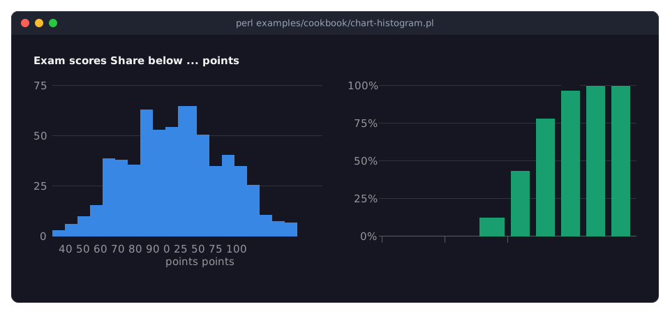
A histogram takes the observations themselves, plain numbers, not counts: it sorts them into bins and draws one bar per bin on a numeric x axis. Narrow bins touch each other; bins of four columns or more keep a gap of one column at their right, so the bars stay apart, as in the right chart.
[ x, y ]points are an error here.Without
binsorbin_width, the bins are chosen from the data: their width follows the spread of the values (the Freedman-Diaconis rule), rounded to 1, 2, 2.5 or 5 times a power of ten, with at most about 50 bins.bins => 20asks for 20 equal bins between the smallest and the largest value;bin_widthfixes the width. A histogram has at most 1000 bins: abin_widthtoo small for the data widens to a round width that needs no more.range => [ 0, 100 ]fixes where the bins start and end, so the chart covers all possible scores, also those nobody reached. Values outside the range are not counted.measuredecides what a bar shows:count(the default),percent(the share of the series' observations; the y axis writes percentages) ordensity(the share per unit of x, which keeps bins of different widths comparable).cumulative => 1adds up: every bar shows its bin and all bins before it, so the last bar reaches 100%. A bin includes its lower edge and excludes its upper one (the last bin includes both), so the bar of the bin from 60 to 70 shows the share of the scores below 70.Several series in one histogram are drawn over each other, translucent, so both distributions stay visible; the picture on Term::Fabulous::Widget::Histogram shows two. The class page also describes
bin_edges, which returns the edges of the bins the chart uses.
Compare profiles on radar and polar area charts (RadarChart, PolarAreaChart)
Goal: compare the strengths of several profiles over the same categories at a glance, and show one value per category as slices whose length is the value.
This program is shipped as examples/cookbook/chart-radar.pl.
use v5.32;
use warnings;
use feature 'signatures';
no warnings 'experimental::signatures';

use Term::Fabulous;
use Term::Fabulous::Widget::Box;
use Term::Fabulous::Widget::PolarAreaChart;
use Term::Fabulous::Widget::RadarChart;
use Clay::XS qw(sizing_grow);

my $root = Term::Fabulous::Widget::Box->new(
	layout => {
		sizing    => { width => sizing_grow(), height => sizing_grow() },
		padding   => { left  => 2, right => 2, top => 1, bottom => 1 },
		child_gap => 2,
	},
);

# One axis per label; each series has a value per axis. A 'line' series
# is not filled.
$root->add_child(
	Term::Fabulous::Widget::RadarChart->new(
		title  => 'Player stats',
		labels => [qw(Pace Shooting Passing Dribbling Defense Physical)],
		min    => 0,
		max    => 100,
		grid   => 'circle',
		series => [
			{ name => 'Striker',  data => [ 89, 91, 72, 86, 38, 77 ] },
			{ name => 'Defender', data => [ 71, 45, 68, 62, 90, 86 ] },
			{ name => 'Average',  data => [ 70, 60, 65, 66, 60, 70 ], type => 'line', line_style => 'dashed', color => '#898781' },
		],
	)
);

# Slices of equal angle; their length shows the value.
$root->add_child(
	Term::Fabulous::Widget::PolarAreaChart->new(
		title       => 'Rain per season (mm)',
		data        => [ [ Spring => 170 ], [ Summer => 210 ], [ Autumn => 260 ], [ Winter => 190 ] ],
		start_angle => -45,
	)
);

Term::Fabulous->new( root => $root, width => 100, height => 26 )->run;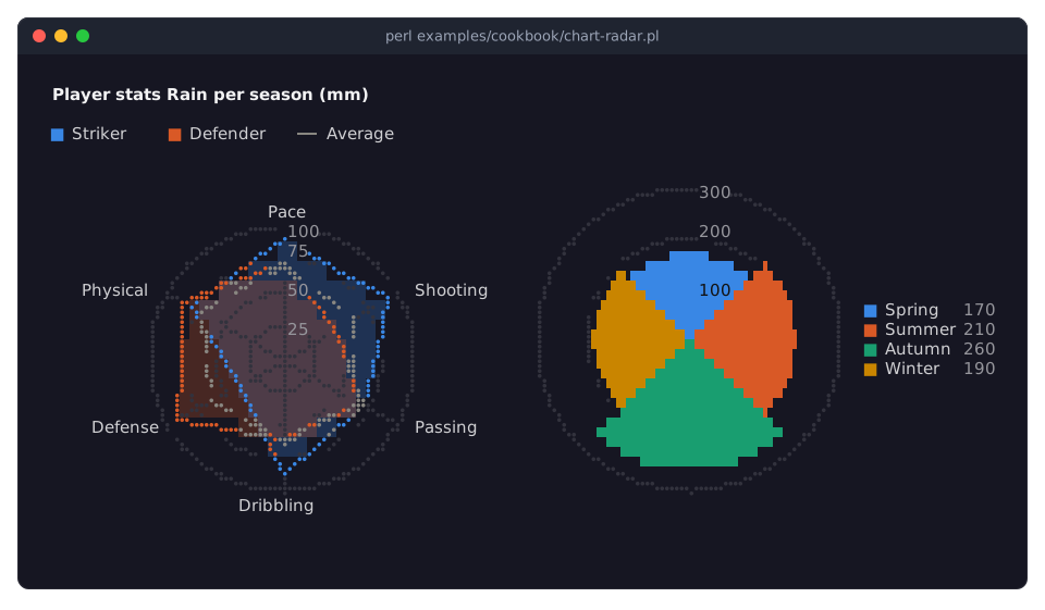
A Term::Fabulous::Widget::RadarChart has one axis per label, from the center outwards, and needs at least three. Each series has one value per label, in the order of the labels.
min => 0andmax => 100fix the scale, so the shapes are measured against the whole range of the ratings, not only against the values that occur. Without them, the center is 0 (unless a value is negative) and the outer ring is a round value at or above the largest one. See "CONSTRUCTOR" in Term::Fabulous::Widget::RadarChart.The series of a radar chart are filled shapes by default, translucent so the others show through.
type => 'line'draws only the outline: here a dashed gray average as a reference. More than two or three filled shapes cover each other; moving the mouse over one emphasizes it.grid => 'circle'draws the rings of the scale as circles; the defaultpolygonconnects the spokes with straight lines, andnonedraws no rings.A Term::Fabulous::Widget::PolarAreaChart takes its data like a pie, but every slice has the same angle, and its length shows its value. Rings mark the scale, with their values along the line to 12 o'clock, and the legend lists the values.
start_angleturns the slices clockwise by a number of degrees. With four slices of 90 degrees,-45centers the first slice (Spring) on 12 o'clock, so the seasons point up, right, down and left.The length of a slice is its value, so its area grows with the square of the value: a slice of twice the value looks four times as large. Use a bar chart when the reader has to compare values exactly.
Show sparklines in table cells (Sparkline)
Goal: a table of stocks with a small chart of the month's prices in every row, green when the price rose and red when it fell.
This program is shipped as examples/cookbook/chart-sparklines.pl.
use v5.32;
use warnings;
use feature 'signatures';
no warnings 'experimental::signatures';

use Term::Fabulous;
use Term::Fabulous::Widget::Box;
use Term::Fabulous::Widget::Sparkline;
use Term::Fabulous::Widget::Table;
use Term::Fabulous::Widget::Table::Mutator qw(sprintf_format);
use Clay::XS qw(sizing_grow CLAY_TOP_TO_BOTTOM);

# Daily closing prices of four stocks over 30 days.
srand 9;

sub prices ( $start, $drift ) {
	my $price = $start;
	return [ map { $price *= 1 + $drift + ( rand() - 0.5 ) * 0.04 } 1 .. 30 ];
}
my @stocks = (
	{ symbol => 'ACME', name => 'Acme Corp.',       prices => prices( 112,  0.004 ) },
	{ symbol => 'GLBX', name => 'Globex',           prices => prices( 48,  -0.003 ) },
	{ symbol => 'INIT', name => 'Initech',          prices => prices( 230,  0.001 ) },
	{ symbol => 'UMBR', name => 'Umbrella Holding', prices => prices( 75,   0.006 ) },
);
$_->{last}   = $_->{prices}[-1]                                 foreach @stocks;
$_->{change} = ( $_->{prices}[-1] / $_->{prices}[0] - 1 ) * 100 foreach @stocks;

my $root = Term::Fabulous::Widget::Box->new(
	layout => {
		layout_direction => CLAY_TOP_TO_BOTTOM,
		sizing           => { width => sizing_grow(), height => sizing_grow() },
		padding          => { left  => 2, right => 2, top => 1, bottom => 1 },
	},
);

# A column whose cells are sparklines of the row's prices, green or red
# by the change over the month. Prices are far from 0, so the areas span
# the prices instead of growing from 0.
my $table = Term::Fabulous::Widget::Table->new(
	id           => 'stocks',
	row_id       => 'symbol',
	border       => 'Outer',
	column_lines => 'none',
	header_line  => 'none',
	stripe_color => '#1c2029',
	rows         => \@stocks,
	columns      => [
		{ key => 'symbol', title => 'Symbol' },
		{ key => 'name',   title => 'Name' },
		{ key => 'last',   title => 'Last',    type => 'number', mutator => sprintf_format('%.2f') },
		{ key => 'change', title => '30 days', type => 'number', mutator => sprintf_format('%+.1f%%') },
		{
			key        => 'prices',
			title      => 'Trend',
			width      => 'fixed(30)',
			sortable   => 0,
			filterable => 0,
			cell       => sub ($cell) {
				my $row = $cell->{row};
				return Term::Fabulous::Widget::Sparkline->new( type => 'area', zero => 0, values => $row->{prices}, color => $row->{change} >= 0 ? '#1baf7a' : '#e66767' );
			},
		},
	],
);
$root->add_child($table);

Term::Fabulous->new( root => $root, width => 90, height => 12 )->run;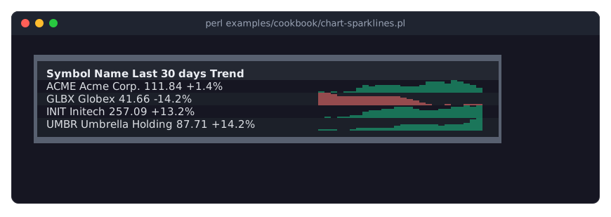
The
cellcode of thepricescolumn returns a widget for every row: a sparkline of the row's prices. The table puts it into the cell, which gives it the cell's background. See "CELL WIDGETS" in Term::Fabulous::Manual::Tables.A sparkline is one row high and as wide as its parent lets it be, here the 30 columns of
width => 'fixed(30)'.typeisline(the default),areaorbar;valuestakes the numbers andcolorthe color, here chosen per row from the change over the month.The column's values are array references, which cannot be sorted or filtered as text:
sortable => 0andfilterable => 0turn that off for the column. The other columns sort and filter as usual.Every sparkline fits its scale to its own values, so it shows the movement of its stock, not how the prices of the rows compare. Give the sparklines the same
minandmaxto compare the rows.An
areaorbarsparkline grows from 0, alinesparkline spans its values. For values far from 0, such as these prices, the changes would take only a small part of the row, sozero => 0makes the areas span their values as a line does; aminnear the lowest value sets the bottom by hand instead.To show a sparkline outside a table, add it to a box like any widget;
$sparkline->add_values(@new)appends values, and withmax_pointsthe oldest go. See Term::Fabulous::Widget::Sparkline and, for a sparkline in a printed report, "Print charts in a report (Static)" in Term::Fabulous::Cookbook::ChartTechniques.
SEE ALSO
This page is part of Term::Fabulous::Cookbook. Previous page: Term::Fabulous::Cookbook::TableStyles. Next page: Term::Fabulous::Cookbook::ChartTechniques.