NAME
Term::Fabulous::Widget::Table::ColumnChooser - The list where the user picks the columns of a table
DESCRIPTION
A box that floats over the top right corner of a Term::Fabulous::Widget::Table with a check box for every column: checking or unchecking one (Space, Enter or a click) shows or hides the column at once. Tab and Shift+Tab move between the check boxes. Escape closes it, and so does moving the focus out of it (Tab past the last check box, a click elsewhere). The table opens it (see "open_column_chooser" in Term::Fabulous::Widget::Table) and focuses its first check box. The user opens it with c on the column titles or a right click on a title.
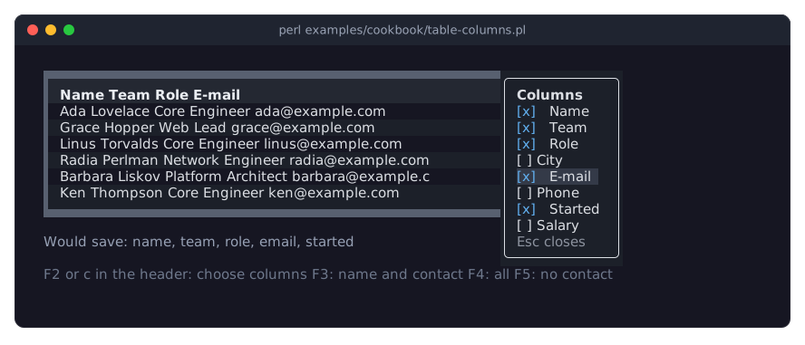
It shows the title Columns, one check box per column (labeled with the column's title, or its key when the title is empty) and the hint Esc closes. The table draws it on its group_background_color with a round frame in its text_color, and fires Term::Fabulous::Event::ColumnsChange for every column the user shows or hides. See "Choosing the visible columns" in Term::Fabulous::Manual::Tables and the recipe "Let the user choose the visible columns (column chooser)" in Term::Fabulous::Cookbook::Tables.
CONSTRUCTOR
my $chooser = Term::Fabulous::Widget::Table::ColumnChooser->new(
	columns   => [ [ name => 'Name', 1 ], [ email => 'E-mail', 0 ] ],
	on_toggle => sub ( $key, $visible ) { ... },
	on_close  => sub () { ... },
);
The table makes the chooser itself. It is a Term::Fabulous::Widget::Box that floats over the top right corner of its parent; the parameters of a Box (colors, border) work too. Unknown parameters die.
columns-
Required. An array reference with one
[ $key, $title, $visible ]entry per column, in order. on_toggle-
Required. A code reference, called with the column key and the new state (1 shown, 0 hidden) when the user checks or unchecks a box.
on_close-
Required. A code reference, called when the user presses
Escapeor the focus leaves the chooser. It must remove the chooser. text_color-
The color of the title and the check boxes. Default:
[220, 223, 228, 255]; the table passes itstext_color. muted_color-
The color of the closing hint. Default:
[140, 146, 158, 255]; the table passes itsmuted_color.
METHODS
checkboxes
The Term::Fabulous::Widget::Checkbox widgets, one per column.
focus_first
Gives the focus to the first check box.
SEE ALSO
Term::Fabulous::Widget::Table, "In the column chooser" in Term::Fabulous::Widget::Table.