NAME
Term::Fabulous::Widget::Checkbox - A box the user can check and uncheck
SYNOPSIS
use Clay::UI::Enum::Result;
use Term::Fabulous::Widget::Checkbox;

my $terms = Term::Fabulous::Widget::Checkbox->new(
	id    => 'terms',
	label => 'I accept the terms',
);
$terms->on( Change => sub ($event) {
	say $event->value ? "accepted" : "declined";
	return Clay::UI::Enum::Result->CONTINUE;
} );

say $terms->checked ? 'accepted' : 'not accepted';
$terms->checked(1);    # programmatic: fires no Change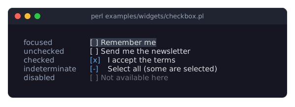
DESCRIPTION
The picture shows a checkbox in each of its states: focused (on the focus_background_color), unchecked, checked, indeterminate and disabled. The program is examples/widgets/checkbox.pl.
A checkbox shows a mark followed by a label:
[x] I accept the terms
[ ] Send me the newsletter
[-] Some of the items
The user toggles it with Space, Enter or a mouse click. Its value is 1 (checked) or 0 (unchecked).
A checkbox can also be indeterminate: it then shows the indeterminate mark ([-]) whatever checked says, which is useful for a box that stands for a group of other boxes, some checked and some not. Toggling an indeterminate box checks it.
Disabling, colors, focus and sizing are described in Term::Fabulous::Widget::Input. The checkbox is one row high and as wide as its widest mark plus a space and the label, unless the layout sizes it.
CONSTRUCTOR
new
my $checkbox = Term::Fabulous::Widget::Checkbox->new(%parameters);Accepts the parameters of "CONSTRUCTOR" in Term::Fabulous::Widget::Input (id, layout, background_color, the border parameters, disabled, can_focus, text_color, disabled_color, accent_color, focus_background_color, the other Box parameters) and the ones below. Unknown parameters die.
label-
A character string. Default:
''(no label, only the mark). The text after the mark, painted intext_color. Dies if not a string. checked-
A boolean. Default: 0. Whether the box starts checked. Stored as 1 or 0; a reference dies.
indeterminate-
A boolean. Default: 0. Whether the box starts indeterminate (see "DESCRIPTION"). Stored as 1 or 0; a reference dies.
checked_mark-
A character string. Default:
'[x]'. The mark of a checked box, painted inaccent_color. Dies if not a string. unchecked_mark-
A character string. Default:
'[ ]'. The mark of an unchecked box, painted intext_color. Dies if not a string. indeterminate_mark-
A character string. Default:
'[-]'. The mark of an indeterminate box, painted inaccent_color. Dies if not a string.
The label is painted after the width of the widest mark, so it stays in place when the box is toggled, even with marks of different widths.
METHODS
The methods of "METHODS" in Term::Fabulous::Widget::Input (disabled, is_enabled, the color accessors, mark_changed), plus:
checked
my $is_checked = $checkbox->checked;
$checkbox->checked(1);
Accessor. Returns 1 or 0. Writing sets the state, clears indeterminate, marks the input changed, and returns the new state. Writing fires no Change event. A reference dies and leaves the state unchanged.
value
my $is_checked = $checkbox->value;The same as reading checked: 1 or 0. Read-only; use checked to change the state. This is the value Change events carry.
A required checkbox (see "required" in Term::Fabulous::Widget::Input) counts as empty while it is unchecked, so it is invalid until the user checks it: the way to insist on accepted terms. While it is invalid, its box and its label are drawn in invalid_color, a red by default (see "Invalid values" in Term::Fabulous::Widget::Input).
indeterminate
my $is_indeterminate = $checkbox->indeterminate;
$checkbox->indeterminate(1);
Accessor. Returns 1 or 0. Writing marks the input changed, returns the new state and fires no event; it does not change checked, so $checkbox->indeterminate(0) shows the checked state again. A reference dies and leaves the state unchanged.
toggle
$checkbox->toggle;Toggles the box as the user does: an unchecked or indeterminate box becomes checked, a checked box becomes unchecked, indeterminate is cleared, and a Change event is fired. Works even while the box is disabled. Returns the checkbox.
label
my $label = $checkbox->label;
$checkbox->label('Remember me');
Accessor for the label. Writing marks the input changed and returns the new label; the new width takes effect at the next frame. A value that is not a string dies and leaves the label unchanged.
checked_mark
my $mark = $checkbox->checked_mark;
$checkbox->checked_mark('[*]');
Accessor for the checked_mark parameter. Writing marks the input changed and returns the new mark. A value that is not a string dies and leaves the mark unchanged.
unchecked_mark
$checkbox->unchecked_mark('[_]');Accessor for the unchecked_mark parameter; works like "checked_mark".
indeterminate_mark
$checkbox->indeterminate_mark('[~]');Accessor for the indeterminate_mark parameter; works like "checked_mark".
KEYS
While the checkbox has the focus and is enabled:
Space,Enter-
Toggle the box (see "toggle").
All other keys bubble to the ancestors.
MOUSE
A click (left button pressed and released over the checkbox, mark or label) toggles it and focuses it.
EVENTS
Change-
Term::Fabulous::Event::Change when the user toggles the box (or "toggle" is called);
$event->valueis 1 (now checked) or 0 (now unchecked). It bubbles to the ancestors.
KDL PROPERTIES
The properties of "KDL PROPERTIES" in Term::Fabulous::Widget::Input, plus label (a string), checked and indeterminate (#true / #false), and checked_mark, unchecked_mark and indeterminate_mark (strings):
use Term::Fabulous::Widget::Checkbox as Checkbox

Checkbox "newsletter" {
	label "Send me the newsletter"
	checked #true
}
EXAMPLES
A "select all" box for a group of boxes
my @items = map { Term::Fabulous::Widget::Checkbox->new( label => $_ ) } qw(Apples Pears Plums);
my $all   = Term::Fabulous::Widget::Checkbox->new( label => 'All fruit' );

sub update_all () {
	my $checked = grep { $_->checked } @items;
	if    ( $checked == 0 )      { $all->checked(0) }
	elsif ( $checked == @items ) { $all->checked(1) }
	else                         { $all->indeterminate(1) }
	return;
}

$_->on( Change => sub ($event) { update_all(); return } ) foreach @items;
$all->on( Change => sub ($event) {
	$_->checked( $event->value ) foreach @items;    # fires no Change
	return;
} );
Ballot-box marks
All three marks are one column wide, so the label never moves (see "CONSTRUCTOR").
my $box = Term::Fabulous::Widget::Checkbox->new(
	label              => 'Done',
	checked_mark       => "\x{2611}",    # BALLOT BOX WITH CHECK
	unchecked_mark     => "\x{2610}",    # BALLOT BOX
	indeterminate_mark => "\x{25A3}",    # WHITE SQUARE CONTAINING BLACK SMALL SQUARE
);
SEE ALSO
Term::Fabulous::Widget::Input, Term::Fabulous::Event::Change, the checkbox section of the forms guide, "Disable inputs until a checkbox is checked" in Term::Fabulous::Cookbook::Forms.