NAME
Term::Fabulous::Cookbook::TableStyles - Recipes: column sizes, lines and colors of tables
DESCRIPTION
This page is part of Term::Fabulous::Cookbook. Previous page: Term::Fabulous::Cookbook::TableRows. Next page: Term::Fabulous::Cookbook::Charts.
The recipes on this page change the looks of a Term::Fabulous::Widget::Table: the widths, alignment and wrapping of the columns, the lines of the grid, a frame, colors and text styles for the whole table, for columns, rows and single cells, and styles that follow the data (conditional formatting). Each recipe is a complete program, shipped in examples/cookbook/, with a screenshot and notes on every feature it uses. Most recipes on Term::Fabulous::Cookbook::Tables and Term::Fabulous::Cookbook::TableRows use the look of A table with colored rows and titles.
Term::Fabulous::Manual::TableStyles explains the concepts behind these recipes: style hashes, which style wins, lines, colors and cell padding. Term::Fabulous::Manual::Tables explains rows, columns, column widths, alignment and wrapping. The reference of every parameter and method is on Term::Fabulous::Widget::Table.
The recipes on this page:
"Size, align and wrap columns (widths, wrapping, widget titles)"
"Lines and colors per row, column and cell (conditional formatting)"
"A table with colored rows and titles (block frame, no grid lines)"
"Compare the line options of a table (frames, grid lines, block frames)"
Size, align and wrap columns (widths, wrapping, widget titles)
Goal: give every column the width it needs: fixed, as wide as its content, a share of the table, or what is left over; place the content left, centered or right; let long text wrap into rows of several lines; and use a widget as a column title.
This program is shipped as examples/cookbook/table-widths.pl.
use v5.32;
use warnings;
use feature 'signatures';
no warnings 'experimental::signatures';

use Term::Fabulous;
use Term::Fabulous::Widget::Box;
use Term::Fabulous::Widget::Table;
use Term::Fabulous::Widget::Table::Mutator qw(number);
use Term::Fabulous::Widget::Text;
use Clay::XS qw(sizing_grow CLAY_TOP_TO_BOTTOM);

my @orders = (
	{ id => 1041, item => 'Desk lamp',   quantity => 2, price => 39.9, stars => 5, ship_to => "Ada Lovelace\nLondon", notes => 'Leave at the reception if nobody answers the door.' },
	{ id => 1042, item => 'Monitor arm', quantity => 1, price => 129,  stars => 4, ship_to => "Grace Hopper\nBoston", notes => 'Gift wrap.' },
	{
		id    => 1043, item => 'USB-C cable', quantity => 12, price => 8.5, stars => 3, ship_to => "Linus Torvalds\nPortland",
		notes => 'Customer asked for the black ones; call before shipping if out of stock.'
	},
);

my $root = Term::Fabulous::Widget::Box->new(
	layout => {
		layout_direction => CLAY_TOP_TO_BOTTOM,
		sizing           => { width => sizing_grow(), height => sizing_grow() },
		padding          => { left  => 2, right => 2, top => 1, bottom => 1 },
		child_gap        => 1,
	},
);

# A header cell of your own: a star and the title. The sort marker still
# follows it.
sub star_title ($column) {
	my $title = Term::Fabulous::Widget::Box->new( layout => { child_gap => 1 } );
	$title->add_child(
		Term::Fabulous::Widget::Text->new( text => "\x{2605}",     text_color => [ 229, 192, 123, 255 ] ),
		Term::Fabulous::Widget::Text->new( text => $column->title, bold => 1, text_color => [ 235, 238, 243, 255 ] ),
	);
	return $title;
}

my $table = Term::Fabulous::Widget::Table->new(
	id        => 'orders',
	row_id    => 'id',
	row_lines => 'Solid',

	# The table takes the whole width, so the grow column has room.
	layout  => { sizing => { width => sizing_grow() } },
	columns => [

		# Exactly 6 cells wide, padding included.
		{ key => 'id', title => '#', type => 'number', width => 'fixed(6)' },

		# The width the other columns leave over.
		{ key => 'item', title => 'Item', width => 'grow' },

		# A third of the table's width; the text wraps at spaces.
		{ key => 'notes', title => 'Notes', width => 'percent(33)' },

		# As wide as its widest line, but at least 16 cells; the text breaks
		# only at its newlines.
		{ key => 'ship_to', title => 'Ship to', width => 'fit(16)', wrap => 'newlines' },

		# Centered, the title too.
		{ key => 'quantity', title => 'Qty', type => 'number', align => 'center' },

		# Numbers are right-aligned; this title stays on the left.
		{ key => 'price', title => 'Price', type => 'number', header_align => 'left', mutator => number( decimals => 2 ) },

		# A widget as the title.
		{ key => 'stars', title => 'Rating', type => 'number', header => \&star_title, mutator => sub ( $stars, $row ) { "\x{2605}" x $stars } },
	],
	rows => \@orders,
);

my $help = Term::Fabulous::Widget::Text->new(
	text       => 'Resize the terminal: Item takes the width left over, Notes stays a third of the table and wraps.',
	text_color => [ 110, 120, 140, 255 ],
);
$root->add_child( $table, $help );

my $ui = Term::Fabulous->new( root => $root, width => 110, height => 24 );
$ui->interaction->set_focused_widget($table);
$ui->run;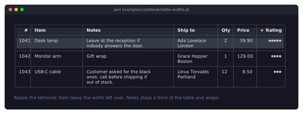
The picture shows the program in a terminal 110 columns wide.
widthtakes'fixed(N)','fit'(the default),'fit(MIN)','fit(MIN, MAX)','grow','grow(MIN, MAX)'and'percent(P)', in terminal cells and including the cell padding. See "Column widths" in Term::Fabulous::Manual::Tables.Itemis'grow': it takes the width the other columns leave over. A grow or percent column only has room when the table is wider than its columns need, so the table haslayout => { sizing => { width => sizing_grow() } }and fills the width of the root box.Notesis'percent(33)', a third of the table's width. Its text is wider, so it wraps at spaces (wrap => 'words', the default), and the row grows: every row is as high as its tallest cell. See "Wrapping and row height" in Term::Fabulous::Manual::Tables.Ship tohaswrap => 'newlines': its text breaks only at the\nin the data, never at spaces.'fit(16)'keeps it at least 16 cells wide.Number columns are right-aligned.
Qtyis centered withalign => 'center', and its title follows, becauseheader_aligndefaults toalign;Pricekeeps its numbers on the right and puts its title on the left withheader_align => 'left'. See "Alignment" in Term::Fabulous::Manual::Tables.row_lines => 'Solid'draws a line between the rows, which makes rows of several lines easy to tell apart. See "Lines between and around the cells" in Term::Fabulous::Manual::TableStyles.The
headercode reference ofRatingreturns the widget of the title cell, here a star and the title; the sort marker still follows it. See "Widgets as column titles" in Term::Fabulous::Manual::Tables.
Lines and colors per row, column and cell (conditional formatting)
Goal: a budget table with a heavy line before one column, dashed lines between its cells, red and green amounts, a grayed-out row and a totals row under a double line.
This program is shipped as examples/cookbook/table-lines.pl.
use v5.32;
use warnings;
use feature 'signatures';
no warnings 'experimental::signatures';

use List::Util qw(sum);
use Term::Fabulous;
use Term::Fabulous::Widget::Box;
use Term::Fabulous::Widget::Table;
use Term::Fabulous::Widget::Table::Mutator qw(number);
use Term::Fabulous::Widget::Text;
use Clay::XS qw(sizing_grow CLAY_TOP_TO_BOTTOM);

my @budget = (
	{ id => 'hardware',   item => 'Hardware',   planned => 12_000, actual => 13_450 },
	{ id => 'software',   item => 'Software',   planned => 8_000,  actual => 7_200 },
	{ id => 'travel',     item => 'Travel',     planned => 5_000,  actual => 6_100 },
	{ id => 'training',   item => 'Training',   planned => 3_000,  actual => 0, cancelled => 1 },
	{ id => 'consulting', item => 'Consulting', planned => 15_000, actual => 14_250 },
	{ id => 'office',     item => 'Office',     planned => 2_000,  actual => 2_380 },
);
push @budget, {
	id      => 'total',
	item    => 'Total',
	planned => sum( map { $_->{planned} } @budget ),
	actual  => sum( map { $_->{actual} } @budget ),
};

my $root = Term::Fabulous::Widget::Box->new(
	layout => {
		layout_direction => CLAY_TOP_TO_BOTTOM,
		sizing           => { width => sizing_grow(), height => sizing_grow() },
		padding          => { left  => 2, right => 2, top => 1, bottom => 1 },
		child_gap        => 1,
	},
);

my $money   = number( decimals => 0 );
my @columns = (
	{ key => 'item',    title => 'Item' },
	{ key => 'planned', title => 'Planned', type => 'number', mutator => $money },
	{ key => 'actual',  title => 'Actual',  type => 'number', mutator => $money },
	{
		key   => 'left',
		title => 'Left',
		type  => 'number',
		value => sub ($row) { $row->{planned} - $row->{actual} },

		# Signed amounts: a plus sign for money left, a minus for overruns.
		mutator    => [ $money, sub ( $text, $row ) { $text =~ /\A-/ || $text eq '0' ? $text : "+$text" } ],
		style      => { border_left => 'Heavy', row_lines => 'Dashed' },
		cell_style => sub ($cell) {
			return { text_color => '#e06c75', bold => 1 } if $cell->{value} < 0;
			return { text_color => '#98c379' };
		},
	},
);

my $table = Term::Fabulous::Widget::Table->new(
	id           => 'budget',
	row_id       => 'id',
	border       => 'Round',
	column_lines => 'Solid',
	header_line  => 'Heavy',
	line_color   => '#5c6370',
	stripe_color => '#1c2029',
	header_style => { background_color => '#2c313c', text_color => '#e5c07b' },
	row_style    => sub ( $row, $id ) { $row->{cancelled} ? { text_color => '#5c6370', italic => 1 } : undef },
	columns      => [ map { { sortable => 0, %$_ } } @columns ],    # the totals row stays at the bottom
	rows         => \@budget,
);

# Marks on single rows and cells.
$table->set_row_style( total => { border_top => 'Double', bold => 1, background_color => '#232a36' } );
$table->set_cell_style( travel => actual => { underline => 1 } );

$root->add_child(
	Term::Fabulous::Widget::Text->new( text => 'Project budget 2026 (EUR)', text_color => [ 230, 230, 230, 255 ], bold => 1 ),
	$table,
);

my $ui = Term::Fabulous->new( root => $root, width => 80, height => 24 );
$ui->run;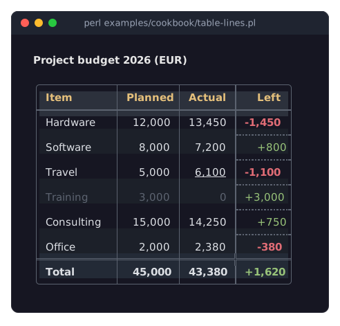
The table parameters
border,column_lines,row_linesandheader_lineset the lines of the whole table, andline_colortheir color. Here: a rounded frame, solid lines between the columns, a heavy line below the titles, and no lines between the rows, sincerow_linesis not given and defaults to none. See "Lines between and around the cells" in Term::Fabulous::Manual::TableStyles.The
styleof theleftcolumn adds lines in one place:border_leftdraws a heavy line before the column, androw_linesdashed lines between its cells. A line takes its space in all columns, drawn blank where there is no line, so the cells stay aligned.cell_styleis conditional formatting per cell: it gets the cell context and returns a style hash, here red and bold for a negative value and green otherwise.row_styledoes the same per row, here gray and italic for a cancelled item. Both run again when the row's data changes. See "Styles of rows and cells" in Term::Fabulous::Manual::TableStyles.set_row_styleandset_cell_stylemark single rows and cells from your program: the totals row gets a double line above it, bold text and its own background, and one cell is underlined. An empty hash removes a mark again.Each style key is taken from the most specific style that sets it:
set_cell_style, then the column'scell_style, thenset_row_style, thenrow_style, then the column'sstyle. So theLeftcell of the cancelled row is green (fromcell_style) and italic (fromrow_style). See "Which style wins" in Term::Fabulous::Manual::TableStyles.For lines, cell styles come first, then row styles, then column styles, then the table's lines. So the double line of the totals row replaces the dashed line of the
leftcolumn above it. See "Lines of columns, rows and cells" in Term::Fabulous::Manual::TableStyles.stripe_colorgives every second row a background; a row style with abackground_color, like the one of the totals row, covers it. See "Striped rows" in Term::Fabulous::Manual::TableStyles.header_stylestyles all column titles, here with a background and yellow text. A column's ownheader_stylewould win over it.The
leftcolumn computes its value from two other entries of the row withvalue; it sorts and filters like any other column. See "Computed columns" in Term::Fabulous::Manual::Tables. The mutators in its array run one after the other: first the number format, then the sign.The totals row is a normal row. Clicking a column title would sort it in with the others, so all columns get
sortable => 0.
A table with colored rows and titles (block frame, no grid lines)
Goal: a table whose column titles and rows are told apart by their colors, not by lines, with a frame that encloses the colors cleanly.
This program is shipped as examples/cookbook/table-colors.pl.
use v5.32;
use warnings;
use feature 'signatures';
no warnings 'experimental::signatures';

use Term::Fabulous;
use Term::Fabulous::Widget::Box;
use Term::Fabulous::Widget::Table;
use Term::Fabulous::Widget::Table::Mutator qw(number);
use Clay::XS qw(sizing_grow CLAY_TOP_TO_BOTTOM);

my $root = Term::Fabulous::Widget::Box->new(
	layout => {
		layout_direction => CLAY_TOP_TO_BOTTOM,
		sizing           => { width => sizing_grow(), height => sizing_grow() },
		padding          => { left  => 2, right => 2, top => 1, bottom => 1 },
	},
);

# Colors separate the titles and the rows; a block frame encloses them.
my $table = Term::Fabulous::Widget::Table->new(
	id                      => 'planets',
	selection               => 'single',
	border                  => 'Outer',
	column_lines            => 'none',
	header_line             => 'none',
	line_color              => '#4b5568',
	header_background_color => '#2c3340',
	header_text_color       => '#e5c07b',
	stripe_color            => '#1c2029',
	selected_color          => '#2d4f75',
	cell_padding            => 2,
	columns                 => [
		{ key => 'name',   title => 'Planet' },
		{ key => 'moons',  title => 'Moons',       type => 'number' },
		{ key => 'radius', title => 'Radius (km)', type => 'number', mutator => number( decimals => 0 ) },
		{ key => 'day',    title => 'Day (hours)', type => 'number', mutator => number( decimals => 1 ) },
	],
	rows => [
		{ name => 'Mercury', moons => 0,   radius => 2439.7,  day => 4222.6 },
		{ name => 'Venus',   moons => 0,   radius => 6051.8,  day => 2802.0 },
		{ name => 'Earth',   moons => 1,   radius => 6371.0,  day => 24.0 },
		{ name => 'Mars',    moons => 2,   radius => 3389.5,  day => 24.7 },
		{ name => 'Jupiter', moons => 95,  radius => 69911.0, day => 9.9 },
		{ name => 'Saturn',  moons => 146, radius => 58232.0, day => 10.7 },
	],
);
$root->add_child($table);

my $ui = Term::Fabulous->new( root => $root, width => 80, height => 24 );
$ui->interaction->set_focused_widget($table);
$ui->run;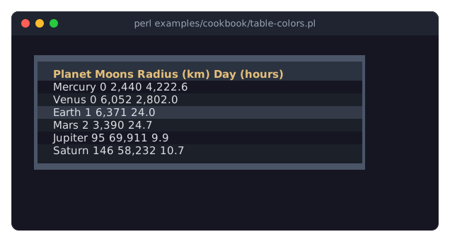
border => 'Outer'draws the frame with half blocks on the outer edge of the frame's cells. The titles' and the rows' colors fill the rest of those cells, so every color ends exactly at the frame. The thin line styles (Round,Solid, ...) sit in the middle of their cells instead, so a colored cell's color shows on both sides of them. See "Tables with colored backgrounds" in Term::Fabulous::Manual::TableStyles.column_lines => 'none'andheader_line => 'none'remove the inner lines. Theheader_background_colorsets the titles apart, thestripe_colorevery second row, andcell_padding => 2keeps the columns apart. See "Colors" in Term::Fabulous::Manual::TableStyles and "Cell padding" in Term::Fabulous::Manual::TableStyles.Inneris the other block style for a table frame: it draws on the inner half of the frame's cells, right next to the cells.Thickdraws a full block frame. Other block styles are not made for tables; see "Lines between and around the cells" in Term::Fabulous::Manual::TableStyles.The cursor's line (here Earth, after two presses of
Down) is drawn in thecursor_colorwhile the table has the focus; this program keeps the defaultcursor_color. Withselection => 'single', the selection follows the cursor, so Earth is also the selected row. When the focus leaves the table, the selected row is drawn in theselected_color. See "Which style wins" in Term::Fabulous::Manual::TableStyles for the order of these colors.
Compare the line options of a table (frames, grid lines, block frames)
Goal: see the line options of a table side by side, to choose the frame and the grid lines for your own table.
This program is shipped as examples/cookbook/table-line-styles.pl. It shows the same small table nine times, each with other lines.
use v5.32;
use warnings;
use feature 'signatures';
no warnings 'experimental::signatures';

use Term::Fabulous;
use Term::Fabulous::Widget::Box;
use Term::Fabulous::Widget::Table;
use Term::Fabulous::Widget::Text;
use Clay::XS qw(sizing_grow CLAY_TOP_TO_BOTTOM);

# The same small table with the lines of each example.
my @examples = (
	[ 'The default'         => {} ],
	[ 'A grid'              => { border => 'Solid',  row_lines    => 'Solid' } ],
	[ 'No lines'            => { border => 'none',   column_lines => 'none', header_line => 'none' } ],
	[ 'Double, Heavy title' => { border => 'Double', header_line  => 'Heavy' } ],
	[ 'Heavy, Dashed rows'  => { border => 'Heavy',  row_lines    => 'Dashed' } ],
	[ 'Ascii'               => { border => 'Ascii',  column_lines => 'Ascii', header_line  => 'Ascii' } ],
	[ 'Outer block frame'   => { border => 'Outer',  column_lines => 'none',  header_line  => 'none', header_background_color => '#2c3340' } ],
	[ 'Inner block frame'   => { border => 'Inner',  column_lines => 'none',  header_line  => 'none', header_background_color => '#2c3340' } ],
	[ 'Thick, padding 2'    => { border => 'Thick',  column_lines => 'none',  cell_padding => 2 } ],
);

sub example ( $index, $caption, $lines ) {
	my $box = Term::Fabulous::Widget::Box->new( layout => { layout_direction => CLAY_TOP_TO_BOTTOM, sizing => { width => sizing_grow() } } );
	$box->add_child( Term::Fabulous::Widget::Text->new( text => $caption, text_color => '#e5c07b' ) );
	$box->add_child(
		Term::Fabulous::Widget::Table->new(
			id        => "example$index",
			scrollbar => 0,
			columns   => [ { key => 'item', title => 'Item' }, { key => 'qty', title => 'Qty', type => 'number' } ],
			rows      => [ { item => 'Pens', qty => 12 }, { item => 'Ink', qty => 3 } ],
			%$lines,
		)
	);
	return $box;
}

my $root = Term::Fabulous::Widget::Box->new(
	layout => {
		layout_direction => CLAY_TOP_TO_BOTTOM,
		sizing           => { width => sizing_grow(), height => sizing_grow() },
		padding          => { left  => 2, right => 2, top => 1, bottom => 1 },
		child_gap        => 1,
	},
);

# Three examples per line.
foreach my $first ( 0, 3, 6 ) {
	my $line = Term::Fabulous::Widget::Box->new( layout => { sizing => { width => sizing_grow() }, child_gap => 4 } );
	$line->add_child( example( $_, @{ $examples[$_] } ) ) foreach $first .. $first + 2;
	$root->add_child($line);
}

my $ui = Term::Fabulous->new( root => $root, width => 80, height => 24 );
$ui->run;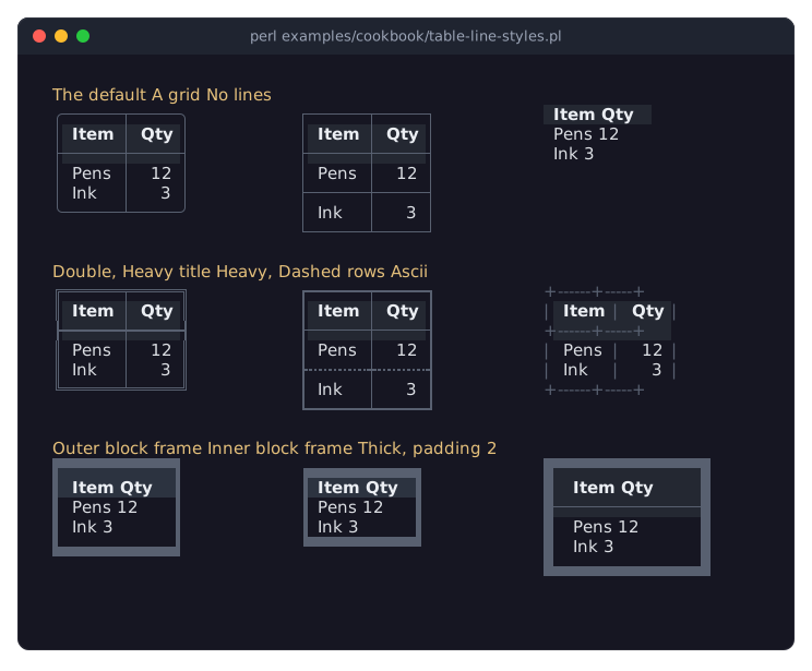
Every example only passes other line parameters to the same table:
border(the frame),column_lines,row_linesandheader_line. Each takes a line style name or'none'. The default is aRoundframe withSolidlines between the columns and below the titles, and no lines between the rows. See "Lines between and around the cells" in Term::Fabulous::Manual::TableStyles.Where lines of different styles meet, the table picks the matching junction glyph: the
Heavyframe of the fifth example meets the thin column line with┯and┷, and theDoubleframe of the fourth meets theHeavytitle line with┣and┫.Outer,InnerandThickare block styles: they draw the frame with half or full blocks on the edge of the terminal cells, so colored cells (here the column titles) reach the frame. Use them for the frame only, withcolumn_linesandheader_lineset to'none'or to a line style. See "Tables with colored backgrounds" in Term::Fabulous::Manual::TableStyles.Every grid line takes a terminal row or column. The last example also sets
cell_padding => 2, two columns of space left and right in every cell (see "Cell padding" in Term::Fabulous::Manual::TableStyles).scrollbar => 0removes the scrollbar column right of each table; these tables always fit.
SEE ALSO
This page is part of Term::Fabulous::Cookbook. Previous page: Term::Fabulous::Cookbook::TableRows. Next page: Term::Fabulous::Cookbook::Charts.
Term::Fabulous::Manual::TableStyles - the guide to the lines and colors of tables.
Term::Fabulous::Widget::Table - the reference: parameters, methods, keys, mouse actions and events.
Term::Fabulous::Enum::BorderStyle - the line styles.
Term::Fabulous::Cookbook::Tables - the first table, cell formats, editing, the column chooser, tables in KDL layouts and printed reports.
Term::Fabulous::Cookbook::TableRows - sorting, filtering, groups, trees and pages.