NAME
Term::Fabulous::Widget::Divider - A line between widgets, with an optional text
SYNOPSIS
use Term::Fabulous::Widget::Divider;
use Term::Fabulous::Enum::BorderStyle;

# A line across the parent:
my $rule = Term::Fabulous::Widget::Divider->new;

# With a text in the middle, at the start or at the end:
my $section = Term::Fabulous::Widget::Divider->new( text => 'Settings' );
my $heading = Term::Fabulous::Widget::Divider->new( text => 'Files', text_position => 'start', bold => 1 );
my $footer  = Term::Fabulous::Widget::Divider->new( text => 'end of list', text_position => 'end' );

# Heavier, in color, or vertical between two columns:
my $heavy  = Term::Fabulous::Widget::Divider->new( line_style => Term::Fabulous::Enum::BorderStyle->Double, color => '#61afef' );
my $column = Term::Fabulous::Widget::Divider->new( vertical => 1 );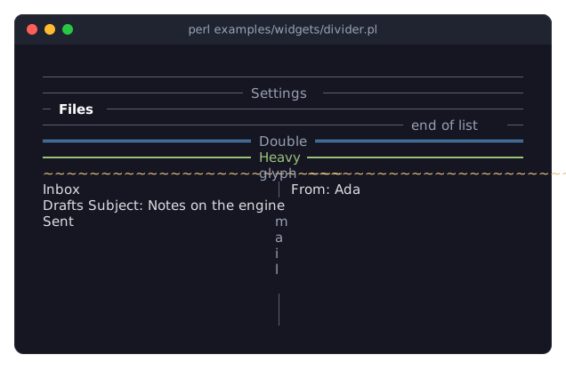
DESCRIPTION
The picture shows dividers in their forms: a plain line, lines with a text at the start, in the center and at the end, lines in other styles and colors, and a vertical divider with a text between two columns. The program is examples/widgets/divider.pl.
A divider separates the widgets above and below it (or left and right of it, when it is vertical) with a line:
────────────── Settings ──────────────
── Files ─────────────────────────────
───────────────────────── end of list ──
The line is drawn with the horizontal (or vertical) glyph of a Term::Fabulous::Enum::BorderStyle, Solid unless told otherwise, or with any glyph of your own. The text sits on the line with text_padding spaces on each side, and, at the start or the end, text_margin cells of line between it and the edge. A vertical divider writes its text downwards, one character per row. A text that does not fit is left out, and the line is drawn alone.
A divider takes no input and has no natural length of its own: it grows along its line to the space its parent gives it (see "SIZE"), and is one cell thick. Being a Term::Fabulous::Widget::Display, it is painted again only when something about it changed.
CONSTRUCTOR
new
my $divider = Term::Fabulous::Widget::Divider->new(%parameters);Accepts the parameters of "CONSTRUCTOR" in Term::Fabulous::Widget::Box (id, layout, background_color, the border parameters, ...) and the ones below. All are optional; unknown parameters die.
vertical-
A boolean. Default: 0, a horizontal line. True draws a vertical line and writes the text downwards. Stored as 1 or 0; a reference dies.
text-
A character string. Default:
''(no text). Dies if not a string. text_position-
start,center(the default) orend: where the text sits along the line. Anything else dies. text_margin-
A non-negative integer. Default: 1. The cells of line between the edge and the text when it sits at the start or the end. When the line is too short for the margin, the text moves to the edge.
text_padding-
A non-negative integer. Default: 1. The spaces on each side of the text.
line_style-
A Term::Fabulous::Enum::BorderStyle item, or the name of one (
'Double'). Default: the theme'sdivider.line.style,Solidin the built-in themes. The line is drawn with the style's top glyph, or its left glyph when the divider is vertical:SolidandRoundgive a thin line,Heavya thick one,Doublea double line,Dasheda dashed one,Ascii-or|,Thick,Blockand the shade styles block characters. Anything else dies, naming the known styles. glyph-
A single character one column wide, or
undef. Default:undef, the glyph ofline_style. A glyph of your own for the line, such as'='or'.'; it wins overline_style. Anything else dies. color-
The color of the line, in any format "Colors" in Term::Fabulous::Widget::Canvas accepts. Default: the theme's
divider.line.color,[90, 96, 110, 255]in the dark theme, a gray. text_color-
The color of the text. Default: the theme's
divider.text,[150, 160, 180, 255]in the dark theme, a lighter gray. bold-
A boolean. Default: 0. Whether the text is bold.
METHODS
The methods of Term::Fabulous::Widget::Display (mark_changed, the Box and Canvas methods), plus an accessor for each constructor parameter. Without an argument each returns the current value; with one it sets the value, checked as new checks it, marks the divider changed (so the next frame paints it) and returns the new value. An invalid value dies and leaves the old one.
vertical
$divider->vertical(1);Returns 1 or 0.
text
$divider->text('Advanced');text_position
$divider->text_position('start');text_margin
$divider->text_margin(4);text_padding
$divider->text_padding(0);line_style
$divider->line_style( Term::Fabulous::Enum::BorderStyle->Heavy );
$divider->line_style('Heavy');
The reader returns the Term::Fabulous::Enum::BorderStyle item, also when a name was written.
glyph
$divider->glyph('=');
$divider->glyph(undef);    # back to the style's glyph
color
$divider->color('#61afef');The reader returns [r, g, b, a].
text_color
$divider->text_color( [ 255, 255, 255 ] );The reader returns [r, g, b, a].
bold
$divider->bold(1);Returns 1 or 0.
line_glyph
my $glyph = $divider->line_glyph; # "\x{2500}"The glyph the line is drawn with now: glyph, or the glyph of line_style for the divider's direction. Read-only.
SIZE
A divider grows along its line: without a sizing in its layout it is as wide (or, vertical, as high) as its parent lets it be, and one cell thick (a vertical divider is as thick as its widest character). With a text, the length is at least the text with its padding, a cell of line on each side and the margin. Inside a parent that fits its content, a divider without a text has no length to grow into; give it a fixed sizing then:
layout => { sizing => { width => sizing_fixed(30) } }A horizontal divider that is more than one row high draws its line in the middle row; a vertical one that is wider than its line draws it in the middle column. See "Size" in Term::Fabulous::Widget::Display.
EVENTS
A divider fires no events of its own. It paints every cell of its line, so it receives Mouse events for clicks on it.
KDL PROPERTIES
The properties of "KDL PROPERTIES" in Term::Fabulous::Widget::Box, plus vertical and bold (#true / #false), text, text_position, text_margin, text_padding, line_style (the name of a border style) and glyph (strings), and color and text_color (color strings):
use Term::Fabulous::Widget::Divider as Divider

Divider "settings" {
	text "Settings"
	text_position "start"
	line_style "Double"
	color "#61afef"
	bold #true
}
EXAMPLES
A section heading
my $heading = Term::Fabulous::Widget::Divider->new(
	text          => 'Network',
	text_position => 'start',
	text_margin   => 2,
	bold          => 1,
	text_color    => [ 255, 255, 255, 255 ],
);
Two columns with a line between them
use Clay::XS qw(sizing_grow);

my $row = Term::Fabulous::Widget::Box->new( layout => { child_gap => 1, sizing => { width => sizing_grow(), height => sizing_grow() } } );
$row->add_child( $left, Term::Fabulous::Widget::Divider->new( vertical => 1 ), $right );
SEE ALSO
Term::Fabulous::Widget::Display, Term::Fabulous::Enum::BorderStyle, "DIVIDERS" in Term::Fabulous::Manual::Layout, "BORDERS" in Term::Fabulous::Manual::Looks.