NAME
Term::Fabulous::Widget::Tabs - Pages behind a row of tabs
SYNOPSIS
use Term::Fabulous::Widget::Tabs;
use Term::Fabulous::Widget::Tabs::Page;
use Term::Fabulous::Widget::Text;

my $settings = Term::Fabulous::Widget::Tabs->new( id => 'settings' );
foreach my $section ( [ General => 'Language, time zone' ], [ Network => 'Hostname, ports' ], [ Users => 'Accounts and groups' ] ) {
	my $page = Term::Fabulous::Widget::Tabs::Page->new( title => $section->[0] );
	$page->add_child( Term::Fabulous::Widget::Text->new( text => $section->[1], text_color => '#c8cdd7' ) );
	$settings->add_child($page);
}

$settings->on( Select => sub ($event) {
	$status->text( 'Showing ' . $event->item->title );
	return;
} );

$settings->select(1);    # from the program: fires nothing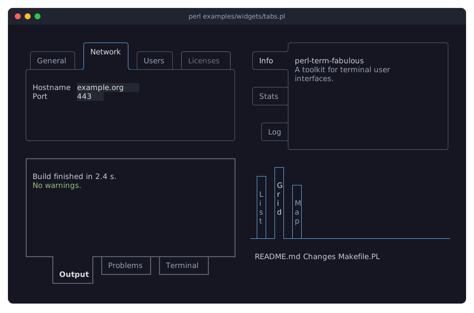
DESCRIPTION
The picture shows the Tabs widget in four forms: tabs along the top with its second page shown and a disabled tab, tabs with downward labels along the left side, a bar at the bottom in another line style, and tabs on the right without a border around the page. The program is examples/widgets/tabs.pl.
A Tabs widget shows one of several pages at a time, chosen with the tabs of its bar. The bar is drawn as a row of boxes that join the border of the page: the active tab is one cell larger and open toward the page, so that it and the page are one shape, while the others are closed by the page's line and look as if they stood behind it:
 ╭─────────╮
 │ General │ ╭─────────╮ ╭───────╮
 │         │ │ Network │ │ Users │
╭╯         ╰─┴─────────┴─┴───────┴───────╮
│                                        │
│  Language   en                         │
│  Time zone  UTC                        │
│                                        │
╰────────────────────────────────────────╯
The bar can be on any side of the page (side), and the labels can be written from left to right or downwards (orientation), on any side; the tabs can sit at the start, in the center or at the end of the bar. The border around the page can be left out (page_border).
The user switches pages with a click on a tab, with Left, Right, Up, Down, Home and End while the active tab has the focus, and with Ctrl+PageUp and Ctrl+PageDown from anywhere inside the Tabs. Only the active tab takes the focus, so Tab walks from it into the page and on. A page can be disabled, and the Tabs fires Term::Fabulous::Event::Select for every change the user makes.
Each page is a Term::Fabulous::Widget::Tabs::Page: a box with a title and an optional icon for its tab, holding the widgets you add to it. Only the active page is part of the widget tree, so the other pages take no space and their widgets cannot take the focus. The Tabs makes a Term::Fabulous::Widget::Tabs::Button for every page in its Term::Fabulous::Widget::Tabs::Bar; the look of the tabs (side, orientation, line style, colors) is set once, on the Tabs.
A Tabs is a Term::Fabulous::Widget::Box that grows in both directions unless the layout says otherwise; add_child accepts only pages. Its children are the bar and a box that holds the shown page, so use "pages" rather than children to get at the pages.
CONSTRUCTOR
new
my $tabs = Term::Fabulous::Widget::Tabs->new(%parameters);Accepts the parameters of "CONSTRUCTOR" in Term::Fabulous::Widget::Box (id, layout, background_color, ...), the look parameters of "CONSTRUCTOR" in Term::Fabulous::Widget::Tabs::Bar, which it passes to its bar, and page_border. All are optional; unknown parameters die. The look parameters are:
side-
top(the default),right,bottomorleft: the side the bar is on. orientation-
horizontal(the default) orvertical: whether the tab labels are written from left to right, or downwards. tab_alignment-
start(the default),centerorend: where the tabs sit along the bar. tab_gaptab_margintab_padding-
Non-negative integers, all 1 by default: the cells between two tabs, between the ends of the bar and the outer tabs, and on each side of a label along its writing direction.
line_style-
A Term::Fabulous::Enum::BorderStyle item with grid joints (
Ascii,Dashed,Double,Heavy,RoundorSolid), or the name of one. Default:Round. The style of the tabs' borders, of the line that closes them and of the page's border. line_color-
The color of those lines. Default:
[90, 96, 110, 255], a gray. text_coloractive_text_color-
The colors of the labels of the inactive tabs and of the active one. Defaults:
[150, 160, 180, 255]and[220, 223, 228, 255]. active_bold-
A boolean. Default: 0. Whether the active tab's label is bold.
hover_background_color-
The background of an inactive tab under the pointer. Default:
[40, 45, 58, 255]. focus_border_color-
The color of the active tab's outline while it has the focus, or
undeffor none. Default:[97, 175, 239, 255], a blue. disabled_color-
The color of a disabled tab. Default:
[108, 112, 120, 255]. page_border-
A boolean. Default: 1. Whether the page has a border on the three sides away from the bar, in
line_styleandline_color; on the bar's side the bar's line closes it. Without it, only the bar's line separates the tabs from the page.
METHODS
The methods of Term::Fabulous::Widget, plus:
add_child
$tabs->add_child( $page, $other_page );Appends pages. Dies for anything but a Term::Fabulous::Widget::Tabs::Page, and for a page that is part of a Tabs already. The first enabled page added becomes the active one, unless a page asks for it with active => 1. Returns the Tabs.
remove_child, remove_child_with_id, remove_children_with, clear_children
As in Term::Fabulous::Widget, for the pages (also those not shown); remove_child dies for anything but a widget and ignores widgets that are not pages of this Tabs. When the active page is removed, the first enabled page left becomes the active one. Fires nothing. children and has_child see the bar and the box that holds the shown page, not the pages.
pages
my @pages = $tabs->pages;The pages, in the order of their tabs.
page
my $page = $tabs->page(2);The page at an index, from 0. Dies for an index outside the pages.
index_of
my $index = $tabs->index_of($page);The index of a page, or undef.
active
my $page = $tabs->active; # or undefThe page shown now.
active_index
my $index = $tabs->active_index; # or undefIts index.
select
$tabs->select(1);        # by index
$tabs->select($page);    # or the page
$tabs->select(undef);    # no page
Shows a page from the program. Fires nothing. A tab that had the focus passes it on to the new active tab. Dies for an index outside the pages or a page of another Tabs. Returns the Tabs.
choose
$tabs->choose($index);Chooses a page as the user does: shows it, focuses its tab and fires Select when the active page changed. A disabled page changes nothing. Returns the Tabs.
bar
my $bar = $tabs->bar;The Term::Fabulous::Widget::Tabs::Bar, for its tabs ($tabs->bar->button($index)) and their events. Change the active tab and the look through the Tabs, which keeps the pages in step.
side
$tabs->side('left');Accessor for the side parameter. Changing it lays the Tabs out again; a tab that had the focus keeps it.
orientation
$tabs->orientation('vertical');Accessor for the orientation parameter.
tab_alignment
$tabs->tab_alignment('center');Accessor for the tab_alignment parameter.
tab_gap
$tabs->tab_gap(0);Accessor for the tab_gap parameter.
tab_margin
$tabs->tab_margin(2);Accessor for the tab_margin parameter.
tab_padding
$tabs->tab_padding(2);Accessor for the tab_padding parameter.
line_style
$tabs->line_style('Heavy');Accessor for the line_style parameter; the reader returns the style item. The borders of the pages follow it.
line_color
$tabs->line_color('#5a606e');Accessor for the line_color parameter. The reader returns [r, g, b, a]; an invalid color dies and leaves the old one, and so does undef. The borders of the pages follow it. The bar keeps the colors and the line style; $tabs->reset_look('line_color') returns them to the theme (see "reset_look" in Term::Fabulous::Widget).
text_color
$tabs->text_color('#96a0b4');Accessor for the text_color parameter; works like "line_color".
active_text_color
$tabs->active_text_color('#ffffff');Accessor for the active_text_color parameter; works like "line_color".
active_bold
$tabs->active_bold(1);Accessor for the active_bold parameter. Returns 1 or 0.
hover_background_color
$tabs->hover_background_color( [ 40, 45, 58 ] );Accessor for the hover_background_color parameter; works like "line_color".
focus_border_color
$tabs->focus_border_color(undef);Accessor for the focus_border_color parameter; undef switches the focus look off.
disabled_color
$tabs->disabled_color('#6c7078');Accessor for the disabled_color parameter; works like "line_color".
page_border
$tabs->page_border(0);Accessor for the page_border parameter. Returns 1 or 0. Restyles the pages as well.
Every writer passes the value to the bar (see "METHODS" in Term::Fabulous::Widget::Tabs::Bar) and shows its change in the next frame.
KEYS
While the active tab has the focus, Left and Up choose the previous enabled tab, Right and Down the next one, wrapping around, and Home and End the first and the last; see "KEYS" in Term::Fabulous::Widget::Tabs::Bar. From anywhere inside the Tabs, also from a widget on the page:
Tab and Shift+Tab move through the active tab and the widgets of the shown page in order, as everywhere. All other keys bubble to the ancestors.
MOUSE
A click on a tab shows its page and focuses the tab. An inactive tab under the pointer is painted on hover_background_color.
EVENTS
Select-
Term::Fabulous::Event::Select when the user chooses another tab (or "choose" is called and the active page changes);
$event->itemis the page now shown and$event->indexits position. Programmatic changes fire nothing. The bar's ownSelect, which names the tab, does not bubble past the Tabs; listen on$tabs->barfor it.
The Activate of the tabs and the events of the widgets on the pages bubble through the Tabs as well.
KDL PROPERTIES
The properties of "KDL PROPERTIES" in Term::Fabulous::Widget::Box, plus side, orientation, tab_alignment, tab_gap, tab_margin, tab_padding and line_style (strings and numbers), active_bold and page_border (#true / #false), focus_border_color (a color string, or #null for no focus look) and the colors line_color, text_color, active_text_color, hover_background_color and disabled_color. The pages are Page child nodes (see "KDL PROPERTIES" in Term::Fabulous::Widget::Tabs::Page):
use Term::Fabulous::Widget::Tabs as Tabs
use Term::Fabulous::Widget::Tabs::Page as Page
use Term::Fabulous::Widget::Text as Text

Tabs "settings" {
	side "left"
	line_style "Solid"
	Page "general" {
		title "General"
		Text { text "Language, time zone"; }
	}
	Page "network" {
		title "Network"
		active #true
		Text { text "Hostname, ports"; }
	}
}
EXAMPLES
A sidebar of tabs
my $tabs = Term::Fabulous::Widget::Tabs->new( side => 'left', tab_alignment => 'start' );Tabs without a frame around the page
my $tabs = Term::Fabulous::Widget::Tabs->new( page_border => 0, active_bold => 1 );Remember the shown page
$settings->on( Select => sub ($event) {
	$config->{page} = $event->item->id;
	return;
} );
SEE ALSO
Term::Fabulous::Widget::Tabs::Page, Term::Fabulous::Widget::Tabs::Bar, Term::Fabulous::Widget::Tabs::Button, Term::Fabulous::Event::Select, Term::Fabulous::Widget::Accordion, "TABS" in Term::Fabulous::Manual::Layout.