NAME
Clay::Cookbook - recipes for common layout, rendering and interaction tasks
HOW TO USE THIS COOKBOOK
Each recipe answers one question and shows the shortest code that does it. The headings are phrased as tasks ("Center an element"), so you can search for the task you have. The concepts behind the recipes are explained in Clay::Manual; every function and attribute is described in Clay::XS, Clay::XS::Structs and the Clay::UI reference pages.
Most recipes use Clay::UI. They assume this preamble, which declares the two widget classes most recipes need:
use v5.22;
use warnings;
use feature 'signatures';
no warnings 'experimental::signatures';

use Object::Pad 0.800;
use Clay::XS qw(:all);
use Clay::UI;
use Clay::UI::Box;
use Clay::UI::Text;

class My::Box  :strict(params) :does(Clay::UI::Box)  {}
class My::Text :strict(params) :does(Clay::UI::Text) {}
Recipes that need more roles or classes declare them. Recipes that use Clay::XS directly say so.
LAYOUT
Fill the whole window
Give the root a GROW size on both axes. It then takes the viewport size passed to Clay::UI->new:
my $root = My::Box->new(
	layout => { sizing => { width => sizing_grow(), height => sizing_grow() } },
);
my $ui   = Clay::UI->new(width => 1024, height => 768, root => $root);
Stack children vertically
my $column = My::Box->new(
	layout => { layout_direction => CLAY_TOP_TO_BOTTOM, child_gap => 8 },
);
The default direction, CLAY_LEFT_TO_RIGHT, makes a row.
Center an element
Center the children of a container with child_alignment. The container must be larger than its content, so give it a GROW or FIXED size:
my $screen = My::Box->new(layout => {
	sizing          => { width => sizing_grow(), height => sizing_grow() },
	child_alignment => { x => CLAY_ALIGN_X_CENTER, y => CLAY_ALIGN_Y_CENTER },
});
$screen->add_child(My::Text->new(text => 'Loading'));
Push an element to the far side
Put an empty GROW element between the two sides of a row. It takes all free space and pushes everything after it to the right:
my $toolbar = My::Box->new(
	layout => { sizing => { width => sizing_grow() }, child_gap => 8 },
);
$toolbar->add_child(
	My::Text->new(text => 'Title'),
	My::Box->new(layout => { sizing => { width => sizing_grow() } }),    # spacer
	My::Text->new(text => 'Close'),
);
To right-align all children instead, use child_alignment => { x => CLAY_ALIGN_X_RIGHT }.
Make columns of equal width
Give every column sizing_grow(). GROW siblings share the free space, starting with the smallest, so columns with little content end up equally wide:
$row->add_child(
	map { My::Box->new(layout => { sizing => { width => sizing_grow() } }) } 1 .. 3
);
For exact proportions, use sizing_percent: three columns of sizing_percent(1/3) are a third of the parent's inner width each (the inner width is the width minus padding and child gaps).
Give an element a minimum or maximum size
sizing_fit and sizing_grow take a minimum and a maximum:
# grows, but stays within 200..600
layout => { sizing => { width => sizing_grow(200, 600) } }

# as wide as its content, at most 300
layout => { sizing => { width => sizing_fit(0, 300) } }
A maximum of 0 means "no maximum".
Wrap tags or buttons onto several lines
Use the flow layout direction CLAY_LEFT_TO_RIGHT_WRAP and give the container a width it has to respect:
my $tags = My::Box->new(layout => {
	layout_direction => CLAY_LEFT_TO_RIGHT_WRAP,
	sizing           => { width => sizing_grow() },
	child_gap        => 6,        # between tags on a line
	line_gap         => 6,        # between lines
	line_sizing      => CLAY_LINE_SIZING_FIT,
});
for my $word (qw(perl layout pdf svg png clay xs widgets)) {
	my $tag = My::Box->new(
		layout           => { padding => padding_all(4) },
		background_color => [220, 230, 250, 255],
		corner_radius    => 4,
	);
	$tag->add_child(My::Text->new(text => $word, font_size => 12));
	$tags->add_child($tag);
}
See examples/07-ui-flow.pl.
Put a badge in the corner of another element
Use a stack (CLAY_BACK_TO_FRONT): its children lie on top of each other. A stack has one child_alignment for all its children (the avatar uses it to centre its picture or initials), so the badge sits in a GROW wrapper with an alignment of its own:
my $avatar = My::Box->new(layout => {
	layout_direction => CLAY_BACK_TO_FRONT,
	sizing           => { width => sizing_fixed(64), height => sizing_fixed(64) },
}, background_color => [90, 120, 200, 255], corner_radius => 32);

my $corner = My::Box->new(layout => {
	sizing          => { width => sizing_grow(), height => sizing_grow() },
	child_alignment => { x => CLAY_ALIGN_X_RIGHT, y => CLAY_ALIGN_Y_TOP },
});
$corner->add_child(My::Box->new(
	layout           => { sizing => { width => sizing_fixed(16), height => sizing_fixed(16) } },
	background_color => [220, 40, 40, 255],
	corner_radius    => 8,
));
$avatar->add_child($corner);
See examples/08-ui-stack.pl.
Line up labels in separate rows
Rows of a form are separate containers, so their labels do not know about each other. Put all labels into one sizing group: they all become as wide as the widest label.
for my $field ('Name', 'E-mail address', 'Phone') {
	my $row   = My::Box->new(layout => { child_gap => 8 });
	my $label = My::Box->new(width_group => 1);    # any id in 1 .. 2**20 - 1
	$label->add_child(My::Text->new(text => $field));
	$row->add_child($label, My::Box->new(layout => { sizing => { width => sizing_grow() } }));
	$form->add_child($row);
}
See Clay::UI::Role::Layout::HasSizingGroup.
Keep an aspect ratio
aspect_ratio is not one of the attributes Clay::UI's roles provide, so add it with a contribute_ method (see "Add an image to a widget"):
class My::Video :strict(params) :does(Clay::UI::Box) {
	method contribute_aspect ($config) { $config->{aspect_ratio} = 16 / 9; return }
}
my $video = My::Video->new(layout => { sizing => { width => sizing_grow() } });
With Clay::XS, add aspectRatio => 16 / 9 to the declaration.
TEXT
Measure text with a real font
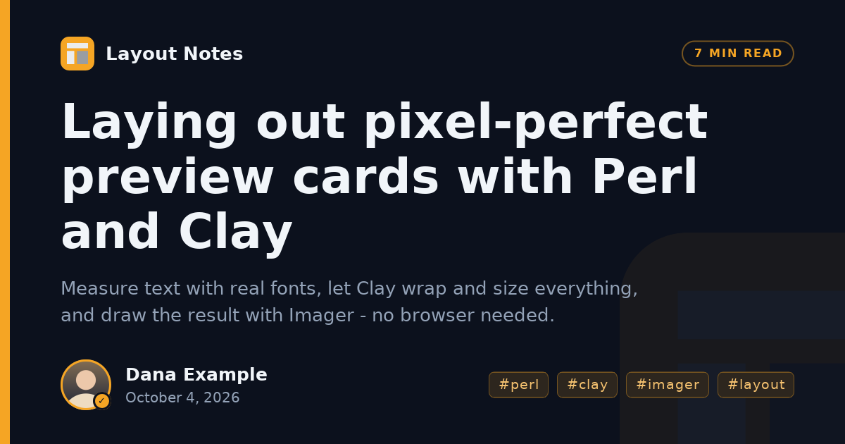
Pass a measure function. It gets the text and the text configuration (camelCase keys) and returns the size. With Imager:
use Imager;
my %fonts = (
	0 => Imager::Font->new(file => '/usr/share/fonts/truetype/dejavu/DejaVuSans.ttf'),
);

my $ui = Clay::UI->new(
	width        => 1200,
	height       => 630,
	root         => $root,
	measure_text => sub ($text, $config, $userdata) {
		my $bbox = $fonts{ $config->{fontId} }->bounding_box(
			string => $text,
			size   => $config->{fontSize},
		);
		return { width => $bbox->advance_width, height => $config->{fontSize} };
	},
);
With PDF::Builder core fonts:
my %fonts = (0 => $pdf->font('Helvetica'), 1 => $pdf->font('Helvetica-Bold'));
measure_text => sub ($text, $config, $userdata) {
	return {
		width  => $fonts{ $config->{fontId} }->width($text) * $config->{fontSize},
		height => $config->{fontSize},
	};
},
Use the same %fonts table in the renderer. See examples/15-og-card.pl and examples/16-invoice-pdf.pl.
Use several fonts or weights
font_id is a number you choose. Map it to a font in the measure function and in the renderer:
my $heading = My::Text->new(text => 'Invoice', font_id => 1, font_size => 24); # 1 = boldWrap text inside a column
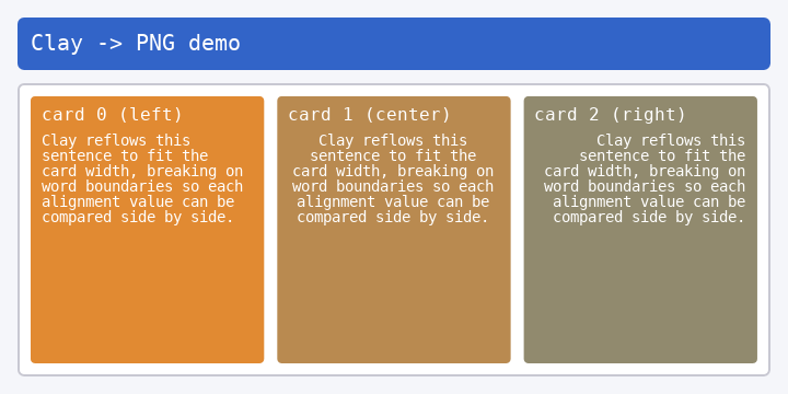
Text wraps at spaces when its parent is narrower than the text. A parent whose width is FIT grows with the text instead, so limit it:
my $column = My::Box->new(layout => { sizing => { width => sizing_fixed(240) } });
$column->add_child(
	My::Text->new(text => $long_paragraph, wrap_mode => CLAY_TEXT_WRAP_WORDS),
);
Each line becomes a separate TEXT render command. Use CLAY_TEXT_WRAP_NEWLINES to break only at "\n", and CLAY_TEXT_WRAP_NONE to keep the text on one line whatever it contains.
Shrink a headline until it fits
Lay out, check the text's height, and retry with a smaller size. Text widgets have no bounding box of their own, so wrap the text in a box:
my $title_box = My::Box->new(layout => { sizing => { width => sizing_fixed(800) } });
my $title     = My::Text->new(text => $headline, font_size => 64);
$title_box->add_child($title);
# ... build the rest of the tree, create $ui ...

for (my $size = 64; $size >= 24; $size -= 4) {
	$title->font_size($size);
	$ui->render;
	# at most three lines
	last if $ui->bounding_box($title_box)->{height} <= 3 * $size;
}
If the box's parent runs out of space, Clay compresses the box and its height no longer shows how many lines the text needs. Give the parent clip => { vertical => 1 } (a widget with Clay::UI::Role::Layout::HasScroll, or a contribute_ method that writes clip): Clay does not compress the children of a clipping parent on the clipped axis. examples/15-og-card.pl uses this technique.
TABLES
Make a table whose columns fit their content
use Clay::UI::Grid;
class My::Grid :strict(params) :does(Clay::UI::Grid) {}

my $grid = My::Grid->new(id => 'people', cell_gap => 12, row_gap => 4);
$grid->append_row([ map { My::Text->new(text => $_, font_id => 1) } 'Name', 'Role' ]);
$grid->append_row([ map { My::Text->new(text => $_) } 'Alice', 'Admin' ]);
$grid->append_row([ map { My::Text->new(text => $_) } 'Bob', 'Developer' ]);
See Clay::UI::Grid and examples/05-ui-grid.pl.
Style table cells and right-align numbers
Pass Clay::UI::Grid::Cell objects instead of bare widgets. A cell has padding, a background, a border and a child_alignment:
use Clay::UI::Grid::Cell;

sub amount_cell ($text, $row_index) {
	my $cell = Clay::UI::Grid::Cell->new(
		layout => {
			padding         => padding_all(4),
			child_alignment => { x => CLAY_ALIGN_X_RIGHT },
		},
		background_color => $row_index % 2 ? [245, 245, 245, 255] : [255, 255, 255, 255],
	);
	$cell->add_child(My::Text->new(text => $text));
	return $cell;
}
Give a table a header row with a background
A row has no style of its own. Colour every cell of the header row, and use cell_gap => 0 with cell padding, so no gaps show between the coloured cells:
my $grid = My::Grid->new(id => 'prices', cell_gap => 0);
sub header_cell ($text) {
	my $cell = Clay::UI::Grid::Cell->new(
		layout           => { padding => padding_all(6) },
		background_color => [40, 60, 90, 255],
	);
	$cell->add_child(My::Text->new(text => $text, text_color => [255, 255, 255, 255]));
	return $cell;
}
$grid->append_row([ map { header_cell($_) } 'Name', 'Qty', 'Price' ]);
$grid->append_row([
	My::Text->new(text => 'Widget'),
	amount_cell('3', 1),
	amount_cell('9.90', 1),
]);
Add a heading row that spans all columns
$grid->append_spanning_row(My::Text->new(text => 'Administrators', font_id => 1));Sort the rows of a table
reorder_rows moves rows without rebuilding them; hover and focus stay with their widgets:
my @order = sort { $names[$a] cmp $names[$b] } 0 .. $grid->row_count - 1;
$grid->reorder_rows(\@order);
Keep a table header fixed while the body scrolls
Make two grids that share their columns, and put the body grid into a scroll container:
use Clay::UI::Grid;
use Clay::UI::Role::Layout::HasScroll;
class My::Grid      :strict(params) :does(Clay::UI::Grid) {}
class My::ScrollBox :strict(params)
	:does(Clay::UI::Box)
	:does(Clay::UI::Role::Layout::HasScroll) {}

my $header   = My::Grid->new(id => 'head', cell_gap => 8);
my $body     = My::Grid->new(id => 'body', cell_gap => 8, share_columns_with => $header);
my $scroller = My::ScrollBox->new(
	id       => 'body-scroll',
	vertical => 1,
	layout   => { sizing => { width => sizing_grow(), height => sizing_fixed(300) } },
);
$scroller->add_child($body);
$page->add_child($header, $scroller);
Both grids need the same cell_gap, or the columns drift apart. See "share_columns_with" in Clay::UI::Grid.
RENDERING
Render to SVG
Loop over the render commands and print one SVG element per command. A complete renderer (rectangles with rounded corners, borders, text, clipping) is in examples/03-svg-render.pl; the core is:
for my $command (@$commands) {
	my ($box, $data) = @$command{qw(boundingBox renderData)};
	if ($command->{commandType} == CLAY_RENDER_COMMAND_TYPE_RECTANGLE) {
		my $c = $data->{backgroundColor};
		printf qq{<rect x="%g" y="%g" width="%g" height="%g" fill="rgba(%d,%d,%d,%g)"/>\n},
			@$box{qw(x y width height)}, @$c{qw(r g b)}, $c->{a} / 255;
	}
}
Render to a PNG image
Use Imager: draw rectangles with box, text with string (or align_string), and clip by drawing into $img->masked(left => ..., top => ..., right => ..., bottom => ...), a view of the image that ignores drawing outside that rectangle. Measure text with the same Imager fonts. Complete renderers are in examples/06-png-render.pl and examples/15-og-card.pl.
Render to a PDF document
Use PDF::Builder (or PDF::API2). Treat one layout unit as one PDF point and use the page size (595 x 842 for A4) as the viewport. PDF's Y axis points up, Clay's down, so flip each box:
my $y_pdf = $page_height - $box->{y} - $box->{height};Text is placed at its baseline; a good approximation is $page_height - $box->{y} - $font_size * 0.8. A complete renderer is in examples/16-invoice-pdf.pl; the invoice it writes is at https://github.com/davenonymous/perl-clay-xs/blob/v0.06/images/example-16-invoice-pdf.pdf.
Split a long document into pages
Clay lays out one area at a time. To paginate:
Lay out all content once in a tall viewport (turn culling off with
Clay_SetCullingEnabled(0)if you use Clay::XS) and read the height of every block ($ui->bounding_box($widget)).Assign blocks to pages so that no block crosses a page boundary.
Build and lay out one tree per page, with the repeated parts (header, footer, table heading) on every page.
examples/16-invoice-pdf.pl paginates an invoice this way; see the PDF at https://github.com/davenonymous/perl-clay-xs/blob/v0.06/images/example-16-invoice-pdf.pdf.
Find the widget or data behind a render command
Clay::UI stores a reference in each command's userData:
for my $command (@$commands) {
	my $widget = $ui->widget_for($command->{userData}) or next;
	my $name = $widget->id // '(no id)';   # text widgets have no id
	say ref($widget), ' ', $name;
}
With Clay::XS, put a key of your own into userData (any unsigned integer) and look it up in your own table.
Add an image to a widget
Images are not a Clay::UI attribute. Add them with a contribute_ method, which writes extra keys into the widget's declaration:
class My::Image :strict(params) :does(Clay::UI::Box) {
	field $image_key :param :reader;    # your key, a positive integer

	method contribute_image ($config) {
		$config->{image} = { image_data => $image_key };
		return;
	}
}

my $logo   = Imager->new(file => 'logo.png') or die Imager->errstr;
my %images = (1 => $logo);
my $logo_widget = My::Image->new(
	image_key => 1,
	layout    => { sizing => { width => sizing_fixed(64), height => sizing_fixed(64) } },
);
The renderer finds $command->{renderData}{imageData} (here 1) in every IMAGE command and draws $images{1} into the bounding box. See examples/14-ui-custom-widgets.pl and examples/15-og-card.pl.
Draw custom content such as charts or logos
Use a custom element: Clay reserves the space, your renderer draws anything into it.
my %painters = (1 => sub ($box) { draw_chart($box) });    # draw_chart is your code

# Clay::XS:
Clay__ConfigureOpenElement({
	layout => { sizing => { width => sizing_fixed(200), height => sizing_fixed(100) } },
	custom => { customData => 1 },
});
In the renderer, call $painters{ $data->{customData} } for every CLAY_RENDER_COMMAND_TYPE_CUSTOM command. In Clay::UI, write the custom key from a contribute_ method as in "Add an image to a widget". See examples/11-xs-images-custom.pl.
INTERACTION
Make a clickable button
Compose Clay::UI::Role::Interaction::Pressable and listen for OnRelease (pressed and released over the button - a completed click):
use Clay::UI::Role::Interaction::Pressable;
class My::Button :strict(params)
	:does(Clay::UI::Box)
	:does(Clay::UI::Role::Interaction::Pressable) {}

my $save = My::Button->new(
	id               => 'save',
	layout           => { padding => padding_all(8) },
	background_color => [60, 120, 200, 255],
);
$save->add_child(My::Text->new(text => 'Save'));
$save->on(OnRelease => sub ($event) { say 'saved'; return });
Feed the pointer to every render:
$ui->render(
	pointer_state => { x => $mouse_x, y => $mouse_y, down => $button_down ? 1 : 0 },
);
The pointer is tested against the previous frame, so render once before the first click.
Style a widget by its hover and pressed state
Read the state in a contribute_ method that writes the background colour. Clay::UI bumps the revision when the state changes, and the next render asks the widget again. Two methods must not both write the background colour, or the result depends on the order in which they run. So either compose Clay::UI::Box and never set its background_color attribute (an unset attribute writes nothing), or compose the roles without Clay::UI::Role::Style::HasBackground, as shown here, so the attribute does not exist at all.
use Clay::UI::Role::Core::Container;
use Clay::UI::Role::Layout::HasLayout;
use Clay::UI::Role::Style::HasCornerRadius;
use Clay::UI::Role::Interaction::Pressable;

class My::HoverButton :strict(params)
	:does(Clay::UI::Role::Core::Container)
	:does(Clay::UI::Role::Layout::HasLayout)
	:does(Clay::UI::Role::Style::HasCornerRadius)
	:does(Clay::UI::Role::Interaction::Pressable)
{
	method contribute_state_colour ($config) {
		$config->{background_color} =
			  $self->is_pressed ? [30, 70, 140, 255]
			: $self->is_hovered ? [80, 140, 220, 255]
			:                     [60, 120, 200, 255];
		return;
	}
}
$self->has_state('hovered') works too, and also answers user states you set with add_state. examples/12-ui-interaction.pl uses this pattern.
Show a tooltip on hover
Add a floating child when the pointer enters, remove it when it leaves:
use Clay::UI::Role::Interaction::Hoverable;
class My::HoverBox :strict(params)
	:does(Clay::UI::Box)
	:does(Clay::UI::Role::Interaction::Hoverable) {}

my $help = My::HoverBox->new(id => 'help', layout => { padding => padding_all(4) });
$help->add_child(My::Text->new(text => '?'));

my $tooltip = My::Box->new(
	id       => 'help-tip',
	floating => {
		attach_to     => CLAY_ATTACH_TO_PARENT,
		attach_points => {
			element => CLAY_ATTACH_POINT_CENTER_TOP,
			parent  => CLAY_ATTACH_POINT_CENTER_BOTTOM,
		},
		offset        => { x => 0, y => 4 },
		z_index       => 100,
	},
	layout           => { padding => padding_all(6) },
	background_color => [30, 30, 30, 230],
	corner_radius    => 4,
);
$tooltip->add_child(
	My::Text->new(text => 'Opens the manual', text_color => [255, 255, 255, 255]),
);

$help->on(OnHoverStart => sub ($event) {
	$event->current_target->add_child($tooltip);
	return;
});
$help->on(OnHoverStopped => sub ($event) {
	$event->current_target->remove_child($tooltip);
	return;
});
The tooltip appears in the same render that reports the hover. The listeners reach the widget through $event->current_target: a listener that captures its own widget ($help) in the closure creates a reference cycle, and the widget is never freed (see "on" in Clay::UI::Role::Events::Listener). See examples/13-ui-scroll-floating.pl.
Open a dropdown menu below a button
Attach the menu's top left corner to the button's bottom left corner:
floating => {
	attach_to     => CLAY_ATTACH_TO_PARENT,
	attach_points => {
		element => CLAY_ATTACH_POINT_LEFT_TOP,
		parent  => CLAY_ATTACH_POINT_LEFT_BOTTOM,
	},
	z_index       => 50,
}
Show a modal dialog
Pointer capture only covers the floating element's own box, so a dialog alone does not stop clicks next to it. Put the dialog into a floating backdrop that covers the whole layout area and captures the pointer; nothing below it receives hover or press events:
my $backdrop = My::Box->new(
	id       => 'backdrop',
	floating => {
		attach_to            => CLAY_ATTACH_TO_ROOT,
		pointer_capture_mode => CLAY_POINTER_CAPTURE_MODE_CAPTURE,
		z_index              => 1000,
	},
	layout   => {
		sizing          => { width => sizing_grow(), height => sizing_grow() },
		child_alignment => { x => CLAY_ALIGN_X_CENTER, y => CLAY_ALIGN_Y_CENTER },
	},
	background_color => [0, 0, 0, 120],    # dims the page
);
my $dialog = My::Box->new(
	id               => 'dialog',
	layout           => { padding => padding_all(16) },
	background_color => [255, 255, 255, 255],
	corner_radius    => 8,
);
$dialog->add_child(My::Text->new(text => 'Delete the file?'));
$backdrop->add_child($dialog);
$root->add_child($backdrop);    # remove it again to close the dialog
To keep Tab inside the dialog, make the dialog a widget that steps the focus within its own subtree (a focus scope, see "Focus scopes" in Clay::UI::Interaction), build $dialog from it, and move the focus into the dialog when it opens:
use Clay::UI::Role::Interaction::HasFocusOrder;
class My::Dialog :strict(params)
	:does(Clay::UI::Box)
	:does(Clay::UI::Role::Interaction::HasFocusOrder)
{
	method get_next_focus ()     { return $self->default_next_focus(within => $self) }
	method get_previous_focus () { return $self->default_previous_focus(within => $self) }
}

my $first = $ui->interaction->default_next_focus(within => $dialog);
$ui->interaction->set_focused_widget($first) if defined $first;
Let an event reach the parent widget
OnPress, OnRelease, OnScroll, OnFocus and OnBlur travel to the parent only when every listener of the widget returns CONTINUE:
use Clay::UI::Enum::Result;
$button->on(OnPress => sub ($event) {
	log_press();
	return Clay::UI::Enum::Result->CONTINUE;
});
$card->on(OnPress => sub ($event) {
	say 'pressed inside the card: ', $event->target->id;
	return;
});
Move focus with Tab
use Clay::UI::Role::Interaction::Focusable;
class My::Input :strict(params)
	:does(Clay::UI::Box)
	:does(Clay::UI::Role::Interaction::Focusable) {}

# in your key handler:
$ui->interaction->focus_next     if $key eq 'Tab';
$ui->interaction->focus_previous if $key eq 'Shift-Tab';
Focus a widget when it is clicked:
$input->on(OnPress => sub ($event) {
	my $widget = $event->current_target;    # not $input or $ui: capturing them leaks
	$widget->ui->interaction->set_focused_widget($widget);
	return;
});
See "FOCUS" in Clay::UI::Interaction.
Send key presses to the focused widget
Clay::UI has no keyboard events. Route keys yourself:
if (my $widget = $ui->interaction->get_focused_widget) {
	$widget->handle_key($key) if $widget->can('handle_key');
}
Disable a button
Compose Clay::UI::Role::Interaction::Disableable. A disabled widget cannot be pressed or focused; disabling a focused widget blurs it. A press over a disabled button is absorbed, as in HTML: a pressable card around it gets no OnPress either.
use Clay::UI::Role::Interaction::Disableable;
class My::SafeButton :strict(params) :does(Clay::UI::Box)
	:does(Clay::UI::Role::Interaction::Pressable)
	:does(Clay::UI::Role::Interaction::Disableable) {}

my $submit = My::SafeButton->new(id => 'submit', disabled => 1);
$submit->disabled(0) if $form_is_valid;
Scroll a list
Compose Clay::UI::Role::Layout::HasScroll (it requires an id) and pass the wheel delta to render:
use Clay::UI::Role::Layout::HasScroll;
class My::ScrollBox :strict(params)
	:does(Clay::UI::Box)
	:does(Clay::UI::Role::Layout::HasScroll) {}

my $list = My::ScrollBox->new(
	id       => 'list',
	vertical => 1,
	layout   => {
		layout_direction => CLAY_TOP_TO_BOTTOM,
		sizing           => { width => sizing_grow(), height => sizing_fixed(300) },
	},
);
$list->add_child(My::Text->new(text => "Item $_")) for 1 .. 100;

$ui->render(
	pointer_state => { x => $x, y => $y, down => 0 },
	scroll_delta  => { x => 0, y => -40 },
	delta_time    => 1 / 60,
);
A negative y delta scrolls down (the content moves up). Clay moves the content by ten times the delta: -40 scrolls 400 units.
Scroll to a position from code
$ui->scroll_to($list, { y => 0 });                            # to the top
my $state = $ui->scroll_state($list);
$ui->scroll_to($list, {                                       # to the bottom
	y => $state->{viewport}{height} - $state->{content}{height},
});
Scroll positions are 0 at the top and negative below it.
Rebuild a widget's children from data
Compose Clay::UI::Role::Core::Preparable. Setters call request_prepare; render calls prepare_layout once before the layout pass:
use Clay::UI::Role::Core::Preparable;
class My::List :strict(params)
	:does(Clay::UI::Box)
	:does(Clay::UI::Role::Core::Preparable)
{
	field @items;

	method add_item ($text) { push @items, $text; $self->request_prepare; return $self }

	method prepare_layout () {
		$self->clear_children;
		$self->add_child(map { My::Text->new(text => $_) } @items);
		return;
	}
}
Redraw only when something changed
Compare the revision a frame laid out with the one you drew last:
my $drawn = -1;
while (my $input = next_input()) {
	my $commands = $ui->render(%$input);
	next if $ui->laid_out_revision == $drawn;
	$drawn = $ui->laid_out_revision;
	draw($commands);
}
A widget class with fields of its own calls $self->mark_changed in its setters. See Clay::UI::Revision.
CLAY::XS RECIPES
Declare an element like the CLAY() macro
A small helper makes nested declarations readable:
sub element ($id, $declaration, $children = sub {}) {
	Clay__OpenElementWithId(Clay_GetElementId($id));
	Clay__ConfigureOpenElement($declaration);
	$children->();
	Clay__CloseElement();
}

element(card => {
	layout          => { padding => padding_all(8) },
	backgroundColor => [255, 255, 255, 255],
}, sub {
	Clay__OpenTextElement('Hello', { fontSize => 16 });
});
Give elements in a loop their own ids
for my $i (0 .. $#rows) {
	Clay__OpenElementWithId(Clay_GetElementIdWithIndex('row', $i));
	...
}
Highlight the element under the pointer
Call Clay_SetPointerState before Clay_BeginLayout, then ask Clay_Hovered() while the element is open:
Clay_SetPointerState({ x => $x, y => $y }, $down);
Clay_BeginLayout();
Clay__OpenElementWithId(Clay_GetElementId('button'));
Clay__ConfigureOpenElement({
	backgroundColor => Clay_Hovered() ? [80, 140, 220, 255] : [60, 120, 200, 255],
});
Clay__CloseElement();
my $commands = Clay_EndLayout();
Clay tests the pointer against the previous completed frame, so the highlight appears from the second frame on.
Animate a colour change
See "TRANSITIONS" in Clay::Manual and examples/10-xs-transitions.pl.
Use two independent layouts
Each Clay_Initialize returns a context and makes it current. Switch with Clay_SetCurrentContext:
my $main  = Clay_Initialize(Clay_MinMemorySize(), [800, 600]);
my $popup = Clay_Initialize(Clay_MinMemorySize(), [300, 200]);
Clay_SetCurrentContext($main);    # declare the main layout next
Every Clay::UI has its own context and switches to it in render.
TROUBLESHOOTING
See what Clay produced
Print the commands:
for my $command (@$commands) {
	printf "type %d id %d at %g,%g size %gx%g\n", $command->{commandType}, $command->{id},
		@{ $command->{boundingBox} }{qw(x y width height)};
}
or turn on Clay's built-in inspector with Clay_SetDebugModeEnabled(1) and draw the frame.
Text has the wrong size or overlaps
The measure function and the renderer disagree. Use the same font table in both, return the width for the exact string (including spaces), and make sure font_id values match.
An element is missing from the output
Check, in this order: it has a size (an empty FIT element is 0 x 0); it has a background_color (elements without one produce no rectangle); it lies inside the viewport (Clay leaves out elements that are completely outside, see "Culling" in Clay::Manual); its parent does not clip it.
Hover or clicks do not work
The pointer is tested against the previous frame: render once before the first pointer input. The widget must compose Hoverable or Pressable, and the pointer must be passed to every render.
"Clay error: An element with this ID was already previously declared during this layout."
Two elements in one frame have the same id (CLAY_ERROR_TYPE_DUPLICATE_ID). In Clay::UI, give list items distinct ids, or no id at all.
A validation error names a key I did not expect
Messages show the path to the value, for example Clay::UI: 'layout.padding.left' expected an integer in 0..65535, got '-5'. Unknown keys are listed together with the keys that are allowed. See "STRUCT ERRORS" in Clay::XS.