NAME
Clay::XS::Structs - every struct and field Clay::XS accepts
SYNOPSIS
use v5.22;
use warnings;
use feature 'signatures';
no warnings 'experimental::signatures';
use Clay::XS qw(:all);

my $ctx = Clay_Initialize(Clay_MinMemorySize(), [800, 600],
    sub ($error, $userdata) { warn "Clay: $error->{errorText}\n" });
Clay_SetMeasureTextFunction(sub ($text, $config, $userdata) {
    return [ 8 * length $text, $config->{fontSize} ];
});

my $card = {
    layout => {
        sizing          => { width => sizing_fixed(240), height => sizing_fit() },
        padding         => padding_all(12),
        childGap        => 8,
        childAlignment  => { x => CLAY_ALIGN_X_CENTER },
        layoutDirection => CLAY_TOP_TO_BOTTOM,
    },
    backgroundColor => [250, 250, 250, 255],
    cornerRadius    => 6,
    border          => { color => [200, 200, 200, 255], width => border_outside(1) },
};
check_struct('Clay_ElementDeclaration', $card);    # strict check, no frame needed

Clay_BeginLayout();
Clay__OpenElementWithId(Clay_GetElementId('card'));
Clay__ConfigureOpenElement($card);
Clay__OpenTextElement('Hello', { fontSize => 16, textColor => [0, 0, 0, 255] });
Clay__CloseElement();
my $commands = Clay_EndLayout();
QUICK INDEX
Element declaration keys (the hash passed to Clay__ConfigureOpenElement) and where they are described. The Clay::UI column names the widget attribute that sets the key (see "Clay::UI spelling"); "-" means Clay::UI has no attribute for it.
Key                         Section                    Clay::UI attribute
--------------------------  -------------------------  ------------------------------
layout                      layout                     layout (HasLayout)
layout.sizing               sizing                     layout => { sizing }
layout.padding              padding                    layout => { padding }
layout.childGap             childGap                   layout => { child_gap }
layout.childAlignment       childAlignment             layout => { child_alignment }
layout.layoutDirection      layoutDirection            layout => { layout_direction }
layout.lineGap              lineGap                    layout => { line_gap }
layout.lineSizing           lineSizing                 layout => { line_sizing }
backgroundColor             backgroundColor            background_color
overlayColor                overlayColor               -
cornerRadius                cornerRadius               corner_radius
aspectRatio                 aspectRatio                -
image.imageData             image                      -
floating.*                  floating                   floating (HasFloating)
custom.customData           custom                     -
clip.horizontal             clip                       horizontal (HasScroll)
clip.vertical               clip                       vertical (HasScroll)
clip.childOffset            clip                       child_offset (HasScroll)
border.color                border                     border_color
border.width                border                     border_width
transition.*                transition                 -
sizingGroup.width           sizingGroup                width_group (HasSizingGroup)
sizingGroup.height          sizingGroup                height_group (HasSizingGroup)
userData                    userData                   reserved by Clay::UI
Every struct check_struct knows and its keys, in the order the struct error messages list them. The text element config (the hash passed to Clay__OpenTextElement) is described in "TEXT ELEMENT CONFIG", Clay_TransitionCallbackArguments in "RETURNED HASHES", the parts of a declaration in "ELEMENT DECLARATION" and the rest in "OTHER STRUCTS". The enter and exit parts of a transition have no C type name of their own.
Struct                              Keys
----------------------------------  ---------------------------------------
Clay_ElementDeclaration             layout backgroundColor overlayColor
                                    cornerRadius aspectRatio image floating
                                    custom clip border transition
                                    sizingGroup userData
Clay_LayoutConfig                   sizing padding childGap childAlignment
                                    layoutDirection lineGap lineSizing
Clay_Sizing                         width height
Clay_SizingAxis                     min max type percent
Clay_Padding                        left right top bottom
Clay_ChildAlignment                 x y
Clay_Color                          r g b a
Clay_CornerRadius                   topLeft topRight bottomLeft bottomRight
Clay_AspectRatioElementConfig       aspectRatio
Clay_ImageElementConfig             imageData
Clay_FloatingElementConfig          offset expand parentId zIndex
                                    attachPoints pointerCaptureMode
                                    attachTo clipTo
Clay_FloatingAttachPoints           element parent
Clay_CustomElementConfig            customData
Clay_ClipElementConfig              horizontal vertical childOffset
Clay_BorderElementConfig            color width
Clay_BorderWidth                    left right top bottom betweenChildren
Clay_TransitionElementConfig        duration properties interactionHandling
                                    enter exit
Clay_TransitionElementConfig.enter  trigger hasSetInitial
Clay_TransitionElementConfig.exit   trigger siblingOrdering hasSetFinal
Clay_SizingGroup                    width height
Clay_TextElementConfig              userData textColor fontId fontSize
                                    letterSpacing lineHeight wrapMode
                                    textAlignment
Clay_Vector2                        x y
Clay_Dimensions                     width height
Clay_BoundingBox                    x y width height
Clay_TransitionData                 boundingBox backgroundColor
                                    overlayColor borderColor borderWidth
Clay_TransitionCallbackArguments    transitionState initial target current
                                    elapsedTime duration properties
Hashes Clay::XS returns or passes to callbacks that no function takes, see "RETURNED HASHES":
element id hash  Clay_ElementData  Clay_ScrollContainerData
Clay_PointerData  error hash  render command
DESCRIPTION
This page lists every struct that Clay::XS functions take or return, with every field: its Perl type, the values it accepts, its default and what it does to the layout or to the render commands. The source of truth for names and ranges is the struct schema tables in src/marshal.c; the meaning of each field comes from Clay's clay.h.
A "declaration" is the hashref passed to Clay__ConfigureOpenElement; it is a Clay_ElementDeclaration. A "render command" is one hash in the arrayref Clay_EndLayout returns (see "RENDER COMMANDS" in Clay::XS).
Writing structs in Perl
A struct is a hash reference whose keys are the exact C field names from clay.h, in camelCase:
backgroundColor,layoutDirection,childGap. Nested structs are nested hashes:{ layout => { padding => { left => 8 } } }.Clay_Color,Clay_Vector2andClay_Dimensionsalso accept an array reference with the fields in order:[r, g, b, a],[x, y],[width, height]. Missing array elements are 0, so[255, 0, 0]is a colour with alpha 0.cornerRadiusandaspectRatioalso accept a plain number:cornerRadius => 8sets all four corners,aspectRatio => 1.5meansaspectRatio => { aspectRatio => 1.5 }.A missing key, or a key whose value is undef, keeps the zero value: 0 for numbers, false for booleans, the first constant (value 0) for enums. This is what a C designated initialiser does, and Clay's defaults are themselves zero, so
{}is a valid declaration: a box withFITsizing on both axes, laid out left to right, drawing nothing. A nested struct that is present starts from zero too:backgroundColor => { r => 255 }hasg,banda0.When a struct is passed to Clay (
Clay__ConfigureOpenElement,Clay__OpenTextElementand the other functions), unknown keys and extra array elements are ignored.check_struct(see "CHECKING STRUCTS" in Clay::XS) is strict: it croaks for unknown keys, for arrays of the wrong length and for references used as booleans. Use it to catch a misspelt key such aschildgap.
Value types and ranges
Every value is checked when it crosses into Clay, at any nesting depth. The field descriptions below use these types:
- float
-
Any number that is finite as a C
float(absolute value up to about 3.4e38). NaN, infinities and non-numeric strings croak. Unless a key's entry gives a range, signs are not checked: Clay accepts negative values and computes with them. The one exception to finiteness is themaxof a sizing axis, which may also be+Inf(see "sizing"). - U16
-
An integer in
0 .. 65535. Values outside0 .. 65535and non-integers (1.5) croak;1.0is accepted. Padding,childGap,lineGap, border widths,fontId,fontSize,letterSpacingandlineHeightare U16 and range-checked this way.Colour channels, corner radii and
percentare floats with a range: channels lie in0 .. 255, radii are not negative andpercentlies in0 .. 1, so{ r => 300 }, a negative radius or apercentof 2 croak (expected a number in 0..255,expected a number >= 0). - U32
-
An integer in
0 .. 4294967295. - int16
-
An integer in
-32768 .. 32767. - enum
-
An integer in
0 .. N, where N is the value of the field's last constant. Use the exported constants (CLAY_TOP_TO_BOTTOM, ...); every field lists its constants with their values. - boolean
-
Any Perl value, read as true or false.
check_structrejects references (they are always true, so almost always a mistake). - opaque integer
-
userData,imageDataandcustomData: an unsigned integer that fits a pointer (0 .. 2**64 - 1on a 64-bit perl). Clay treats it as an opaque pointer and hands it back unchanged in render commands. Arefaddrvalue fits. Integers above 2**53 are exact only as Perl integers or decimal strings, not as floats. Clay::XS takes no reference to anything, so keep the object an integer stands for alive yourself.
A value that does not fit croaks a Clay::XS::StructError object (see "STRUCT ERRORS" in Clay::XS). It names the path to the field:
Clay_ElementDeclaration.layout.padding.left: expected an integer in 0..65535, got '-8'
Clay_ElementDeclaration.floating.zIndex: expected an integer in -32768..32767, got '32768'
Clay_ElementDeclaration.layout: expected a hash reference, got 'x'
Clay::UI spelling
Clay::UI widgets take the same structs, with two differences:
Keys may be written in snake_case:
child_gap,layout_direction,child_alignment,background_color,corner_radius,top_left,between_children,attach_to,attach_points,parent_id,z_index,pointer_capture_mode,clip_to,child_offset,overlay_color,aspect_ratio,image_data,custom_data. Clay::UI turns every key into camelCase before it reaches Clay::XS, so the camelCase spelling works too, but one hash must not hold both spellings of a key (that dies withkey 'child_gap' camelizes to 'childGap', which is already present in the same hash).A declaration is not one hash: each top-level key is set through its own widget attribute, provided by a role the widget class composes. Values are checked with
check_structwhen they are set, and errors use the snake_case path, for exampleClay::UI: 'layout.child_gap' expected an integer in 0..65535, got '-1'.
Which attribute carries which part of the declaration:
layout(Clay::UI spelling)-
The
layoutattribute of Clay::UI::Role::Layout::HasLayout takes a wholeClay_LayoutConfig:layout => { sizing => { width => sizing_grow() }, child_gap => 8 }. backgroundColor(Clay::UI spelling)-
The
background_colorattribute of Clay::UI::Role::Style::HasBackground, aClay_Color. border(Clay::UI spelling)-
Two attributes of Clay::UI::Role::Style::HasBorder:
border_color(aClay_Color) andborder_width.border_widthtakes aClay_BorderWidthhash, or a number that sets the four outer sides (betweenChildrenstays 0). cornerRadius(Clay::UI spelling)-
The
corner_radiusattribute of Clay::UI::Role::Style::HasCornerRadius: a number for all four corners or aClay_CornerRadiushash. floating(Clay::UI spelling)-
The
floatingattribute of Clay::UI::Role::Layout::HasFloating, a wholeClay_FloatingElementConfig. clip(Clay::UI spelling)-
Three attributes of Clay::UI::Role::Layout::HasScroll:
horizontal(default 0),vertical(default 1) andchild_offset(default: the scroll offset Clay tracks for the element, fromClay_GetScrollOffset). A widget composing HasScroll is a scroll container; it also receives OnScroll events. sizingGroup(Clay::UI spelling)-
Two attributes of Clay::UI::Role::Layout::HasSizingGroup:
width_groupandheight_group, integers in0 .. 2**20 - 1(higher ids are reserved for Clay::UI::Grid). - text element config
-
The parameters of Clay::UI::Text:
text,font_id,font_size,text_color,letter_spacing,line_height,wrap_mode,text_alignment. Two defaults differ from Clay's zero values:font_sizeis 16 andtext_coloris[0, 0, 0, 255]. userData(Clay::UI spelling)-
Reserved. Clay::UI sets
userDataon every element and text element to a number that identifies the widget, so$ui->widget_for($cmd->{userData})finds the widget of a render command. A widget whose config setsuser_data(oruserData) dies inrender.
Clay::UI::Box composes HasLayout, HasBackground, HasBorder, HasCornerRadius and HasFloating. Every element widget already has width_group and height_group: Clay::UI::Role::Core::Element composes HasSizingGroup. Only HasScroll (for clip) must be composed yourself where you need it.
Keys Clay::UI has no attribute for
No Clay::UI role sets overlayColor, aspectRatio, image, custom or transition. To use them, give the widget class a method whose name starts with contribute_. Clay::UI calls every such method of the class (and of its roles and superclasses) with the config hash of the frame, in alphabetical order of the method names, and passes the result to Clay (see "to_config" in Clay::UI::Role::Core::Element). The method writes its key into the hash, in either spelling, and returns nothing:
use Object::Pad;
use Clay::UI::Box;

class My::Picture :strict(params) :does(Clay::UI::Box) {
	use Clay::XS qw(CLAY_TRANSITION_PROPERTY_BACKGROUND_COLOR);

	field $image_handle :param;          # an integer your renderer understands
	field $ratio        :param = 1.5;

	method contribute_image ($config) {
		$config->{image} = { image_data => $image_handle };
		return;
	}
	method contribute_aspect_ratio ($config) {
		$config->{aspect_ratio} = $ratio;
		return;
	}
	method contribute_overlay_color ($config) {
		$config->{overlay_color} = [255, 255, 255, 64];
		return;
	}
	method contribute_transition ($config) {
		$config->{transition} = {
			duration   => 0.2,
			properties => CLAY_TRANSITION_PROPERTY_BACKGROUND_COLOR,
		};
		return;
	}
}
Rules for such a method:
The methods run in alphabetical order of their names. Do not write a key that another
contribute_method of the class also writes: such code depends on that order. For example, do not combine your owncontribute_background_colorwith thebackground_colorattribute (HasBackground'scontribute_backgroundwritesbackground_colortoo). The one exception islayout, which HasLayout and Clay::UI::Grid merge into: add your ownlayoutkeys by merging into the existing hash, using keys no other method sets.The method name must not clash with a
contribute_method of a role the class composes:contribute_layout,contribute_background,contribute_border,contribute_corner_radius,contribute_floating,contribute_clip,contribute_sizing_group, andcontribute_grid_defaults(in a class composing Clay::UI::Grid). Object::Pad dies on a clash (Method 'contribute_background' clashes with the one provided by role Clay::UI::Role::Style::HasBackground).Nothing checks the values when your fields are set. Clay::XS checks them in the layout pass, where unknown keys are ignored; a bad value dies from
render. Callcheck_structin your constructor or setters to catch mistakes early.A setter that changes what such a method writes must call
$self->mark_changed, so renderers that skip unchanged frames see the change (see Clay::UI::Revision).Do not write
user_data: it is reserved (see above).Transitions need the same element id in every frame: give the widget an
id. Install the transition handlers withClay_SetTransitionHandlersright afterClay::UI->new, while the UI's context is the current one.
ELEMENT DECLARATION
Clay_ElementDeclaration is the hash passed to Clay__ConfigureOpenElement, once per element, right after the element is opened:
Clay__OpenElementWithId(Clay_GetElementId('sidebar'));
Clay__ConfigureOpenElement({
    layout          => { sizing => { width => sizing_fixed(200), height => sizing_grow() } },
    backgroundColor => [30, 30, 40, 255],
});
# ... children ...
Clay__CloseElement();
Its keys are described below, one section each. An element without any drawing key (backgroundColor, border, image, custom, overlayColor, clip) produces no render command; it only positions its children.
The render commands of one element come in this order: OVERLAY_COLOR_START (from overlayColor), IMAGE, CUSTOM, SCISSOR_START (from clip), RECTANGLE (from backgroundColor), the commands of the children, BORDER and the betweenChildren rectangles, OVERLAY_COLOR_END, SCISSOR_END.
layout
layout is a Clay_LayoutConfig: how big the element is and how its children are placed inside it.
layout => {
    sizing          => { width => sizing_grow(), height => sizing_fit() },
    padding         => { left => 16, right => 16, top => 8, bottom => 8 },
    childGap        => 8,
    childAlignment  => { x => CLAY_ALIGN_X_LEFT, y => CLAY_ALIGN_Y_CENTER },
    layoutDirection => CLAY_LEFT_TO_RIGHT,
}
Default (missing): FIT sizing on both axes, no padding, no gap, children aligned left and top, laid out left to right. Clay::UI: the layout attribute, keys in snake_case.
sizing
sizing is a Clay_Sizing: { width => $axis, height => $axis }, one Clay_SizingAxis per axis. Each axis has a sizing type and the numbers that type uses:
{ type => CLAY__SIZING_TYPE_FIT,     min => $px, max => $px }
{ type => CLAY__SIZING_TYPE_GROW,    min => $px, max => $px }
{ type => CLAY__SIZING_TYPE_FIXED,   min => $px, max => $px }
{ type => CLAY__SIZING_TYPE_PERCENT, percent => $fraction }
Build axes with the helpers rather than by hand; each returns such a hash:
sizing_fit($min, $max)     # both optional, default 0
sizing_grow($min, $max)    # both optional, default 0
sizing_fixed($size)        # min and max both $size
sizing_percent($fraction)  # 0.5 is 50 %
sizing.width
width is the Clay_SizingAxis of the x axis, default FIT with no limits. Clay::UI: layout => { sizing => { width => ... } }.
sizing.height
height is the Clay_SizingAxis of the y axis, default FIT with no limits. Clay::UI: layout => { sizing => { height => ... } }.
Sizing axis fields
The keys of one Clay_SizingAxis hash:
- type
-
An enum, default
CLAY__SIZING_TYPE_FIT(0). A missingtypemeans FIT. The four sizing types are described below. - min
-
A float, default 0. The element is never smaller than
minpixels on this axis, not even when its parent is too small for its children. - max
-
A float, default 0. The element is never larger than
maxpixels. Amaxof 0 or less means no maximum, so the default has none.+Inf(and any number above thefloatrange) is accepted and means no maximum as well:sizing_fit(0, 9**9**9). - percent
-
A float in
0 .. 1, default 0. Used only by PERCENT; other values croak (see PERCENT below).
The type decides which keys are read: a PERCENT axis reads only percent, the other types read only min and max. check_struct croaks for a key the type does not use, for example Clay_SizingAxis: expected only the keys type, percent, got the unknown key 'min'.
FIT (CLAY__SIZING_TYPE_FIT, 0)
The element is as big as its content: the children plus padding plus the gaps between them (for a text element, the measured text). This is the default. The result is clamped to min .. max. When the parent is too small, FIT elements may be compressed, but never below min and never below what their own content can shrink to.
sizing => { width => sizing_fit(), height => sizing_fit(40) } # at least 40 px tallGROW (CLAY__SIZING_TYPE_GROW, 1)
The element starts at its content size and then grows to fill the free space of its parent on this axis. Several GROW siblings share the free space, growing the smallest first, until they reach their max. On the parent's off axis (the vertical axis of a left-to-right parent), a GROW child takes the parent's full inner size.
# A 300 px wide row: 'a' gets 190 px, 'b' stops at its max of 50 px
Clay__OpenElementWithId(Clay_GetElementId('row'));
Clay__ConfigureOpenElement({ layout => { sizing => { width => sizing_fixed(300) }, childGap => 10 } });
for my $child ([a => sizing_grow()], [b => sizing_grow(0, 50)], [c => sizing_fixed(40)]) {
    my ($name, $width) = @$child;
    Clay__OpenElementWithId(Clay_GetElementId($name));
    Clay__ConfigureOpenElement({ layout => { sizing => { width => $width } } });
    Clay__CloseElement();
}
Clay__CloseElement();
FIXED (CLAY__SIZING_TYPE_FIXED, 3)
The element is exactly sizing_fixed($size) pixels: Clay clamps the content size to min .. max, and sizing_fixed sets both to $size. A FIXED element neither grows nor is compressed. A hand-built FIXED axis with only min set is as big as its content, at least min. For the same reason sizing_fixed(0) behaves like sizing_fit() (a max of 0 means no maximum): the element is as big as its content. Use sizing_fixed(1) for an element that should take (almost) no space.
PERCENT (CLAY__SIZING_TYPE_PERCENT, 2)
The element is percent times the parent's inner size on this axis: the parent's size minus its padding and, on the layout axis, minus all childGaps between its children. percent is a fraction: 0.5 is 50 %. Two sizing_percent(0.5) children of a 200 px wide parent with 10 px padding on each side and a childGap of 20 are 80 px wide each.
percent must lie in 0 .. 1: other values croak (sizing_percent(1.5) croaks sizing_percent: percent: expected a number in 0..1, got '1.5'), so Clay's CLAY_ERROR_TYPE_PERCENTAGE_OVER_1 is never reached from Perl.
padding
padding is a Clay_Padding: { left => $px, right => $px, top => $px, bottom => $px }, each a U16, default 0: values outside 0 .. 65535 or non-integers croak (Clay_ElementDeclaration.layout.padding.left: expected an integer in 0..65535, got '-8'). Padding is the space between the element's edge and its children; it adds to a FIT element's size. padding_all($px) builds a hash with all four sides set.
padding => padding_all(16)
padding => { left => 16, right => 16, top => 8, bottom => 8 }
Clay::UI: layout => { padding => ... }.
childGap
childGap is a U16 (values outside 0 .. 65535 or non-integers croak), default 0: the space in pixels between neighbouring children along the layout axis (horizontal for CLAY_LEFT_TO_RIGHT and CLAY_LEFT_TO_RIGHT_WRAP, vertical for CLAY_TOP_TO_BOTTOM). It adds to a FIT element's size. CLAY_BACK_TO_FRONT ignores it.
layout => { childGap => 8 }Clay::UI: layout => { child_gap => 8 }.
childAlignment
childAlignment is a Clay_ChildAlignment, { x => $enum, y => $enum }: where the children sit inside the element when they do not fill it.
On the layout axis the children move as a block; on the off axis each child is aligned on its own (see "Terms" in Clay::XS for both terms). Alignment respects the padding. In a CLAY_LEFT_TO_RIGHT_WRAP container, x aligns every line on its own and y aligns each child within its line (see "FLOW LAYOUT" in Clay::XS). In a CLAY_BACK_TO_FRONT container, both apply to every child.
# a 20x20 child of a 100x100 element ends up at (40, 80)
childAlignment => { x => CLAY_ALIGN_X_CENTER, y => CLAY_ALIGN_Y_BOTTOM }
Clay::UI: layout => { child_alignment => { x => ..., y => ... } }.
childAlignment.x
x is an enum: CLAY_ALIGN_X_LEFT (0, default), CLAY_ALIGN_X_RIGHT (1), CLAY_ALIGN_X_CENTER (2).
childAlignment.y
y is an enum: CLAY_ALIGN_Y_TOP (0, default), CLAY_ALIGN_Y_BOTTOM (1), CLAY_ALIGN_Y_CENTER (2).
layoutDirection
layoutDirection is an enum: how the children are arranged.
CLAY_LEFT_TO_RIGHT(0, default)-
In a row, left to right. The layout axis is horizontal.
CLAY_TOP_TO_BOTTOM(1)-
In a column, top to bottom. The layout axis is vertical.
CLAY_LEFT_TO_RIGHT_WRAP(2)-
Left to right, starting a new line below whenever the next child does not fit into the remaining width ("flow" layout); lines are
lineGapapart. See "FLOW LAYOUT" in Clay::XS. CLAY_BACK_TO_FRONT(3)-
On top of each other ("stack" layout): every child is placed inside the padding by
childAlignment, later children are drawn over earlier ones,childGapis ignored. See "STACK LAYOUT" in Clay::XS.
layout => { layoutDirection => CLAY_TOP_TO_BOTTOM, childGap => 4 }Clay::UI: layout => { layout_direction => CLAY_TOP_TO_BOTTOM }.
lineGap
lineGap is a U16 (values outside 0 .. 65535 or non-integers croak), default 0: the vertical space in pixels between the lines of a CLAY_LEFT_TO_RIGHT_WRAP container. Other directions ignore it.
# 100 px wide: 'a' (60 px) on line 1; 'b' (60 px) and 'c' (30 px) on line 2, 7 px lower
layout => { layoutDirection => CLAY_LEFT_TO_RIGHT_WRAP, childGap => 5, lineGap => 7,
            sizing => { width => sizing_fixed(100) } }
Clay::UI: layout => { line_gap => 7 }.
lineSizing
lineSizing is an enum: what a CLAY_LEFT_TO_RIGHT_WRAP container taller than its lines does with the leftover height. Other directions ignore it.
CLAY_LINE_SIZING_GROW(0, default)-
Every line gets an equal share of the leftover height; GROW children grow with their line.
CLAY_LINE_SIZING_FIT(1)-
Every line is as tall as its tallest child;
childAlignment.yplaces the block of lines in the container.
Clay::UI: layout => { line_sizing => CLAY_LINE_SIZING_FIT }.
backgroundColor
backgroundColor is a Clay_Color (see "Clay_Color"), default [0, 0, 0, 0]. When its alpha (a) is above 0, the element produces a RECTANGLE render command with the element's bounding box, this colour and the cornerRadius. An alpha of 0 draws nothing. It does not affect the layout.
IMAGE and CUSTOM render commands carry the colour as well (a tint, for images), but the RECTANGLE command is produced in addition to them when the alpha is above 0, and it comes after them: drawn in order, the rectangle covers the image. Put the background on a parent element instead.
backgroundColor => [40, 50, 60, 255]Clay::UI: the background_color attribute.
overlayColor
overlayColor is a Clay_Color, default [0, 0, 0, 0]. When its alpha is above 0, the element's commands are wrapped in an OVERLAY_COLOR_START and an OVERLAY_COLOR_END render command, both with renderData => { color => ... } and an empty bounding box. The renderer should blend everything drawn in between (the element and all its children) towards the colour's RGB, by the colour's alpha, like GLSL's mix(color, overlay.rgb, overlay.a): alpha 0 changes nothing, alpha 255 replaces every colour. Fading an element in or out is a common use. It does not affect the layout.
overlayColor => [255, 255, 255, 128] # wash out the subtree by halfClay::UI: no attribute; a contribute_ method writes it as overlay_color (or overlayColor); see "Keys Clay::UI has no attribute for".
cornerRadius
cornerRadius is a Clay_CornerRadius (see "Clay_CornerRadius") or a number for all four corners, default 0 (square corners). It is the radius in pixels of the rounded corners of the element's RECTANGLE, BORDER, IMAGE and CUSTOM render commands; a radius of half the element's size draws a circle. Clay only passes it to the renderer; it does not affect the layout.
cornerRadius => 8
cornerRadius => { topLeft => 8, topRight => 8 }    # bottom corners square
cornerRadius => corner_radius_all(8)
Clay::UI: the corner_radius attribute.
aspectRatio
aspectRatio is a Clay_AspectRatioElementConfig, { aspectRatio => $float }, or that float alone; default 0 (off). A non-zero value keeps the element's width divided by its height at that ratio: once the width is known, Clay sets the height to width / aspectRatio, even when the height has a size of its own (the width wins). An element with a height but no width gets height * aspectRatio as its width. Use it for images that scale with the layout.
Clay sizes all widths before any height, so the width must come from the width sizing (FIXED, GROW, PERCENT or the content of a FIT element) or from a FIXED height. An element whose width comes from nothing (FIT with no content) and that has no FIXED height comes out 0x0: for example an empty element with height => sizing_grow() or with no sizing at all. A GROW height with a width works: width => sizing_fixed(100), height => sizing_grow() with aspectRatio => 2 gives 100x50.
# 300 px wide (GROW in a 300 px parent), so 200 px tall
{ layout => { sizing => { width => sizing_grow() } }, aspectRatio => 1.5 }
Clay::UI: no attribute; a contribute_ method writes it as aspect_ratio (or aspectRatio); see "Keys Clay::UI has no attribute for".
image
image is a Clay_ImageElementConfig, { imageData => $integer }.
imageData
imageData is an opaque integer, default 0. When it is not 0, the element produces an IMAGE render command whose renderData holds imageData, the backgroundColor (the renderer decides whether to use it as a tint; [0, 0, 0, 0] should mean "untinted") and the cornerRadius. With imageData 0 there is no IMAGE command. Clay does not know the image's size: give the element a size, and an aspectRatio to keep its proportions. The backgroundColor travels only in the IMAGE command: an image element emits no RECTANGLE.
# imageData 1 is a key into your renderer's own image table,
# for example: my %images = (1 => $logo_image);
{ layout => { sizing => { width => sizing_fixed(64) } }, aspectRatio => 1,
  image => { imageData => 1 } }
Clay::UI: no attribute; a contribute_ method writes it as image => { image_data => ... } (or imageData); see "Keys Clay::UI has no attribute for".
floating
floating is a Clay_FloatingElementConfig. A floating element is taken out of the normal layout: it does not change its parent's size or its siblings' positions, it is placed relative to another element (the element it is attached to), and it is drawn as its own layer, above or below other content by its zIndex. Tooltips, menus and dialogs float. Its own size and its children are laid out as usual.
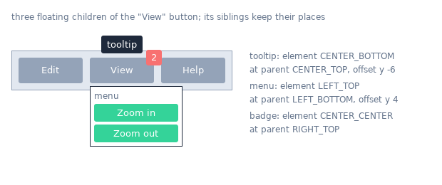
floating => {
    attachTo     => CLAY_ATTACH_TO_PARENT,
    attachPoints => { element => CLAY_ATTACH_POINT_CENTER_BOTTOM,
                      parent  => CLAY_ATTACH_POINT_CENTER_TOP },
    offset       => [0, -4],
    zIndex       => 10,
}
Floating is off unless attachTo is set: with the default CLAY_ATTACH_TO_NONE every other field is ignored. Clay::UI: the floating attribute, keys in snake_case (attach_to, attach_points, z_index, parent_id, pointer_capture_mode, clip_to).
attachTo
attachTo is an enum: which element the floating element is attached to.
CLAY_ATTACH_TO_NONE(0, default)-
Not floating.
CLAY_ATTACH_TO_PARENT(1)-
The parent it is declared in.
CLAY_ATTACH_TO_ELEMENT_WITH_ID(2)-
The element whose id is in
parentId. CLAY_ATTACH_TO_ROOT(3)-
The root of the layout (the whole layout area). With
offsetthis gives absolute positioning.
Clay::UI: floating => { attach_to => ... }.
attachPoints
attachPoints is a Clay_FloatingAttachPoints, { element => $enum, parent => $enum }: a point on the floating element (element) is placed on a point of the element it is attached to (parent). Both default to CLAY_ATTACH_POINT_LEFT_TOP, so by default the two top-left corners meet. The points are the outer box corners, edge centres and centre; padding is not taken into account. The values:
CLAY_ATTACH_POINT_LEFT_TOP       0    CLAY_ATTACH_POINT_CENTER_BOTTOM  5
CLAY_ATTACH_POINT_LEFT_CENTER    1    CLAY_ATTACH_POINT_RIGHT_TOP      6
CLAY_ATTACH_POINT_LEFT_BOTTOM    2    CLAY_ATTACH_POINT_RIGHT_CENTER   7
CLAY_ATTACH_POINT_CENTER_TOP     3    CLAY_ATTACH_POINT_RIGHT_BOTTOM   8
CLAY_ATTACH_POINT_CENTER_CENTER  4

# a 10x10 tooltip centred above the top-right corner of its 100x100 parent at (50, 50):
# the tooltip ends up at (145, 40)
attachPoints => { element => CLAY_ATTACH_POINT_CENTER_BOTTOM,
                  parent  => CLAY_ATTACH_POINT_RIGHT_TOP }
Clay::UI: floating => { attach_points => { element => ..., parent => ... } }.
attachPoints.element
element is an enum (0 .. 8, values above), default CLAY_ATTACH_POINT_LEFT_TOP: the point on the floating element.
attachPoints.parent
parent is an enum (0 .. 8, values above), default CLAY_ATTACH_POINT_LEFT_TOP: the point on the element it is attached to.
floating.offset
offset is a Clay_Vector2, default [0, 0]: moved by this many pixels after the attach points are lined up.
offset => { x => 5, y => 6 }Clay::UI: floating => { offset => ... }.
expand
expand is a Clay_Dimensions, default [0, 0]: the floating element's box grows by width pixels on the left and on the right and by height pixels at the top and at the bottom. The bigger box is what the element's render commands and Clay_GetElementData report, and its children are placed from the bigger box's top-left corner.
expand => [10, 10] # a 40x40 element at (0, 0) is drawn as 60x60 at (-10, -10)Clay::UI: floating => { expand => ... }.
parentId
parentId is a U32, default 0: the id of the element to attach to when attachTo is CLAY_ATTACH_TO_ELEMENT_WITH_ID. Pass the numeric id or the whole element id hash from Clay_GetElementId; Clay::XS uses its id. Other attachTo values ignore it.
floating => { attachTo => CLAY_ATTACH_TO_ELEMENT_WITH_ID,
              parentId => Clay_GetElementId('menu-button') }
The target may be declared anywhere in the same frame, before or after the floating element. When the frame declares no element with that id, Clay reports CLAY_ERROR_TYPE_FLOATING_CONTAINER_PARENT_NOT_FOUND to the error handler at the end of the frame.
Clay::UI: floating => { parent_id => ... }.
zIndex
zIndex is an int16, default 0: the drawing order of the floating element and all its children. Clay sorts floating elements by ascending zIndex before it produces render commands, so drawing the commands in order puts higher values on top; the normal (non-floating) layout is at 0, so negative values draw below it. Render commands of the floating element and its children carry its zIndex in their zIndex key, except BORDER, SCISSOR_END and the betweenChildren RECTANGLE commands, which always carry 0.
zIndex => 10Clay::UI: floating => { z_index => ... }.
pointerCaptureMode
pointerCaptureMode is an enum: whether the floating element hides the elements below it from the pointer functions (Clay_PointerOver, Clay_GetPointerOverIds, hover callbacks).
CLAY_POINTER_CAPTURE_MODE_CAPTURE(0, default)-
The pointer stops here: elements below it are not reported.
CLAY_POINTER_CAPTURE_MODE_PASSTHROUGH(1)-
Elements below it are reported as well.
Clay::UI: floating => { pointer_capture_mode => ... }.
clipTo
clipTo is an enum: whether the floating element is clipped by the clip rectangle of the element it is attached to.
CLAY_CLIP_TO_NONE(0, default)-
Not clipped; it is drawn in full, even outside a scroll container.
CLAY_CLIP_TO_ATTACHED_PARENT(1)-
Clipped like the element it is attached to: its commands are wrapped in a
SCISSOR_START/SCISSOR_ENDpair with that clip rectangle.
Clay::UI: floating => { clip_to => ... }.
custom
custom is a Clay_CustomElementConfig, { customData => $integer }, for things Clay cannot describe (a chart, a 3D view, a video).
customData
customData is an opaque integer, default 0. When it is not 0, the element produces a CUSTOM render command whose renderData holds customData, the backgroundColor and the cornerRadius. The renderer draws it however it likes, inside the command's bounding box.
custom => { customData => $chart_number }Clay::UI: no attribute; a contribute_ method writes it as custom => { custom_data => ... } (or customData); see "Keys Clay::UI has no attribute for".
clip
clip is a Clay_ClipElementConfig: clips the children to the element's box on one or both axes and makes the element a scroll container.
clip => { vertical => 1, childOffset => Clay_GetScrollOffset() }A clipping element produces a SCISSOR_START render command (with its bounding box and renderData => { horizontal, vertical }) before its children and a SCISSOR_END after them; the renderer should only draw inside the box in between. Clay remembers a scroll position for every clipping element across frames, moved by Clay_UpdateScrollContainers (mouse wheel, dragging) and by set_scroll_position; read it with Clay_GetScrollContainerData (see "Clay_ScrollContainerData"). Clay::UI: the HasScroll attributes listed below.
horizontal
horizontal is a boolean, default false: clip, and allow scrolling, on the x axis. On a clipping axis the children may be larger than the element: they are not compressed to fit it. Clay::UI: the horizontal attribute of HasScroll, default 0.
vertical
vertical is a boolean, default false: clip, and allow scrolling, on the y axis. Clay::UI: the vertical attribute of HasScroll, default 1.
childOffset
childOffset is a Clay_Vector2, default [0, 0]: every child is moved by this many pixels. This is how scrolling is shown: pass Clay_GetScrollOffset() (the scroll position Clay tracks for the open element) to let Clay scroll, or your own offset to scroll yourself. Use negative values: { y => -30 } shows the content 30 pixels further down. With external scroll handling on (Clay_SetExternalScrollHandlingEnabled), Clay does not apply it. Clay::UI: the child_offset attribute of HasScroll; unset, Clay::UI passes Clay_GetScrollOffset().
border
border is a Clay_BorderElementConfig, { color => ..., width => ... }: lines along the element's edges and, optionally, between its children. Borders do not affect the layout: they are drawn inside the element's box, over its padding and, without padding, over its children.
border => { color => [200, 200, 200, 255], width => border_outside(1) }Clay::UI: the border_color and border_width attributes.
border.color
color is a Clay_Color, default [0, 0, 0, 0]: the colour of all borders of the element.
border.width
width is a Clay_BorderWidth (see "Clay_BorderWidth"), { left, right, top, bottom, betweenChildren }, each a U16 in pixels, default 0: values outside 0 .. 65535 or non-integers croak.
When any of the five is above 0 and color has an alpha above 0, the element produces a BORDER render command after its children, with its bounding box and renderData => { color, cornerRadius, width }; the renderer draws the four sides inset into the box.
betweenChildren draws a line in the childGap between neighbouring children: vertical lines for CLAY_LEFT_TO_RIGHT, horizontal lines for CLAY_TOP_TO_BOTTOM, both for CLAY_LEFT_TO_RIGHT_WRAP (see "FLOW LAYOUT" in Clay::XS), nothing for CLAY_BACK_TO_FRONT. Each line is a separate RECTANGLE render command in the border colour, produced only when color has an alpha above 0, so the renderer needs no special code for them.
width => border_all(2)          # all four sides and between children
width => border_outside(2)      # the four sides only
width => { bottom => 3 }        # an underline
Clay::UI: border_width, a hash (between_children) or a number for the four sides.
transition
transition is a Clay_TransitionElementConfig: animates changes of the element's position, size and colours between frames, and its appearing (enter) and disappearing (exit). The element needs the same id in every frame. The animation itself is computed by the per-context handlers installed with Clay_SetTransitionHandlers (see "CALLBACKS" in Clay::XS). Without handlers the key has no effect: the element changes at once, as in C with a NULL handler (see "FUNCTIONS: TRANSITIONS" in Clay::XS).
transition => {
    duration   => 0.25,
    properties => CLAY_TRANSITION_PROPERTY_BACKGROUND_COLOR | CLAY_TRANSITION_PROPERTY_POSITION,
    enter      => { hasSetInitial => 1 },
    exit       => { hasSetFinal => 1 },
}
Any transition hash, even {}, makes Clay track the element for transitions while the context has transition handlers (Clay::XS installs its C handler only then); without the key the element has no transitions. Clay::UI: no attribute, but a contribute_ method can add the key; install the handlers with Clay_SetTransitionHandlers right after Clay::UI->new (see "Keys Clay::UI has no attribute for").
duration
duration is a float, default 0: the length of a transition in seconds. Clay only passes it to the handler (as duration), next to the time elapsed so far (elapsedTime, the sum of the $delta_time values given to Clay_EndLayout); the handler decides when the transition is complete.
properties
properties is a bit set, an integer in 0 .. 511, default 0 (nothing is animated): the properties to animate. Combine constants with |. A property that changes but is not listed takes its new value at once.
CLAY_TRANSITION_PROPERTY_NONE                0
CLAY_TRANSITION_PROPERTY_X                   1
CLAY_TRANSITION_PROPERTY_Y                   2
CLAY_TRANSITION_PROPERTY_POSITION            3    X | Y
CLAY_TRANSITION_PROPERTY_WIDTH               4
CLAY_TRANSITION_PROPERTY_HEIGHT              8
CLAY_TRANSITION_PROPERTY_DIMENSIONS         12    WIDTH | HEIGHT
CLAY_TRANSITION_PROPERTY_BOUNDING_BOX       15    POSITION | DIMENSIONS
CLAY_TRANSITION_PROPERTY_BACKGROUND_COLOR   16
CLAY_TRANSITION_PROPERTY_OVERLAY_COLOR      32
CLAY_TRANSITION_PROPERTY_CORNER_RADIUS      64
CLAY_TRANSITION_PROPERTY_BORDER_COLOR      128
CLAY_TRANSITION_PROPERTY_BORDER_WIDTH      256
CLAY_TRANSITION_PROPERTY_BORDER            384    BORDER_COLOR | BORDER_WIDTH
The animated values are those of "Clay_TransitionData": bounding box, background colour, overlay colour, border colour and border width. The corner radius is not among them, so CLAY_TRANSITION_PROPERTY_CORNER_RADIUS is accepted but animates nothing.
interactionHandling
interactionHandling is an enum: whether the pointer functions see the element while it moves.
CLAY_TRANSITION_DISABLE_INTERACTIONS_WHILE_TRANSITIONING_POSITION(0, default)-
The element and its children are skipped by
Clay_PointerOver,Clay_GetPointerOverIdsand hover callbacks while it enters, exits, or animates its position. CLAY_TRANSITION_ALLOW_INTERACTIONS_WHILE_TRANSITIONING_POSITION(1)-
The element is skipped only while it exits.
enter
enter is a hash, { trigger => $enum, hasSetInitial => $boolean }: the transition of an element that appears. It has no C type name, so check_struct cannot check it alone (check the whole Clay_TransitionElementConfig).
- hasSetInitial
-
A boolean, default false. True gives the element an enter transition: in the frame it appears, Clay calls the
$set_initialhandler ofClay_SetTransitionHandlerswith the element's state, and animates from the state the handler returns to the real one. False: the element appears at once. - enter.trigger
-
An enum:
CLAY_TRANSITION_ENTER_SKIP_ON_FIRST_PARENT_FRAME(0, default) skips the enter transition when the parent appears in the same frame (a list shown for the first time does not animate all its items);CLAY_TRANSITION_ENTER_TRIGGER_ON_FIRST_PARENT_FRAME(1) runs it anyway.
exit
exit is a hash, { trigger => $enum, siblingOrdering => $enum, hasSetFinal => $boolean }: the transition of an element that is no longer declared. Like enter, it has no C type name.
- hasSetFinal
-
A boolean, default false. True gives the element an exit transition: in the first frame it is missing, Clay calls the
$set_finalhandler with its last state and keeps drawing the element (with its children, at a fixed size) while it animates to the state the handler returns. False: the element disappears at once. - exit.trigger
-
An enum:
CLAY_TRANSITION_EXIT_SKIP_WHEN_PARENT_EXITS(0, default) skips the exit transition when the parent disappears in the same frame;CLAY_TRANSITION_EXIT_TRIGGER_WHEN_PARENT_EXITS(1) runs it anyway. - siblingOrdering
-
An enum: where an exiting element is drawn relative to its former siblings.
CLAY_EXIT_TRANSITION_ORDERING_UNDERNEATH_SIBLINGS(0, default) below them,CLAY_EXIT_TRANSITION_ORDERING_NATURAL_ORDER(1) in its old place in the order,CLAY_EXIT_TRANSITION_ORDERING_ABOVE_SIBLINGS(2) above them.
sizingGroup
sizingGroup is a Clay_SizingGroup, { width => $id, height => $id }, added by this distribution's patch to Clay. Elements that share a non-zero group id on an axis get the same size on that axis: the largest content size in the group, before GROW space is shared out. Each member stays within its own max. Only FIT and GROW axes take part; FIXED and PERCENT sizes do not depend on content. Groups work across the whole tree (form labels in different rows, columns of a grid) and may nest; nesting that forms a cycle on one axis is reported as CLAY_ERROR_TYPE_SIZING_GROUP_CYCLE. See "SIZING GROUPS" in Clay::XS.
# four elements in a column, all with sizingGroup => { width => 1 }:
# content 30 px -> 80; content 80 px -> 80; sizing_fit(0, 50) -> 50; sizing_fixed(10) -> 10
sizingGroup => { width => 1 }
Clay::UI: the width_group and height_group attributes of HasSizingGroup.
sizingGroup.width
width is a U32, default 0 (no group): the group id on the x axis.
sizingGroup.height
height is a U32, default 0 (no group): the group id on the y axis. Width and height ids are separate: width group 1 and height group 1 are different groups.
userData
userData is an opaque integer, default 0. Clay copies it into every render command of the element ($cmd->{userData}), so the renderer can find your own data for it; commands without one carry 0. The SCISSOR_END command of a clipping element always carries 0.
userData => refaddr($object) # keep $object alive yourselfClay::UI: reserved; Clay::UI sets it to identify the widget (use $ui->widget_for($cmd->{userData})).
TEXT ELEMENT CONFIG
Clay_TextElementConfig is the hash passed to Clay__OpenTextElement with the text:
Clay__OpenTextElement('Hello, world', {
    fontId    => 0,
    fontSize  => 16,
    textColor => [0, 0, 0, 255],
    wrapMode  => CLAY_TEXT_WRAP_WORDS,
});
A text element is a leaf. Clay measures the text with the function installed by Clay_SetMeasureTextFunction, which receives this hash (with all eight keys) for every word it measures; the element is as big as the measured text, wrapped into lines when it does not fit. Every line becomes one TEXT render command whose renderData holds the line (stringContents), where the line starts in the text (stringOffset, in characters), textColor, fontId, fontSize, letterSpacing and lineHeight. The whole hash may be undef or {}: all zero.
Clay::UI: the parameters of Clay::UI::Text, in snake_case (font_id, font_size, text_color, letter_spacing, line_height, wrap_mode, text_alignment); font_size defaults to 16 and text_color to [0, 0, 0, 255] there.
textColor
textColor is a Clay_Color, default [0, 0, 0, 0] (fully transparent): the colour of the text. Clay only passes it to the renderer.
textColor => [33, 33, 33, 255]fontId
fontId is a U16 (values outside 0 .. 65535 or non-integers croak), default 0: a number naming a font. Clay does not interpret it; your measure function and your renderer map it to a font.
# Your own convention, for example: fontId 0 = regular, 1 = bold.
# The measure function and the renderer look the font up by this number.
Clay__OpenTextElement('Title', { fontId => 1, fontSize => 24 });
fontSize
fontSize is a U16 (values outside 0 .. 65535 or non-integers croak), default 0: the font size. Clay does not interpret it; your measure function and renderer do (usually as pixels).
letterSpacing
letterSpacing is a U16 (values outside 0 .. 65535 or non-integers croak), default 0: extra horizontal space in pixels between characters. Clay does not add it; the measure function must include it in the widths it returns, and the renderer must draw with it.
lineHeight
lineHeight is a U16 (values outside 0 .. 65535 or non-integers croak), default 0: the height in pixels of each line. With 0, a line is as tall as the measure function says. Above 0, every line is lineHeight tall, so the element is lines * lineHeight tall; the TEXT render command of each line is lineHeight tall and the lines stack from the element's top, so the boxes stay inside the element and the renderer centres the glyphs in them. The lineHeight in renderData is the configured value (0 when unset).
lineHeight => 24 # 16 px font, 24 px line pitchwrapMode
wrapMode is an enum: when the text breaks into several lines.
CLAY_TEXT_WRAP_WORDS(0, default)-
At spaces when the text is wider than its element, and at newlines. The element can be compressed down to its longest word.
CLAY_TEXT_WRAP_NEWLINES(1)-
Only at newlines. The element is never compressed below its widest line.
CLAY_TEXT_WRAP_NONE(2)-
Never wraps: the whole text is one line and one
TEXTcommand, newline characters included (the measure function sees them as ordinary characters of one string).
textAlignment
textAlignment is an enum: how the lines of wrapped text are aligned inside the text element's box: CLAY_TEXT_ALIGN_LEFT (0, default), CLAY_TEXT_ALIGN_CENTER (1), CLAY_TEXT_ALIGN_RIGHT (2). A single line is as wide as its element, so this does nothing to it; place the text element with the parent's childAlignment instead.
userData (text element)
userData is an opaque integer, default 0, copied into every TEXT render command of the element, like the element declaration's "userData". Clay::UI: reserved.
OTHER STRUCTS
The small structs used inside the declarations and by function arguments. Each can be checked with check_struct under its name.
Clay_Color
Clay_Color is { r => $float, g => $float, b => $float, a => $float } or [r, g, b, a]; every channel defaults to 0. The channels run from 0 to 255 (other values croak); Clay only passes them to the renderer, except that an alpha (a) of 0 suppresses the backgroundColor rectangle, the overlayColor commands and the betweenChildren lines.
[255, 128, 0, 255]
{ r => 255, g => 128, b => 0, a => 255 }- r
-
Red, a float, default 0.
- g
-
Green, a float, default 0.
- b
-
Blue, a float, default 0.
- a
-
Alpha (opacity), a float, default 0. 0 is fully transparent; by convention 255 is opaque.
The channels are floats in 0 .. 255; other values croak expected a number in 0..255.
Clay_Vector2
Clay_Vector2 is { x => $float, y => $float } or [x, y], default [0, 0]: a position or offset in pixels. Used by floating.offset, clip.childOffset, Clay_SetPointerState, Clay_UpdateScrollContainers, set_scroll_position and the query-scroll callback's result; returned by Clay_GetScrollOffset.
Clay_Dimensions
Clay_Dimensions is { width => $float, height => $float } or [width, height], default [0, 0]. Used by floating.expand, Clay_Initialize, Clay_SetLayoutDimensions and the measure callback's result; returned by Clay_GetLayoutDimensions.
Clay_BoundingBox
Clay_BoundingBox is { x => $float, y => $float, width => $float, height => $float } (a hash only, no array form): a rectangle in pixels, relative to the top-left corner of the layout. Render commands, Clay_GetElementData and "Clay_TransitionData" use it.
Clay_CornerRadius
Clay_CornerRadius is { topLeft => $float, topRight => $float, bottomLeft => $float, bottomRight => $float } or one number for all four, each default 0. See "cornerRadius". corner_radius_all($r) returns the hash.
- topLeft
-
The radius of the top left corner, a float, default 0.
- topRight
-
The radius of the top right corner, a float, default 0.
- bottomLeft
-
The radius of the bottom left corner, a float, default 0.
- bottomRight
-
The radius of the bottom right corner, a float, default 0.
Radii are floats of at least 0 (a negative radius croaks expected a number >= 0). Clay::UI spells them top_left, top_right, bottom_left, bottom_right.
Clay_Padding
Clay_Padding is { left, right, top, bottom }, each a U16, default 0: values outside 0 .. 65535 or non-integers croak. See "padding". padding_all($px) returns the hash.
- left
-
The space in pixels between the element's left edge and its children.
- right
-
The space in pixels between the element's right edge and its children.
- top
-
The space in pixels between the element's top edge and its children.
- bottom
-
The space in pixels between the element's bottom edge and its children.
Clay_BorderWidth
Clay_BorderWidth is { left, right, top, bottom, betweenChildren }, each a U16 in pixels, default 0: values outside 0 .. 65535 or non-integers croak. See "border.width". border_all($px) sets all five, border_outside($px) the four sides with betweenChildren 0.
- left, right, top, bottom
-
The width of the border along that edge, drawn inside the element's box. These four keys have the same names as those of "Clay_Padding".
- betweenChildren
-
The width of the lines drawn in the
childGapbetween neighbouring children (see "border.width"). Clay::UI spells itbetween_children.
Clay_ChildAlignment
Clay_ChildAlignment is { x => $enum, y => $enum }. See "childAlignment".
Clay_SizingAxis
Clay_SizingAxis is { type, min, max } or { type => CLAY__SIZING_TYPE_PERCENT, percent }. See "sizing". sizing_fit, sizing_grow, sizing_fixed and sizing_percent return one.
Clay_Sizing
Clay_Sizing is { width => $axis, height => $axis }, two "Clay_SizingAxis" hashes, each default FIT with no limits.
Clay_SizingGroup
Clay_SizingGroup is { width => $id, height => $id }, each a U32, default 0. See "sizingGroup".
Clay_FloatingAttachPoints
Clay_FloatingAttachPoints is { element => $enum, parent => $enum }, each 0 .. 8. See "attachPoints".
Clay_TransitionData
Clay_TransitionData is the state a transition animates:
{
    boundingBox     => { x, y, width, height },     # Clay_BoundingBox
    backgroundColor => { r, g, b, a },              # Clay_Color
    overlayColor    => { r, g, b, a },
    borderColor     => { r, g, b, a },
    borderWidth     => { left, right, top, bottom, betweenChildren },
}- boundingBox
-
A "Clay_BoundingBox": the element's position and size. Animated by the X, Y, WIDTH and HEIGHT properties.
- backgroundColor (Clay_TransitionData)
-
A "Clay_Color", animated by
CLAY_TRANSITION_PROPERTY_BACKGROUND_COLOR. - overlayColor (Clay_TransitionData)
-
A "Clay_Color", animated by
CLAY_TRANSITION_PROPERTY_OVERLAY_COLOR. - borderColor
-
A "Clay_Color", animated by
CLAY_TRANSITION_PROPERTY_BORDER_COLOR. - borderWidth
-
A "Clay_BorderWidth", animated by
CLAY_TRANSITION_PROPERTY_BORDER_WIDTH.
The transition handlers receive such hashes and $set_initial / $set_final return one (see "CALLBACKS" in Clay::XS). A returned hash may be partial: keys it leaves out keep their previous value. A sub-hash that is present starts from zero, so return a whole colour, not just one channel.
Clay_TransitionElementConfig
Clay_TransitionElementConfig is the "transition" key of a declaration: { duration, properties, interactionHandling, enter => { trigger, hasSetInitial }, exit => { trigger, siblingOrdering, hasSetFinal } }. C's function pointer fields (handler, setInitialState, setFinalState) are not keys: the handler is installed while the context has Perl transition handlers, and the two booleans stand for the state functions.
Clay_ElementDeclaration
Clay_LayoutConfig
See "layout".
Clay_TextElementConfig
Clay_AspectRatioElementConfig, Clay_ImageElementConfig, Clay_CustomElementConfig
See "aspectRatio", "image" and "custom".
Clay_FloatingElementConfig, Clay_ClipElementConfig, Clay_BorderElementConfig
See "floating", "clip" and "border".
RETURNED HASHES
Hashes Clay::XS functions return or pass to callbacks. They are fresh copies; changing them changes nothing in Clay.
element id hash
Clay_GetElementId, Clay_GetElementIdWithIndex, Clay__HashString, Clay__HashStringWithOffset and Clay_GetPointerOverIds return element ids (Clay_ElementId) as hashes:
{ id => 2466489830, offset => 0, baseId => 2466489830, stringId => 'x' }- id
-
U32: the hash Clay identifies the element by. Render commands carry it in their
idkey;Clay_GetOpenElementIdreturns it alone. - offset
-
U32: the index given to
Clay_GetElementIdWithIndexorClay__HashStringWithOffset, 0 otherwise. - baseId
-
U32: the hash of the string and seed, before the offset was applied (equal to
idwhenoffsetis 0). - stringId
-
The string the id was made from, as a character string. Present only for ids made from a non-empty string; ids of elements opened with
Clay__OpenElementhave none.
Functions taking an element id (Clay__OpenElementWithId, Clay_GetElementData, Clay_PointerOver, Clay_GetScrollContainerData, set_scroll_position) want such a hash; they read id, offset and baseId (U32 each). Clay__OpenElementWithId also keeps a private copy of stringId, which Clay reports back in Clay_GetPointerOverIds and shows in its debug view; the other functions ignore stringId. floating.parentId takes the hash or the number.
Clay_ElementData
Clay_GetElementData($id) returns:
{ boundingBox => { x, y, width, height }, found => 1 }- boundingBox (Clay_ElementData)
-
A "Clay_BoundingBox": where the element was in the last completed frame (a floating element's box includes its
expand). - found
-
1 when an element with that id exists, 0 otherwise (then the box is all 0).
Clay_ScrollContainerData
Clay_GetScrollContainerData($id) returns:
{
    scrollPosition            => { x, y },          # current scroll offset
    scrollContainerDimensions => { width, height }, # the element's box size
    contentDimensions         => { width, height }, # its children plus padding
    config                    => { horizontal, vertical, childOffset => { x, y } },
    found                     => 1,
}- scrollPosition
-
A "Clay_Vector2": the current scroll offset. In C it is a pointer you write through; here it is a copy, and
set_scroll_positionwrites the position. - scrollContainerDimensions
-
A "Clay_Dimensions": the size of the container's box.
- contentDimensions
-
A "Clay_Dimensions": the size of the container's children plus its padding.
- config
-
The element's "clip" config:
horizontal,verticalandchildOffset. The key may be absent: it is there between frames when the last completed frame declared the container, and during a frame once the container has been declared in it; before that (and whenfoundis 0) it is left out, because Clay would read it from an element slot that may hold another element (see "Clay_GetScrollContainerData" in Clay::XS). - found (Clay_ScrollContainerData)
-
1 when the id names an element declared with
clipin a completed frame; otherwise 0, and everything else is 0 too.
Clay_PointerData
Clay_GetPointerState() returns, and hover callbacks receive:
{ position => { x, y }, state => CLAY_POINTER_DATA_... }- position
-
A "Clay_Vector2": the last position given to
Clay_SetPointerState. - state
-
One of
CLAY_POINTER_DATA_PRESSED_THIS_FRAME(0),CLAY_POINTER_DATA_PRESSED(1),CLAY_POINTER_DATA_RELEASED_THIS_FRAME(2),CLAY_POINTER_DATA_RELEASED(3).
error hash
The error handler given to Clay_Initialize receives Clay_ErrorData as:
{ errorType => CLAY_ERROR_TYPE_..., errorText => 'human-readable text' }- errorType
-
One of the
CLAY_ERROR_TYPE_...constants (see "Error types" in Clay::XS). - errorText
-
Clay's message, a human-readable string.
render command
Clay_EndLayout returns an arrayref of render commands:
{
    id          => $u32,                    # element id (derived ids for lines, borders)
    commandType => CLAY_RENDER_COMMAND_TYPE_...,
    zIndex      => $int16,                  # see zIndex
    boundingBox => { x, y, width, height },
    userData    => $integer,                # see userData; 0 when unset
    renderData  => { ... },                 # depends on commandType
}
renderData by commandType:
RECTANGLE (1)              backgroundColor, cornerRadius
BORDER (2)                 color, cornerRadius, width (Clay_BorderWidth)
TEXT (3)                   stringContents, stringOffset, textColor, fontId,
                           fontSize, letterSpacing, lineHeight
IMAGE (4)                  backgroundColor, cornerRadius, imageData
SCISSOR_START (5)          horizontal, vertical
SCISSOR_END (6)            horizontal, vertical
OVERLAY_COLOR_START (7)    color
OVERLAY_COLOR_END (8)      color
CUSTOM (9)                 backgroundColor, cornerRadius, customData
NONE (0)                   (empty)
See "RENDER COMMANDS" in Clay::XS.
Clay_TransitionCallbackArguments
The transition handler installed with Clay_SetTransitionHandlers receives, and Clay_EaseOut takes, a Clay_TransitionCallbackArguments hash (check_struct knows it under that name):
{
    transitionState => CLAY_TRANSITION_STATE_...,   # IDLE 0, ENTERING 1,
                                                    # TRANSITIONING 2, EXITING 3
    initial         => \%transition_data,           # state when it started
    target          => \%transition_data,           # state it moves to
    current         => \%transition_data,           # update this one
    elapsedTime     => $seconds,
    duration        => $seconds,                    # the element's duration
    properties      => $bits,                       # the properties being animated
}- transitionState
-
One of
CLAY_TRANSITION_STATE_IDLE(0),CLAY_TRANSITION_STATE_ENTERING(1),CLAY_TRANSITION_STATE_TRANSITIONING(2),CLAY_TRANSITION_STATE_EXITING(3). - initial
-
A "Clay_TransitionData": the state when the transition started.
- target
-
A "Clay_TransitionData": the state the transition moves to.
- current
-
A "Clay_TransitionData": the state to draw now. The handler updates it.
- elapsedTime
-
Seconds since the transition started (the sum of the
$delta_timevalues given toClay_EndLayout), a number >= 0. Clay interpolates with the ratio ofelapsedTimetoduration; a negative time would move it outside 0..1 and border widths outside their range. - duration (Clay_TransitionCallbackArguments)
-
The element's transition "duration" in seconds.
- properties (Clay_TransitionCallbackArguments)
-
The element's transition "properties": the bits of the properties being animated.
Clay_EaseOut returns { complete => $bool, current => \%transition_data }:
- complete
-
1 when
elapsedTimehas reachedduration(ordurationis 0 or less), 0 otherwise. - current (Clay_EaseOut result)
-
A "Clay_TransitionData": the argument's
currentwith every property selected inpropertieseased frominitialtowardstarget.
SEE ALSO
Clay::XS (functions, callbacks, render commands, check_struct), Clay::UI (the widget layer), Clay::Manual, Clay::Cookbook, Clay::UI::Text, Clay::UI::Role::Core::Element, src/marshal.c (the struct schemas), src/clay/clay.h (Clay's own field comments, generated by make).