NAME
Term::Fabulous::Manual::Looks - Text, colors and borders
DESCRIPTION
This page is part of Term::Fabulous::Manual. Previous page: Term::Fabulous::Manual::Layout. Next page: Term::Fabulous::Manual::Events.
This page explains how widgets look: how a Text widget shows text (character strings, wrapping, alignment, line height, bold, italic and underlined text, wide characters and control characters), how colors are written and how translucent colors are blended, how borders are drawn (border styles, per-side styles, widths, colors and borders that join the lines around them), and how a theme colors every widget at once (the built-in themes, theme files, variants, switching at run time). Every feature is shown in a picture, with the Perl code and, where a layout file can set it, the form it takes in a KDL layout file.
The reference pages for this topic are Term::Fabulous::Widget::Text, Term::Fabulous::Color, Term::Fabulous::Enum::WebColor, Term::Fabulous::Enum::BorderStyle, Term::Fabulous::Role::HasBorderStyle and Term::Fabulous::Theme. Complete programs are in Term::Fabulous::Cookbook::GettingStarted (non-ASCII text, wrapping and alignment) and Term::Fabulous::Cookbook::Layout (per-side border styles, switching themes).
TEXT
Term::Fabulous::Widget::Text shows text in one color. Text wraps at spaces when it is wider than the room its parent gives it, and a "\n" in the text starts a new line.
my $label = Term::Fabulous::Widget::Text->new(
	text       => 'Disk usage: 42%',
	text_color => [ 230, 230, 230, 255 ],
);
$label->text('Disk usage: 43%');    # shown in the next frame
In a KDL layout file:
Text "usage" {
	text "Disk usage: 42%"
	text_color "#e6e6e6"
}
Without a text_color, a Text is drawn in the theme's text color ("THEMES"): a light gray in the built-in dark theme, a dark gray in light. To use the terminal's default text color instead, pass [0, 0, 0, 0] (see "Alpha and the terminal default color").
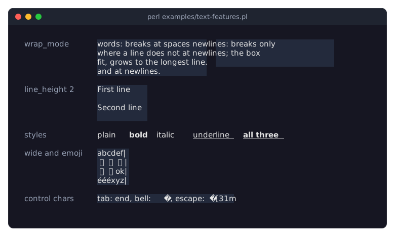
A Text widget has no background, border or padding of its own; put it in a Term::Fabulous::Widget::Box for those. The program examples/text-features.pl shows the text features described in this section side by side; the panels behind the texts show how much room each Text takes:
Text is character strings
The text of a Text widget is a Perl character string, like all text in Term::Fabulous: the input widgets (value, label, placeholder, options), the canvas drawing methods, Term::Fabulous::Editor, Term::Fabulous::Unicode and Term::Fabulous::Layout->new( string => ... ). With use utf8;, non-ASCII literals in your source work directly:
use utf8;                 # this source file contains non-ASCII text

my $greeting = Term::Fabulous::Widget::Text->new(
	text       => 'Grüße aus München',
	text_color => [ 255, 255, 255, 255 ],
);
$greeting->text('Schöne Grüße');
Text that comes from outside the program (files, command output, sockets, @ARGV) is bytes. Decode it first with Encode::decode('UTF-8', ...); otherwise each byte shows as a character of its own, so "ü" shows as two wrong characters:
use Encode qw(decode);

chomp( my $hostname = `hostname` );    # bytes
$label->text( decode( 'UTF-8', $hostname ) );
Text in a KDL layout file is already a character string and is passed to the Text widget as is. The recipe Show non-ASCII text is a complete program.
Wrapping
The wrap_mode parameter of a Text widget decides where lines break. Import the constants from Clay::XS:
CLAY_TEXT_WRAP_WORDS(the default)-
Breaks at spaces when the text is wider than the room it gets, and at every
"\n". The first panel of the picture at the start of "TEXT" shows it: a text in a box 24 columns wide, wrapped at spaces. CLAY_TEXT_WRAP_NEWLINES-
Breaks only at
"\n". The Text is as wide as its longest line: a parent withfitsizing grows to it (the second panel in the picture), while a line that is wider than a fixed-size parent runs past the parent's right edge and is cut off only at the edge of the terminal or of an enclosing Term::Fabulous::Widget::ScrollBox. CLAY_TEXT_WRAP_NONE-
The same as
CLAY_TEXT_WRAP_NEWLINES:"\n"still starts a new line, and nothing else does. The layout engine Clay lays out both modes alike (it only distinguishesCLAY_TEXT_WRAP_WORDSfrom the others), so useCLAY_TEXT_WRAP_NEWLINES; to show text on one line, remove its newlines.
use Clay::XS qw(CLAY_TEXT_WRAP_NEWLINES);

my $listing = Term::Fabulous::Widget::Text->new(
	text       => join( "\n", @lines ),
	text_color => [ 230, 230, 230, 255 ],
	wrap_mode  => CLAY_TEXT_WRAP_NEWLINES,
);
Only spaces are break points. A word longer than the available width is not broken, and neither is text without spaces, such as a Japanese sentence: it runs past the right edge of its parent and is cut off only at the edge of the terminal or of an enclosing ScrollBox. A tab is not a break point either (see "Control characters").
In a KDL layout file, write wrap_mode newlines (words, newlines or none).
Alignment
text_alignment aligns each line within the width of the Text widget: CLAY_TEXT_ALIGN_LEFT (the default), CLAY_TEXT_ALIGN_CENTER or CLAY_TEXT_ALIGN_RIGHT, from Clay::XS.
use Clay::XS qw(CLAY_TEXT_ALIGN_CENTER);

my $notice = Term::Fabulous::Widget::Text->new(
	text           => "Saved.\nThe file was written to disk.",
	text_color     => [ 230, 230, 230, 255 ],
	text_alignment => CLAY_TEXT_ALIGN_CENTER,
);
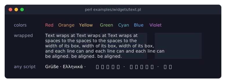
The Text widget is as wide as its longest line (or as the room it gets, when it wraps), so alignment is visible on text with several lines. The picture of Term::Fabulous::Widget::Text shows the same wrapped sentence aligned left, centered and aligned right:
To center a single line, or any widget, in a wider box, use the box's child_alignment (see "Aligning and centering children" in Term::Fabulous::Manual::Layout). In a KDL layout file, write text_alignment center (left, center or right). The recipe Wrap, align and space text prints every wrap mode and alignment.
Line height
line_height is the number of rows each line of text takes, an integer. The default, 0, means one row, like 1. With a larger value the line is drawn in the middle row of its rows (the upper middle row when the number is even), so line_height => 2 leaves an empty row below every line:
my $spaced = Term::Fabulous::Widget::Text->new(
	text        => "First line\nSecond line",
	text_color  => [ 230, 230, 230, 255 ],
	line_height => 2,
);
In a KDL layout file, write line_height 2.
Bold, italic and underline
The boolean parameters bold, italic and underline draw the characters of a Text widget in these styles; they can be combined, and they take no space. The terminal draws them with its font, so a font without an italic face shows italic text upright.
my $warning = Term::Fabulous::Widget::Text->new(
	text       => 'Unsaved changes',
	text_color => [ 255, 200, 80, 255 ],
	bold       => 1,
);
$warning->underline(1);    # shown in the next frame
In a KDL layout file:
Text {
	text "Unsaved changes"
	text_color "#ffc850"
	bold #true
	underline #true
}
These are the only text styles a Text widget has, and they apply to the whole text. For a bold word inside a sentence, a colored phrase or reverse video, use a RichText.
Styled spans inside one text
A Term::Fabulous::Widget::RichText is a Text whose spans give ranges of its characters a look of their own: style bits (bold, italic, underline, reverse, dim, blink, strike, overline, conceal), a text color and a background. The text wraps and aligns exactly like a Text; a span simply continues on the next line. The shortest way to write one is markup in the syntax of Python's rich library:
my $hint = Term::Fabulous::Widget::RichText->new(
	markup => 'Press [bold]Enter[/] to save, [bold #e06c75]Esc[/] to leave.',
);
A tag opens a span with a style string, [/] closes the innermost open span, [/bold] the matching one, and \[ is a literal bracket. A style string is words in any order: the bit names above, not bold to clear a bit inside an outer span, a color (a CSS name in any case, or any color string of Term::Fabulous::Color), on COLOR for the background, and default for the terminal's own color. See Term::Fabulous::Text::Style for the words and Term::Fabulous::Text::Markup for the tags.
Spans can also be given as character ranges, or added later:
my $line = Term::Fabulous::Widget::RichText->new(
	text  => 'error: config.kdl not found',
	spans => [ [ 0, 6, 'bold #e06c75' ] ],
);
$line->stylize( 'underline', 7, 17 );    # the file name, shown in the next frame
Later spans win where spans overlap, and setting text drops them. In a KDL layout file:
RichText {
	markup "Press [bold]Enter[/] to save"
}
The widget's own text_color, bold, italic and underline are the base look that the spans change. The program examples/widgets/rich-text.pl shows markup, spans, every style word and a wrapped paragraph side by side.
Links inside a text
A RichText can also hold links, ranges of its text that the user follows with a click, or with Tab, Left/Right and Enter. The widget fires LinkActivate with the link's target and leaves the rest to the program:
my $help = Term::Fabulous::Widget::RichText->new(
	markup => 'Read the [link=faq]FAQ[/link] or [link=https://perl.org]perl.org[/link].',
);
$help->on( LinkActivate => sub ($event) { show_page( $event->link ); return } );
Links are drawn over the spans in the theme's link look: underlined in the accent color, highlighted under the pointer and when selected. A theme changes the look with the slots text.link (the color of the words) and text.link.background, each in the states normal, hovered and selected, such as 'text.link.selected' => 'text_inverse'. See "Looks" in Term::Fabulous::Widget::RichText for the defaults and a picture, and "Follow links in a text (RichText links)" in Term::Fabulous::Cookbook::KeyboardAndMouse for a program with links in colors of its own.
Wide characters and emoji
A terminal cell holds one character. Some characters, most CJK characters and many emoji, take two cells. Term::Fabulous measures text the same way termbox2 draws it (with termbox2's own width tables, see Term::Fabulous::Unicode), so wide characters line up as long as the locale is UTF-8 and the terminal agrees with termbox2 about each character's width. In the picture at the start of "TEXT", four lines of Latin letters, Japanese, emoji and combining accents all end in the same column.
Characters made of several code points (a grapheme cluster), such as a letter with a combining accent or a flag, are kept together and take the width of the whole cluster: "e\x{301}" (an e and a combining acute accent) takes one cell. An emoji presentation selector (U+FE0F), a zero-width joiner or a pair of regional indicators makes a cluster two cells wide. Use string_columns from Term::Fabulous::Unicode to find out how many columns a string takes, for example to pad a label:
use Term::Fabulous::Unicode qw(string_columns);

my $columns = string_columns('日本語');    # 6
Control characters
Control characters in text are never sent to the terminal, because they could move the cursor or change terminal settings. A tab becomes one space; every other control character (U+0000 to U+001F except tab and newline, U+007F to U+009F) is shown as U+FFFD, the replacement character. That includes a carriage return: remove the "\r" of Windows line ends (s/\r\n/\n/g) before you show such text. In Text widgets, a newline starts a new line, as described in "Wrapping". The last line of the picture at the start of "TEXT" shows a tab, a bell character and an escape sequence. See "sanitize_text" in Term::Fabulous::Unicode for the exact rules.
Font parameters
The parameters font_id, font_size and letter_spacing exist because Clay::UI::Text supports graphical fonts. They have no effect in a terminal, where every character is drawn in the terminal's font.
COLORS
Colors are red, green, blue and alpha (opacity) channels, each from 0 to 255. Term::Fabulous always draws with 24-bit colors.
Color formats
Every color a widget takes, and every color argument of the canvas drawing methods, accepts the same formats: anything Term::Fabulous::Color->new( color => ... ) accepts.
- Perl code
-
Format                   Example                          Alpha
-----------------------  -------------------------------  ---------------
hex string               '#ff8800' or 'ff8800'            255
hex string with alpha    '#ff880080'                      the last pair
rgb() string             'rgb(255, 136, 0)'               255
rgba() string            'rgba(255, 136, 0, 0.5)'         the 4th value
hsl() string             'hsl(32, 100%, 50%)'             255
hsla() string            'hsla(32, 100%, 50%, 50%)'       the 4th value
web color name           'DarkOrange' or 'darkorange'     255
array reference          [ 255, 136, 0 ] or [ ..., 128 ]  255 or the 4th
hash reference           { r => 255, g => 136, b => 0 }   255 or a/alpha
packed integer           0xFF8800                         255
Term::Fabulous::Color    Term::Fabulous::Color->hex(...)  its alpha
named color (WebColor)   WebColor->DarkOrange             255
A hash takes either the keys
r,g,b(anda) orred,green,blue(andalpha). The alpha ofrgba()andhsla()can be a channel value (128), a fraction with a decimal point (0.5) or a percentage (50%); see "new" in Term::Fabulous::Color for all rules. A web color name is one of the 148 CSS named colors, in any case ("A string" in Term::Fabulous::Color has the grammar, "COLORS" in Term::Fabulous::Enum::WebColor the names). Three-digit hex ('#f80') is not accepted. An invalid color dies with the name of the parameter:Term::Fabulous::Widget::Box: background_color must be a color, got 'redd' (unrecognized color string 'redd')Colors in some of these formats:
use Term::Fabulous::Enum::WebColor;

my $box = Term::Fabulous::Widget::Box->new(
	background_color => '#14192b',
	border_color     => Term::Fabulous::Enum::WebColor->SteelBlue,    # or 'SteelBlue'
);
my $text = Term::Fabulous::Widget::Text->new( text => 'Hello', text_color => 'hsl(210, 20%, 90%)' );
The widgets store their colors as an array reference
[r, g, b, a], whatever format was given, and their accessors return that array:$box->background_colorreturns[20, 25, 43, 255]above. - KDL layout files
-
Every property whose name ends in
_color, and thecolorof abordernode, takes a string in any of the string formats above:background_color "#14192b" text_color "rgb(220, 220, 220)" border color="hsl(210, 80%, 60%)" text_color "SteelBlue"The table of named colors lists the web color names.
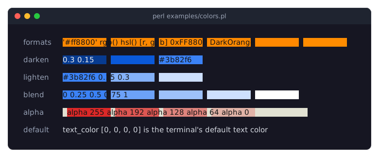
The program examples/colors.pl shows one orange in six formats, the color functions of "Working with colors", red backgrounds with less and less alpha, and the terminal's default text color:
Named colors
Term::Fabulous::Enum::WebColor has the 148 named colors of CSS as Term::Fabulous::Color objects. Give one, or its name as a string in any case ('MidnightBlue', 'midnightblue'), wherever a color is expected, or derive new colors from it:
use Term::Fabulous::Enum::WebColor;

my $box = Term::Fabulous::Widget::Box->new( background_color => Term::Fabulous::Enum::WebColor->MidnightBlue );
my $same = Term::Fabulous::Widget::Box->new( background_color => 'MidnightBlue' );
my $by_name = Term::Fabulous::Enum::WebColor->from_name('Tomato');    # undef for unknown names
examples/web-colors.pl shows all of them; see the picture on Term::Fabulous::Enum::WebColor.
Alpha and the terminal default color
Alpha has three meanings:
- Alpha 0
-
"No color": the terminal's default color is used (the color the terminal shows when a program sets none). A box with
background_color => [0, 0, 0, 0], or without a background color, paints no background, so whatever is behind it shows, text and borders included. Atext_colororborder_colorwith alpha 0 draws in the terminal's default text color. - Alpha 255
-
The color is drawn opaque.
- Alpha 1 to 254
-
Translucent. A
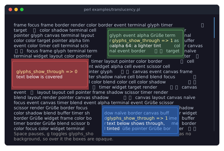
background_colorwith such an alpha is blended, cell by cell, with whatever was drawn below the widget, like a sheet of tinted glass:[0, 0, 0, 128]dims the area below to half its brightness. What happens to the text and borders below is up to the widget's glyphs_show_through. Off, the default, covers them with spaces in the blended color. On, they stay visible through the background, with their colors tinted the same way, until the widget draws its own content over them.Only backgrounds are blended. Text colors, border colors, the colors of the input widgets and the cell colors of a canvas with such an alpha are drawn opaque.
my $dimmer = Term::Fabulous::Widget::Box->new(
	background_color    => [ 0, 0, 0, 128 ],    # half-transparent black
	glyphs_show_through => 1,                   # the text below stays readable
);
In a KDL layout file: background_color "rgba(0, 0, 0, 0.5)" and glyphs_show_through #true.
The terminal default color cannot be blended, because only the terminal knows which color it shows for it. Where the color below a translucent background is the default, the background is drawn opaque, and a glyph showing through with the default text color keeps it. examples/translucency.pl shows all of this, with translucent boxes orbiting over a screen of text:
Black is a real color: [0, 0, 0, 255] is drawn as black, not as the terminal's default.
Working with colors
Term::Fabulous::Color parses colors and derives new ones, which is useful for themes. Colors are immutable; every method returns a new object.
use Term::Fabulous::Color;

my $accent  = Term::Fabulous::Color->hex('#3b82f6');
my $hover   = $accent->lighten(0.1);                                     # 10 percentage points lighter
my $pressed = $accent->darken(0.1);                                      # 10 percentage points darker
my $muted   = $accent->blend( Term::Fabulous::Color->rgb( 128, 128, 128 ), 0.5 );    # halfway to gray
my $glass   = $accent->with_alpha(128);                                  # translucent

$box->background_color($hover);
my ( $r, $g, $b, $a ) = $pressed->to_rgba;
my $hex = $muted->hexString;                                             # '#5e81bbff'
The other constructors are rgb, rgba, hsl and hsla; the other methods read channels (red, to_hsl, rgb_int, ...) and write ANSI escape sequences (ansi, fg_sgr, ...). See Term::Fabulous::Color for all of them. To color every widget at once, and to switch all the colors at run time, use a theme ("THEMES").
BORDERS
Every widget except Term::Fabulous::Widget::Text can have a border: boxes, buttons, scroll boxes, dialogs, toasts, canvases, charts, the input widgets, accordions, progress bars, spinners and images. (A table draws its frame and its lines itself; see "Lines between and around the cells" in Term::Fabulous::Manual::TableStyles.) Three parameters control it:
bordered-
Which sides have a border: a true value for all four sides, or a hash reference such as
{ left => 1, top => 1 }for some of them (the sides it leaves out have none). Without it, the theme decides for the widget's family: the built-in themes give dialogs, toasts and menus a border and no other widget. See "Borders and space" and "Borders from the theme". border_style-
A Term::Fabulous::Enum::BorderStyle item, or its name such as
'Round', that decides the characters of all four sides;border_style_top,border_style_right,border_style_bottomandborder_style_leftset one side each. See "Border styles" and "Use a different border style on each side". border_color-
The color of the border characters, in the formats described in "Color formats". Without one, the border is drawn in the theme's border color (the
bordertoken of the built-in themes).
use Term::Fabulous::Enum::BorderStyle;

my $panel = Term::Fabulous::Widget::Box->new(
	bordered     => 1,
	border_style => Term::Fabulous::Enum::BorderStyle->Round,
	border_color => [ 120, 170, 255, 255 ],
);
In a KDL layout file, the style and the color are attributes of the border node, and bordered is a property of its own:
Box "panel" {
	border style=Round color="#78aaff"
	bordered #true
}
A border needs bordered (or the theme's border.enabled): a style or a color alone draws nothing. A side with a border but no style takes the style the theme gives the widget's family, Round for every family in the built-in themes; a theme that sets a family's style to none has such a side drawn with spaces (the Blank style).
Border styles
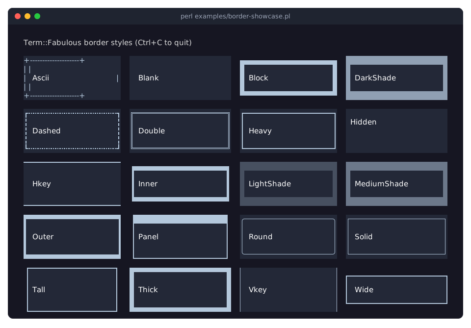
Term::Fabulous::Enum::BorderStyle has 20 styles: Ascii, Blank, Block, DarkShade, Dashed, Double, Heavy, Hidden, Hkey, Inner, LightShade, MediumShade, Outer, Panel, Round, Solid, Tall, Thick, Vkey and Wide. Each is a class method that returns the style object; to look one up by name (for example from a configuration file), use from_name:
my $style = Term::Fabulous::Enum::BorderStyle->from_name('Double')
	// die "unknown border style\n";
Hidden switches a side off: it draws nothing and takes no space, whatever bordered says. Some styles (Block, Panel, Tall, Wide, Inner) draw half of their characters on the background outside the widget, so that the border blends into the parent; they look best when the widget and its parent have different background colors. examples/border-showcase.pl shows all styles:
Use a different border style on each side
The four side parameters set the style of one side each. A side parameter wins over border_style for its side, also when both are given to new; border_style fills the sides that have no style of their own. The side accessors change one side afterwards:
my $card = Term::Fabulous::Widget::Box->new(
	bordered          => 1,
	border_style      => Term::Fabulous::Enum::BorderStyle->Solid,    # all four sides ...
	border_style_left => Term::Fabulous::Enum::BorderStyle->Thick,    # ... except the left one
);
$card->border_style_top( Term::Fabulous::Enum::BorderStyle->Double );    # then change the top
In a KDL layout file, the side styles are the attributes style-top, style-right, style-bottom and style-left of the border node:
border style=Solid style-left=Thick style-top=DoubleThe top and bottom sides own the corners: where the top or bottom row meets a drawn left or right side, the corner glyph comes from the style of the top or bottom side. There is no border_style accessor; to change all four sides, call the four side accessors. The recipe Use a different border style on each side is a complete program.
Borders and space
A border is one line of characters on each side that has one, drawn on the outermost cells of the widget, inside its box, and it takes room in the layout: Term::Fabulous adds a cell to the padding of every side with a border, so the content always starts inside the border, and the padding of the widget's layout is extra room between the border and the content. A widget with fit sizing grows by the border. See also "Borders take space" in Term::Fabulous::Manual::Layout.
bordered takes one true or false value for all four sides, or a hash with any of the keys left, right, top and bottom and true or false values: a side the hash leaves out has no border, and an unknown key dies. A side with the Hidden style takes no space, even where the widget has a border, so the content reaches that edge of the widget; use it to switch off one side of a border the theme gives all four sides.
my $rule = Term::Fabulous::Widget::Box->new(    # a line above and at the left only
	bordered     => { left => 1, top => 1 },
	border_style => Term::Fabulous::Enum::BorderStyle->Solid,
);
In a KDL layout file: bordered left=#true top=#true.
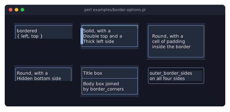
examples/border-options.pl shows a border on two sides, per-side styles, a border with a cell of padding inside, a Hidden side and the two parameters of "Joining borders":
Border colors
The characters of a border are drawn in the border_color. Their background is usually the widget's own background. Some styles use the background just outside the widget, or reverse video, for some characters so that the border blends with its surroundings; the location codes of the border styles say which. Change the color like any other color:
$panel->border_color('#ff5050'); # shown in the next frameA widget that was given no border_color or no border_style takes them from the theme, where the theme has them for the widget's family (a button, a dialog, a toast, ...); see "THEMES". The built-in themes draw the border of a Box in their border token and in the Round style, so a Box given bordered alone gets a round frame.
Borders from the theme
A widget that is not given bordered has a border when the theme's border.enabled says so for its family. The built-in themes give dialogs, toasts and menus a border and no other widget. A theme can give one to buttons, to the inputs in three families that are set one by one (input for check boxes, radio buttons, sliders, star ratings and segmented controls, text_input for text fields and text areas, and dropdown), to menu bars, and to accordions, progress bars, spinners and images. A theme can also take the border away from menus. This theme file frames every text field and text area:
text_input {
	border enabled=#true
}
The box family (plain boxes, scroll boxes, canvases, charts and every widget that names no family of its own) has no border.enabled, because widgets build their parts out of boxes; nor do tab bars, scrollbars and dividers, which draw lines of their own, or status bars and document tabs (the document_tabs family), which are one row high. These widgets have a border only when the program gives them one. A table draws its frame itself. bordered given to a widget wins over the theme, bordered => 0 included, and reset_look('bordered') returns it to the theme. See "Borders" in Term::Fabulous::Theme.
Joining borders
Two more parameters let a border join the lines around it. Both are set in Perl code only; KDL layout files have no property for them.
border_corners-
Replaces the glyph of any corner, for example
├instead of┌where a line comes in from above. The class method junction of Term::Fabulous::Enum::BorderStyle returns the glyph where lines of given styles meet: a line, a corner, a T or a cross, also where lines of different styles meet (a light line into a heavy one). outer_border_sides-
Draws some sides on the background just outside the widget instead of the widget's own, so the border looks like part of its surroundings and a colored widget starts inside it (the last panel in the picture of "Borders and space").
This box sits directly below a box that has a border on its left, right and top sides; its top corners join the side lines of the upper box, so the two boxes share one line (the middle panel of the second row in the picture of "Borders and space"):
my $solid = Term::Fabulous::Enum::BorderStyle->Solid;
my $body  = Term::Fabulous::Widget::Box->new(
	bordered       => 1,
	border_style   => $solid,
	border_corners => {
		top_left  => Term::Fabulous::Enum::BorderStyle->junction( up => $solid, right => $solid, down => $solid ),    # ├
		top_right => Term::Fabulous::Enum::BorderStyle->junction( up => $solid, left  => $solid, down => $solid ),    # ┤
	},
);
Term::Fabulous::Widget::Table draws its grid lines this way. See Term::Fabulous::Role::HasBorderStyle for the exact rules.
THEMES
A theme decides the colors and the borders of every widget that does not set them itself: the text color of a Text, the background of a text field, the border color of a focused button, whether a text field has a border at all, the lines of a table. Term::Fabulous comes with two themes, dark (the colors the pictures on these pages show) and light. A theme also decides the background of the screen: every frame first paints the whole screen in the theme's background token, so a theme looks the same on any terminal, and light is readable on a dark one. A theme is set per UI and can be switched at any time:
my $ui = Term::Fabulous->new( root => $root, width => 80, height => 24, theme => 'light' );
$ui->theme('dark');    # every widget takes the new colors in the next frame
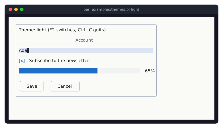
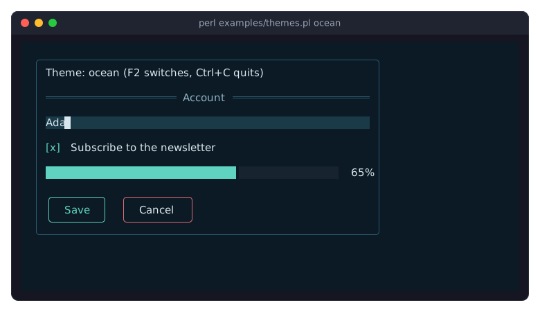
Term::Fabulous::Static takes the same parameter, but paints no screen background: its lines go into whatever the terminal shows. Without a theme, a UI uses dark. The program examples/themes.pl shows the same panel under both built-in themes and under the theme files in examples/themes/ (F2 switches); here under light and under the ocean theme file:
What a theme colors
A theme has two layers. The palette is a set of named colors, the tokens: background, surface, border, text, text_muted, accent, focus_background, success, warning, danger and some twenty more (the full list is in "Tokens" in Term::Fabulous::Theme). background is the screen itself: a theme that wants the terminal's own background gives it a color with alpha 0 (see "Alpha and the terminal default color"). Above it, every kind of widget, a family, has slots, one for each part the theme decides: a button has background, border.color, border.style, border.enabled (whether it has a border, see "Borders from the theme") and text; an input has text, accent, placeholder, selection and more; a table has header.background, cursor, line.color, ... Each slot defaults to a token, so a theme that changes the accent token changes the focus borders, the check marks, the scrollbar thumbs and the group headers of tables at once, while a theme that sets button.border.color changes buttons only.
A slot can have a different value in a state of the widget: hovered, focused, pressed, disabled, selected, active or invalid, where the widget shows such a state. button.border.color in the focused state is the accent by default, input.text and input.border.color in the invalid state are the danger token; a state a theme does not set looks like the normal state. "Families, slots and states" in Term::Fabulous::Theme lists every family with its slots and their states, and the parameter of each widget class says which slot it reads (for example "new" in Term::Fabulous::Widget::Button).
Your own colors win
A color, a border style or bordered given to a widget, in new, through an accessor or in a layout file, stays whatever the theme says. So a program that colors its widgets as the earlier sections describe looks the same under every theme, and a program that leaves the colors to the theme follows it. The reader of a themed parameter returns the color in use, the given one or the theme's. To return a given color to the theme, call "reset_look" in Term::Fabulous::Widget with the parameter's name:
$button->border_color('#ff5050');    # red under every theme
$button->reset_look('border_color');  # the theme's again
undef is not the way back: most color accessors die for it, with a message that names reset_look (undef switches a look off where a widget allows that, such as a button's focus_border_color). reset_look also takes the looks a widget hands to its parts: the colors of a Term::Fabulous::Widget::Tabs (kept by its bar) and the scrollbar colors of a Term::Fabulous::Widget::ScrollBox (kept by both scrollbars).
Only the colors, the border styles and whether a widget has a border are themed. Layout, text and the glyphs of a widget (the marks of a check box, the frames of a spinner) are the widget's own.
Variants and classes
A theme may define variants of a family, named after the classes a widget can be given ("classes" in Term::Fabulous::Widget): a button with classes => ['primary'] draws with the primary variant of the button family where the theme has one, and like every other button where it has none. A variant sets any slots and states of its family; the rest stay the family's. A widget with several classes takes the variants of all of them, later classes winning where two set the same slot. The classes can be changed at run time ($button->classes(['primary', 'wide'])), and a layout file sets them with classes "primary" "wide". Text widgets have classes too, so a theme can define text.muted or text.heading.
Theme files
A theme is a KDL file (https://kdl.dev, the language of the layout files) with a theme node that names the theme and the built-in theme it starts from, a palette node, and one node per family. In a family node, name "value" sets a slot (a token name or any color string), border style=Round color="border" sets border.style and border.color at once, a node named after a state holds the slots of that state, and variant "NAME" holds a variant:
theme "ocean" extends="dark"

palette {
	background "#0b1a24"
	accent "#5fd3c0"
	surface "#10242f"
	text "#d8e8ee"
}

button {
	border style=Round
	focused { border color="accent" }
	variant "primary" {
		border color="accent"
		text "accent"
	}
}

divider {
	line style=Double
}
none switches a color or a style off, and reverse (for button.background in the pressed state) draws the button in reverse video. A few slots cannot be switched off, because their widget draws with the value, such as the scrollbar's track and thumb and the tab bar's line style, which also needs a style with joints; "Values" in Term::Fabulous::Theme lists them. Unknown tokens, families, slots, states and styles die with the known names, and so does none for such a slot, or a token or slot set twice. The program loads the file and gives the theme to the UI:
use Term::Fabulous::Theme;

my $ocean = Term::Fabulous::Theme->from_file('ocean.kdl');
my $ui    = Term::Fabulous->new( root => $root, width => 80, height => 24, theme => $ocean );
examples/themes/ocean.kdl is a complete theme file (examples/themes/ holds three more: nord, dracula and solarized-light), and the recipe Switch themes at run time a complete program. The grammar is described in "THEME FILES" in Term::Fabulous::Theme.
The theme editor
The distribution comes with a program to make and change theme files: fabulous-theme-editor. It opens theme files in tabs, shows a widget of every family (or the screens of your program) in the theme you edit, and lists every setting with its value and where the value comes from; a change in the form or in the text of the file shows at once, and every change can be undone. A mistake in the text is shown with its line.
fabulous-theme-editor examples/themes/ocean.kdlTerm::Fabulous::ThemeEditor describes the editor and how to start it from Perl, for example with a preview of your own program's screens (the recipe Design a theme against your own screen). To check theme files or change them from a script, with their lines and comments kept, use Term::Fabulous::Theme::Document.
Themes in Perl
A theme can be built in Perl as well, with the same parts: the theme it extends, palette tokens, slots (under family.slot or family.slot.state keys) and variants:
my $theme = Term::Fabulous::Theme->new(
	name     => 'ocean',
	extends  => 'dark',
	palette  => { accent => '#5fd3c0', surface => '#10242f' },
	slots    => { 'button.border.style' => 'Round', 'button.border.color.focused' => 'accent' },
	variants => { 'button.primary' => { 'border.color' => 'accent', text => 'accent' } },
);
A theme may extend another theme object, so a program can derive a variation of a theme it loaded. Term::Fabulous::Color helps with the colors ("Working with colors"): $accent->lighten(0.1) is a color like any other. See "CONSTRUCTORS" in Term::Fabulous::Theme.
Widgets of your own
A widget class of your own inherits the family of its base class, so a widget derived from Term::Fabulous::Widget::Input draws with the input slots, and declares which of its parameters the theme supplies. "Colors from the theme" in Term::Fabulous::Manual::CustomWidgets explains it, and Term::Fabulous::Role::Themed is the reference.
SEE ALSO
This page is part of Term::Fabulous::Manual. Previous page: Term::Fabulous::Manual::Layout. Next page: Term::Fabulous::Manual::Events.
Term::Fabulous::Widget::Text, Term::Fabulous::Color, Term::Fabulous::Enum::WebColor, Term::Fabulous::Enum::BorderStyle, Term::Fabulous::Role::HasBorderStyle, Term::Fabulous::Theme, Term::Fabulous::Role::Themed, Term::Fabulous::Unicode, Term::Fabulous::Cookbook::GettingStarted, Term::Fabulous::Cookbook::Layout.