NAME
Term::Fabulous::Widget::SegmentedControl - Choose one of a few options shown side by side
SYNOPSIS
use Clay::UI::Enum::Result;
use Term::Fabulous::Widget::SegmentedControl;

my $period = Term::Fabulous::Widget::SegmentedControl->new(
	id      => 'period',
	options => [ [ Day => 'd' ], [ Week => 'w' ], [ Month => 'm' ], [ Year => 'y' ] ],
	value   => 'w',
);
$period->on( Change => sub ($event) {
	reload_chart( $event->value );
	return Clay::UI::Enum::Result->CONTINUE;
} );

say $period->value;    # w
$period->value('m');   # programmatic: fires no Change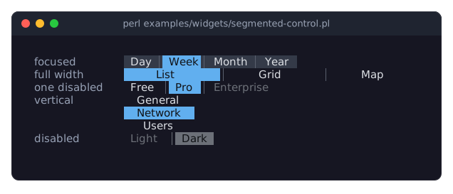
DESCRIPTION
The picture shows segmented controls in their forms: a focused one with Week selected, one stretched to the width of its parent, one with a disabled segment, a vertical one and a disabled one. The program is examples/widgets/segmented-control.pl.
A segmented control shows a few options side by side as one bar, with the selected one highlighted:
Day │ Week │ Month │ Year(the selected segment is painted on the accent_color). It does what a Term::Fabulous::Widget::RadioGroup does, in less space and without marks, and suits a handful of short options such as a period, a view or a sort order. The user chooses with the arrow keys, Home and End, the digits (1 is the first segment), or a click; the selection changes at once, there is nothing to confirm. While the pointer is over a segment, it is shown on hover_background_color.
Each option has a label and a value (the label unless given), and may be disabled on its own: a disabled segment is drawn in disabled_color, skipped by the keys and ignored by clicks. The selected segment keeps its selected_text_color on the accent (gray while the control is disabled), so it stays readable. The control may be vertical, one segment per row. When the layout makes it wider (or, vertical, higher) than its segments need, the extra space is shared among the segments, so a control with sizing => { width => sizing_grow() } fills its row.
Disabling, colors, focus and sizing are described in Term::Fabulous::Widget::Input. The control is one row high (or, vertical, one row per option) and, unless the layout sizes it, as wide as its labels with segment_padding on each side and a separator between them.
CONSTRUCTOR
new
my $control = Term::Fabulous::Widget::SegmentedControl->new(%parameters);Accepts the parameters of "CONSTRUCTOR" in Term::Fabulous::Widget::Input (id, layout, background_color, the border parameters, disabled, can_focus, text_color, disabled_color, accent_color, focus_background_color, the other Box parameters) and the ones below. Unknown parameters die.
options-
An array reference of options, each one of:
a string: the label, which is also the value;
an array reference
[ $label, $value ];a hash reference
{ label => $label, value => $value, disabled => $bool };valuedefaults to the label,disabledto false.
Default: no options (the control is then one empty cell). A value may be
undef; labels must be strings. Anything else dies, and so do other hash keys. value-
The value of the option to select, or
undeffor none. Default:undef. Dies when no option has the value. Givevalueorselected_index, not both. selected_index-
The index of the option to select, from 0, or
undef. Default:undef. vertical-
A boolean. Default: 0, a row. True stacks the segments, one per row, without separators. Stored as 1 or 0; a reference dies.
segment_padding-
A non-negative integer. Default: 1. The spaces on each side of a label inside its segment; 0 makes the control compact, 2 roomy.
separator-
A single character one column wide, or
undef. Default:"\x{2502}"(a thin vertical line). The glyph between two segments of a horizontal control;undefdraws none. selected_text_color-
The color of the selected segment's label, which sits on the
accent_color, in any format "Colors" in Term::Fabulous::Widget::Canvas accepts. Default: the theme'sinput.selected_text,[16, 18, 22, 255]in the dark theme, nearly black. separator_color-
The color of the separators. Default: the theme's
input.separator,[90, 96, 110, 255]in the dark theme, a gray. hover_background_color-
The background of the segment under the pointer. Default: the theme's
input.hover_background,[60, 66, 80, 255]in the dark theme, a dark gray.
METHODS
The methods of "METHODS" in Term::Fabulous::Widget::Input (disabled, is_enabled, the color accessors, mark_changed), plus:
options
my @options = $control->options;
$control->options( [ 'List', 'Grid', { label => 'Map', value => 'map', disabled => 1 } ] );
Accessor. The reader returns the options as a list of hash references { label => ..., value => ..., disabled => ... } (copies). Writing replaces all options, checked as new checks them, keeps the selection if the new options have the selected value and clears it otherwise, marks the input changed and returns the new list. Writing fires no Change.
value
my $value = $control->value;
$control->value('map');
$control->value(undef);    # no selection
Accessor. The reader returns the selected option's value, or undef. Writing selects the option with that value (undef deselects), marks the input changed and returns the new value. Dies when no option has the value. Fires no Change.
selected_index
my $index = $control->selected_index;
$control->selected_index(2);
Accessor for the selection by index (from 0), or undef. Dies for an index outside the options. Fires no Change.
choose
$control->choose(1);Selects a segment as the user does: when the selection changes, a Change event is fired. A disabled segment, or the segment already selected, changes nothing. Dies for an index outside the options. Returns the control.
option_disabled
my $is_disabled = $control->option_disabled(2);
$control->option_disabled( 2, 1 );
Reads or sets whether one option is disabled, by index. Writing marks the input changed and returns the new state. A disabled option that is selected stays selected.
vertical
$control->vertical(1);Accessor for the vertical parameter. Returns 1 or 0.
segment_padding
$control->segment_padding(2);Accessor for the segment_padding parameter.
separator
$control->separator(' ');
$control->separator(undef);
Accessor for the separator parameter.
selected_text_color
$control->selected_text_color('#000000');Accessor for the selected_text_color parameter; the reader returns [r, g, b, a]. An invalid color dies and leaves the old one.
separator_color
$control->separator_color('#444444');Accessor for the separator_color parameter; works like "selected_text_color".
hover_background_color
$control->hover_background_color( [ 70, 80, 100 ] );Accessor for the hover_background_color parameter; works like "selected_text_color".
Every writer marks the input changed, so the next frame paints the new look.
KEYS
While the control has the focus and is enabled:
Left,Up-
The previous enabled segment, wrapping around from the first to the last.
Right,Down-
The next enabled segment, wrapping around from the last to the first.
Home,End-
The first and the last enabled segment.
1to9-
The segment with that number, counted from 1. A disabled segment is not chosen; a number beyond the last segment bubbles.
Without a selection, Right chooses the first enabled segment and Left the last. All other keys bubble to the ancestors.
MOUSE
- Hover
-
The segment under the pointer is painted on
hover_background_colorwhile the pointer stays over it; a disabled segment and a disabled control show nothing. The terminal reports pointer motion only while the program runs with the mouse enabled. - Click
-
A click on a segment selects it and focuses the control. A click on a disabled segment or a separator only focuses it.
EVENTS
Change-
Term::Fabulous::Event::Change when the user selects another segment (or "choose" is called);
$event->valueis the value of the selected option. Programmatic writes tovalue,selected_indexandoptionsfire nothing.
KDL PROPERTIES
The properties of "KDL PROPERTIES" in Term::Fabulous::Widget::Input, plus value, selected_index, segment_padding, separator, vertical (#true / #false) and the colors selected_text_color, separator_color and hover_background_color. Options are added with two kinds of nodes, which may be repeated and mixed; each adds to the options given before:
options "Label 1" "Label 2" ...-
One or more options whose value is their label.
option "Label" value="v" disabled=#true-
One option;
value=defaults to the label,disabled=to#false.
use Term::Fabulous::Widget::SegmentedControl as SegmentedControl

SegmentedControl "period" {
	options "Day" "Week" "Month"
	option "Year" value="y" disabled=#true
	value "Week"
	sizing width=grow
}
The options of a layout are added before its value and selected_index are set, wherever they stand in the block. A value that no option has dies.
EXAMPLES
A view switch that fills its row
my $view = Term::Fabulous::Widget::SegmentedControl->new(
	options => [qw(List Grid Map)],
	value   => 'List',
	layout  => { sizing => { width => sizing_grow() } },
);
A vertical control as a menu
my $menu = Term::Fabulous::Widget::SegmentedControl->new(
	options         => [ 'General', 'Network', 'Users', { label => 'Licenses', disabled => 1 } ],
	value           => 'General',
	vertical        => 1,
	segment_padding => 2,
);
SEE ALSO
Term::Fabulous::Widget::Input, Term::Fabulous::Event::Change, Term::Fabulous::Widget::RadioGroup, Term::Fabulous::Widget::Dropdown, the segmented control section of the forms guide.