NAME
Term::Fabulous::Widget::Dropdown - Choose one of several options from a list that opens
SYNOPSIS
use Clay::UI::Enum::Result;
use Term::Fabulous::Widget::Dropdown;

my $color = Term::Fabulous::Widget::Dropdown->new(
	id          => 'color',
	options     => [ 'Red', [ 'Dark green' => 'green' ], { label => 'Blue', value => 'blue' } ],
	placeholder => 'Pick a color',
);
$color->on( Change => sub ($event) {
	say 'color: ', $event->value;    # 'Red', 'green' or 'blue'
	return Clay::UI::Enum::Result->CONTINUE;
} );

$color->value('green');              # programmatic: fires no Change
say $color->selected_label;          # 'Dark green'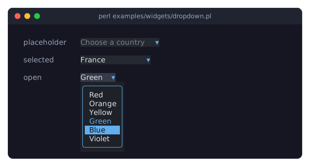
DESCRIPTION
The picture shows three dropdowns: one without a selection, showing its placeholder; one with France selected; and a focused one whose list is open, with the selected option Green in the accent_color and the highlighted option Blue on the accent_color. The program is examples/widgets/dropdown.pl.
A dropdown shows the label of the selected option (or a placeholder) and a small arrow. When the user opens it, the options appear in a list that floats over all other widgets, also over a Term::Fabulous::Widget::Dialog the dropdown is in. It opens below the dropdown, unless it does not fit there and there is more room above the dropdown; then it opens above. The list shows up to max_visible_options options at a time; when the terminal has less room on the chosen side, it shrinks to that room, but always shows at least one option. It scrolls through the rest and has a scrollbar when it scrolls, drawn like every scrollbar (Term::Fabulous::Widget::Scrollbar) in the theme's scrollbar.track and scrollbar.thumb colors. Choosing an option closes the list.
Every option has a label (the text shown) and a value (what value and the Change event return). The value defaults to the label.
The list is a child widget of the dropdown, created when the list opens and removed when it closes (see Term::Fabulous::Widget::Dropdown::List). The dropdown keeps the focus and handles the keys while the list is open. The list closes when the dropdown loses the focus, for example through Tab or a click elsewhere.
Disabling, colors, focus and sizing are described in Term::Fabulous::Widget::Input. Unless the layout sizes it, the dropdown is one row high and as wide as its longest label (or the placeholder, if that is longer) plus two columns for the arrow.
CONSTRUCTOR
new
my $dropdown = Term::Fabulous::Widget::Dropdown->new(%parameters);Accepts the parameters of "CONSTRUCTOR" in Term::Fabulous::Widget::Input (id, layout, the border parameters, disabled, can_focus, text_color, disabled_color, accent_color, focus_background_color, the other Box parameters) and the ones below. Unknown parameters die.
options-
An array reference of options. Default: no options. Each option is one of:
a string, which is both the label and the value:
'Red';an array reference
[ $label, $value ]:[ 'Dark green' ='green' ]>;a hash reference with the key
labeland optionallyvalueanddisabled:{ label => 'Blue', value => 'blue', disabled => 1 }.
A missing or
undefvalue is the label. Labels are character strings; values are strings or numbers. Any other shape dies. These are the options of a Term::Fabulous::Widget::SegmentedControl as well (see "Options" in Term::Fabulous::OptionList).A disabled option is shown in the open list in the
disabled_color, but the user cannot choose it: the keys and typing skip it, it is never highlighted, and pressing or releasing the mouse on it does nothing (the list stays open). The program may still select it withvalueorselected_index; the list then opens on the first enabled option. value-
The value of the option to select at the start. Default: none selected. Dies if no option has this value. Give either
valueorselected_index, not both (giving both dies). selected_index-
The index (from 0) of the option to select at the start. Default: none selected. Dies if out of range.
placeholder-
A character string. Default:
''(none). Shown inplaceholder_colorwhile no option is selected. max_visible_options-
A positive integer. Default: 8. The most options the open list shows at once. The list is also made smaller when the terminal has less room above and below the dropdown.
placeholder_color-
A color, in any format Term::Fabulous::Widget::Input accepts. Default: the theme's
dropdown.placeholder,[120, 126, 138, 255]in the dark theme, a gray. list_background_color-
A color, as above. The background of the open list. Default: the theme's
dropdown.list.background,[30, 33, 40, 255]in the dark theme, a very dark gray. highlight_text_color-
A color, as above. The text color of the highlighted option in the open list, which is painted on the theme's
dropdown.highlight.background(the accent). Default: the theme'sdropdown.highlight.text,[16, 18, 22, 255]in the dark theme, nearly black. background_color-
Any Term::Fabulous::Color format, stored as
[r, g, b, a]. Default: the theme'sdropdown.background,[36, 40, 48, 255]in the dark theme, a dark gray, like the text inputs.
The open list's border has the accent_color, and so does the label of the selected option in the list.
METHODS
The methods of "METHODS" in Term::Fabulous::Widget::Input (is_enabled, the color accessors, mark_changed), plus:
value
my $value = $dropdown->value;
$dropdown->value('green');
$dropdown->value(undef);    # select nothing
Accessor. Returns the value of the selected option, or undef when none is selected. Writing selects the first option with that value (compared as strings), or clears the selection for undef, marks the input changed, and returns the new value. Dies if no option has the value. Writing fires no Change event.
selected_index
my $index = $dropdown->selected_index;
$dropdown->selected_index(0);
$dropdown->selected_index(undef);
Accessor for the index of the selected option (from 0), undef for none. Writing returns the new index and fires no Change event. Dies if the index is not an integer in range; the selection then stays.
selected_label
my $label = $dropdown->selected_label;The label of the selected option, or undef when none is selected.
options
my @options = $dropdown->options;    # ( { label => ..., value => ..., disabled => 0 }, ... )
$dropdown->options( [ 'One', 'Two', [ Three => 3 ] ] );
Accessor. Returns the options as a list of hash references with the keys label, value and disabled (copies; changing them does not change the dropdown). Writing replaces all options (in the formats of the options parameter), closes the list, and keeps the selection when an option with the selected value still exists; otherwise nothing is selected afterwards. Writing fires no Change event. Returns the new options.
placeholder
my $text = $dropdown->placeholder;
$dropdown->placeholder('Choose one');
Accessor for the placeholder. Writing marks the input changed and returns the new placeholder. A value that is not a string dies and leaves the placeholder unchanged.
max_visible_options
my $count = $dropdown->max_visible_options;
$dropdown->max_visible_options(12);
Accessor for the max_visible_options parameter. Writing returns the new value, which takes effect the next time the list opens. A value that is not a positive integer dies and leaves the old value.
placeholder_color
$dropdown->placeholder_color('#888888');Accessor for the placeholder_color parameter. Writing marks the dropdown changed and returns the new color as [r, g, b, a]. An invalid color dies and leaves the old one.
list_background_color
$dropdown->list_background_color([ 20, 20, 30, 255 ]);Accessor for the list_background_color parameter. Writing returns the new color as [r, g, b, a]; it takes effect the next time the list opens. An invalid color dies and leaves the old one.
highlight_text_color
$dropdown->highlight_text_color('#000000');Accessor for the highlight_text_color parameter. Writing marks the dropdown changed and returns the new color as [r, g, b, a]; an open list shows it in the next frame. An invalid color dies and leaves the old one.
disabled
$dropdown->disabled(1);As described in "disabled" in Term::Fabulous::Widget::Input; disabling also closes the list.
open
$dropdown->open;Opens the list as the user does, with the selected option (or, when it is disabled or there is none, the first enabled one) highlighted. Does nothing when the list is already open, when there are no options, or while the dropdown is disabled. Returns the dropdown.
close
$dropdown->close;Closes the list without changing the selection. Does nothing when it is closed. Returns the dropdown.
is_open
if ( $dropdown->is_open ) { ... }1 while the list is open, 0 otherwise.
choose
$dropdown->choose(2);Selects the option at an index (from 0) as the user does: closes the list and, when the selection changes, fires a Change event. A disabled option is not chosen and the list stays as it is. Dies if the index is not an integer in range. Returns the dropdown.
highlight
$dropdown->highlight(3);Moves the highlight of the open list to an index (clamped to the options) and scrolls it into view. Does nothing while the list is closed, or for a disabled option. Returns the dropdown.
highlighted_index
my $index = $dropdown->highlighted_index;The index of the highlighted option in the open list, undef while the list is closed.
KEYS
The dropdown uses the keys below while it has the focus and is enabled. All of them skip disabled options, as the other widgets with entries do (see Term::Fabulous::Roving).
When the list is closed:
Enter,Space,Alt+Down,F4-
Open the list.
Up,Down-
Select the previous or next option directly, without opening the list (this fires
Change). They stop at the first and last option. With nothing selected,Upselects the last option andDownthe first. Home,End-
Select the first or last option.
When the list is open:
Up,Down-
Move the highlight one option up or down.
PageUp,PageDown-
Move the highlight by as many options as the list shows.
Home,End-
Move the highlight to the first or last option.
Enter,Space-
Select the highlighted option and close the list.
Escape-
Close the list without changing the selection.
In both states, typing a printable character other than the space (without Ctrl or Alt) jumps to the next option whose label starts with it, ignoring case: it selects that option while the list is closed (firing Change) and highlights it while the list is open. The current option is the selected one while the list is closed and the highlighted one while it is open. Characters typed at most one second apart form one search string, so typing d, a quickly finds "Dark green" rather than the next option starting with a. A search for a single character starts after the current option, so pressing d again moves on to the next label starting with d; a longer search string starts at the current option, so it stays there while the label still matches. Both wrap around from the last option to the first. The space is not part of a search: it opens the list, or chooses the highlighted option.
The keys above are used and do not bubble, and so is every printable character, even one that matches no label. Only a dropdown without any options lets printable characters bubble. All other keys bubble to the ancestors, among them Tab (which then moves the focus and closes the list) and, while the list is closed, Escape.
MOUSE
Pressing the left button on the dropdown opens the list, or closes it when it is open; the list reacts to the press, not to the release.
Pressing the left button on an option of the open list highlights it; releasing the button over an option selects it and closes the list. So both a click on an option and a single gesture work: press on the dropdown, drag to an option and release there.
The mouse wheel over the open list scrolls it by one option per notch.
EVENTS
Change-
Term::Fabulous::Event::Change when the user selects another option, with the option's value as
$event->value. Selecting the option that is already selected fires nothing. Programmatic writes tovalue,selected_indexandoptionsfire nothing.
KDL PROPERTIES
The properties of "KDL PROPERTIES" in Term::Fabulous::Widget::Input, plus value, selected_index, placeholder, max_visible_options, placeholder_color, list_background_color and highlight_text_color. Options are added with two kinds of nodes, which may be repeated and mixed; each adds to the options given before:
options "Label 1" "Label 2" ...-
One or more options whose value is their label.
option "Label" value="v" disabled=#true-
One option;
value=defaults to the label,disabled=to#false.
use Term::Fabulous::Widget::Dropdown as Dropdown

Dropdown "color" {
	placeholder "Pick a color"
	options "Red" "Green"
	option "Dark blue" value="navy"
	value "navy"
}
The options of a layout are added before its value and selected_index are set, wherever they stand in the block, so value "navy" may also come first. A value that no option has dies.
EXAMPLES
Options with numeric values
my $priority = Term::Fabulous::Widget::Dropdown->new(
	options => [ [ Low => 1 ], [ Normal => 2 ], [ High => 3 ] ],
	value   => 2,
);
my $level = $priority->value;    # 2
Options that depend on another dropdown
my $country = Term::Fabulous::Widget::Dropdown->new( options => [ 'Germany', 'France' ] );
my $city    = Term::Fabulous::Widget::Dropdown->new( placeholder => 'City' );
my %cities  = ( Germany => [qw(Berlin Hamburg)], France => [qw(Paris Lyon)] );

$country->on( Change => sub ($event) {
	$city->options( $cities{ $event->value } );    # clears the city selection
	return;
} );
SUBCLASS INTERFACE
The open list (Term::Fabulous::Widget::Dropdown::List) paints the options through these methods; override them in a subclass to change how options look.
option_attrs
my ( $fg, $bg ) = $self->option_attrs($index);The termbox2 attributes of an option's row in the list: the highlight_text_color on the accent_color for the highlighted option, the accent_color for the selected one, the text_color for the others (undef background: the list background shows).
option_label
my $label = $self->option_label($index);The label of the option at an index.
option_count
my $count = $self->option_count;The number of options.
layout_properties
The KDL table (see "layout_properties" in Term::Fabulous::Widget::Box): the colors as colors, the other properties as scalars, and options and option as structured properties. The options of a layout are applied before value and selected_index, wherever they stand.
CAVEATS
Inside a Term::Fabulous::Widget::ScrollBox, the mouse wheel over the open list scrolls the list; a list that shows all options, or is at its end, leaves the notch to the scroll box, which then moves the dropdown and its list.
SEE ALSO
Term::Fabulous::Widget::Input, Term::Fabulous::Widget::Dropdown::List, Term::Fabulous::Event::Change, the dropdown section of the forms guide, "Choose from options in Perl (Dropdown, RadioGroup, Slider)" in Term::Fabulous::Cookbook::Forms.