NAME
Term::Fabulous::Cookbook::Layout - Recipes: layout, borders, colors and themes
DESCRIPTION
This page is part of Term::Fabulous::Cookbook. Previous page: Term::Fabulous::Cookbook::Menus. Next page: Term::Fabulous::Cookbook::Tables.
This page shows how to arrange widgets and how they look: labels of equal width, borders that differ per side, colors derived from one base color and switched at run time, a theme designed in the theme editor against a screen of your own, states and classes to style widgets from, and a layout that changes with the terminal size. It uses Term::Fabulous::Widget::Box, Term::Fabulous::Color, Term::Fabulous::Enum::BorderStyle and the Start and Resize events. The concepts are explained in Term::Fabulous::Manual::Layout (sizing, alignment, groups) and Term::Fabulous::Manual::Looks (colors and borders); the common widget parameters and methods are listed in Term::Fabulous::Widget.
The recipes on this page:
"Switch themes at run time (built-in themes and a theme file)"
"Change the layout with the terminal size (Start and Resize events)"
Line up labels with equal widths (width_group)
Goal: line up the values of a list of label/value rows, whatever the length of each label.
This program is shipped as examples/cookbook/width-group.pl.
use v5.32;
use warnings;
use feature 'signatures';
no warnings 'experimental::signatures';

use Term::Fabulous::Static;
use Term::Fabulous::Widget::Box;
use Term::Fabulous::Widget::Text;
use Clay::XS qw(CLAY_TOP_TO_BOTTOM);

my $root = Term::Fabulous::Widget::Box->new( layout => { layout_direction => CLAY_TOP_TO_BOTTOM } );

foreach my $pair ( [ 'Name', 'Ada Lovelace' ], [ 'Occupation', 'Mathematician' ], [ 'Born', '1815' ] ) {
	my ( $name, $value ) = @$pair;
	my $row   = Term::Fabulous::Widget::Box->new( layout      => { child_gap => 2 } );
	my $label = Term::Fabulous::Widget::Box->new( width_group => 1 );    # all labels: one group
	$label->add_child( Term::Fabulous::Widget::Text->new( text => "$name:", text_color => [ 150, 160, 180, 255 ] ) );
	$row->add_child( $label, Term::Fabulous::Widget::Text->new( text => $value, text_color => [ 255, 255, 255, 255 ] ) );
	$root->add_child($row);
}

# Colors only when STDOUT is a terminal.
Term::Fabulous::Static->new( root => $root, width => 40 )->print;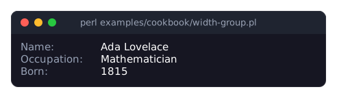
In a pipe or a file, the program prints the same without colors:
Name:        Ada Lovelace
Occupation:  Mathematician
Born:        1815
Widgets with the same non-zero
width_groupget the same width: the width of the widest of them. The groups work across the whole tree, so the labels need not share a parent.height_groupdoes the same for heights. See "Equal sizes across the tree" in Term::Fabulous::Manual::Layout.Group ids are integers from 1 to 1048575; 0 means "no group". Text widgets cannot join a group, so each label is wrapped in a Box.
Only widgets sized by their content (the default
fit, orgrow) take part;fixedandpercentsizes are kept.
Use a different border style on each side
Goal: different border styles on different sides of a box, or a border on some sides only.
This program is shipped as examples/cookbook/border-sides.pl.
use v5.32;
use warnings;
use feature 'signatures';
no warnings 'experimental::signatures';

use Term::Fabulous::Static;
use Term::Fabulous::Enum::BorderStyle;
use Term::Fabulous::Widget::Box;
use Term::Fabulous::Widget::Text;
use Clay::XS qw(sizing_grow CLAY_TOP_TO_BOTTOM);

my $Style = 'Term::Fabulous::Enum::BorderStyle';

sub panel ( $title, %border ) {
	my $box = Term::Fabulous::Widget::Box->new(
		border_color => [ 120, 180, 240, 255 ],
		layout       => { sizing => { width => sizing_grow() }, padding => { left => 1, right => 1 } },
		%border,
	);
	$box->add_child( Term::Fabulous::Widget::Text->new( text => $title, text_color => [ 230, 230, 230, 255 ] ) );
	return $box;
}

my $root = Term::Fabulous::Widget::Box->new( layout => { layout_direction => CLAY_TOP_TO_BOTTOM, sizing => { width => sizing_grow() }, child_gap => 1 } );

# Lines above and below only: no left and right border.
my $rules = panel(
	'Rules above and below',
	bordered            => { top => 1, bottom => 1 },
	border_style_top    => $Style->Double,
	border_style_bottom => $Style->Solid,
);

# A box with a heavy top edge. border_style sets the sides that have no
# style of their own.
my $header = panel( 'Heavy top edge', bordered => 1, border_style => $Style->Solid, border_style_top => $Style->Heavy );

# A tab-like look: thick left edge only.
my $marker = panel( 'Thick left edge', bordered => { left => 1 }, border_style_left => $Style->Thick );

$root->add_child( $rules, $header, $marker );
Term::Fabulous::Static->new( root => $root, width => 32 )->print( colors => 0 );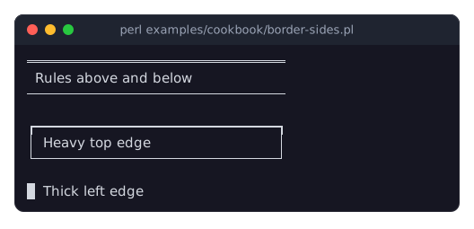
The program prints three boxes: the first with a double line above and a single line below the text and nothing at the sides, the second a single-line frame with a heavy top edge, the third only a solid block at the left of its text. In a pipe or a file, it prints the same without colors:
════════════════════════════════
 Rules above and below
────────────────────────────────

┏━━━━━━━━━━━━━━━━━━━━━━━━━━━━━━┓
│ Heavy top edge               │
└──────────────────────────────┘

█ Thick left edgebordereddecides which sides have a border: a true value for all sides, or a hash withtop,right,bottomandleft(the sides it leaves out have none). Borders take one cell per side inside the box. See "BORDERS" in Term::Fabulous::Manual::Looks.border_style_top,border_style_right,border_style_bottomandborder_style_leftchoose the style of each side,border_styleof all sides that have no style of their own. So the second box passes both:border_stylefor three sides andborder_style_topfor the side that differs. A KDL layout does the same withborder style=Solid style-top=Heavy. The four side parameters are also accessors, which change a side later, for example$header->border_style_top( $Style->Double );border_styleexists only as a parameter ofnew. See Term::Fabulous::Role::HasBorderStyle.The styles are the items of Term::Fabulous::Enum::BorderStyle, for example
Solid,Round,Heavy,Double,ThickandAscii; examples/border-showcase.pl shows all of them.
Switch themes at run time (built-in themes and a theme file)
Goal: let the user switch between the built-in dark and light themes and a theme of your own, written in a file, with a key.
This program is shipped as examples/cookbook/theme-switch.pl; the theme file is examples/themes/ocean.kdl:
theme "ocean" extends="dark"

palette {
	background "#0b1a24"
	background "#0b1a24"
	surface "#10242f"
	border "#2b5a70"
	text "#d8e8ee"
	accent "#5fd3c0"
	success "#9ad46b"
	warning "#f0c674"
	danger "#f27e7e"
}

button {
	border style=Round
	variant "primary" {
		border color="accent"
		text "accent"
		focused { border color="text" }
	}
}

divider {
	line style=Double
}
use v5.32;
use warnings;
use feature 'signatures';
no warnings 'experimental::signatures';
use FindBin;
use Term::Fabulous;
use Term::Fabulous::Theme;
use Term::Fabulous::Widget::Box;
use Term::Fabulous::Widget::Button;
use Term::Fabulous::Widget::Text;
use Term::Fabulous::Widget::TextField;
use Clay::XS qw(sizing_grow CLAY_TOP_TO_BOTTOM);
# Three themes: the two built-in ones, and one from a file. The file
# starts from the dark theme and changes its palette, gives buttons a
# round border and defines a 'primary' variant for them.
my @themes = ( 'dark', 'light', Term::Fabulous::Theme->from_file("$FindBin::Bin/../themes/ocean.kdl") );
my $current = 0;
# No widget here is given a color: the theme supplies them all. The
# screen is painted in the theme's background, the panel is a Box,
# which paints nothing of its own, and the text, the field and the
# buttons take their family's looks.
my $root = Term::Fabulous::Widget::Box->new(
layout => {
layout_direction => CLAY_TOP_TO_BOTTOM,
sizing => { width => sizing_grow(), height => sizing_grow() },
padding => { left => 2, right => 2, top => 1, bottom => 1 },
child_gap => 1,
},
);
my $label = Term::Fabulous::Widget::Text->new( text => 'Theme: dark. Press F2 to switch to the next theme.' );
my $field = Term::Fabulous::Widget::TextField->new( placeholder => 'Type here' );
my $save = Term::Fabulous::Widget::Button->new( classes => ['primary'], bordered => 1, layout => { padding => { left => 2, right => 2 } } );
$save->add_child( Term::Fabulous::Widget::Text->new( text => 'Save' ) );
$root->add_child( $label, $field, $save );
my $ui = Term::Fabulous->new( root => $root, width => 80, height => 24, theme => $themes[$current] );
# Setting the theme of the UI is all it takes: every widget reads its
# colors again in the next frame.
$root->on(
KeyPress => sub ($event) {
return unless ( $event->key_name // '' ) eq 'F2';
$current = ( $current + 1 ) % @themes;
$ui->theme( $themes[$current] );
$label->text( 'Theme: ' . $ui->theme->name . '. Press F2 to switch to the next theme.' );
return;
}
);
$ui->interaction->set_focused_widget($field);
$ui->run;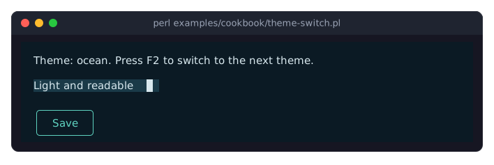
A theme file is KDL, like the layout files: a
themenode that names the theme and the built-in theme it extends, apalettewith the tokens to change, and a node per widget family with its slots, states and variants. Everything the file does not set stays as in the theme it extends. See "Theme files" in Term::Fabulous::Manual::Looks and "THEME FILES" in Term::Fabulous::Theme.Term::Fabulous::Theme->from_filereads the file and dies, naming the node, for anything it does not know. The built-in themes are passed by name;$ui->themetakes either.The widgets take their colors from the theme because they were given none. A widget with a color of its own (
text_color => '#ff5050') keeps it under every theme, and$widget->reset_look('text_color')returns it to the theme. See "THEMES" in Term::Fabulous::Manual::Looks.The Save button has the class
primary, so under the ocean theme it draws with the theme'sprimaryvariant of thebuttonfamily; under the built-in themes, which define no variant, it looks like any other button. See "Variants and classes" in Term::Fabulous::Manual::Looks.Colors for a theme of your own can be computed with Term::Fabulous::Color:
lighten,darkenandblendreturn new colors that a palette or a slot takes as they are (see "Working with colors" in Term::Fabulous::Manual::Looks and "new" in Term::Fabulous::Theme).
Design a theme against your own screen (the theme editor)
Goal: make a theme file for your program while you see your program's screen in it, with every change shown at once.
This program is shipped as examples/cookbook/theme-editor-preview.pl.
use v5.32;
use warnings;
use feature 'signatures';
no warnings 'experimental::signatures';

use Clay::XS qw(sizing_grow CLAY_TOP_TO_BOTTOM);
use Term::Fabulous::ThemeEditor;
use Term::Fabulous::Widget::Box;
use Term::Fabulous::Widget::Button;
use Term::Fabulous::Widget::Checkbox;
use Term::Fabulous::Widget::Divider;
use Term::Fabulous::Widget::Text;
use Term::Fabulous::Widget::TextField;

# The screen of your program, as the program builds it. No widget here is
# given a color, so the theme decides them all.
sub sign_in_screen () {
	my $form = Term::Fabulous::Widget::Box->new(
		bordered => 1,
		layout   => {
			layout_direction => CLAY_TOP_TO_BOTTOM,
			sizing           => { width => sizing_grow( 0, 44 ) },
			padding          => { left  => 1, right => 1 },
			child_gap        => 1,
		},
	);
	my $name     = Term::Fabulous::Widget::TextField->new( placeholder => 'E-mail address', validator => 'email' );
	my $password = Term::Fabulous::Widget::TextField->new( placeholder => 'Password',       mask      => '*' );
	my $sign_in  = Term::Fabulous::Widget::Button->new( classes => ['primary'], bordered => 1, layout => { padding => { left => 1, right => 1 } } );
	$sign_in->add_child( Term::Fabulous::Widget::Text->new( text => 'Sign in' ) );
	my $cancel = Term::Fabulous::Widget::Button->new( bordered => 1, layout => { padding => { left => 1, right => 1 } } );
	$cancel->add_child( Term::Fabulous::Widget::Text->new( text => 'Cancel' ) );
	my $buttons = Term::Fabulous::Widget::Box->new( layout => { child_gap => 2 } );
	$buttons->add_child( $sign_in, $cancel );

	$form->add_child(
		Term::Fabulous::Widget::Divider->new( text => 'Sign in', text_position => 'start' ),
		$name, $password,
		Term::Fabulous::Widget::Checkbox->new( label => 'Keep me signed in' ),
		$buttons,
	);
	return $form;
}

# The editor shows the screen on its left, in the theme being edited,
# instead of its gallery of widgets; the editor itself is drawn in the
# built-in light theme. The theme file is the first argument, or
# sign-in.kdl in the current directory, which is made when you save.
Term::Fabulous::ThemeEditor->new(
	files    => [ $ARGV[0] // 'sign-in.kdl' ],
	preview  => sub ($editor) { sign_in_screen() },
	ui_theme => 'light',
)->run;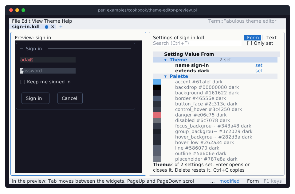
Term::Fabulous::ThemeEditor is the theme editor of the distribution, which the program
fabulous-theme-editorstarts from the shell. Itspreviewparameter replaces the gallery of every widget family on the left with widgets you give it, drawn in the theme being edited; the editor itself is drawn inui_theme. The picture shows the form afterF6(into the preview), typing an incomplete e-mail address andTab: the field shows the theme'sinvalidlook.The screen is built by a function, as a program usually builds its screens; the editor calls the code once, with the editor as its argument. Give the widgets no colors where the theme should decide, or the preview shows your colors instead of the theme's.
The theme file is the first argument; a file that does not exist yet is made when you save (
Ctrl+S). In the editor,Enteron a setting opens a dialog for its value,Deleteresets it,F2shows the file as text, andF1lists every key.The program loads the file with
Term::Fabulous::Theme->from_file('sign-in.kdl'), as in "Switch themes at run time (built-in themes and a theme file)".
Mark widgets with states and classes
Goal: mark widgets with names, such as "selected" or "danger", and style them from those marks in one place.
This program is shipped as examples/cookbook/states-and-classes.pl.
use v5.32;
use warnings;
use feature 'signatures';
no warnings 'experimental::signatures';

use Term::Fabulous::Static;
use Term::Fabulous::Widget::Box;
use Term::Fabulous::Widget::Button;
use Term::Fabulous::Widget::Text;
use Clay::XS qw(sizing_grow CLAY_TOP_TO_BOTTOM);

# One look per state, applied by a single function.
sub restyle ($item) {
	$item->background_color( $item->has_state('selected') ? [ 60, 90, 140, 255 ] : [ 30, 35, 50, 255 ] );
	return;
}

my $menu = Term::Fabulous::Widget::Box->new( layout => { layout_direction => CLAY_TOP_TO_BOTTOM, sizing => { width => sizing_grow() } } );
my @items;
foreach my $name (qw(Open Save Quit)) {
	my $item = Term::Fabulous::Widget::Button->new(
		id      => lc $name,
		classes => [ 'menu-item', $name eq 'Quit' ? 'danger' : () ],
		layout  => { sizing => { width => sizing_grow() }, padding => { left => 1 } },
	);
	$item->add_child( Term::Fabulous::Widget::Text->new( text => $name, text_color => [ 230, 230, 230, 255 ] ) );
	restyle($item);
	push @items, $item;
}
$menu->add_child(@items);

# The derived states (hovered, pressed, focused) need a UI that owns the
# tree; a Static one is enough here.
my $page = Term::Fabulous::Static->new( root => $menu, width => 20 );

# User states: any name you like.
$items[1]->add_state('selected');
$items[2]->toggle_state('selected')->toggle_state('selected');    # on and off again
restyle($_) foreach @items;

# Derived states follow the interaction tracker and cannot be set.
$page->interaction->set_focused_widget( $items[0] );

# The menu, with Save in the color of the selected state (colors only when
# STDOUT is a terminal), and the states and classes of each item.
$page->print;

foreach my $item (@items) {
	printf "%-5s states: %-18s classes: %s\n", $item->id, join( ',', sort $item->states ), join( ' ', sort $item->get_classes );
}
printf "Save selected: %d, Open focused: %d\n", $items[1]->has_state('selected'), $items[0]->has_state('focused');
eval { $items[0]->add_state('focused'); 1 } or print "add_state('focused') dies\n";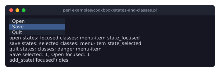
In a pipe or a file, the program prints the same without colors:
 Open
 Save
 Quit
open  states: focused            classes: menu-item state_focused
save  states: selected           classes: menu-item state_selected
quit  states:                    classes: danger menu-item
Save selected: 1, Open focused: 1
add_state('focused') dies
Every widget except Text has a set of states: names you choose.
add_state,remove_state,toggle_stateandclear_states(which removes all of them) change them and return the widget, so calls chain;has_statetests one,statesreturns all (in no particular order). See "add_state" in Term::Fabulous::Widget.hovered,pressed,focusedanddisabledare derived states: they follow the mouse, the focus and thedisabledflag of widgets that have them (buttons and input widgets), appear instatesandhas_state, and cannot be changed (add_state('focused')dies).hovered,pressedandfocusedneed a UI that owns the widget tree; here the Term::Fabulous::Static object, which also prints the menu.classesis a constructor parameter: a list of names that never changes.get_classesreturns the classes followed bystate_NAMEfor every current state, a single list to decide a widget's look from.Term::Fabulous does not style widgets from states or classes by itself; your code does, as
restyleshows. Call it after changing a state, or from the listeners of the events that change the derived states (OnFocus,OnBlur,OnPress,OnRelease).
Change the layout with the terminal size (Start and Resize events)
Goal: arrange two panes side by side on a wide terminal and above each other on a narrow one.
This program is shipped as examples/cookbook/resize-aware-layout.pl.
use v5.32;
use warnings;
use feature 'signatures';
no warnings 'experimental::signatures';

use IO::Async::Loop;
use Term::Fabulous;
use Term::Fabulous::Enum::BorderStyle;
use Term::Fabulous::Widget::Box;
use Term::Fabulous::Widget::Text;
use Clay::XS qw(sizing_grow CLAY_TOP_TO_BOTTOM CLAY_LEFT_TO_RIGHT);

use constant NARROW_COLUMNS => 70;

my $root = Term::Fabulous::Widget::Box->new(
	layout => { sizing => { width => sizing_grow(), height => sizing_grow() }, child_gap => 1 },
);
foreach my $name (qw(Inbox Message)) {
	my $pane = Term::Fabulous::Widget::Box->new(
		bordered     => 1,
		border_style => Term::Fabulous::Enum::BorderStyle->Round,
		border_color => [ 120, 160, 220, 255 ],
		layout       => { sizing => { width => sizing_grow(), height => sizing_grow() }, padding => { left => 1 } },
	);
	$pane->add_child( Term::Fabulous::Widget::Text->new( text => $name, text_color => [ 230, 230, 230, 255 ] ) );
	$root->add_child($pane);
}

# Panes side by side on a wide terminal, stacked on a narrow one.
sub arrange ($columns) {
	my $direction = $columns < NARROW_COLUMNS ? CLAY_TOP_TO_BOTTOM : CLAY_LEFT_TO_RIGHT;
	$root->layout( { %{ $root->layout }, layout_direction => $direction } );
	return;
}

# Start is fired on the root once, when run() has opened the terminal
# and knows its size. Resize is fired twice per resize: before the new
# size is applied (is_pre_event) and after it (is_post_event).
$root->on( Start => sub ($event) { arrange( $event->width ); return } );
$root->on(
	Resize => sub ($event) {
		arrange( $event->width ) if $event->is_post_event;
		return;
	}
);

my $ui = Term::Fabulous->new( root => $root, width => 80, height => 24 );
$ui->run;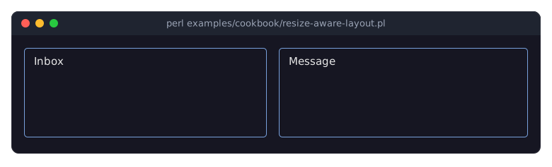
The same program on a terminal 60 columns wide:
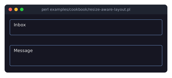
Term::Fabulous::Event::Resize is fired on the root widget when the terminal changes size (once the size has been stable for a tenth of a second), twice: before the new size is applied (
is_pre_event) and after it (is_post_event).widthandheightare the new size in cells.runstarts with the real terminal size, not the 80 x 24 given tonew, and fires Term::Fabulous::Event::Start with it before the first frame, so the samearrangeruns at the start and after every resize.layoutis an accessor: give it a new hash to change the layout.arrangecopies the current hash and changes onlylayout_direction. The next frame uses the new layout. See "Changing the layout at run time" in Term::Fabulous::Manual::Layout.Usually you need none of this:
growandpercentsizes follow the terminal size by themselves.
SEE ALSO
This page is part of Term::Fabulous::Cookbook. Previous page: Term::Fabulous::Cookbook::Menus. Next page: Term::Fabulous::Cookbook::Tables.