NAME
Term::Fabulous::Role::HasBorderStyle - Border glyphs per side, and borders that take space
SYNOPSIS
use Term::Fabulous::Widget::Box;
use Term::Fabulous::Enum::BorderStyle;

my $box = Term::Fabulous::Widget::Box->new(
	bordered     => 1,
	border_color => [ 180, 200, 220, 255 ],
	border_style => Term::Fabulous::Enum::BorderStyle->Round,    # all four sides
	layout       => { padding => { left => 1, right => 1 } },    # inside the border
);

# Change one side later:
$box->border_style_top( Term::Fabulous::Enum::BorderStyle->Double );
DESCRIPTION
This role is part of every Term::Fabulous::Widget (and therefore of every Box, Button, ScrollBox, Canvas and input widget). It does two things:
It adds the border style parameters and accessors, which choose the characters a border is drawn with (Clay itself only knows where a border is and its color).
It makes borders take space in the layout, so that the content never overlaps them.
You do not compose this role yourself; it is already part of the widget classes. A widget has a border on the sides "bordered" in Term::Fabulous::Widget names, given by the program or by the theme's border.enabled, drawn in a border style and a border_color that the program or the theme gives:
bordered     => 1,
border_style => Term::Fabulous::Enum::BorderStyle->Round,
border_color => [ 180, 200, 220, 255 ],
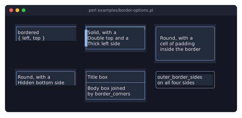
The borders section of the looks guide explains borders with examples. examples/border-options.pl shows a border on some sides, per-side styles, padding inside a border, a Hidden side, border_corners and outer_border_sides:
How a border is drawn
A side is drawn when the widget has a border on it (see "bordered" in Term::Fabulous::Widget) and its style is not
Hidden. It is one cell thick. "drawn_border_sides" answers which sides are drawn.A side with the
Hiddenstyle is switched off: it draws nothing and takes no space, even where the widget has a border. Use it to turn one side of a border off while the rest comes from the theme'sborder.enabled, which switches all four sides.The top and bottom sides are drawn over the whole width of the widget and own the corners: a corner glyph appears where the top or bottom row meets a drawn left or right side, taken from the style of the top or bottom side. The left and right sides fill the rows between.
A side is drawn in the style "border_style_of" answers: its own style, else the style the widget derives for it (see "derived_border_style"), else the style the theme gives the widget's family (
border.style), else theBlankstyle, that is with spaces. AHiddenstyle from any of these switches the side off.border_cornersreplaces the glyph of any corner, for example to join the box to lines around it (\x{251C}instead of\x{250C}where a line comes in from above). The corner keeps the colors its style gives it.outer_border_sidesdraws some sides on the background outside the widget instead of its own (see below).The glyphs have the
border_color(the terminal's default foreground color when none is set). Their background is usually the widget's background; some styles, such asBlock,Inner,PanelorWide, use the background outside the widget or reverse video for some glyphs so that they blend with the surroundings. See Term::Fabulous::Enum::BorderStyle for the styles.
Border space
Clay, the layout engine, would draw borders on top of the content. This role prevents that: every drawn side (see "drawn_border_sides") adds one cell to that side's padding before Clay lays the widget out. The effect is:
The content starts inside the border, and the
paddingin the widget'slayoutis extra space between the border and the content. In the SYNOPSIS, a child of the box starts two cells right of the left edge: one for the border, one for the padding.A widget with
fitsizing grows by the border.A
Hiddenside adds no padding, so the content reaches that edge of the widget.
Room between the border and the content is padding, never a thicker border. The widget's stored layout is not modified; only the configuration handed to Clay is.
CONSTRUCTOR PARAMETERS
These parameters are accepted by the new of every widget class that composes the role. Unknown values die.
border_style-
A Term::Fabulous::Enum::BorderStyle item, for example
Term::Fabulous::Enum::BorderStyle->Round, or its name ('Round', case sensitive); it sets the style of every side that has no side parameter of its own. Default: the style the theme gives the widget's family, if any (see "THEMES" in Term::Fabulous::Manual::Looks). Anything else dies, listing the known names (see "border_style" in Term::Fabulous::Check). border_style_topborder_style_rightborder_style_bottomborder_style_left-
undef, a Term::Fabulous::Enum::BorderStyle item or its name, for one side. Default:undef. A side parameter wins overborder_style:border_style => Term::Fabulous::Enum::BorderStyle->Solid, border_style_left => Term::Fabulous::Enum::BorderStyle->Thick,gives a thick left side and solid other sides, like
border style=Solid style-left=Thickin a KDL layout file. The side accessors change one side after construction. border_corners-
undef(the default) or a hash reference with any of the keystop_left,top_right,bottom_leftandbottom_right, each a single character one column wide. A corner named here is drawn with that glyph instead of the corner glyph of its style; the others keep theirs. Only corners that are drawn at all are affected (a corner is drawn where a drawn top or bottom side meets a drawn left or right side). The colors stay those of the style's corner. Unknown keys and other glyphs die. Term::Fabulous::Widget::Table uses it to join the lines of its cells, with the glyphs from "junction" in Term::Fabulous::Enum::BorderStyle.border_style => Term::Fabulous::Enum::BorderStyle->Solid, border_corners => { top_left => "\x{251C}", bottom_left => "\x{251C}" }, outer_border_sides-
An array reference of side names (
top,right,bottom,left). Default:[]. The glyphs of these sides are drawn on the background just outside the widget (what is painted there, usually the parent's background) instead of the widget's own: the border looks like part of its surroundings, and a colored widget starts inside it. The glyphs of a style that already uses the outer background (see "locations" in Term::Fabulous::Enum::BorderStyle) are not affected; those in reverse video use the outer background as well. A corner is drawn like the side next to it when that side is listed, otherwise like its top or bottom side. Unknown side names die. Term::Fabulous::Widget::Table draws its outer frame this way, so a highlighted row ends at the frame.
border_corners and outer_border_sides cannot be set from a KDL layout file.
METHODS
There is no border_style accessor; to change all sides after construction, call the four side accessors.
border_style_top
my $style = $box->border_style_top;    # the style the top side is drawn in
$box->border_style_top( Term::Fabulous::Enum::BorderStyle->Heavy );
$box->border_style_top(undef);         # no style of its own: the theme's
Accessor for the style of the top side. The writer takes undef (no style of its own), a Term::Fabulous::Enum::BorderStyle item or its name, anything else dies, and returns the new value. The reader returns the style the side is drawn in, as "border_style_of": the side's own style, else the derived or the theme's style, else Blank; it is never undef, like the color readers that return the color in use. The change shows in the next frame.
border_style_right
$box->border_style_right( Term::Fabulous::Enum::BorderStyle->Heavy );Accessor for the style of the right side, as "border_style_top".
border_style_bottom
$box->border_style_bottom( Term::Fabulous::Enum::BorderStyle->Heavy );Accessor for the style of the bottom side, as "border_style_top".
border_style_left
$box->border_style_left( Term::Fabulous::Enum::BorderStyle->Heavy );Accessor for the style of the left side, as "border_style_top".
border_style_of
my $style = $widget->border_style_of('left');The Term::Fabulous::Enum::BorderStyle item a side (top, right, bottom or left; anything else dies) is drawn in: the style given to the side (directly or through border_style), else the one the widget derives ("derived_border_style"), else the theme's border.style for the widget's family and classes (see "look" in Term::Fabulous::Role::Themed), else Blank. The four side readers and Term::Fabulous::Render::Border answer with it, and a side it answers Hidden for is not drawn and takes no space (see "Border space").
drawn_border_sides
my $drawn = $widget->drawn_border_sides; # { top => 1, right => 1, bottom => 0, left => 1 }The sides a border is drawn on and takes a cell of: the sides of "bordered" in Term::Fabulous::Widget whose style ("border_style_of") is not Hidden. A new hash reference of all four sides, each 1 or 0. For widgets that place parts inside their border, as Term::Fabulous::Widget::ScrollBox places its scrollbars.
border_corners
my $corners = $box->border_corners;    # a copy, or undef
$box->border_corners( { top_left => "\x{253C}" } );
$box->border_corners(undef);           # the style's corners again
Accessor for the border_corners parameter. The reader returns a new hash (or undef); the writer takes what the parameter takes, replaces all corners at once and returns the new value. The change shows in the next frame.
outer_border_sides
my $sides = $box->outer_border_sides;          # a copy, e.g. [ 'left', 'top' ]
$box->outer_border_sides( [ 'left', 'right' ] );
Accessor for the outer_border_sides parameter. The reader returns a new array reference of the sides in the order left, right, top, bottom; the writer takes what the parameter takes and returns the new value. The change shows in the next frame.
is_outer_border_side
my $outer = $box->is_outer_border_side('left'); # 1 or 0Whether a side is listed in outer_border_sides. Used by Term::Fabulous::Render::Border.
border_corner_glyph
my $glyph = $box->border_corner_glyph('top_left'); # or undefThe glyph drawn at one corner instead of the style's corner glyph, or undef when the style's glyph is drawn. Used by Term::Fabulous::Render::Border.
contribute_border_sides
$widget->contribute_border_sides( \%config );Called by Clay::UI while it builds the configuration of a frame, after contribute_border, which handed Clay the border_color the program gave: it tells Clay to draw a border one cell wide on every side of "drawn_border_sides" and none on the others. You do not call it yourself.
contribute_layout_inset
$widget->contribute_layout_inset( \%config );Called by Clay::UI while it builds the configuration of a frame; it adds a cell for every side of "drawn_border_sides" to the padding as described in "Border space". You do not call it yourself.
METHODS A WIDGET DEFINES
derived_border_style
# A tab: the bar's line style, except on the side toward the page.
method derived_border_style ($side) {
	return $side eq $page_side ? Term::Fabulous::Enum::BorderStyle->Hidden : $bar->line_style;
}
Optional. The style a side without a style of its own is drawn in, derived from the widget's surroundings, or undef to leave the side to the theme. Read whenever a side's style is read, so it may follow other widgets without copying their looks. Term::Fabulous::Widget::Tabs::Button and Term::Fabulous::Widget::Tabs::Page derive their borders from the bar, the option list of a Term::Fabulous::Widget::Dropdown takes the dropdown's list.border.style. A style the program gives a side wins over it.
SEE ALSO
Term::Fabulous::Enum::BorderStyle, "BORDERS" in Term::Fabulous::Manual::Looks, Term::Fabulous::Widget, Clay::UI::Role::Style::HasBorder, the example program examples/border-showcase.pl, which shows every style.