NAME
Term::Fabulous::Widget::Accordion - Sections that open and close under their headers
SYNOPSIS
use Term::Fabulous::Widget::Accordion;
use Term::Fabulous::Widget::Accordion::Item;
use Term::Fabulous::Widget::Text;

my $settings = Term::Fabulous::Widget::Accordion->new( id => 'settings' );
foreach my $section ( [ General => 'Language, time zone' ], [ Network => 'Hostname, ports' ], [ Users => 'Accounts and groups' ] ) {
	my $item = Term::Fabulous::Widget::Accordion::Item->new( title => $section->[0] );
	$item->add_child( Term::Fabulous::Widget::Text->new( text => $section->[1], text_color => '#c8cdd7' ) );
	$settings->add_child($item);
}
$settings->open(0);    # the first item

$settings->on( Select => sub ($event) {
	$status->text( ( $event->open ? 'Opened ' : 'Closed ' ) . $event->item->title );
	return;
} );
DESCRIPTION
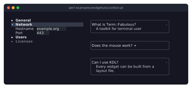
The picture shows two accordions: one with its second section open and its last section disabled, and one with a border around every item and the toggles at the end of the headers and two sections open at once. The program is examples/widgets/accordion.pl.
An accordion stacks sections, its items, each with a header line and a body that shows while the item is open:
▸ General
▾ Network
    Hostname  example.org
    Port      443
▸ Users
One item is open at a time: opening another closes it, and the open item can be closed, so that all are closed. With multiple => 1, any number of items can be open. The user opens and closes an item with a click on its header, or with Enter or Space while the header has the focus; Tab moves the focus from header to header and through the widgets of the open bodies, and Up, Down, Home and End on a header move it to the other headers. An item can be disabled, and the accordion fires Term::Fabulous::Event::Select for every change the user makes.
Each item is a Term::Fabulous::Widget::Accordion::Item: its header holds a toggle glyph, an optional icon and the title; its body holds the widgets you add to the item and is part of the widget tree only while the item is open, so a closed body takes no space. The look of the headers (the glyphs, their colors, where the toggle sits, borders around the items) is set once, on the accordion. By default the toggle sits at the start of the header, as in a tree; item_borders and toggle_position => 'end' give the look of a web page's accordion.
An accordion is a Term::Fabulous::Widget::Box laid out top to bottom whose width grows unless the layout says otherwise; its children are its items, and add_child accepts nothing else.
CONSTRUCTOR
new
my $accordion = Term::Fabulous::Widget::Accordion->new(%parameters);Accepts the parameters of "CONSTRUCTOR" in Term::Fabulous::Widget::Box (id, layout, background_color, the border parameters, ...) and the ones below. All are optional; unknown parameters die.
multiple-
A boolean. Default: 0, one open item at a time. True lets any number of items be open. Stored as 1 or 0; a reference dies.
item_borders-
A boolean. Default: 0. True draws a border around every item, in the theme's
accordion.border.styleandaccordion.border.color: aRoundborder in thedisabledtoken's gray in the built-in themes. Stored as 1 or 0. Not to be confused withbordered, which frames the whole accordion, as it frames any box (see "bordered" in Term::Fabulous::Widget). toggle_position-
start(the default) orend: whether the toggle glyph sits before the title or at the right end of the header. Anything else dies. open_glyphclosed_glyph-
Character strings. Default:
"\x{25BE}"(a small down triangle) and"\x{25B8}"(a small right triangle). The toggle of an open and of a closed item;'-'and'+'give a plus toggle. title_color-
The color of the titles, in any format Term::Fabulous::Color accepts. Default: the theme's
accordion.title,[220, 223, 228, 255]in the dark theme. title_bold-
A boolean. Default: 0. Whether the titles are bold.
accent_color-
The color of an open item's toggle. Default: the theme's
accordion.accent,[97, 175, 239, 255]in the dark theme, a blue. header_background_color-
The background of the headers, or
undeffor none. Default: the theme'saccordion.header.background, none in the built-in themes. focus_background_color-
The background of the header that has the focus. Default: the theme's
accordion.header.backgroundin thefocusedstate,[52, 58, 72, 255]in the dark theme. hover_background_color-
The background of the header under the pointer. Default: the theme's
accordion.header.backgroundin thehoveredstate,[40, 45, 58, 255]in the dark theme. disabled_color-
The color of a disabled item's header. Default: the theme's
accordion.disabled,[108, 112, 120, 255]in the dark theme, a gray. The borders of the items (item_borders) take the theme'saccordion.border.colorandaccordion.border.style; the six colors return to the theme with "reset_look" in Term::Fabulous::Widget. body_indent-
A non-negative integer. Default: 2. The columns the bodies are indented by.
METHODS
The methods of Term::Fabulous::Widget, plus:
add_child
$accordion->add_child( $item, $other_item );Appends items. Dies for anything but a Term::Fabulous::Widget::Accordion::Item. When the accordion allows one open item and an added item is open, the items open before it are closed. Returns the accordion.
items
my @items = $accordion->items;The items, in order.
item
my $item = $accordion->item(2);The item at an index, from 0. Dies for an index outside the items.
index_of
my $index = $accordion->index_of($item);The index of an item, or undef.
open_items
my @open = $accordion->open_items;The open items, in order.
selected
my $item = $accordion->selected; # or undefThe open item, or the first open one with multiple; undef when all are closed.
open
$accordion->open(1);        # by index
$accordion->open($item);    # or the item
Opens an item from the program, closing the others unless multiple allows them. Fires nothing. Dies for an index outside the items or an item of another accordion. Returns the accordion.
close
$accordion->close($item);Closes an item. Fires nothing. Returns the accordion.
open_all
$accordion->open_all;Opens every item. Dies unless multiple is set. Returns the accordion.
close_all
$accordion->close_all;Closes every item. Returns the accordion.
choose
$accordion->choose($index);Toggles an item as the user does: opens a closed item (closing the others unless multiple), closes an open one, and fires Select. A disabled item changes nothing. Returns the accordion.
multiple
$accordion->multiple(1);Accessor for the multiple parameter. Writing 0 while several items are open closes all but the first. Returns 1 or 0.
item_borders
$accordion->item_borders(1);Accessor for the item_borders parameter. Returns 1 or 0.
toggle_position
$accordion->toggle_position('end');Accessor for the toggle_position parameter: start or end.
open_glyph
$accordion->open_glyph('-');Accessor for the open_glyph parameter.
closed_glyph
$accordion->closed_glyph('+');Accessor for the closed_glyph parameter.
title_color
$accordion->title_color('#ffffff');Accessor for the title_color parameter. The reader returns [r, g, b, a]. An invalid color dies and leaves the old one.
title_bold
$accordion->title_bold(1);Accessor for the title_bold parameter. Returns 1 or 0.
accent_color
$accordion->accent_color('#98c379');Accessor for the accent_color parameter; works like "title_color".
header_background_color
$accordion->header_background_color( [ 28, 33, 45 ] );
$accordion->header_background_color(undef);
Accessor for the header_background_color parameter; undef removes the background.
focus_background_color
$accordion->focus_background_color('#343a48');Accessor for the focus_background_color parameter; works like "title_color".
hover_background_color
$accordion->hover_background_color('#282d3a');Accessor for the hover_background_color parameter; works like "title_color".
disabled_color
$accordion->disabled_color('#6c7078');Accessor for the disabled_color parameter; works like "title_color".
body_indent
$accordion->body_indent(4);Accessor for the body_indent parameter.
Every writer restyles the items, so the next frame shows the new look.
KEYS
While the header of an item has the focus:
Enter,Space-
Open or close the item (the header is a Term::Fabulous::Widget::Button).
Up,Down-
Move the focus to the previous or the next enabled header, wrapping around.
Home,End-
Move the focus to the first or the last enabled header.
Tab and Shift+Tab move through the headers and the widgets of the open bodies in order, as everywhere. All other keys bubble to the ancestors.
MOUSE
A click on a header opens or closes its item and focuses the header. The header under the pointer is painted on hover_background_color.
EVENTS
Select-
Term::Fabulous::Event::Select when the user opens or closes an item (or "choose" is called);
$event->itemis the item,$event->indexits position and$event->open1 or 0. Only the item the user acted on fires, not the one that closes to make room for it. Programmatic changes fire nothing.
The Activate of the headers and the events of the widgets in the bodies bubble through the accordion as well.
KDL PROPERTIES
The properties of "KDL PROPERTIES" in Term::Fabulous::Widget::Box, plus multiple, item_borders and title_bold (#true / #false), toggle_position, open_glyph, closed_glyph and body_indent (strings and numbers), and the colors title_color, accent_color, header_background_color, focus_background_color, hover_background_color and disabled_color. The items are Item child nodes (see "KDL PROPERTIES" in Term::Fabulous::Widget::Accordion::Item):
use Term::Fabulous::Widget::Accordion as Accordion
use Term::Fabulous::Widget::Accordion::Item as Item
use Term::Fabulous::Widget::Text as Text

Accordion "settings" {
	item_borders #true
	toggle_position "end"
	Item "general" {
		title "General"
		open #true
		Text { text "Language, time zone"; }
	}
	Item "network" {
		title "Network"
		Text { text "Hostname, ports"; }
	}
}
EXAMPLES
A plus toggle
my $faq = Term::Fabulous::Widget::Accordion->new( open_glyph => '-', closed_glyph => '+', title_bold => 1 );Remember the open section
$settings->on( Select => sub ($event) {
	$config->{section} = $event->open ? $event->item->id : undef;
	return;
} );
SEE ALSO
Term::Fabulous::Widget::Accordion::Item, Term::Fabulous::Event::Select, Term::Fabulous::Widget::Button, "ACCORDIONS" in Term::Fabulous::Manual::Layout.