NAME
Term::Fabulous::Widget::Input - Common base class of the input widgets
SYNOPSIS
use Term::Fabulous::Widget::TextField;

# Every input widget accepts these parameters:
my $field = Term::Fabulous::Widget::TextField->new(
	id                     => 'name',
	disabled               => 0,
	required               => 1,
	validator              => 'email',
	text_color             => '#dcdfe4',
	accent_color           => [ 97, 175, 239, 255 ],
	disabled_color         => 0x6c7078,
	invalid_color          => 'Tomato',
	focus_background_color => 'rgb(52, 58, 72)',
);

$field->disabled(1);                   # gray, ignores input, loses the focus
$field->accent_color('#ff8800');      # shows in the next frame
my $message = $field->error;           # what is wrong with the value, or undef
$field->on( ValidityChange => sub ($event) { $hint->text( $event->error // '' ); return } );

# A widget of your own (see SUBCLASS INTERFACE):
use Object::Pad;
use Term::Fabulous::Widget::Input;

class My::Toggle :isa(Term::Fabulous::Widget::Input) :strict(params) {
	field $on = 0;

	method value () { return $on }

	method natural_size () { return ( 5, 1 ) }    # columns, rows

	method paint () {
		my $bg = $self->paint_focus_background;
		$self->paint_text( 0, 0, $on ? '[ON]' : '[OFF]', $self->accent_attr, $bg );
		return;
	}

	method activate () {                       # a click
		$on = $on ? 0 : 1;
		$self->mark_changed;                    # the next frame paints it
		$self->fire_change($on);
		return;
	}

	method handle_key ($event) {
		return 0 unless ( $event->main_key_name // '' ) eq 'Space';
		$self->activate;
		return 1;                               # used: stops bubbling
	}
}
DESCRIPTION
Term::Fabulous::Widget::Input is the abstract base class of all input widgets:
Term::Fabulous::Widget::TextField - one line of text
Term::Fabulous::Widget::TextArea - several lines of text
Term::Fabulous::Widget::Checkbox - a box to check
Term::Fabulous::Widget::RadioButton - one choice of a Term::Fabulous::Widget::RadioGroup
Term::Fabulous::Widget::Dropdown - one choice from a list that opens
Term::Fabulous::Widget::Slider - a number from a range
Term::Fabulous::Widget::StarRating - a number of stars
Term::Fabulous::Widget::SegmentedControl - one choice of a few, side by side
You do not create an Input directly (the class is abstract and new dies); this page describes what all input widgets have in common, and how to write an input widget of your own.
What every input widget does:
It takes the keyboard focus. Under Term::Fabulous,
TabandBackTab(Shift+Tab) move the focus from input to input, and a click on an input focuses it. The focused input shows its content onfocus_background_color. A radio button is the exception: its radio group takes the focus for all its buttons.It receives the key presses while it has the focus. Keys it uses (for example letters in a text field) stop there; keys it does not use (for example
Escape,TaborF1) bubble on to its ancestors, so application shortcuts on an outer box keep working while the user types. Each widget's KEYS section lists the keys it uses. See "KEYBOARD" in Term::Fabulous::Manual::Events.It works with the mouse: clicks, drags and the mouse wheel, as described in each widget's MOUSE section. Term::Fabulous asks the terminal to report the pointer as it moves, too, so the hover state of an input (
is_hovered, theOnHoverStartandOnHoverStoppedevents) follows the pointer. A terminal that does not report plain movement changes the hover state only when a button is pressed or released, while it is dragged and when the wheel turns.It fires a Term::Fabulous::Event::Change when the user changes its value (see "EVENTS").
It can check its value:
requiredrejects an empty value,validatora wrong one. An invalid value is drawn in the invalid look and reported by "error", "is_valid" and theValidityChangeevent (see "Invalid values").It sizes itself to its content unless the
layoutsays otherwise (see "SIZE").It can be disabled (see "disabled").
It has the derived states
focused,hovered,pressedanddisabled, which$input->has_state('focused')and$input->statesreport (see "has_state" in Term::Fabulous::Widget). Whether the value is valid is not one of these states; ask "is_valid".It can be built from a KDL layout file (see "KDL PROPERTIES").
Technically, an input is a Term::Fabulous::Widget::Display, a canvas that paints itself when a frame is drawn (see "Painting"): setters only record the new state, and the frame paints whatever changed since the last one, so only cells that really changed are sent to the terminal. Anything you draw into an input with the canvas methods (put, put_text, ...) is lost the next time it paints.
Painting
Every setter of an input records the new value and calls mark_changed ("mark_changed" in Clay::UI::Role::Core::Element), so a frame becomes due; nothing is painted at once. When the frame is drawn, the renderer calls the input's refresh ("refresh" in Term::Fabulous::Widget::Canvas), which compares the input's paint key (see "paint_key") with the one it last painted for: the size of its buffer, how often the input was marked changed, whether it has the focus, whether it is enabled, whether its value is valid, and what a subclass adds, such as the state of its radio group. Only when the key differs does it clear the buffer and call "paint". So the cells always show the state of the frame they are drawn in, also when the state was changed by another widget, and a frame that changes nothing about an input paints nothing of it. The cells read with cell show the state of the last frame. This is how every Term::Fabulous::Widget::Display paints; see "Painting" in Term::Fabulous::Widget::Display.
Invalid values
An input's value is invalid while it is empty and the input is required, or while its validator rejects it (see "required" and "validator"). An invalid input looks different as soon as its value is invalid, without waiting for the user to leave it:
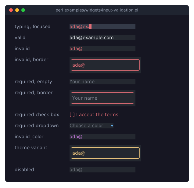
The picture shows examples/widgets/input-validation.pl in the dark theme. From the top:
Typing, focused: an e-mail field after typing
ada@exa. The look changes with every key, so the text stays red until the address is complete. The cursor takes the color of the text.Valid, invalid: the text of an invalid value is drawn in
invalid_color, by default the theme'sdangerred.Invalid, border: an input with a border (
bordered => 1) also draws its border in thedangerred, unless it was given aborder_colorof its own.Required, empty: an empty text field shows its placeholder in the usual gray, required or not. So a required field without a border does not look invalid while it is empty, only when the user types something wrong. With a border, the border is red.
Required check box: an unchecked required box draws its box and its label in
invalid_color.Required dropdown: a dropdown without a choice shows its placeholder in gray, like an empty text field.
invalid_color: the color of an invalid value set for one input, here
'#c678dd', a purple.Theme variant: a theme can draw invalid values in other colors, for every input or only for the inputs with a class. The program's theme draws the text inputs of the class
calmin thewarningcolor:my $theme = Term::Fabulous::Theme->new( name => 'calm-invalid', extends => 'dark', variants => { 'text_input.calm' => { 'text.invalid' => 'warning', 'border.color.invalid' => 'warning' } }, ); my $field = Term::Fabulous::Widget::TextField->new( validator => 'email', classes => ['calm'] );The slots are
textandborder.colorin the stateinvalid. They belong to the familyinput, which the familiestext_input(text fields and text areas) anddropdownextend; a variant names the family of the widget, astext_input.calmdoes. To change every input, set the slotsinput.text.invalidandinput.border.color.invalidinstead. See Term::Fabulous::Theme.Disabled: a disabled input shows the disabled look, valid or not.
The input does not draw the message that says what is wrong. Read it from "error" or from the ValidityChange event, and show it where it suits your program; the recipes "Check the values of a form (required, validator)" in Term::Fabulous::Cookbook::Forms and "Write your own checks and restrict typing (accept, pattern, code)" in Term::Fabulous::Cookbook::Forms show two ways.
CONSTRUCTOR
new
my $input = Term::Fabulous::Widget::TextField->new(%parameters); # or any other inputEvery input widget's new accepts the parameters below, in addition to its own. Unknown parameters die. Term::Fabulous::Widget::Input itself is abstract: calling Term::Fabulous::Widget::Input->new dies.
id-
A string. Optional. Identifies the widget for Clay, which needs a unique id per widget; it is also handy for telling inputs apart in a form-wide
Changelistener ($event->target->id). Ids must be unique in a widget tree. layout-
A hash reference of layout options, as for every widget:
sizing,padding,child_gap,child_alignment,layout_direction. See "LAYOUT" in Term::Fabulous::Manual::Layout. Asizingyou give here overrides the natural size of the input on that axis (see "SIZE"). background_color-
The widget's background, in any format Term::Fabulous::Color accepts (see "Color formats" in Term::Fabulous::Manual::Looks); it is stored as an
[r, g, b, a]array reference. Text inputs and the dropdown default to a dark gray ([36, 40, 48, 255]); the other inputs have no background of their own and show the background of their parent. borderedborder_colorborder_style-
A border around the input, exactly as for Term::Fabulous::Widget::Box; see "BORDERS" in Term::Fabulous::Manual::Looks. Without
bordered, the theme'sborder.enabledfor the input's family decides (input,text_inputordropdown;falsein the built-in themes, so inputs have no border). The border takes cells inside the widget's box; the natural size is grown accordingly. disabled-
A boolean, stored as 1 or 0. Default: 0. A disabled input is painted in
disabled_color, ignores keys, clicks and the mouse wheel, and cannot take the focus; since the user cannot change it, it fires noChangeorSubmitof its own accord. See "disabled". can_focus-
A boolean. Default: 1. Whether the input may take the keyboard focus (see Clay::UI::Role::Interaction::Focusable). It counts while the input is enabled: a disabled input cannot take the focus, whatever this says (see "can_focus"). A Term::Fabulous::Widget::RadioButton never takes the focus (it does not accept it, see "accepts_focus"), so for it the parameter has no effect.
required-
A boolean, stored as 1 or 0. Default: 0. Whether an empty value is invalid: empty text, a dropdown without a selection, an unchecked checkbox (see "value_is_empty"). See "required".
required_message-
A string. Default:
'Please fill in this field.'. What "error" reports for an empty required value. validator-
What checks a non-empty value: the name of a named validator (
'email','integer','number','url','hostname','ip','date','time'), a regular expression the whole value must match, a code reference that returns what is wrong with the value (or false), a list of those, or a Term::Fabulous::Validator for one with options. Default:undef, any value is fine. See "validator". text_color-
The color of the input's text. Default: the theme's
input.text,[220, 223, 228, 255]in the dark theme, a light gray. disabled_color-
The color of all text while the input is disabled, and of inactive parts such as scrollbar tracks. Default: the theme's
input.textin thedisabledstate,[108, 112, 120, 255]in the dark theme, a medium gray. invalid_color-
The color of the text while the value is invalid (see "is_valid"). Default: the theme's
input.textin theinvalidstate, thedangertoken,[224, 108, 117, 255]in the dark theme, a red. The border of an invalid input takesinput.border.colorin theinvalidstate, the same red, unless the input has aborder_colorof its own. accent_color-
The color of highlights: check marks, the selected radio button's mark, the filled part of a slider, the dropdown's arrow and the border of its open list. Default: the theme's
input.accent,[97, 175, 239, 255]in the dark theme, a light blue. focus_background_color-
The background of the input's content while it has the focus. Default: the theme's
input.backgroundin thefocusedstate,[52, 58, 72, 255]in the dark theme, a dark blue-gray.The five colors return to the theme with "reset_look" in Term::Fabulous::Widget; the input's own
background_color,border_colorand border style come from the theme'sinputfamily too when they are not given. See "THEMES" in Term::Fabulous::Manual::Looks.
The five colors accept every color format of the canvas: a packed 0xRRGGBB integer, an [r, g, b] or [r, g, b, a] array reference, a { r, g, b } hash reference, a string such as '#ff8800', 'rgb(255, 136, 0)' or 'hsl(32, 100%, 50%)', or a Term::Fabulous::Color object (see "Colors" in Term::Fabulous::Widget::Canvas). undef and invalid colors die. A color with alpha 0 means "no color": the terminal's default color is used.
An input is a Term::Fabulous::Widget::Box, so it also takes the other parameters of a Box, described in "new" in Term::Fabulous::Widget: floating, width_group and height_group (to line up the inputs of a form), classes, glyphs_show_through, the per-side border styles (border_style_top and so on), border_corners and outer_border_sides.
METHODS
disabled
my $is_disabled = $input->disabled;
$input->disabled(1);
$input->disabled(0);
Accessor, from Clay::UI::Role::Interaction::Disableable. Returns 1 or 0; any plain true or false value may be written, also through new; a reference dies (Clay::UI: 'disabled' must be a plain boolean value).
Writing a true value disables the input: it is painted in disabled_color, ignores keys, clicks and the mouse wheel (so the user causes no Change or Submit), cannot take the focus (can_focus reads 0) and, if it has the focus, gives the focus up at once (no widget is focused afterwards, unless the input is inside an open Term::Fabulous::Widget::Dialog, whose backdrop takes it). Clay::UI never presses a disabled widget: a click on it fires no OnPress or OnRelease. KeyPress and Mouse events fired on a disabled input still bubble on to its ancestors, and it is still hovered (OnHoverStart, OnHoverStopped), so listeners you add yourself for these still run. It has the derived state disabled ("DERIVED STATES" in Clay::UI::Role::Style::HasStates).
Writing a false value enables the input again: it can take the focus when can_focus was last set to a true value, through new, a layout file or the accessor, also while the input was disabled. A Term::Fabulous::Widget::RadioButton, which never takes the focus, keeps 0. Writing the value the input already has changes nothing. Returns the new value (1 or 0).
A radio button also counts as disabled while its radio group is disabled: its is_enabled is then false, while its own disabled stays 0.
is_enabled
if ( $input->is_enabled ) { ... }True when the input accepts input, the opposite of disabled.
text_color
my $color = $input->text_color;
$input->text_color('#ffffff');
Accessor for the text_color parameter. The reader returns the color as [r, g, b, a], whatever form it was given in (see "cell_color" in Term::Fabulous::Check). Writing marks the input changed and returns the new color. An invalid color, or undef, dies and leaves the old color.
disabled_color
$input->disabled_color([ 90, 90, 90 ]);Accessor for the disabled_color parameter; works like "text_color".
invalid_color
$input->invalid_color('#ff5555');Accessor for the invalid_color parameter; works like "text_color".
required
my $is_required = $input->required;
$input->required(1);
Accessor for the required parameter. Returns 1 or 0; a reference dies. Writing runs "validate", so a ValidityChange is fired when the message changed with it.
required_message
$input->required_message('Please enter your name.');Accessor for the required_message parameter. A value that is not a string dies. Writing runs "validate".
validator
my $validator = $input->validator;    # a Term::Fabulous::Validator, or undef
$input->validator('email');
$input->validator( qr/\A[A-Z]{3}\z/ );
$input->validator( sub ($value) { $value % 2 ? 'Please enter an even number.' : undef } );
$input->validator( [ 'hostname', qr/\.example\.com\z/ ] );
$input->validator( Term::Fabulous::Validator->integer( min => 1, max => 65535 ) );
$input->validator(undef);             # any value is fine
Accessor for the validator. The reader returns the Term::Fabulous::Validator object, whatever form it was given in, or undef. Writing takes everything "coerce" in Term::Fabulous::Validator does; an unknown name or an unsuitable value dies and leaves the validator as it was. Writing runs "validate". A text input also takes the accept spec the validator suggests, as long as it was not given one of its own (see "accept" in Term::Fabulous::Widget::TextInput).
error
my $message = $input->error;What is wrong with the value right now, or undef when it is fine: required_message for an empty required value, else what the validator says about a non-empty value. An empty value that is not required is fine, and the validator never sees it. The value is checked every time you ask; nothing is cached.
is_valid
if ( $input->is_valid ) { ... }True when "error" is undef. While it is false, the input shows the invalid look: its text in invalid_color and its border, when it has one, in the theme's input.border.color of the invalid state; "look_state" in Term::Fabulous::Role::Themed is invalid. A disabled input shows the disabled look instead.
validate
my $message = $input->validate;Checks the value and returns the message, or undef when the value is fine. When the message differs from the one the input reported last, it also fires Term::Fabulous::Event::ValidityChange on the input.
The input calls it after every Change and when required, required_message or validator is written. Call it yourself after setting the value from the program, which fires no events.
Before its first ValidityChange, an input counts as having reported a valid value. An input that is invalid from the start, such as an empty required field, therefore reports nothing until the user changes it or something calls validate. To show the messages of such inputs, call validate on them: once after building the form ($_->validate foreach $form->invalid_inputs), or when the user sends the form. "invalid_inputs" in Term::Fabulous::Widget lists the inputs below a widget that are not valid, reported or not.
accent_color
$input->accent_color(0xFF8800);Accessor for the accent_color parameter; works like "text_color".
focus_background_color
$input->focus_background_color('rgb(40, 44, 60)');Accessor for the focus_background_color parameter; works like "text_color".
mark_changed
$input->mark_changed;Marks the input changed: a frame becomes due (see "mark_changed" in Clay::UI::Role::Core::Element), and that frame paints the input again from its current state and sizes it again, also when the change was made from a timer. The setters call it, so you only need it after changing state behind the widget's back, for example through "editor" in Term::Fabulous::Widget::TextInput. Returns the input.
can_focus
$input->can_focus(0);
if ( $input->can_focus ) { ... }
Whether the input can take the focus now: 1 when it may (the last value written, through new, a layout file or this accessor, was true), it is enabled and it accepts the focus at all (a radio button does not); 0 otherwise. Writing records whether the input may take the focus and returns what reading returns now: can_focus(1) on a disabled input returns 0, and the input takes the focus once it is enabled. The order of can_focus and disabled does not matter. Writing a false value to the focused input takes the focus away at once. From Clay::UI::Role::Interaction::Focusable.
is_focused
if ( $input->is_focused ) { ... }True while the input has the keyboard focus. Inherited from Clay::UI::Role::Interaction::Focusable. Give an input the focus with $ui->interaction->set_focused_widget($input).
SIZE
Every input has a natural content size: for example one row and as many columns as its label needs (a checkbox), or preferred_columns by one row (a text field). When the layout gives no sizing for an axis, the input is given a fixed size on that axis: its natural size plus its padding and its border (see "Size" in Term::Fabulous::Widget::Display). A sizing in the layout always wins:
# 20 columns wide (the default preferred_columns), one row high:
Term::Fabulous::Widget::TextField->new;

# As wide as the parent allows, still one row high:
Term::Fabulous::Widget::TextField->new( layout => { sizing => { width => sizing_grow() } } );
The natural size is a fixed sizing, and a width_group or height_group ("new" in Term::Fabulous::Widget) lines up fit and grow sizings only. An input has no content Clay could fit, so a plain fit sizing gives it no columns at all; to line up inputs, give each a fit sizing with its natural size as the minimum:
# Both 30 columns wide, the width of the wider one:
Term::Fabulous::Widget::TextField->new( width_group => 1, layout => { sizing => { width => sizing_fit(20) } } );
Term::Fabulous::Widget::TextField->new( width_group => 1, layout => { sizing => { width => sizing_fit(30) } } );
EVENTS
Change-
Term::Fabulous::Event::Change, fired on the input when the user changes its value. Setting the value from the program never fires it. It bubbles to the input's ancestors unless a listener on the way returns something other than
Clay::UI::Enum::Result->CONTINUE. ValidityChange-
Term::Fabulous::Event::ValidityChange, fired by "validate" right after a
Changewhen the message about the value changed with it: the value became invalid, valid, or invalid for another reason. It bubbles likeChange. The event carriesis_validanderror. OnFocus,OnBlur-
Clay::UI::Events::OnFocus and Clay::UI::Events::OnBlur, fired by Clay::UI when the input gains or loses the focus.
OnHoverStart,OnHoverStopped,OnPress,OnRelease-
The pointer events of Clay::UI; see "MOUSE" in Term::Fabulous::Manual::Events. A completed click (
OnReleaseafter a press on the same input) is what toggles a checkbox or selects a radio button. CanvasResize-
Term::Fabulous::Event::CanvasResize, fired when the layout gives the input a new size. The input paints itself for the new size in the same frame.
The input registers its own listeners for KeyPress, Mouse, OnFocus, OnBlur and OnRelease when it is constructed. Listeners you add with on run after them, on the same widget, and see every event, including keys the input used. Keep in mind that your listener's return value also decides whether the event bubbles further.
KDL PROPERTIES
In a layout file (see Term::Fabulous::Layout), every input accepts the properties of "KDL PROPERTIES" in Term::Fabulous::Widget::Box (layout, sizing, padding, border, background_color, border_color, bordered, width_group, height_group) and the following ones. The string after the widget name is its id (TextField "name" is the id name).
disabled-
Takes
#trueor#false, like thedisabledparameter. can_focus-
Takes
#trueor#false, like thecan_focusparameter; withdisabled #truein the same block the order does not matter. required-
Takes
#trueor#false, like therequiredparameter. required_message-
A string, like the
required_messageparameter. validator-
The name of a named validator (
validator "email"); a layout cannot give a regular expression, code or options, set those from the program. A text input applies it before itsvalue, wherever it stands. text_color,disabled_color,invalid_color,accent_color,focus_background_color-
Any Term::Fabulous::Color string, such as
"#ff8800"or"rgb(255, 136, 0)".
A complete layout with one disabled text field:
use Term::Fabulous::Widget::Box as Box
use Term::Fabulous::Widget::TextField as TextField

Box "form" {
	TextField "name" {
		disabled #true
		accent_color "#ff8800"
		sizing width=grow
	}
	TextField "email" {
		required #true
		validator "email"
	}
}
Properties are applied after the widget was constructed, with the same checks as the accessors of the same name. Values that depend on each other are applied together, so their order in the layout does not matter: a dropdown's options come before its value, a slider's min, max and step are one range set before its value, and a text input's max_length, accept and validator come before its value. Everything else is applied in the order of the layout.
SUBCLASS INTERFACE
To write an input widget of your own, subclass Term::Fabulous::Widget::Input with Object::Pad (see the "SYNOPSIS"). You must implement natural_size and paint; override the other methods as needed, value as soon as the input holds a value. Paint with put_attrs ("put_attrs" in Term::Fabulous::Widget::Canvas) and the helpers below and those of "SUBCLASS INTERFACE" in Term::Fabulous::Widget::Display (color_attr, paint_text, fill_attrs), which take termbox2 attributes (the integers returned by foreground_attr, color_attr and friends) instead of colors.
Term::Fabulous draws a frame only when something changed, and the frame paints the input (see "Painting"). Whenever your widget changes state that paint or natural_size uses, call $self->mark_changed and do not paint: the next frame calls paint. When paint also reads state of other objects that change without telling your widget, add that state to "paint_key". Without either, the change shows only when something else makes the input paint.
natural_size
method natural_size () { return ( $columns, $rows ) }Required. The content size the input wants when the layout does not size it (see "SIZE"): a number of cells per axis, or a sizing hash of Clay::XS, as described in "natural_size" in Term::Fabulous::Widget::Display. Called for every frame.
paint
method paint () { ... }Required. Draws the input into its buffer. It is called while a frame is drawn, when the "paint_key" changed, with a cleared buffer that has at least one cell; use $self->columns and $self->rows for its size. Cell writes made here belong to the frame being drawn and make no further frame due.
paint_key
method paint_key :override () {
	my $group = $self->group;
	return ( $self->SUPER::paint_key, $group->value, $group->is_focused );
}
The list of values "paint" depends on; the input paints again when any of them changed since it last painted. The default holds what "paint_key" in Term::Fabulous::Widget::Display holds (the size of the buffer and a count of the input's mark_changed calls), whether the input has the focus and whether it is enabled. Extend it with what paint reads from other objects, which do not mark this input changed: Term::Fabulous::Widget::RadioButton adds its group's value, focus and cursor button, Term::Fabulous::Widget::TextInput its editor's revision. The values are compared as strings; keep them cheap to compute, since the key is computed for every frame.
handle_key
method handle_key ($event) { return $used }Receives every Term::Fabulous::Event::KeyPress fired on the input (or bubbling up to it) while it is enabled. Return true when you used the key: the event then stops. Return false to let it bubble on. The default uses nothing.
handle_mouse
method handle_mouse ($event) { return $used }Receives every Term::Fabulous::Event::Mouse fired on the input (or bubbling up to it) while it is enabled. Return value as for handle_key. The default uses nothing.
The event carries terminal coordinates. Use "cell_at" in Term::Fabulous::Widget::Canvas to turn them into a cell of the input's buffer; it returns the empty list when the pointer is outside the buffer (on the border or padding):
method handle_mouse ($event) {
	my ( $column, $row ) = $self->cell_at($event) or return 0;
	...
}
activate
method activate () { ... }Called when the input is clicked (the left button pressed and released over it) while it is enabled. The default does nothing.
focus_changed
method focus_changed ($is_focused) { ... }Called after the input gained ($is_focused true) or lost the focus, for what a widget does then besides painting (a dropdown closes its list). The default does nothing; the focus is part of the "paint_key".
layout_properties
method layout_properties :common () {
	return ( $class->SUPER::layout_properties, on_label => 'scalar', off_label => 'scalar', on_color => 'color' );
}
The table of the properties a KDL layout may set and how each is read (see "layout_properties" in Term::Fabulous::Role::CanParseLayout). To make parameters of your widget settable from a layout file, declare it as a class method (:common), keep the inherited table through $class->SUPER::layout_properties and add an accessor (reader and writer) of the same name for each new property. Every input inherits can_focus and disabled (booleans) and its four colors.
accepts_focus
method accepts_focus :override () { return 0 }Whether the input can ever take the focus. Default: 1 (from Clay::UI::Role::Interaction::Focusable). An input that returns 0 (like Term::Fabulous::Widget::RadioButton) gets can_focus 0 even when enabled.
fire_change
$self->fire_change($new_value);Fires a Term::Fabulous::Event::Change with that value on the input, then runs "validate", which fires a ValidityChange when the message about the value changed. Call it after the user changed the value, never when the program did.
value
method value () { return $on }The value the input holds, read by validation ("required", "validator", "is_valid") whenever it is asked. Optional: the default returns undef, so an input without a value of its own, such as a list that only moves the reader somewhere, counts as empty and is valid unless it is required. Every input of Term::Fabulous overrides it.
value_is_empty
method value_is_empty :override () { return $checked ? 0 : 1 }Whether the value counts as not filled in, which required rejects and the validator never sees. Default: value is undef or the empty string. Term::Fabulous::Widget::Checkbox overrides it: an unchecked box is empty. From Term::Fabulous::Role::Validatable, which also has validator_changed, the hook a text input uses to take the validator's suggested accept.
foreground_attr
my $fg = $self->foreground_attr;The termbox2 attribute of text_color, or of disabled_color while the input is disabled, or of invalid_color while its value is invalid.
accent_attr
my $fg = $self->accent_attr;The termbox2 attribute of accent_color, or of disabled_color while the input is disabled.
reverse_attr
my $cursor_fg = $self->reverse_attr($fg);An attribute in reverse video (foreground and background swapped), as used for the text cursor. undef counts as the terminal default.
rgba_of
my $rgba = $self->rgba_of($color);Any color the canvas accepts, as the [r, g, b, a] array reference that background_color and border_color take. A packed integer is opaque.
focus_background_attr
my $bg = $self->focus_background_attr;The attribute of focus_background_color while the input has the focus, undef otherwise. Override it to change when the focus background is shown (Term::Fabulous::Widget::RadioButton shows it only on the button the keyboard is on).
paint_focus_background
my $bg = $self->paint_focus_background;Fills the whole buffer with focus_background_attr when it is defined, and returns it (undef when the input shows no focus background). Pass the result on as the background of everything you paint after it.
CAVEATS
A disabled input does not use the mouse wheel; inside a Term::Fabulous::Widget::ScrollBox the wheel over it scrolls the scroll box. So does the wheel over a text area, a slider or an open dropdown list that cannot move any further.
SEE ALSO
"FORMS AND INPUT WIDGETS" in Term::Fabulous::Manual::Forms, Term::Fabulous::Event::Change, Term::Fabulous::Event::ValidityChange, Term::Fabulous::Validator, Term::Fabulous::Widget::Display, Term::Fabulous::Widget::Canvas, Term::Fabulous::Widget::TextInput.