NAME
Term::Fabulous::Widget::Box - The general-purpose container widget
SYNOPSIS
use Term::Fabulous::Widget::Box;
use Term::Fabulous::Widget::Text;
use Term::Fabulous::Enum::BorderStyle;
use Clay::XS qw(sizing_grow sizing_fit CLAY_TOP_TO_BOTTOM);

my $card = Term::Fabulous::Widget::Box->new(
	id               => 'card',
	layout           => {
		layout_direction => CLAY_TOP_TO_BOTTOM,
		sizing           => { width => sizing_grow(), height => sizing_fit() },
		padding          => { left => 1, right => 1 },
		child_gap        => 1,
	},
	background_color => [ 30, 35, 50, 255 ],
	bordered         => 1,
	border_color     => [ 97, 175, 239, 255 ],
	border_style     => Term::Fabulous::Enum::BorderStyle->Round,
);
$card->add_child(
	Term::Fabulous::Widget::Text->new( text => 'Title',     text_color => [ 255, 255, 255, 255 ] ),
	Term::Fabulous::Widget::Text->new( text => 'Body text', text_color => [ 200, 205, 215, 255 ] ),
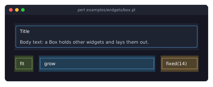
);
DESCRIPTION
A Box is a rectangle that holds other widgets and arranges them in a row or a column. It can have a background color and a border, and it can receive events. Boxes are the building blocks of every screen: nest them to divide the terminal into areas, then put Term::Fabulous::Widget::Text and the other widgets inside.
Box is the concrete form of Term::Fabulous::Widget; most other widgets (Term::Fabulous::Widget::Button, Term::Fabulous::Widget::ScrollBox, Term::Fabulous::Widget::Canvas, the input widgets) are Boxes with extra behavior. A Box can also be built from a KDL layout file (see "KDL PROPERTIES").
The SYNOPSIS above draws this (colors left out):
+----------------------------+
| Title                      |
|                            |
| Body text                  |
+----------------------------+
with rounded corners. The border takes one cell on every side and the padding one more cell left and right; see "Border space" in Term::Fabulous::Role::HasBorderStyle.
CONSTRUCTOR
new
my $box = Term::Fabulous::Widget::Box->new(%parameters);All parameters are optional; unknown parameters die. A Box accepts the parameters common to all container widgets. Each is listed here with its meaning in one sentence; the constructor of Term::Fabulous::Widget describes the accepted values in full.
id-
A string that names the widget and must be unique in the widget tree. Default:
undef(no id). layout-
A hash reference with the keys
sizing,padding,child_gap,layout_direction,child_alignment,line_gapandline_sizingthat decides the size of the box and how its children are arranged. Default:{}, which fits the box to its content and places the children from left to right. floating-
A hash reference that takes the box out of its parent's layout and draws it on top of other widgets, attached to its parent, the root or another widget. Default:
undef(the box is laid out normally). background_color-
The color of the box's area, in any format Term::Fabulous::Color accepts (
[r, g, b, a],{ r, g, b, a }, a string such as'#14192b', a Color object). Default:undef, so the box is transparent. glyphs_show_through-
A boolean. Default: false. With a translucent
background_color, whether text and borders below the box stay visible through it. bordered-
Which sides have a border: a true value for all four sides, or a hash reference with any of
left,right,topandbottomand true or false values. Default: no border; the theme has noborder.enabledfor a Box (see "bordered" in Term::Fabulous::Widget). border_color-
The color of the border glyphs, in the same formats as
background_color. Default: the theme'sbox.border.color, thebordertoken in the built-in themes (see "THEMES" in Term::Fabulous::Manual::Looks). border_style-
A Term::Fabulous::Enum::BorderStyle item or its name (
'Round') that sets the style of every side that has no side parameter of its own. Default: the theme'sbox.border.style,Roundin the built-in themes (see "THEMES" in Term::Fabulous::Manual::Looks). border_style_topborder_style_rightborder_style_bottomborder_style_left-
A Term::Fabulous::Enum::BorderStyle item or its name that sets the style of one side. Default:
undef. It wins overborder_stylefor that side. border_corners-
A hash reference of glyphs drawn at the corners instead of the style's corner glyphs. Default:
undef. outer_border_sides-
An array reference of sides whose border glyphs are drawn on the background outside the box. Default:
[]. width_groupheight_group-
A sizing group number that gives the box the same width (or height) as the other widgets with that number. Default: 0, which means no group.
classes-
An array reference of free-form names, returned by "get_classes" in Term::Fabulous::Widget. Default:
[].
METHODS
A Box has all methods of Term::Fabulous::Widget: children (add_child, remove_child, children, ...), events (on, fire_event), the search "find_by_id" in Term::Fabulous::Widget, the accessors layout, floating, background_color, glyphs_show_through, border_color, bordered, border_style_top, border_style_right, border_style_bottom, border_style_left, width_group and height_group, and the state methods. It adds nothing for applications; the methods in "SUBCLASS INTERFACE" are for widget authors.
EVENTS
A Box fires no events of its own. Events fired on its children bubble up to it (see "EVENTS" in Term::Fabulous::Manual::Events), and Term::Fabulous fires KeyPress on it when it is the root and nothing has the focus, and Mouse when it is the topmost widget painted under the pointer. A Box receives Mouse events only on the cells it paints: its whole area when it has a background color, and only its border cells when it has a border but no background. A Box with neither is transparent to the mouse.
KDL PROPERTIES
A Box built by Term::Fabulous::Layout reads these property nodes from its block. Child nodes whose names start with an uppercase letter are child widgets; everything else is a property. Unknown properties, unknown keys and invalid values die, naming the property.
use Term::Fabulous::Widget::Box as Box
use Term::Fabulous::Widget::Text as Text

Box "card" {
	layout direction=down gap=1
	sizing width="fixed(30)" height="fit(3, 10)"
	padding left=1 right=1
	child_alignment x=center
	border style=Round color="#61afef"
	bordered #true
	background_color "rgb(30, 35, 50)"

	Text { text "Title"; text_color "#ffffff"; }
	Text { text "Body text"; text_color "hsl(220, 15%, 80%)"; }
}
layout direction=... gap=N line_gap=N line_sizing=...-
directionisdown(aliasesttb,top_to_bottom),right(aliasesltr,left_to_right),wrap(aliasesltr_wrap,left_to_right_wrap; see "Flow layout" in Term::Fabulous::Manual::Layout) orstack(aliasesback_to_front,btf; see "Stack layout" in Term::Fabulous::Manual::Layout).gap(aliaschild_gap; giving both dies) is the number of cells between children, a non-negative integer.line_gapis the number of rows between the lines of awrapbox, a non-negative integer.line_sizingisgrow(the default) orfitand decides what awrapbox taller than its lines does with the leftover rows. Each key is optional, but at least one must be given: a barelayoutnode dies. sizing width=... height=...-
Each value is
grow,fit,"grow(MIN)","grow(MIN, MAX)","fit(MIN)","fit(MIN, MAX)","fixed(N)"with N a non-negative integer number of cells, or"percent(N)"with N a number from 0 to 100 ("percent(50)"is half of the parent; note that Perl code uses a fraction instead:sizing_percent(0.5)). MIN and MAX are non-negative integer numbers of cells, the limits ofsizing_grow($min, $max)andsizing_fit($min, $max); without MAX there is no maximum, and a MIN greater than MAX dies. Values with parentheses must be quoted. Either key may be left out. A secondsizingnode changes only the axes it names. child_alignment x=... y=...-
Where the children are placed when they do not fill the box:
xisleft(the default),centerorright,yistop(the default),centerorbottom. Either key may be left out, but at least one must be given. A secondchild_alignmentnode changes only the key it names. An unknown name dies with the known ones. floating attach_to=... parent_id=... element=... parent=... offset_x=N offset_y=N z_index=N pointer_capture=... clip_to=...-
Sets the
floatinghash (see "floating" in Term::Fabulous::Widget). Each key is optional, but at least one must be given:attach_to-
parent(the default),rootorelement.elementrequiresparent_id. parent_id-
The id of the widget to attach to with
attach_to=element, a string. elementparent-
The point of this box (
element) that is placed on the point of the widget it is attached to (parent):left_top(the default),left_center,left_bottom,center_top,center_center,center_bottom,right_top,right_centerorright_bottom. offset_xoffset_y-
Integers added to the position, in cells; negative values move left and up.
z_index-
An integer from -32768 to 32767; floating widgets with a higher value are drawn on top.
pointer_capture-
capture(the default) orpassthrough. clip_to-
none(the default) orattached_parent.
A second
floatingnode changes only the keys it names. An unknown name dies with the known ones.Box "menu" { floating attach_to=element parent_id="menu-button" element=left_top parent=left_bottom floating z_index=10 border style=Round bordered #true } padding left=N right=N top=N bottom=N-
Any subset of the four sides; non-negative integers. A second
paddingnode changes only the sides it names, likesizing. border style=... style-top=... style-right=... style-bottom=... style-left=... color=...-
stylesets all four sides,style-topand the other side keys override it for one side. Values are the names of Term::Fabulous::Enum::BorderStyle items (Round,Solid,Double, ...).colortakes any color string that Term::Fabulous::Color understands ("#61afef","rgb(97, 175, 239)","hsl(207, 82%, 66%)", ...). This property does not make a border appear: also givebordered. bordered #trueorbordered top=#true right=#true bottom=#true left=#true-
A border on all four sides, or on the sides named
#true; the sides left out have none.#false(or0) gives no border. Any other value dies, a quoted"true"included. background_color "..."border_color "..."-
Any Term::Fabulous::Color string.
glyphs_show_through #true-
#trueor#false(the default), see "glyphs_show_through" in Term::Fabulous::Widget. width_group Nheight_group N-
Sizing group numbers, see "width_group" in Term::Fabulous::Widget.
border_corners, outer_border_sides and classes cannot be set from KDL; set them in Perl after the build (see "LIMITATIONS" in Term::Fabulous::Layout).
SUBCLASS INTERFACE
This method is for authors of widget classes that should be buildable from KDL layouts. See Term::Fabulous::Role::CanParseLayout, which also provides apply_layout_node and apply_layout_settings.
layout_properties
method layout_properties :common () {
	return ( $class->SUPER::layout_properties, title => 'scalar', collapsed => 'boolean', shortcut => \&_parse_shortcut );
}
The table of the properties a layout may set and how each is read (see "layout_properties" in Term::Fabulous::Role::CanParseLayout). For a Box: background_color and border_color are colors, glyphs_show_through is a boolean, width_group and height_group are scalars, and layout, border, sizing, padding, child_alignment and floating are structured properties the Box parses itself (see "KDL PROPERTIES"). bordered is a layout property by itself, as a themed parameter (see "layout_properties" in Term::Fabulous::Role::CanParseLayout). Subclasses extend the table as shown.
SEE ALSO
Term::Fabulous::Widget for the common parameters and methods, "LAYOUT" in Term::Fabulous::Manual::Layout (every layout option with a picture), the example program examples/widgets/box.pl, Term::Fabulous::Layout, Term::Fabulous::Role::HasBorderStyle, "Line up labels with equal widths (width_group)" in Term::Fabulous::Cookbook::Layout, "Use a different border style on each side" in Term::Fabulous::Cookbook::Layout.