NAME
Term::Fabulous::Cookbook::ChartTechniques - Recipes: time axes, live data, transforms, KDL and reports with charts
DESCRIPTION
This page is part of Term::Fabulous::Cookbook. Previous page: Term::Fabulous::Cookbook::Charts. Next page: Term::Fabulous::Cookbook::ChartStyles.
This page shows techniques for the data of charts and for the places a chart is used, whatever its type: time axes, live data that scrolls, logarithmic axes, transforms that smooth or index data, charts in KDL layouts and charts in printed reports. Each recipe is a complete program with a picture and notes. The previous page, Term::Fabulous::Cookbook::Charts, introduces each chart type with a recipe of its own; start there if you have not drawn a chart yet. The next page, Term::Fabulous::Cookbook::ChartStyles, changes how charts look and react: curves, markers, colors, line styles and hover.
Most recipes use Term::Fabulous::Widget::LineChart, Term::Fabulous::Widget::AreaChart and Term::Fabulous::Widget::BarChart, whose axes, series options and data methods are described on Term::Fabulous::Widget::XYChart. Titles, legends and colors are common to all charts and described on Term::Fabulous::Widget::Chart. The concepts are explained in the charts chapter of the manual, and the data steps have a page of their own: Term::Fabulous::Chart::Transform.
The recipes on this page:
"Plot values over time (time axis, from and to, a dashed forecast)"
"A live chart that follows new data (append, max_points, span)"
"Describe charts in a KDL layout (series, slices, transforms)"
Plot values over time (time axis, from and to, a dashed forecast)
Goal: plot hourly measurements over four days on a time axis, continue them with a dashed forecast, and shade a stretch of time.
This program is shipped as examples/cookbook/chart-time-series.pl.
use v5.32;
use warnings;
use utf8;
use feature 'signatures';
no warnings 'experimental::signatures';

use POSIX qw(strftime);
use Term::Fabulous;
use Term::Fabulous::Widget::Box;
use Term::Fabulous::Widget::LineChart;
use Clay::XS qw(sizing_grow);

my $root = Term::Fabulous::Widget::Box->new(
	layout => {
		sizing  => { width => sizing_grow(), height => sizing_grow() },
		padding => { left  => 2, right => 2, top => 1, bottom => 1 },
	},
);

# Hourly temperatures: measured until noon on June 3rd, forecast from
# then on. The x values are date strings (local time; a trailing Z means
# UTC); epoch seconds or DateTime objects work as well.
my $now = '2026-06-03 12:00Z';
my ( @measured, @forecast );
foreach my $hour ( 0 .. 4 * 24 ) {
	my $time  = strftime( '%Y-%m-%d %H:%MZ', gmtime( 1780272000 + 3600 * $hour ) );
	my $value = 17 + 6 * sin( ( $hour - 9 ) * 3.14159 / 12 ) + 2 * sin( $hour / 17 );
	push @measured, [ $time, $value ] if $hour <= 2 * 24 + 12;
	push @forecast, [ $time, $value + 1.5 * ( $hour - 2 * 24 - 12 ) / 36 ] if $hour >= 2 * 24 + 12;    # drifts away from the measurements
}

my $chart = Term::Fabulous::Widget::LineChart->new(
	title  => 'Temperature in Lisbon',
	curve  => 'monotone',
	x_axis => { type  => 'time', utc    => 1, min => '2026-06-01 00:00Z', max => '2026-06-05 00:00Z' },
	y_axis => { title => '°C',   format => '%d°' },
	series => [
		{ name => 'Measured', data => \@measured },
		{ name => 'Forecast', data => \@forecast, line_style => 'dashed' },

		# The same data, drawn only from the start of the 2nd to noon of the 3rd.
		{ name => 'Heat warning', data => \@measured, type => 'area', from => '2026-06-02 00:00Z', to => $now, fill_opacity => 0.25, color => '#e66767' },
	],
);
$root->add_child($chart);

Term::Fabulous->new( root => $root, width => 90, height => 24 )->run;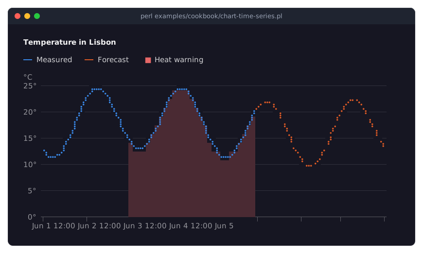
With
[ x, y ]points whose x values are dates, the x axis is a time axis.type => 'time'says so; the defaultautowould also recognize the date strings. An x value can be a number of epoch seconds, a date string or an object with anepochmethod, such as a DateTime. A date string without a zone is local time; a trailingZmeans UTC.utc => 1writes the tick labels in UTC instead of local time, so the chart looks the same everywhere.minandmaxfix the ends of the axis, here midnight to midnight over four days, whatever the data covers. The chart chooses ticks that suit the span; aformatin thex_axiswrites them with your ownstrftimeformat. See "Time axes" in Term::Fabulous::Widget::XYChart.The forecast is a series of its own, with
line_style => 'dashed', starting at the hour the measurements end.dottedis the third line style; see "Line styles" in Term::Fabulous::Widget::XYChart.fromandtolimit where a series is drawn, in x values. The "Heat warning" series uses the measured data again, as a redareawith a lightfill_opacity, drawn only from the start of June 2nd to noon of June 3rd: a way to shade a stretch of time. A line or the top of an area is cut exactly atfromandto, with the ends interpolated between the points. Points outside are kept in the series, but not drawn, and they do not count for the axes. See "From, to and span" in Term::Fabulous::Widget::XYChart.A line chart's series are lines unless they say otherwise: any series can be a
line,area,barorscatterseries. Areas are drawn below lines, so the shading stays under the measured line.curve => 'monotone'smooths the lines of all series; see "Connect points with curves and easings (curve)" in Term::Fabulous::Cookbook::ChartStyles. As in the line chart recipe ("Draw a line chart with labels and points (LineChart)" in Term::Fabulous::Cookbook::Charts), the program needsuse utf8for the degree sign.
A live chart that follows new data (append, max_points, span)
Goal: a chart of the last minute of network traffic that moves on as new measurements arrive, four times a second.
This program is shipped as examples/cookbook/chart-live.pl.
use v5.32;
use warnings;
use feature 'signatures';
no warnings 'experimental::signatures';

use IO::Async::Loop;
use IO::Async::Timer::Periodic;
use Term::Fabulous;
use Term::Fabulous::Widget::Box;
use Term::Fabulous::Widget::LineChart;
use Term::Fabulous::Widget::Text;
use Clay::XS qw(sizing_grow CLAY_TOP_TO_BOTTOM);
use Time::HiRes ();

my $root = Term::Fabulous::Widget::Box->new(
	layout => {
		layout_direction => CLAY_TOP_TO_BOTTOM,
		sizing           => { width => sizing_grow(), height => sizing_grow() },
		padding          => { left  => 2, right => 2, top => 1, bottom => 1 },
		child_gap        => 1,
	},
);

# The last minute: the x axis always spans 60 seconds up to the newest
# point, and each series keeps at most 240 points.
my $chart = Term::Fabulous::Widget::LineChart->new(
	title      => 'Network traffic',
	x_axis     => { type => 'time', span => 60, format => '%H:%M:%S' },
	y_axis     => { min  => 0, title => 'Mbit/s' },
	max_points => 240,
	series     => [ { name => 'Received', type => 'area', line => 1 }, { name => 'Sent' } ],
);
my $status = Term::Fabulous::Widget::Text->new( text => 'Waiting for data', text_color => [ 150, 160, 180, 255 ] );
$root->add_child( $chart, $status );

# Made-up measurements, four per second.
my $tick = 0;

sub measure () {
	$tick++;
	return ( 65 + 20 * sin( $tick / 23 ) + 8 * sin( $tick / 3.1 ) + 4 * sin( $tick * 1.7 ), 18 + 6 * sin( $tick / 11 ) + 3 * sin( $tick * 2.3 ) );
}

my $timer = IO::Async::Timer::Periodic->new(
	interval => 0.25,
	on_tick  => sub {
		my ( $received, $sent ) = measure();

		# One point for each series, both at this moment.
		$chart->append( Time::HiRes::time(), { Received => $received, Sent => $sent } );
		$status->text( sprintf 'Now: %.1f Mbit/s in, %.1f Mbit/s out', $received, $sent );
		return;
	},
);
$timer->start;
IO::Async::Loop->new->add($timer);

Term::Fabulous->new( root => $root, width => 80, height => 22 )->run;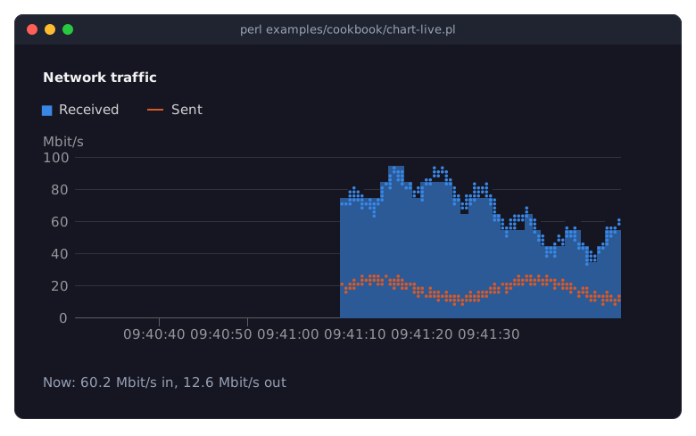
The picture shows the program after it ran for 30 seconds.
The series start without data: a name and a type are enough. Received is an area with
line => 1, which draws a line along its top; an area has none unless asked to. Sent is a line, the default type of a line chart.$chart->append( $x, { name => $value, ... } )adds one point to each series named in the hash, all at the same x: the way to feed several series from one measurement. Here the x value istime, the current epoch seconds.add_pointsadds points to one series. See "Live data" in Term::Fabulous::Widget::XYChart.span => 60makes the time axis show the 60 seconds up to the newest point, so the chart moves on with every new point.formatwrites the tick labels withstrftime.max_points => 240keeps the newest 240 points of each series and drops older ones; without it, the data grows as long as the program runs. Make it about the span times the rate (60 seconds times 4 per second), so the memory holds what the chart shows; points older than the span are neither drawn nor counted for the y axis, whatevermax_pointskeeps.min => 0on the y axis keeps its bottom at 0. Without it, the bottom of the axis follows the lowest value shown and jumps whenever a low value scrolls in or out. The top still follows the highest value; give the axis amaxas well to fix it.The timer only changes the data: the chart is drawn again in the next frame, and only the cells that changed are sent to the terminal. The timer is set up as in the clock recipe.
Show values of very different sizes (logarithmic axis)
Goal: show series that grow from a few to tens of thousands so that the early years and the smaller series stay readable.
This program is shipped as examples/cookbook/chart-log-scale.pl.
use v5.32;
use warnings;
use feature 'signatures';
no warnings 'experimental::signatures';

use Term::Fabulous;
use Term::Fabulous::Widget::Box;
use Term::Fabulous::Widget::LineChart;
use Clay::XS qw(sizing_grow);

my $root = Term::Fabulous::Widget::Box->new(
	layout => {
		sizing    => { width => sizing_grow(), height => sizing_grow() },
		padding   => { left  => 2, right => 2, top => 1, bottom => 1 },
		child_gap => 4,
	},
);

# Values from a few to many thousands: on a linear axis the small ones
# lie flat on the floor...
my @series = (
	{ name => 'Downloads', data => [ 12, 40, 150, 610, 2400, 9800, 31000, 88000 ] },
	{ name => 'Issues',    data => [ 2,  5,  14,  30,  71,   160,  390,   900 ] },
);
my @years = 2019 .. 2026;
$root->add_child( Term::Fabulous::Widget::LineChart->new( title => 'Linear axis', labels => \@years, points => 1, series => \@series ) );

# ... on a logarithmic one every factor of ten takes the same room, and
# steady growth is a straight line.
$root->add_child(
	Term::Fabulous::Widget::LineChart->new(
		title  => 'Logarithmic axis',
		labels => \@years,
		points => 1,
		y_axis => { type => 'log' },
		series => \@series,
	)
);

Term::Fabulous->new( root => $root, width => 100, height => 20 )->run;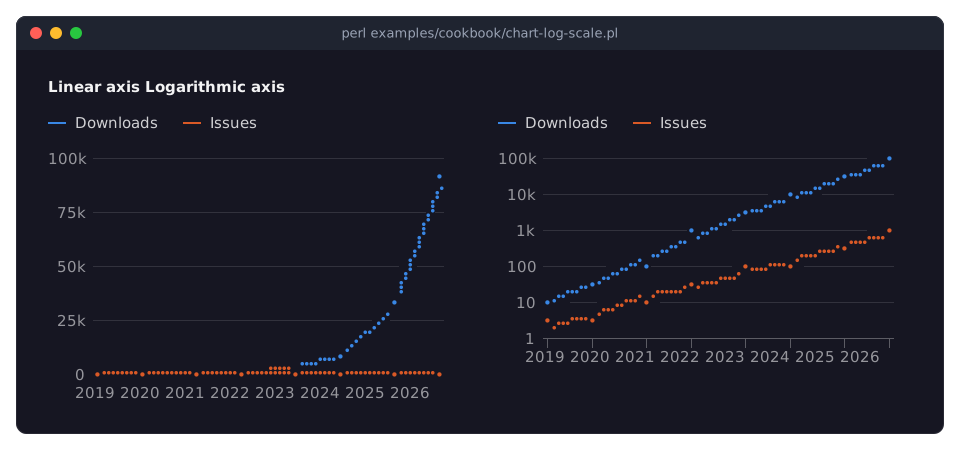
On the linear axis at the left, the largest value sets the scale: all values below a few thousand lie on the floor, and the issues cannot be told from 0.
type => 'log'in they_axismakes every power of ten take the same height. Growth by the same factor every year becomes a straight line, and series of very different sizes are both readable. The ticks are at the powers of ten, written with SI prefixes from a thousand on (1k,10k);base => 2puts them at the powers of 2 instead.A logarithmic axis cannot show 0 or negative values: a line has a gap there, and bars and points are left out.
undefin the data leaves a gap as well. See "Logarithmic axes" in Term::Fabulous::Widget::XYChart.Readers take a logarithmic axis for a linear one unless they are told: say so in the title or the axis title, as here.
The x axis can be logarithmic too, for numeric x values:
x_axis => { type => 'log' }.
Smooth noisy data and index it to 100 (transforms)
Goal: show the trend in noisy daily figures, and compare the growth of two prices of very different size on one axis.
This program is shipped as examples/cookbook/chart-transform.pl.
use v5.32;
use warnings;
use feature 'signatures';
no warnings 'experimental::signatures';

use Term::Fabulous;
use Term::Fabulous::Widget::Box;
use Term::Fabulous::Widget::LineChart;
use Clay::XS qw(sizing_grow CLAY_TOP_TO_BOTTOM);

my $root = Term::Fabulous::Widget::Box->new(
	layout => {
		layout_direction => CLAY_TOP_TO_BOTTOM,
		sizing           => { width => sizing_grow(), height => sizing_grow() },
		padding          => { left  => 2, right => 2, top => 1, bottom => 1 },
		child_gap        => 1,
	},
);

# Noisy daily visits for 120 days, with a weekly rhythm.
srand 3;
my @visits = map { 300 + 2 * $_ + 60 * sin( $_ * 6.283 / 7 ) + ( rand() - 0.5 ) * 160 } 0 .. 119;

# The same data three times: as it is, and smoothed two ways. The data
# given stays as it is; only what is drawn is prepared.
$root->add_child(
	Term::Fabulous::Widget::LineChart->new(
		title  => 'Daily visits',
		series => [
			{ name => 'Raw',            data => \@visits, color     => '#3a4152' },
			{ name => '7-day average',  data => \@visits, transform => [ [ 'moving_average', 7 ] ] },
			{ name => 'Smoothed (0.1)', data => \@visits, transform => [ [ 'exponential',    0.1 ] ], line_style => 'dashed' },
		],
	)
);

# Two prices of very different size, both indexed to 100 at the start,
# so their growth compares on one axis.
my @shares = map { 1200 + 4 * $_ + 80 * sin( $_ / 9 ) } 0 .. 119;
my @bonds  = map { 96 + 0.05 * $_ + 2 * sin( $_ / 15 ) } 0 .. 119;
$root->add_child(
	Term::Fabulous::Widget::LineChart->new(
		title     => 'Growth since day 1 (day 1 = 100)',
		transform => [ [ 'index', 100 ] ],
		curve     => 'monotone',
		series    => [ { name => 'Shares', data => \@shares }, { name => 'Bonds', data => \@bonds } ],
	)
);

Term::Fabulous->new( root => $root, width => 90, height => 30 )->run;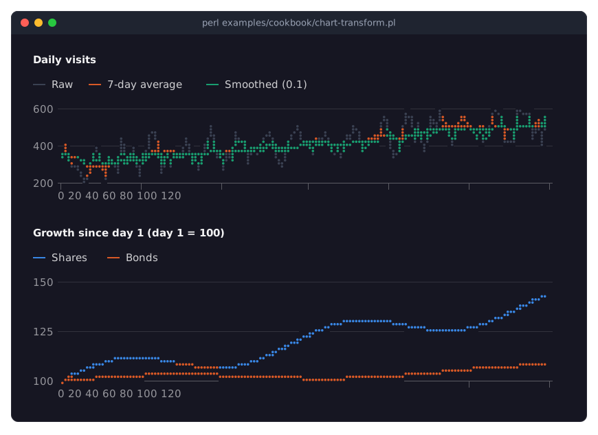
The
transformof a series lists steps that run on its points before they are drawn. The data you give stays as it is, and the steps run again whenever it changes, so live data stays prepared the same way. Write the steps as a list, even a single step with arguments:[ [ 'moving_average', 7 ] ]. See "Steps" in Term::Fabulous::Chart::Transform for all steps.The three series of the first chart share
@visits. The raw data is drawn in a dim color close to the background, as context; the smoothed lines stand out over it.[ 'moving_average', 7 ]is the mean of the last 7 days: it removes the weekly rhythm, but it lags about three days behind the data.[ 'moving_average', 7, 'center' ]averages the days around each point instead and does not lag.[ 'exponential', 0.1 ]is exponential smoothing: each smoothed value moves a tenth of the way from the smoothed value before it towards the new data value. A smaller factor smooths more and lags more. The dashedline_styletells it apart from the moving average.A
transformgiven to the chart applies to every series without one of its own.[ 'index', 100 ]makes each value relative to the first, which becomes 100: the shares start at 1200 and the bonds at 96, and both start at 100 in the chart, so 110 means 10% above day 1. This is how to compare series of very different sizes on one axis; a chart has no second y axis.Other steps sum up (
cumulative), turn counters into rates (rate), group points into intervals (resample), scale to 0 to 1 (normalize) or remove spikes (median); a code reference is a step of your own. The section on preparing data in XYChart describes where transforms run.
Describe charts in a KDL layout (series, slices, transforms)
Goal: describe a bar chart and a donut chart in a KDL layout, with their data, and add data to them from Perl.
This program is shipped as examples/cookbook/chart-kdl.pl.
use v5.32;
use warnings;
use feature 'signatures';
no warnings 'experimental::signatures';

use Term::Fabulous;
use Term::Fabulous::Layout;

my $layout = Term::Fabulous::Layout->new( string => <<'KDL' );
use Term::Fabulous::Widget::Box as Box
use Term::Fabulous::Widget::BarChart as BarChart
use Term::Fabulous::Widget::DonutChart as DonutChart

Box "root" {
	layout gap=4
	sizing width=grow height=grow
	padding left=2 right=2 top=1 bottom=1

	BarChart "sales" {
		sizing width="percent(60)" height=grow
		title "Sales and returns"
		labels "Q1" "Q2" "Q3" "Q4"
		value_labels #true
		y_axis title="units" grid="dotted"
		series "Sold" color="#3987e5" { data 90 140 165 190; }
		series "Returned" color="#e66767" { data 14 11 17 12; }
		series "Trend" type="line" line_style="dashed" color="#c98500" {
			data 90 140 165 190
			transform "moving_average" 2
		}
	}

	DonutChart "channels" {
		title "Sold by channel"
		legend "bottom"
		slice "Shop" 312
		slice "Partners" 158
		slice "Phone" 97
	}
}
KDL

my $root = $layout->build;

# Data from the program goes to the widgets the layout named.
$root->find_by_id('channels')->set_value( Web => 431 );

Term::Fabulous->new( root => $root, width => 100, height => 22 )->run;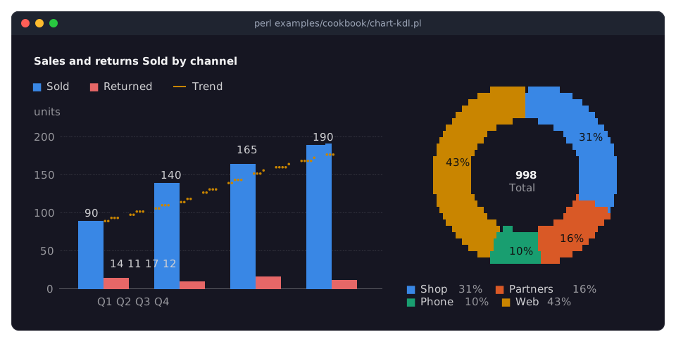
use Term::Fabulous::Widget::BarChart as BarChartmakes the chart available in the layout. The parameters of a chart are nodes in its block:title "...",legend "bottom",value_labels #true.labelstakes the labels as arguments, andx_axisandy_axistake the keys of the axis hash as properties.A
seriesnode takes the series' name as its argument and its options as properties (color,type,line_style, ...). Inside its block,dataholds the values,pointan[ x, y ]pair, and everytransformnode adds one step with its arguments. A;ends a node, so a short block fits on one line.The
Trendseries is a dashed line over the bars: the moving average of each quarter and the one before it, computed from the same numbers asSold.value_labelsapplies only to the bars.A
DonutChart(and any pie) takes its data asslicenodes: a label and a value, and an optionalcolorproperty.Within a chart node, the labels and the axes are applied before the series, wherever they stand, so the series' values are read the way the axes say. The KDL properties of XYChart and those of PieChart list all nodes.
From Perl,
find_by_idfinds a chart by the name the layout gave it.set_valuechanges the value of a slice, or adds a slice when the label is new, asWebhere. Charts with axes take new data withset_data,add_pointsandappend.The bar chart takes 60% of the width (
sizing width="percent(60)"), and the donut grows to the rest. For a table in KDL, see "Describe a table in a KDL layout (columns, lines, sort, groups)" in Term::Fabulous::Cookbook::Tables; the layout language is described in Term::Fabulous::Layout.
Print charts in a report (Static)
Goal: print a bar chart and a sparkline as part of a report, without an event loop, to the terminal, a pipe or a file.
This program is shipped as examples/cookbook/chart-report.pl.
use v5.32;
use warnings;
use feature 'signatures';
no warnings 'experimental::signatures';

use Term::Fabulous::Static;
use Term::Fabulous::Widget::BarChart;
use Term::Fabulous::Widget::Box;
use Term::Fabulous::Widget::Sparkline;
use Term::Fabulous::Widget::Text;
use Clay::XS qw(sizing_grow sizing_fixed CLAY_TOP_TO_BOTTOM);

my %disk = ( '/' => 71, '/home' => 88, '/var' => 46, '/srv' => 23 );
my @load = ( 0.4, 0.6, 0.5, 0.9, 1.4, 2.1, 1.8, 1.2, 0.9, 1.1, 1.6, 1.3, 0.8, 0.7, 0.6, 0.9, 1.0, 0.8 );

my $root = Term::Fabulous::Widget::Box->new( layout => { layout_direction => CLAY_TOP_TO_BOTTOM, sizing => { width => sizing_grow() }, child_gap => 1 } );

# A chart in a report needs a fixed height: there is no screen to fill.
$root->add_child(
	Term::Fabulous::Widget::BarChart->new(
		title        => 'Disk usage (%)',
		horizontal   => 1,
		value_labels => 1,
		labels       => [ sort keys %disk ],
		y_axis       => { min => 0, max => 100 },
		series       => [ { name => 'used', data => [ map { $disk{$_} } sort keys %disk ] } ],
		layout       => { sizing => { width => sizing_grow(), height => sizing_fixed(9) } },
	)
);

# Text is black unless it has a text_color, which a dark terminal does
# not show: give it a color, as the chart does for its labels.
my $line = Term::Fabulous::Widget::Box->new( layout => { child_gap => 1 } );
$line->add_child(
	Term::Fabulous::Widget::Text->new( text => 'Load, last 18 hours:', text_color => [ 230, 230, 230, 255 ] ),
	Term::Fabulous::Widget::Sparkline->new( type => 'bar', values => \@load, layout => { sizing => { width => sizing_fixed(18) } } ),
	Term::Fabulous::Widget::Text->new( text => sprintf( 'now %.1f', $load[-1] ), text_color => [ 230, 230, 230, 255 ] ),
);
$root->add_child($line);

# Colors on a terminal, plain characters in a pipe or file.
Term::Fabulous::Static->new( root => $root, width => 60 )->print;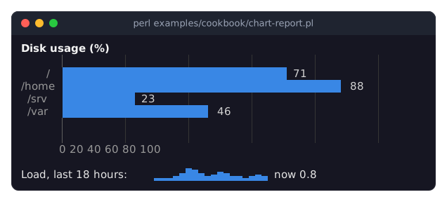
Term::Fabulous::Static lays out and draws the widget tree once and prints it; the program ends right after. On a terminal the output has colors; in a pipe or a file it is plain text. See "Render a report to a file or pipe (Static)" in Term::Fabulous::Cookbook::Output.
A chart grows to the room it gets, but a report has no screen height to fill: give the chart a fixed height, here
sizing_fixed(9). The root box has no height of its own, so the report is as high as what it holds.In a horizontal bar chart, the
y_axisstill describes the values, although it is drawn along the bottom:minandmaxfix it to 0 to 100 percent, so a full disk would fill its row.The labels and the values come from the same hash, both in the order of
sort keys %disk; Perl's hash order is random, so sort once and use that order for both.A Term::Fabulous::Widget::Sparkline is a chart one row high, without axes, legend or title. Its width is fixed to 18 columns, one per value: a bar takes at least one cell, and with more values than columns, the bars show the newest values that fit.
SEE ALSO
This page is part of Term::Fabulous::Cookbook. Previous page: Term::Fabulous::Cookbook::Charts. Next page: Term::Fabulous::Cookbook::ChartStyles.
Term::Fabulous::Widget::XYChart - axes, series options and data methods of line, area, bar and scatter charts.
Term::Fabulous::Chart::Transform - the steps that prepare series data.
Term::Fabulous::Static - printing widgets without an event loop.
Term::Fabulous::Cookbook::Charts - one recipe per chart type.
Term::Fabulous::Cookbook::ChartStyles - curves, markers, colors, line styles and hover.