NAME
Term::Fabulous::Manual::Forms - Forms and input widgets
DESCRIPTION
This page is part of Term::Fabulous::Manual. Previous page: Term::Fabulous::Manual::Events. Next page: Term::Fabulous::Manual::Feedback.
This page is the guide to the input widgets: text fields, text areas, checkboxes, radio buttons, dropdowns, sliders, star ratings, segmented controls and the color picker. It first describes what all inputs have in common (value, Change event, id, focus, disabled and read-only inputs, the visual states, size and checking input), then shows each input widget with a short example and a picture, explains how the text inputs are edited (keys, selection, clipboard, undo), and ends with complete forms: reading all values and building a form from a KDL layout file. The reference of each widget is on its class page; complete programs are in Term::Fabulous::Cookbook::Forms.
The page assumes you know how to build a widget tree ("WIDGETS AND THE WIDGET TREE" in Term::Fabulous::Manual::Layout) and how listeners work ("EVENTS" in Term::Fabulous::Manual::Events).
"FORMS AND INPUT WIDGETS": the widgets and what they share
"THE INPUT WIDGETS ONE BY ONE": text fields, password fields, text areas, checkboxes, radio buttons, dropdowns, sliders, star ratings, segmented controls, color pickers
"EDITING TEXT": keys, selection, clipboard, undo, editing from the program
"KEYS OF THE INPUT WIDGETS": all keys at a glance
"COMPLETE FORMS": a small form, reading all values, a form in KDL
FORMS AND INPUT WIDGETS
A form is a box with input widgets in it. Term::Fabulous has no form widget of its own: any Term::Fabulous::Widget::Box holds inputs, and because the events of the inputs bubble up to it, one listener on the box sees every change.
The input widgets
- Term::Fabulous::Widget::TextField
-
One line of text, optionally masked for passwords. Fires
SubmitonEnter. See "Text fields". - Term::Fabulous::Widget::TextArea
-
Several lines of text, wrapped or scrolled sideways, with a scrollbar. See "Text areas".
- Term::Fabulous::Widget::Checkbox
-
On or off, with an optional "indeterminate" third look. See "Checkboxes".
- Term::Fabulous::Widget::RadioGroup and Term::Fabulous::Widget::RadioButton
-
One choice of several, all visible. See "Radio buttons".
- Term::Fabulous::Widget::Dropdown
-
One choice of several, from a list that opens over the other widgets. See "Dropdowns".
- Term::Fabulous::Widget::Slider
-
A number from a range. See "Sliders".
- Term::Fabulous::Widget::StarRating
-
A number of stars, whole or half, editable or read-only. See "Star ratings".
- Term::Fabulous::Widget::SegmentedControl
-
One choice of a few, shown side by side as one bar. See "Segmented controls".
- Term::Fabulous::Widget::ColorPicker
-
A color, typed, set with sliders or picked from a list of named swatches. See "Color pickers".
examples/form.pl uses all of them in one form. The picture shows it after the user typed a name and a note, chose a color and started an e-mail address; the status line at the bottom shows the last Change or, as here, what is wrong with a value (see "Checking input").
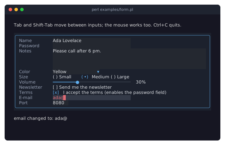
All input widgets except the radio group and the color picker are subclasses of Term::Fabulous::Widget::Input, whose page describes the shared parameters and methods in full. The text field and the text area share a second base class, Term::Fabulous::Widget::TextInput, with the editing keys, the placeholder and read_only. A radio group is a box that holds radio buttons; it takes the focus and holds the value for all of them. A color picker is a box built from a text field, a switch, sliders and a table; its parts take the focus, and the picker holds the value.
Values
Every input has a value method that reads its current value:
a text field or text area: its text, a character string (see "Text is character strings" in Term::Fabulous::Manual::Looks);
a checkbox: 1 (checked) or 0;
a radio group: the value of the selected button, or
undef;a dropdown: the value of the selected option, or
undef;a slider: a number.
To set the value from your program, call value with an argument on a text field, text area, radio group, dropdown or slider, and checked on a checkbox (a checkbox's value is read only). A radio button's value is different: it is the value the button gives its group when it is selected, and writing it does not select the button.
$name->value('Ada Lovelace');
$terms->checked(1);
$size->value('l');           # a radio group: selects the button with the value 'l'
$color->value('navy');       # a dropdown: selects the option with the value 'navy'
$volume->value(75);
Setting a value from the program never fires Change. Three methods act like the user instead and do fire it: $checkbox->toggle, $group->choose($button) and $dropdown->choose($index).
The Change and Submit events
An input fires a Term::Fabulous::Event::Change when the user changes its value. $event->value is the new value and $event->target the input that changed. A radio group fires it on the group, not on the button.
use Clay::UI::Enum::Result;

$volume->on(
	Change => sub ($event) {
		say 'Volume: ', $event->value;
		return Clay::UI::Enum::Result->CONTINUE;
	}
);
Change bubbles to the ancestors of the input, unless a listener on the way stops it (see "Return values and bubbling" in Term::Fabulous::Manual::Events), so one listener on the form box sees the changes of all inputs inside it. Tell the inputs apart by their id:
$form->on(
	Change => sub ($event) {
		$status->text( $event->target->id . ' is now ' . ( $event->value // 'nothing' ) );
		return;
	}
);
A text field also fires a Term::Fabulous::Event::Submit when the user presses Enter, with the text as $event->value. A text area uses Enter for a new line and fires no Submit. To react to Enter in other inputs, listen for KeyPress on the form (see "Application shortcuts" in Term::Fabulous::Manual::Events).
Ids
Give every input an id (id => 'email' in Perl, TextField "email" in KDL). The id identifies the input in a form-wide listener ($event->target->id), and find_by_id finds it in the tree, which is how a program gets hold of the inputs of a form built from a layout file. Ids must be unique within a widget tree (see "Widget ids" in Term::Fabulous::Manual::Layout).
Focus
The input that has the focus (see "focus" in Term::Fabulous::Manual::Glossary) receives the key presses. Tab moves the focus to the next input, Shift+Tab (BackTab) to the previous one, and a click on an input focuses it. A radio group is one focus stop for all its buttons. To put the cursor into the first field when the program starts:
$ui->interaction->set_focused_widget($name);The focused input shows it: its content is painted on its focus_background_color, and a text input shows a block cursor. Keys an input does not use, such as Tab, Escape and the function keys, bubble on to its ancestors, so application shortcuts keep working while the user types. The focus section of the events page describes the focus order, can_focus and how to change the order.
Disabled inputs
disabled greys an input out: it is painted in its disabled_color, ignores keys, clicks and the mouse wheel, and cannot take the focus, so Tab skips it. An input that has the focus loses it when it is disabled. Buttons and radio groups have disabled too; a radio button counts as disabled while its group is.
my $password = Term::Fabulous::Widget::TextField->new( id => 'password', mask => '*', disabled => 1 );

$terms->on(
	Change => sub ($event) {
		$password->disabled( !$event->value );    # enabled while the box is checked
		return;
	}
);
The program can still set the value of a disabled input. See "disabled" in Term::Fabulous::Widget::Input and the recipe Disable inputs until a checkbox is checked.
Read-only text
A text field or text area with read_only => 1 keeps its normal look and can take the focus; the user can move the cursor, select and copy, but not change the text. Use it for text the user should be able to copy, such as a generated key or a log; use disabled when the input should look unavailable. See "read_only" in Term::Fabulous::Widget::TextInput.
Visual states
The inputs show their state themselves; you choose the colors:
Focused: the content on
focus_background_color. A text input shows the cursor as a block (the character under it in reverse video), a slider paints its thumb intext_color, and a radio group highlights the button the keyboard is on.Disabled: everything in
disabled_color.Invalid: while the value is empty but
required, or rejected by thevalidator, the text is drawn ininvalid_colorand the border, where there is one, in the theme'sdangercolor (a red in the built-in themes). An empty text field or dropdown has no text to color and keeps its gray placeholder. A disabled input shows the disabled look instead. See "Checking input".Placeholder: an empty text input, or a dropdown without a selection, shows its
placeholderinplaceholder_color.Masked: a text field with a
maskshows the mask character for every character of the text.Selected text: selected text in a text input is painted on
selection_color.Checked, selected, open: check marks, the selected radio button, the filled part of a slider, the dropdown's arrow and the border of its open list are painted in
accent_color.
The colors are parameters and accessors of every input (text_color, disabled_color, invalid_color, accent_color, focus_background_color, see "CONSTRUCTOR" in Term::Fabulous::Widget::Input) and of some inputs only (placeholder_color, selection_color, track_color, list_background_color, highlight_text_color). They take every color format. The pictures in "THE INPUT WIDGETS ONE BY ONE" show each widget in its states.
Your program can ask for the state too: $input->is_focused, $input->is_enabled, $input->is_valid, or $input->has_state('focused') with the state names focused, hovered, pressed and disabled (see "has_state" in Term::Fabulous::Widget; invalid is not a widget state, ask is_valid).
Size
Without a sizing rule in its layout, an input is exactly as big as its content: a text field is preferred_columns wide (default 20) and one row high, a text area preferred_columns by preferred_rows (40 by 5), a checkbox or radio button as wide as its mark and label, a dropdown as wide as its longest label plus the arrow, a slider preferred_columns plus its value label. A sizing rule in the layout wins:
use Clay::XS qw(sizing_grow sizing_fixed);

# A text field that fills the width of its row:
Term::Fabulous::Widget::TextField->new( layout => { sizing => { width => sizing_grow() } } );

# A text area as wide as its parent and eight rows high:
Term::Fabulous::Widget::TextArea->new( layout => { sizing => { width => sizing_grow(), height => sizing_fixed(8) } } );
To line up the labels of a form, put each label into a box of the same width group (see "Equal sizes across the tree" in Term::Fabulous::Manual::Layout), as examples/kdl-form.pl does. The size section of Term::Fabulous::Widget::Input explains how to line up inputs of different natural widths.
Checking input
Two things keep input in shape. A text input can restrict what the user may type at all, with accept; and every input can say whether its value is acceptable, with required and validator. They are separate on purpose: accept is an editing rule, applied as the user types and pastes, validator is a rule about the whole value.
Restricting characters. accept takes the body of a character class ('0-9', 'a-zA-Z ', '^0-9' for everything but digits), a regular expression every character must match (qr/\p{L}/) or a code reference; see "accept" in Term::Fabulous::Widget::TextInput for the details. A key the spec rejects does nothing; pasted text keeps its accepted characters and drops the rest, so pasting +49 170 1234 into a digits-only field inserts the digits. Setting value from the program to a text with a rejected character dies: the restriction is for the user.
my $zip = Term::Fabulous::Widget::TextField->new( id => 'zip', accept => '0-9', max_length => 5 );Checking the value. required => 1 makes an empty value invalid: empty text, a dropdown without a selection, an unchecked checkbox. validator checks a non-empty value: the name of a built-in validator (email, integer, number, url, hostname, ip, date, time), a regular expression the whole value must match, a code reference that returns what is wrong with the value (or nothing), a list of those, or a Term::Fabulous::Validator object when a validator takes options. An empty value that is not required is always fine; the validator never sees it.
use Term::Fabulous::Validator;

my $name  = Term::Fabulous::Widget::TextField->new( id => 'name',  required  => 1 );
my $email = Term::Fabulous::Widget::TextField->new( id => 'email', validator => 'email', placeholder => 'name@example.com' );
my $port  = Term::Fabulous::Widget::TextField->new( id => 'port',  validator => Term::Fabulous::Validator->integer( min => 1, max => 65535 ) );
my $code  = Term::Fabulous::Widget::TextField->new( id => 'code',  validator => qr/\A[A-Z]{3}\z/ );
my $even  = Term::Fabulous::Widget::TextField->new( id => 'even',  validator => sub ($value) { $value % 2 ? 'Please enter an even number.' : undef } );
my $terms = Term::Fabulous::Widget::Checkbox->new( id => 'terms', label => 'I accept the terms', required => 1 );
The validators that know their characters also restrict typing: integer lets the user type digits and a minus sign only, unless the field has an accept of its own.
What the user sees. An input whose value is invalid shows the invalid look at once, while the user types, not only when the user leaves the field: its text in invalid_color and its border, where it has one, in the theme's danger color. An empty text field or dropdown has no text to color and keeps its gray placeholder, so an empty required field looks invalid only when it has a border, which turns red. The picture shows every case (see "Invalid values" in Term::Fabulous::Widget::Input):
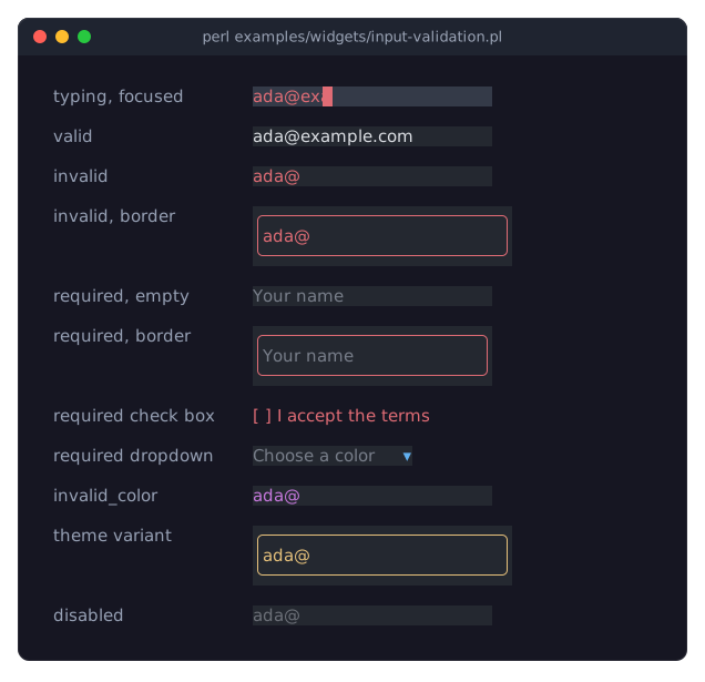
The input does not show the message; the message is yours to place. $input->error is the message right now (undef when the value is fine), $input->is_valid the same as a boolean, and the input fires Term::Fabulous::Event::ValidityChange after every Change whose message differs from the last one reported:
use Term::Fabulous::Widget::Text;

my $hint = Term::Fabulous::Widget::Text->new( text => ' ', text_color => '#e06c75' );
$form->on(
	ValidityChange => sub ($event) {
		$hint->text( $event->error // ' ' );
		return;
	}
);
Checking a whole form. When the user submits, ask the form: $form->invalid_inputs lists the inputs below a widget that are not valid, in layout order, so a Submit listener (or a button) can stop and move the focus to the first one:
$form->on(
	Submit => sub ($event) {
		if ( my @invalid = $form->invalid_inputs ) {
			$hint->text( $invalid[0]->error );
			$ui->interaction->set_focused_widget( $invalid[0] );
			return;
		}
		save( form_values($form) );
		return;
	}
);
Setting a value from the program fires no ValidityChange, as it fires no Change; call $input->validate to report it, or $_->validate foreach $form->invalid_inputs once after building a form to show its initial state. The messages are in English by default; give your own with required_message and the message option of every validator ("CONSTRUCTORS" in Term::Fabulous::Validator).
The recipe A login form checks a whole form this way when the user presses Enter. Check the values of a form uses every built-in validator and shows each message next to its field, and Write your own checks and restrict typing shows accept, patterns, code and lists of validators.
THE INPUT WIDGETS ONE BY ONE
Every picture below comes from a program in examples/widgets/, which shows the widget in its states; run it to try the keys. The class page of each widget is the reference: all parameters, methods, keys, mouse actions, events and KDL properties.
Text fields
A Term::Fabulous::Widget::TextField holds one line of text. It scrolls sideways when the text is wider than the field, shows a placeholder while it is empty, limits the text to max_length characters if you set one, and fires Submit on Enter.
use Term::Fabulous::Widget::TextField;

my $name = Term::Fabulous::Widget::TextField->new(
	id                => 'name',
	placeholder       => 'Your name',
	max_length        => 40,
	preferred_columns => 30,
);
$name->on(
	Submit => sub ($event) {
		say 'Hello, ', $event->value;
		return;
	}
);
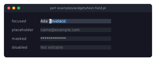
The picture shows a focused field in which Lovelace is selected, an empty field with a placeholder, a masked password and a disabled field (examples/widgets/text-field.pl):
In KDL:
TextField "name" {
	placeholder "Your name"
	max_length 40
	preferred_columns 30
}
Password fields
A text field with a mask shows every character as the mask character. value and the events still give the real text. A masked text cannot be copied or cut, and the word keys and the double click act on the whole text, so they do not reveal where its spaces are.
my $password = Term::Fabulous::Widget::TextField->new( id => 'password', mask => '*' );

$password->mask(undef);    # show the text, for example while a "Show password" box is checked
In KDL: TextField "password" { mask "*"; }. See "mask" in Term::Fabulous::Widget::TextField.
Text areas
A Term::Fabulous::Widget::TextArea holds several lines of text. Enter starts a new line. Long lines wrap at spaces (or, with wrap => 0, the view scrolls sideways), and a scrollbar shows the position while the text has more rows than the area.
use Clay::XS qw(sizing_grow sizing_fixed);
use Term::Fabulous::Widget::TextArea;

my $notes = Term::Fabulous::Widget::TextArea->new(
	id          => 'notes',
	placeholder => 'Anything else?',
	layout      => { sizing => { width => sizing_grow(), height => sizing_fixed(6) } },
);

my @lines = split /\n/, $notes->value, -1;
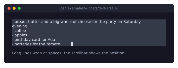
The picture shows a focused text area with a wrapped line and a scrollbar (examples/widgets/text-area.pl):
In KDL:
TextArea "notes" {
	placeholder "Anything else?"
	sizing width=grow height="fixed(6)"
}
Checkboxes
A Term::Fabulous::Widget::Checkbox is on or off. Space, Enter or a click toggles it. Its value is 1 or 0, and you set it with checked. A checkbox can also be indeterminate, a third look for a box that stands for a group of boxes of which only some are checked.
use Term::Fabulous::Widget::Checkbox;

my $news = Term::Fabulous::Widget::Checkbox->new(
	id      => 'newsletter',
	label   => 'Send me the newsletter',
	checked => 1,
);
say $news->checked ? 'subscribed' : 'not subscribed';
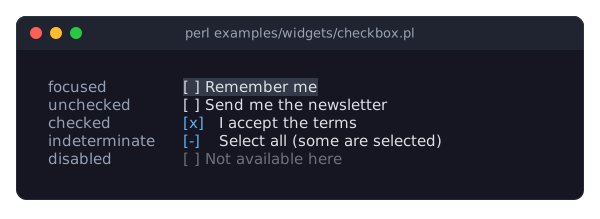
The picture shows a focused, an unchecked, a checked, an indeterminate and a disabled checkbox (examples/widgets/checkbox.pl):
In KDL:
Checkbox "newsletter" {
	label "Send me the newsletter"
	checked #true
}
Radio buttons
A Term::Fabulous::Widget::RadioGroup lets the user choose one of several Term::Fabulous::Widget::RadioButtons, all visible at once. The buttons are children of the group (or deeper inside it, for example in a box). The group holds the value, takes the focus for all its buttons and fires Change; the arrow keys move the selection, and a click selects a button. The buttons are laid out from top to bottom unless the group's layout says otherwise.
use Clay::XS qw(CLAY_LEFT_TO_RIGHT);
use Term::Fabulous::Widget::RadioGroup;
use Term::Fabulous::Widget::RadioButton;

my $size = Term::Fabulous::Widget::RadioGroup->new(
	id     => 'size',
	value  => 'm',
	layout => { layout_direction => CLAY_LEFT_TO_RIGHT, child_gap => 2 },
);
$size->add_child( Term::Fabulous::Widget::RadioButton->new( label => $_->[0], value => $_->[1] ) )
	foreach [ Small => 's' ], [ Medium => 'm' ], [ Large => 'l' ];
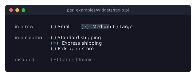
A button without a value stands for its label. The picture shows a focused group in a row, a group in a column and a disabled group (examples/widgets/radio.pl):
In KDL:
RadioGroup "size" {
	value "m"
	layout direction=right gap=2
	RadioButton { label "Small"; value "s"; }
	RadioButton { label "Medium"; value "m"; }
	RadioButton { label "Large"; value "l"; }
}
Dropdowns
A Term::Fabulous::Widget::Dropdown shows the selected option and opens a list of all options on Enter, Space, Alt+Down, F4 or a click. The list floats over the other widgets, below the dropdown, or above it when it does not fit below and there is more room above. Every option has a label (what the user sees) and a value (what value and Change give); an option given as a plain string is both. An option can be disabled ({ label => 'Archive', disabled => 1 }): it is shown greyed out and the user cannot choose it, as in a segmented control. Up and Down change the selection without opening the list, and typing the first letters of a label jumps to it.
use Term::Fabulous::Widget::Dropdown;

my $color = Term::Fabulous::Widget::Dropdown->new(
	id          => 'color',
	placeholder => 'Pick a color',
	options     => [ 'Red', 'Green', [ 'Dark blue' => 'navy' ] ],
);
$color->value('navy');
say $color->selected_label;    # Dark blue
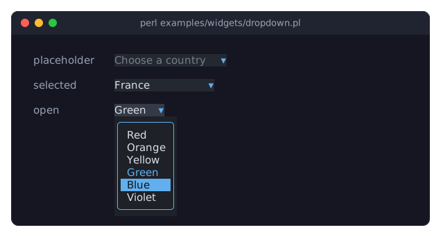
The picture shows a dropdown with its placeholder, one with a selection, and a focused one with its list open (examples/widgets/dropdown.pl):
In KDL, options adds options whose value is their label, and option adds one option with a value of its own:
Dropdown "color" {
	placeholder "Pick a color"
	options "Red" "Green"
	option "Dark blue" value="navy"
}
Sliders
A Term::Fabulous::Widget::Slider chooses a number between min and max, in steps of step. The arrow keys move it by a step, PageUp and PageDown by a page_step, Home and End to the ends; the mouse clicks, drags and turns the wheel. The value is shown right of the track, formatted with value_format.
use Term::Fabulous::Widget::Slider;

my $volume = Term::Fabulous::Widget::Slider->new(
	id           => 'volume',
	min          => 0,
	max          => 100,
	step         => 5,
	value        => 30,
	value_format => '%d%%',
);
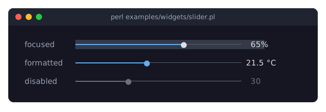
The picture shows a focused slider, one that formats its value with a code reference, and a disabled one (examples/widgets/slider.pl):
In KDL:
Slider "volume" {
	step 5
	value 30
	value_format "%d%%"
}
Star ratings
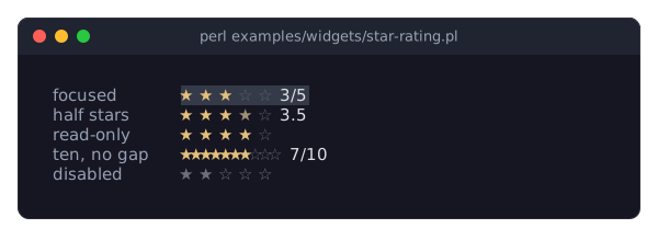
A Term::Fabulous::Widget::StarRating shows max stars (five by default), the first value of them filled, and lets the user choose with the arrow keys, the digits, a click on a star or the wheel; while the pointer hovers over a star, the stars up to it are previewed. With half the value moves in half stars. read_only shows a rating without letting the user change it, for lists and cards, and show_value adds the value as text.
use Term::Fabulous::Widget::StarRating;

my $rating = Term::Fabulous::Widget::StarRating->new(
	id         => 'rating',
	value      => 3,
	show_value => 1,
);
The picture shows a focused rating, one with half stars, a read-only one, one out of ten without gaps and a disabled one (examples/widgets/star-rating.pl):
In KDL:
StarRating "rating" {
	value 3
	show_value #true
}
Segmented controls
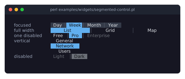
A Term::Fabulous::Widget::SegmentedControl shows a few options side by side as one bar and highlights the selected one: what a radio group does, in one row and without marks. The options are given like a dropdown's (a label, [ label, value ] or a hash, which may also disable the option). The arrow keys, Home, End and the digits choose, so does a click, and the selection changes at once. A vertical control stacks the segments, and a control whose layout makes it wider than its labels shares the space among the segments.
use Term::Fabulous::Widget::SegmentedControl;

my $period = Term::Fabulous::Widget::SegmentedControl->new(
	id      => 'period',
	options => [ [ Day => 'd' ], [ Week => 'w' ], [ Month => 'm' ] ],
	value   => 'w',
);
The picture shows a focused control, one stretched to the full width, one with a disabled segment, a vertical one and a disabled one (examples/widgets/segmented-control.pl):
In KDL:
SegmentedControl "period" {
	options "Day" "Week" "Month"
	value "Week"
}
Color pickers
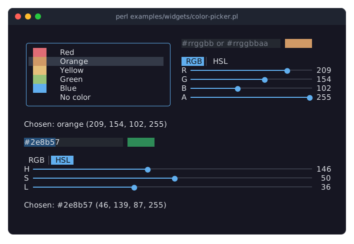
A Term::Fabulous::Widget::ColorPicker chooses a color in three ways: the user types it into a field (#rrggbb, rgb(...), hsl(...), a color name), moves sliders, or picks a named swatch from a list, when the program gives it one. A sample next to the field shows the color. The sliders show red, green and blue, or hue, saturation and lightness; a segmented control above them switches between the two. An alpha slider below them is left out with alpha => 0, which also makes the field refuse translucent colors.
use Term::Fabulous::Widget::ColorPicker;

my $accent = Term::Fabulous::Widget::ColorPicker->new(
	id       => 'accent',
	value    => '#61afef',
	alpha    => 0,
	swatches => [ [ '#61afef', 'Sky', '#61afef' ], [ '#98c379', 'Mint', '#98c379' ], [ none => 'No color' ] ],
);
The value is a string: what the user typed, when it is a color, the color of the sliders as #rrggbb (#rrggbbaa with an alpha below 255), or the value of the chosen swatch. A swatch is [ $value, $label, $color ], and its value need not be a color at all: a theme's token name, or none for no color. $picker->rgba gives the color as numbers, or undef for a value without one.
The picker fires Change when the user changes the value and Submit on Enter in the field or on a swatch, both with itself as the target. The events of its parts stop inside it, so a listener on a form sees only the picker's. It is no Term::Fabulous::Widget::Input, but it has validate, error and is_valid, those of its field, so it can be a field of a Term::Fabulous::Widget::Prompt: OK then keeps the prompt open while the field holds text that is no color, and puts the focus on the field (see "Ask for a color (ColorPicker in a Prompt)" in Term::Fabulous::Cookbook::Forms).
The picture shows a picker with swatches, the RGB sliders and the alpha slider, and one without swatches and alpha in HSL (examples/widgets/color-picker.pl):
In KDL, without swatches, which only Perl can give:
ColorPicker "background" {
	value "#282c34"
	alpha #false
	sliders "hsl"
}
EDITING TEXT
The text field and the text area are edited the same way. What follows is a summary; the reference is the keys and mouse sections of Term::Fabulous::Widget::TextInput.
Editing keys
Typing inserts at the cursor and replaces the selection.
LeftandRightmove by a character,Ctrl+LeftandCtrl+Rightby a word,HomeandEndto the start and end of the line,Ctrl+HomeandCtrl+Endto the start and end of the text. In a text area,Up,Down,PageUpandPageDownmove by rows.BackspaceandDeletedelete a character,Ctrl+WandCtrl+Deletea word,Ctrl+UandCtrl+Keverything to the start or the end of the line.In a text field,
EnterfiresSubmit; in a text area, it starts a new line.
Tab is never inserted; it moves the focus. The cursor moves by grapheme clusters (see "grapheme cluster" in Term::Fabulous::Manual::Glossary), so it never stops inside a character that is made of several code points, and wide characters such as CJK take two columns.
Selecting text
Hold Shift with any movement key to select (Shift+Right, Ctrl+Shift+Left, Shift+End, ...), or press Ctrl+A to select everything. With the mouse, drag over the text, or double-click a word. Selected text is painted on the input's selection_color, as in the picture of the text field above. Typing, Backspace or a paste replaces the selection.
The clipboard
Ctrl+Insert copies the selection, Ctrl+X or Shift+Delete cuts it, and Ctrl+V or Shift+Insert pastes. Ctrl+C is not copy: it ends the program, unless the UI was made with stop_on_ctrl_c => 0 (see "Keys Term::Fabulous handles itself" in Term::Fabulous::Manual::Events).
The clipboard is one string shared by all text inputs of the program, not the clipboard of your desktop. Your program reads and writes it with clipboard from Term::Fabulous::Editor:
use Term::Fabulous::Editor;

Term::Fabulous::Editor->clipboard('order-4711');    # Ctrl+V now pastes this
my $copied = Term::Fabulous::Editor->clipboard;      # what the user copied last
See the recipe Copy and paste through the clipboard and, for a key that loads the desktop clipboard, the example Load the system clipboard on a key press.
Undo and redo
Ctrl+Z undoes the last change and Ctrl+Y redoes it. Typing is undone one word (or one run of spaces) at a time; every other edit is one step. Up to 100 steps are kept. Setting the text with value clears the history.
Changing the text from the program
value replaces the whole text. For anything finer, use the Term::Fabulous::Editor of the input, which holds the text, the cursor, the selection and the undo history. After changing it, call mark_changed on the input so that a frame is drawn; the input then scrolls to the cursor and shows the change. Edits through the editor fire no Change.
# Append a line at the end of a text area and show it:
my $editor = $log->editor;
$editor->move_document_end;
$editor->insert( $editor->is_empty ? $line : "\n$line" );
$log->mark_changed;

# Select the whole text of a field:
$name->editor->select_all;
$name->mark_changed;
KEYS OF THE INPUT WIDGETS
The keys each input uses while it has the focus. Keys an input does not use bubble to its ancestors. Each class page lists the details in its KEYS section.
Widget        Keys
------------  --------------------------------------------------------------
TextField     typing, editing keys (see EDITING TEXT), Enter: Submit
TextArea      typing, editing keys, Up/Down/PageUp/PageDown (with Shift:
              select), Enter: new line
Checkbox      Space, Enter: toggle
RadioGroup    Up/Left, Down/Right: previous/next button (wraps around);
              Home, End: first/last button; Space, Enter: select the
              button the keyboard is on
Dropdown      closed: Enter, Space, Alt+Down, F4: open the list;
              Up, Down: previous/next option; Home, End: first/last
              option; letters: jump to a label
              open: Up, Down, PageUp, PageDown, Home, End: move the
              highlight; Enter, Space: choose; Escape: close;
              letters: jump to a label
Slider        Left/Down, Right/Up: one step; PageDown, PageUp: one
              page_step; Home, End: lowest, highest value
StarRating    Left/Down, Right/Up: one star (or half); Home, End: no
              stars, all stars; 0-9: that many stars
Segmented-    Left/Up, Right/Down: previous/next segment (wraps
Control       around); Home, End: first/last segment; 1-9: that segment
The class pages: "KEYS" in Term::Fabulous::Widget::TextInput, "KEYS" in Term::Fabulous::Widget::TextField, "KEYS" in Term::Fabulous::Widget::TextArea, "KEYS" in Term::Fabulous::Widget::Checkbox, "KEYS" in Term::Fabulous::Widget::RadioGroup, "KEYS" in Term::Fabulous::Widget::Dropdown, "KEYS" in Term::Fabulous::Widget::Slider, "KEYS" in Term::Fabulous::Widget::StarRating, "KEYS" in Term::Fabulous::Widget::SegmentedControl.
COMPLETE FORMS
A small form
A complete program with a name field and a checkbox; one listener on the form box reports every change, and Enter in the name field ends the program:
use v5.32;
use warnings;
use feature 'signatures';
no warnings 'experimental::signatures';

use Clay::XS qw(sizing_grow CLAY_TOP_TO_BOTTOM);
use Term::Fabulous;
use Term::Fabulous::Widget::Box;
use Term::Fabulous::Widget::Checkbox;
use Term::Fabulous::Widget::Text;
use Term::Fabulous::Widget::TextField;

my $form = Term::Fabulous::Widget::Box->new(
	layout => {
		layout_direction => CLAY_TOP_TO_BOTTOM,
		sizing           => { width => sizing_grow(), height => sizing_grow() },
		child_gap        => 1,
	},
);
my $name   = Term::Fabulous::Widget::TextField->new( id => 'name', placeholder => 'Your name' );
my $terms  = Term::Fabulous::Widget::Checkbox->new( id => 'terms', label => 'I accept the terms' );
my $status = Term::Fabulous::Widget::Text->new(
	text       => 'Type your name, then press Enter.',
	text_color => [ 220, 220, 220, 255 ],
);
$form->add_child( $name, $terms, $status );

my $ui = Term::Fabulous->new( root => $form, width => 80, height => 24 );

# One listener for every input of the form.
$form->on(
	Change => sub ($event) {
		$status->text( $event->target->id . ' is now ' . $event->value );
		return;
	}
);
$name->on(
	Submit => sub ($event) {
		$ui->loop->stop;
		return;
	}
);

# Start with the cursor in the name field.
$ui->interaction->set_focused_widget($name);
$ui->run;

say 'Name: ', $name->value, ', terms accepted: ', $terms->value;
Reading a whole form
Every input has a value reader, so a short function collects the values of all inputs with an id into a hash, for example to save them:
# { id => value } of every input at or below $node that has an id.
sub form_values ( $node, $values = {} ) {
	my $is_input = $node->isa('Term::Fabulous::Widget::Input') || $node->isa('Term::Fabulous::Widget::RadioGroup');
	$values->{ $node->id } = $node->value
		if $is_input && defined $node->id && !$node->isa('Term::Fabulous::Widget::RadioButton');
	if ( $node->can('children') ) {
		form_values( $_, $values ) foreach @{ $node->children };
	}
	return $values;
}

my $values = form_values($form);    # { name => 'Ada', terms => 1, ... }
Radio buttons are skipped: their group holds the state. The recipe Read all values of a form explains the function in detail; to fill a form from saved values, call value (or checked for a checkbox) on each input in the same way.
A form in a KDL layout file
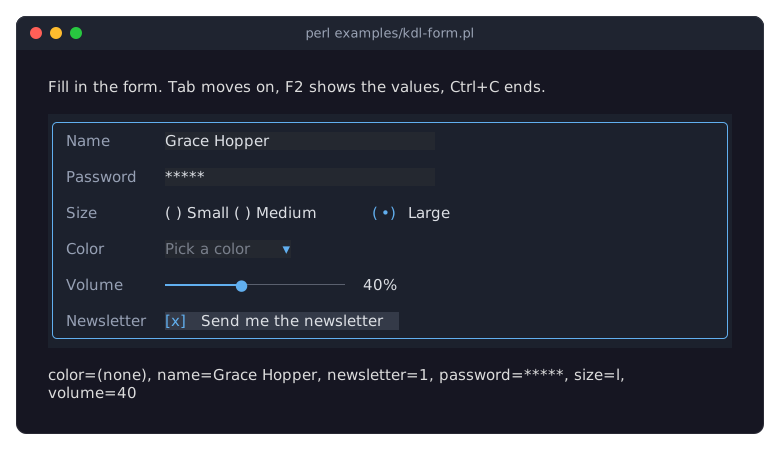
A form can be described in KDL (see "KDL LAYOUT FILES" in Term::Fabulous::Manual::KDL) and built with Term::Fabulous::Layout. The program then finds the inputs by their ids. examples/kdl-form.pl builds a form with every input widget except the text area, shows each change in a status line and the values of all inputs on F2:
The recipe Build a form from a KDL file shows and explains the program.
More form recipes
Term::Fabulous::Cookbook::Forms has complete programs for:
a login form in a centered dialog, which checks its input on
Enter;
To write an input widget of your own, see "SUBCLASS INTERFACE" in Term::Fabulous::Widget::Input and Term::Fabulous::Manual::CustomWidgets.
SEE ALSO
This page is part of Term::Fabulous::Manual. Previous page: Term::Fabulous::Manual::Events. Next page: Term::Fabulous::Manual::Feedback.
The class pages: Term::Fabulous::Widget::Input, Term::Fabulous::Widget::TextInput, Term::Fabulous::Widget::TextField, Term::Fabulous::Widget::TextArea, Term::Fabulous::Widget::Checkbox, Term::Fabulous::Widget::RadioGroup, Term::Fabulous::Widget::RadioButton, Term::Fabulous::Widget::Dropdown, Term::Fabulous::Widget::Slider, Term::Fabulous::Widget::StarRating, Term::Fabulous::Widget::SegmentedControl, Term::Fabulous::Widget::ColorPicker, Term::Fabulous::Editor, Term::Fabulous::Validator, Term::Fabulous::Event::Change, Term::Fabulous::Event::ValidityChange, Term::Fabulous::Event::Submit.
The recipes: Term::Fabulous::Cookbook::Forms.