NAME
Term::Fabulous::Manual::Charts - Canvases and charts
DESCRIPTION
This page is part of Term::Fabulous::Manual. Previous page: Term::Fabulous::Manual::Menus. Next page: Term::Fabulous::Manual::Tables.
This page covers the two ways to draw graphics in the terminal. A canvas ("CANVASES") is a widget you draw into yourself, cell by cell or pixel by pixel: for plots of your own, maps, games and animations. A chart ("CHARTS") is a canvas that draws itself from data: line, area, bar, scatter, histogram, sparkline, pie, donut, polar area and radar charts with titles, legends, axes and hover. The page explains the ideas and shows a short example for each; the class pages have every parameter, and the cookbook pages Term::Fabulous::Cookbook::Canvases, Term::Fabulous::Cookbook::Charts, Term::Fabulous::Cookbook::ChartTechniques and Term::Fabulous::Cookbook::ChartStyles have complete programs.
CANVASES
Canvas or PixelCanvas
A Term::Fabulous::Widget::Canvas is a box that holds a grid of cells you draw into: one character (more exactly, one grapheme cluster) with a foreground and a background color per cell. Use it for anything that is not text in boxes: a map, a game board, a plot of your own.
A Term::Fabulous::Widget::PixelCanvas is a canvas you draw on in pixels instead of characters. It shows two pixels per cell, one above the other, with the half block characters; as a terminal cell is about twice as high as it is wide, the pixels come out roughly square. It draws lines, rectangles and circles. Both canvases have every parameter of a Term::Fabulous::Widget::Box, so they can have a background, a border and padding.
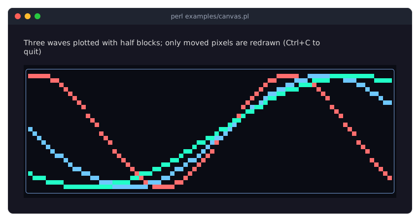
examples/canvas.pl animates three waves on a canvas:
The canvas size
The layout decides the canvas size, like for any box; give the canvas a sizing (sizing_grow to fill the room, sizing_fixed for a known size), otherwise it has no room at all. The cell buffer has as many columns and rows as the canvas's content box (inside border and padding). Before the first frame the buffer is empty (0 by 0 cells). Whenever the layout gives the canvas a new size (the first frame, a terminal resize, a layout change), the canvas fires CanvasResize (Term::Fabulous::Event::CanvasResize) just before that frame is drawn. Draw in that listener, then the drawing always fits:
use Clay::XS qw(sizing_grow);
use Term::Fabulous::Widget::Canvas;

my $canvas = Term::Fabulous::Widget::Canvas->new(
	background_color => [ 10, 10, 20, 255 ],
	layout           => { sizing => { width => sizing_grow(), height => sizing_grow() } },
);
$canvas->on(
	CanvasResize => sub ($event) {
		$canvas->clear;
		$canvas->put_text( 0, 0, 'Size: ' . $event->columns . 'x' . $event->rows, '#ffcc00' );
		$canvas->fill( 0, 1, $event->columns, 1, '-', 0x808080 );
		return;
	}
);
Drawing outside the buffer, including everything drawn before the first frame, is silently dropped. Cells that are still inside a new size keep their contents. $canvas->columns and $canvas->rows tell the current size; draw again from them whenever your data changes.
Drawing cells
put sets one cell, put_text writes a string from a cell to the right (without wrapping), fill fills a rectangle with one character, erase unsets one cell and clear unsets them all. An unset cell shows the canvas's background (or that of its nearest ancestor with one, or the screen color). The drawing methods return the canvas, so calls chain, and a change appears in the next frame, also when it is drawn from a timer.
$canvas->put( 5, 2, '@', 0xFFFF00 );                    # one cell, yellow
$canvas->put_text( 0, 0, 'Score: 100', '#ffffff', '#202040' );
$canvas->fill( 0, 3, 10, 2, '#', [ 0, 200, 0 ] );       # 10x2 block
$canvas->fill( 12, 3, 4, 2, ' ', undef, '#3987e5' );    # a solid colored rectangle
$canvas->clear->put_text( 0, 0, 'Game over' );
Coordinates count from 0 at the top-left cell of the buffer and may be fractional (they are rounded down), so a plotter can pass computed positions directly. Colors take every format listed for canvas cells in the color formats, the fastest being a packed 0xRRGGBB integer; undef means "no color of its own": the cell shows the canvas background, or the terminal's default text color.
Text drawn on a canvas is a character string, like the text of a Text widget. A wide character (most CJK characters and many emoji) covers two cells. $canvas->cell( $x, $y ) reads a cell back. The details are in the methods of Canvas.
Drawing pixels
A PixelCanvas is pixel_width pixels wide (its columns) and pixel_height pixels high (twice its rows). set_pixel and unset_pixel change one pixel, fill_rect and draw_rect draw a filled or an outlined rectangle, draw_line a line and draw_circle the outline of a circle; pixel reads one back. Shapes may extend past the edges; the pixels outside are dropped.
use Clay::XS qw(sizing_grow);
use Term::Fabulous::Widget::PixelCanvas;

my $image = Term::Fabulous::Widget::PixelCanvas->new(
	background_color => [ 0, 0, 0, 255 ],
	layout           => { sizing => { width => sizing_grow(), height => sizing_grow() } },
);
$image->on(
	CanvasResize => sub ($event) {
		my ( $width, $height ) = ( $image->pixel_width, $image->pixel_height );
		$image->clear;
		$image->draw_rect( 0, 0, $width, $height, 0x808080 );
		$image->draw_line( 0, $height - 1, $width - 1, 0, 0x00FF00 );
		$image->draw_circle( $width / 2, $height / 2, $height / 3, '#ff8800' );
		$image->fill_rect( 2, 2, 6, 4, [ 40, 80, 200 ] );
		return;
	}
);
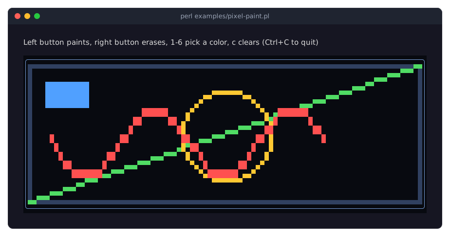
The cell methods still work on a pixel canvas, for example to write a label over an image. examples/pixel-paint.pl draws such shapes and lets you paint with the mouse:
The mouse on a canvas
A canvas does nothing with the mouse by itself. Listen for Mouse events (buttons and the wheel) or MouseMove events (the pointer moving with no button held), and translate the event's terminal position with cell_at into a cell of the buffer, or with pixel_at into a pixel of a pixel canvas. Both return the empty list when the pointer is outside the buffer, for example on the border:
use Clay::UI::Enum::Result;
use Term::Fabulous::Termbox qw(TB_KEY_MOUSE_LEFT);

$canvas->on(
	Mouse => sub ($event) {
		return Clay::UI::Enum::Result->CONTINUE unless $event->key == TB_KEY_MOUSE_LEFT;
		my ( $x, $y ) = $canvas->cell_at($event) or return Clay::UI::Enum::Result->CONTINUE;
		$canvas->put( $x, $y, '*', 0xFFFF00 );
		return;
	}
);
A cell holds two pixels, but the terminal reports the mouse per cell: pixel_at returns the upper pixel of the cell, and the one below it ($y + 1) is under the pointer as well. Mouse events in general are described in the mouse section of the events page.
Efficient updates
A canvas remembers which cells changed since it was last drawn: cells that hold something else now, not cells that were only written again with what they held. As long as it stays in the same place and nothing is drawn over it, each frame sends only its changed cells to the terminal. So you may simply clear the canvas and draw everything again for every frame of an animation: only the difference reaches the terminal. A canvas is drawn in full in its first frame, after it moved or changed size, while it is scrolled, and while other widgets overlap it (Term::Fabulous::Render::Canvas).
Canvas recipes
"Paint with the mouse (Canvas, clicks and drags)" in Term::Fabulous::Cookbook::Canvases
"Plot data on a pixel canvas (PixelCanvas)" in Term::Fabulous::Cookbook::Canvases
CHARTS
The chart widgets are canvases that draw themselves: give them data, and they lay out a title, a legend, axes and the plot in whatever room the layout gives them, and draw again whenever the data, an option or their size changes.
use Term::Fabulous::Widget::LineChart;

my $chart = Term::Fabulous::Widget::LineChart->new(
	title  => 'Requests per second',
	labels => [qw(Mon Tue Wed Thu Fri Sat)],
	curve  => 'monotone',
	y_axis => { title => 'req/s', min => 0 },
	series => [
		{ name => 'api', data => [ 120, 135, 160, 158, 171 ] },
		{ name => 'web', data => [ 80, 82, 95, 110, 104 ], line_style => 'dashed' },
	],
);
$chart->append( undef, { api => 180, web => 99 } );    # the next point of both series: Sat
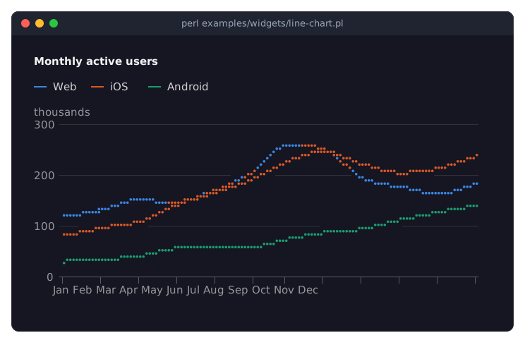
examples/widgets/line-chart.pl draws such a chart:
Which chart for which data
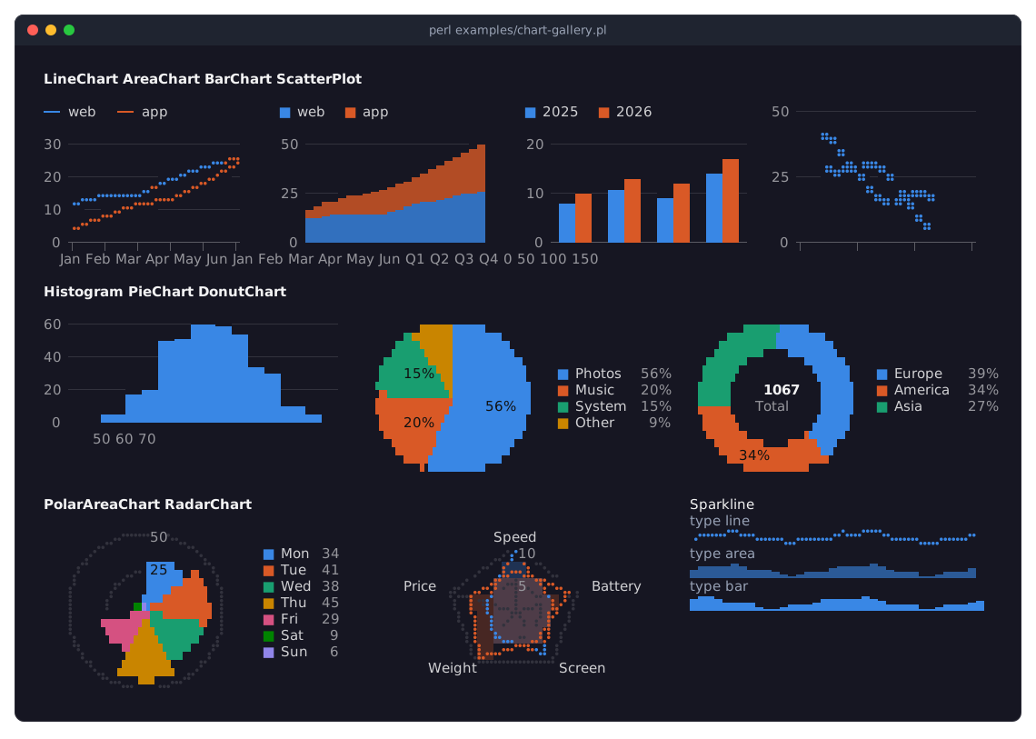
examples/chart-gallery.pl shows every chart widget with a little data of the kind it suits:
- Term::Fabulous::Widget::LineChart
-
Values that change along a continuous x: over time, over a measured quantity. Several series compare well as lines.
- Term::Fabulous::Widget::AreaChart
-
Like a line chart, with the area under each line filled; stacked areas show how parts add up to a total over time, and
stacked => 'percent'how their shares change. - Term::Fabulous::Widget::BarChart
-
Values per category (months, products, regions): grouped bars to compare series per category, stacked bars for parts of a total, horizontal bars for long category labels.
- Term::Fabulous::Widget::ScatterPlot
-
Pairs of numbers, one point per observation, to see whether two quantities go together; with a trend line if you like.
- Term::Fabulous::Widget::Histogram
-
How a set of numbers is distributed: the chart counts the values into bins of equal width and draws a bar per bin.
- Term::Fabulous::Widget::Sparkline
-
A trend the size of a word, one row high and without axes, next to a number in a dashboard, a list or a table cell.
- Term::Fabulous::Widget::PieChart and Term::Fabulous::Widget::DonutChart
-
Parts of one whole, up to about six of them. A donut has room in the middle for the total or a text.
- Term::Fabulous::Widget::PolarAreaChart
-
Values of one kind over categories that form a cycle (weekdays, months, directions): every slice has the same angle and reaches as far out as its value.
- Term::Fabulous::Widget::RadarChart
-
Profiles: several values per series on axes around a center, to compare the shape of a handful of series over three to about eight axes that share a scale.
Line, area, bar and scatter charts are one widget, Term::Fabulous::Widget::XYChart, with a different default series type; a chart may mix the types, for example bars with a line for the target. The histogram and the sparkline are XY charts too. Pie, donut and polar area charts are one widget with different defaults (Term::Fabulous::Widget::PieChart). What all charts share (title, legend, palettes, themes, hover) is on Term::Fabulous::Widget::Chart.
Series and data
A series is a named list of data points drawn in one color: a line, an area, a group of bars or a set of points. An XY chart takes its series as an array of hashes; each point is a plain y value (the x is the point's position or the label there), an [ x, y ] pair, or a hash with x and y. x values may be numbers, labels or dates, and the chart reads from them what kind of x axis it has: category, linear, logarithmic or time ("AXES" in Term::Fabulous::Widget::XYChart). undef is a gap.
my $chart = Term::Fabulous::Widget::BarChart->new(
	labels => [qw(Q1 Q2 Q3 Q4)],
	series => [
		{ name => 'Sold',     data => [ 90, 140, 165, 190 ] },
		{ name => 'Returned', data => [ 14, 11, 17, 12 ], color => '#e66767' },
	],
);
The data is kept as given, and may be replaced, extended or appended to at any time with the methods of Term::Fabulous::Role::HasSeries (set_data, add_points, append, remove_series, hide_series, ...). Every change shows in the next frame, and only the cells that changed go to the terminal, so a chart can take many updates per second; max_points keeps only the newest points of a live series. A series' transform prepares its data before it is drawn: smoothing, running totals, rates, indexing, resampling (Term::Fabulous::Chart::Transform). The keys of a series are listed in the series keys of XYChart.
$chart->set_data( Sold => [ 95, 140, 170, 201 ] );
$chart->hide_series('Returned');
The other charts take their data in their own form. A pie, donut or polar area chart has slices, each with a unique label and a value; the slices are its series:
my $pie = Term::Fabulous::Widget::PieChart->new(
	data => [ [ Rent => 1200 ], [ Food => 450 ], [ Car => 300 ] ],
);
$pie->set_value( Food => 480 );    # change a slice, or add it when it is new
$pie->remove_slice('Car');
A radar chart has series like an XY chart, with one value per axis (labels); a histogram has series of plain numbers, the observations it counts; a sparkline has just values. Their pages describe the forms: "Data" in Term::Fabulous::Widget::PieChart, "Data" in Term::Fabulous::Widget::RadarChart, Term::Fabulous::Widget::Histogram, Term::Fabulous::Widget::Sparkline.
How a chart lays itself out
A chart without a sizing in its layout grows to the room its parent leaves, in both directions (a sparkline is one row high and grows in width). Inside that room it places, from the top: the title (in the first row), the legend (at the top or at the bottom, or in a column beside the plot), and the plot. An XY chart puts the y axis labels at the left and the x axis labels below the plot, with the axis titles when given. The value axis picks round ticks that land exactly on rows, so a grid line always lies beside its label; rows the ticks leave over become a margin below the axis.
A chart adapts to small sizes rather than failing: a legend that does not fit shows +N more, a chart under three rows has no title, tick labels are thinned out until they do not touch, and a chart without room for a plot draws only what fits. Give a chart a fixed size where the layout has no room to share, for example in a report:
use Clay::XS qw(sizing_grow sizing_fixed);

my $chart = Term::Fabulous::Widget::BarChart->new(
	layout => { sizing => { width => sizing_grow(), height => sizing_fixed(12) } },
	...
);
Titles and legends
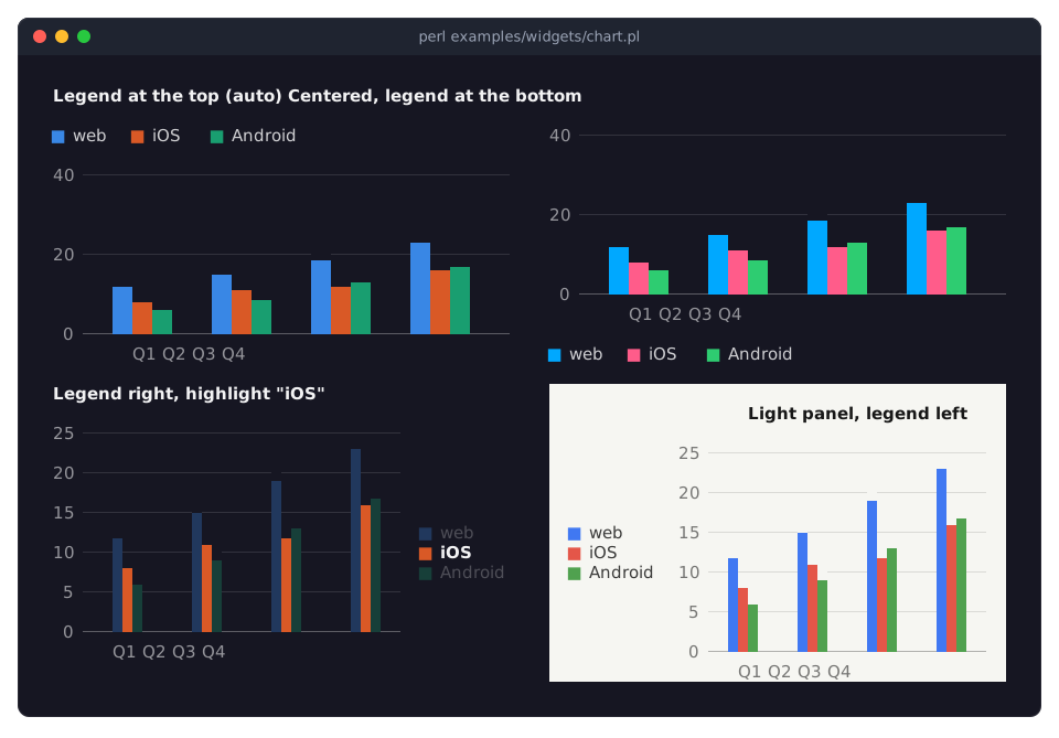
The title is drawn in bold in the first row; title_align puts it at the left (the default), in the center or at the right. The legend lists the series (or the slices) with their colors. By default (legend => 'auto') a chart shows it only when there are at least two entries, at the top for charts with axes and radar charts, and at the right for pie, donut and polar area charts; top, bottom, left, right and none choose for yourself.
my $chart = Term::Fabulous::Widget::BarChart->new(
	title       => 'Active users per quarter',
	title_align => 'center',
	legend      => 'bottom',
	...
);
examples/widgets/chart.pl shows the positions:
A pie chart's legend also shows each slice's share or value (legend_values). The details are in the title and legend section of Chart.
Colors, palettes and themes
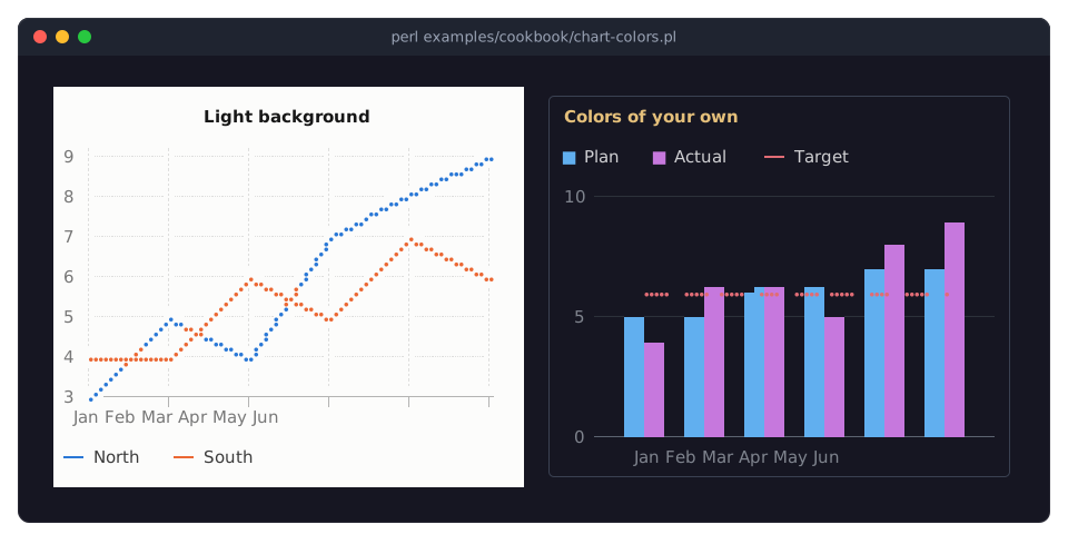
Every series (or slice) gets the next color of the chart's palette when it is added, and keeps it while other series come and go; a color of its own wins. There are four named palettes: default, whose colors stay apart for readers with color vision deficiencies, classic, pastel and vivid; or give an array of colors of your own (Term::Fabulous::Chart::Palette).
my $chart = Term::Fabulous::Widget::LineChart->new(
	palette => 'vivid',                       # or [ '#3987e5', '#d95926', ... ]
	series  => [ { name => 'web', data => \@web }, { name => 'api', data => \@api, color => '#ff6347' } ],
);
A chart has no background of its own by default: it draws on the background of its nearest ancestor with an opaque one, or on the screen color of the theme (see "background_below" in Term::Fabulous::Widget). Its title, legend text, tick labels, axis and grid lines are mixed from that background and a light or dark ink, so a chart suits any panel and any theme. The theme chooses the ink and the palette steps; auto (the default) picks the light theme on a light background by itself, as the chart on the light panel in the picture above does. title_color, text_color, label_color, axis_color and grid_color set those colors yourself. See "Colors and themes" in Term::Fabulous::Widget::Chart and the recipe "Light backgrounds, palettes and colors of your own" in Term::Fabulous::Cookbook::ChartStyles:
How a chart is drawn
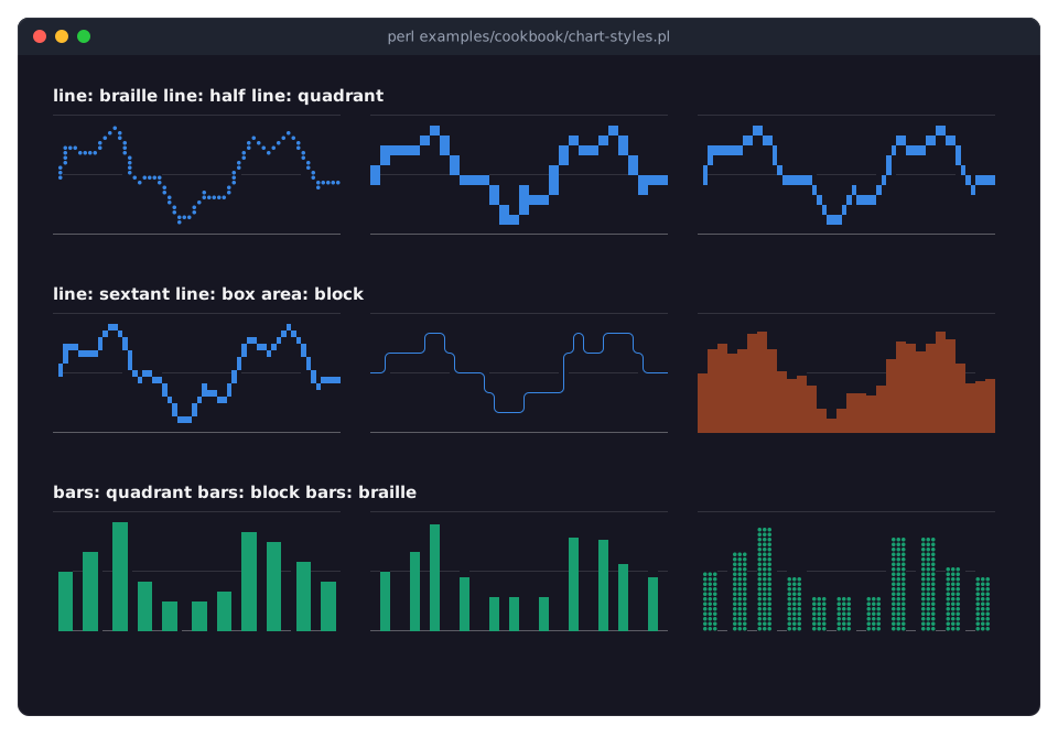
A chart draws into subpixels, several per cell, and turns each cell into one character with two colors: Braille dots for lines and points (2 x 4 per cell), eighth blocks for bars and areas, quadrant blocks for pie slices. The marker of a series (or of a pie chart) chooses other characters: half blocks, quadrants, sextants, box-drawing lines ("Rendering styles" in Term::Fabulous::Widget::XYChart). Translucent fills are mixed with the background below them, so overlapping areas and histograms stay visible. examples/cookbook/chart-styles.pl compares the markers:
Hover and SeriesHover
Charts have no tooltips. While the mouse pointer is on a series (its line, area, bars, points or legend entry) or on a slice, the chart emphasizes it and fades the others (hover_fade), and fires a SeriesHover event (Term::Fabulous::Event::SeriesHover) with the series, the nearest data point's index, its label and its value. A program shows the details its own way, for example in a status line:
use Term::Fabulous::Widget::Text;

my $status = Term::Fabulous::Widget::Text->new( text => '' );
$chart->on(
	SeriesHover => sub ($event) {
		my $text = !defined $event->series ? ''
			: defined $event->index        ? sprintf( '%s, %s: %s', $event->series, $event->label, $event->value )
			:                                $event->series;    # a legend entry
		$status->text($text);
		return;
	}
);
When the pointer leaves the series, the chart fires one more event, without a series; so it does when the program removes or hides the series (or slice) under the pointer. $chart->highlight($name) emphasizes a series from the program, for example the one selected in a list; hover => 0 turns the hover effects and events off. examples/cookbook/chart-hover.pl shows the hovered point below the chart:
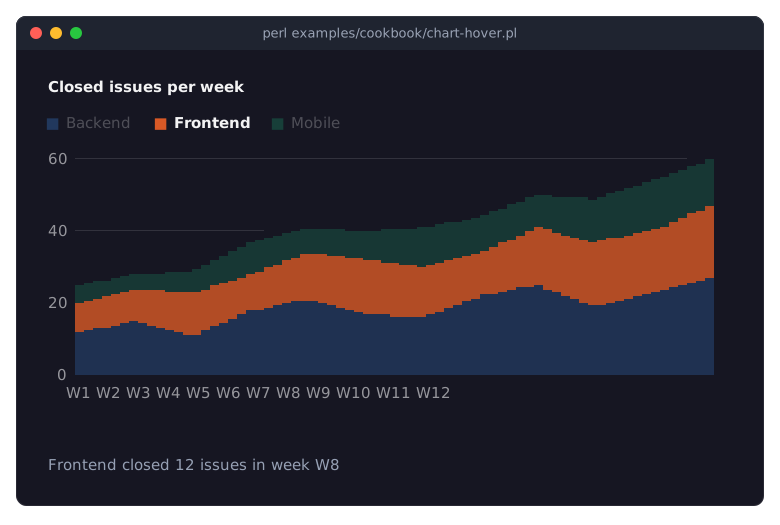
The recipe Show details of the point under the pointer explains the program.
Charts in KDL layouts
Every chart has KDL properties: its parameters, and its data as nodes (series nodes with data for XY and radar charts, slice nodes for pie charts, values for a sparkline). A layout can hold a complete chart, or only its frame, with the data added from Perl after the layout is built ("KDL LAYOUT FILES" in Term::Fabulous::Manual::KDL):
use Term::Fabulous::Layout;

my $layout = Term::Fabulous::Layout->new( string => <<'KDL' );
use Term::Fabulous::Widget::Box as Box
use Term::Fabulous::Widget::BarChart as BarChart
use Term::Fabulous::Widget::DonutChart as DonutChart

Box "root" {
	layout gap=4
	sizing width=grow height=grow
	BarChart "sales" {
		title "Sales"
		labels "Q1" "Q2" "Q3" "Q4"
		series "Sold" { data 90 140 165 190; }
	}
	DonutChart "channels" {
		title "Sold by channel"
		slice "Shop" 312
		slice "Partners" 158
	}
}
KDL
my $root = $layout->build;
$root->find_by_id('channels')->set_value( Web => 431 );    # data from the program
The KDL forms of every property are on the class pages, in the section KDL PROPERTIES ("KDL PROPERTIES" in Term::Fabulous::Widget::Chart for the common ones), and the recipe Describe charts in a KDL layout builds a complete screen from a layout.
Charts in reports
Charts render through Term::Fabulous::Static like every widget, so a program can print a bar chart or a sparkline as text (rendering without a terminal). On a terminal the output has colors. In a file or a pipe it has none, and a chart still reads well: cells that a bar or an area fills completely print as full blocks (█), the ends of the bars as partial blocks, and the labels as text. A report has no screen to fill, so give a chart a fixed height:
use Clay::XS qw(sizing_grow sizing_fixed);
use Term::Fabulous::Static;
use Term::Fabulous::Widget::BarChart;

my $chart = Term::Fabulous::Widget::BarChart->new(
	title        => 'Disk usage (%)',
	horizontal   => 1,
	value_labels => 1,
	labels       => [ '/', '/home', '/var' ],
	y_axis       => { min => 0, max => 100 },
	series       => [ { name => 'used', data => [ 71, 88, 46 ] } ],
	layout       => { sizing => { width => sizing_grow(), height => sizing_fixed(7) } },
);
Term::Fabulous::Static->new( root => $chart, width => 60 )->print;
examples/cookbook/chart-report.pl (the recipe Print charts in a report) prints a bar chart and a sparkline:
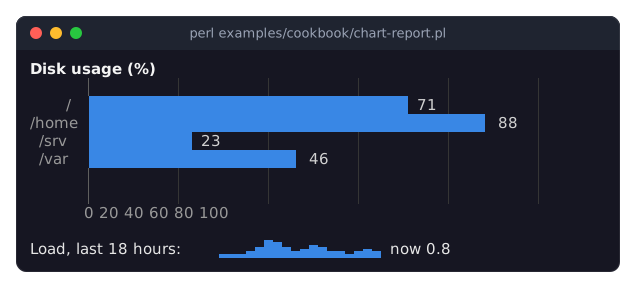
Chart recipes
Term::Fabulous::Cookbook::Charts has a complete program for every chart type. Term::Fabulous::Cookbook::ChartTechniques has programs for the techniques they share: time axes, live data, logarithmic axes, transforms, KDL layouts and reports; Term::Fabulous::Cookbook::ChartStyles for curves, markers, colors, line styles and hover.
SEE ALSO
This page is part of Term::Fabulous::Manual. Previous page: Term::Fabulous::Manual::Menus. Next page: Term::Fabulous::Manual::Tables.
The class pages: Term::Fabulous::Widget::Canvas, Term::Fabulous::Widget::PixelCanvas, Term::Fabulous::Widget::Chart, Term::Fabulous::Widget::XYChart, Term::Fabulous::Widget::LineChart, Term::Fabulous::Widget::AreaChart, Term::Fabulous::Widget::BarChart, Term::Fabulous::Widget::ScatterPlot, Term::Fabulous::Widget::Histogram, Term::Fabulous::Widget::Sparkline, Term::Fabulous::Widget::PieChart, Term::Fabulous::Widget::DonutChart, Term::Fabulous::Widget::PolarAreaChart, Term::Fabulous::Widget::RadarChart, Term::Fabulous::Event::SeriesHover, Term::Fabulous::Event::CanvasResize, Term::Fabulous::Chart::Palette.
The recipes: Term::Fabulous::Cookbook::Canvases, Term::Fabulous::Cookbook::Charts, Term::Fabulous::Cookbook::ChartTechniques, Term::Fabulous::Cookbook::ChartStyles.