NAME
Term::Fabulous::Widget::XYChart - The common base of charts with an x and a y axis
SYNOPSIS
# XYChart is abstract; you use its subclasses, which differ only in
# the type their series have by default:
use Term::Fabulous::Widget::LineChart;      # line
use Term::Fabulous::Widget::AreaChart;      # area
use Term::Fabulous::Widget::BarChart;       # bar
use Term::Fabulous::Widget::ScatterPlot;    # scatter

my $chart = Term::Fabulous::Widget::LineChart->new(
	title  => 'Requests per second',
	labels => [qw(Mon Tue Wed Thu Fri)],           # a category axis
	curve  => 'monotone',                          # for all series
	y_axis => { title => 'req/s', min => 0 },
	series => [
		{ name => 'api', data => [ 120, 135, 160, 158, 171 ] },
		{ name => 'web', data => [ 80, 82, 95, 110, 104 ], line_style => 'dashed' },
		{ name => 'jobs', type => 'bar', data => [ 20, 25, 18, 30, 27 ] },
	],
);

# Points with x values: numbers, dates or labels
my $temperatures = Term::Fabulous::Widget::LineChart->new(
	x_axis => { format => '%H:%M' },
	series => [ { name => 'outside', data => [ [ '2026-06-01 06:00', 12.5 ], [ '2026-06-01 12:00', 21.0 ] ] } ],
);

# More data: one point for each series, here in a new category
$chart->append( 'Sat', { api => 180, web => 99, jobs => 22 } );
$chart->max_points(300);    # every series keeps its newest 300 points

# Changes show in the next frame
$chart->set_series( web => ( type => 'area', fill_opacity => 0.4 ) );
$chart->stacked('percent');
$chart->on( SeriesHover => sub ($event) { ... } );
DESCRIPTION
An XYChart draws one or more series of data points against an x axis and a y axis. The four subclasses are the same widget with a different default series type: lines through the points, filled areas under them, bars, or single points. Any chart can mix the types: a bar chart may carry a line series for a target, a line chart an area for a range. Term::Fabulous::Widget::Histogram and Term::Fabulous::Widget::Sparkline are XYCharts too, with their own pages.
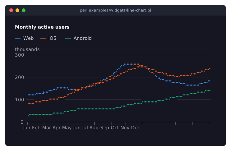
The program is examples/widgets/line-chart.pl.
The chart lays itself out in the room it has: the title and legend from Term::Fabulous::Widget::Chart, the y axis labels at the left, the x axis labels below, axis titles when given, and the plot in between. The y axis chooses round ticks that land exactly on rows, so every grid line lies beside its label; the x axis chooses ticks whose labels do not touch. Lines are drawn in Braille dots (a quarter cell wide, an eighth cell high), areas and bars in block characters to an eighth of a cell; "Rendering styles" has the alternatives.
This page covers everything the XY charts share: "SERIES" (what a series is and the forms its data takes), "AXES" (kinds of x values, the axis options, logarithmic and time axes), "STACKING", "LOOKS" (curves, rendering styles, points, line styles, value labels, horizontal bars), "DATA" (transforms, cutting series to a range, live data), "HOVER", and then the reference: "CONSTRUCTOR", "METHODS", "EVENTS", "KDL PROPERTIES" and the "SUBCLASS INTERFACE". Title, legend, colors, themes and the hover mechanics are on Term::Fabulous::Widget::Chart. For an introduction to all chart widgets, read the charts chapter of the manual; complete programs are in Term::Fabulous::Cookbook::Charts, Term::Fabulous::Cookbook::ChartTechniques and Term::Fabulous::Cookbook::ChartStyles.
SERIES
A series is a named list of data points drawn in one color: a line, an area, a group of bars or a set of points. Give the series to the constructor as series, an array of hashes, or add them later with add_series; every method of Term::Fabulous::Role::HasSeries is available (set_series, set_data, add_points, append, remove_series, hide_series, ...).
Series keys
{
	name  => 'api',             # unique; default "Series 1", "Series 2", ...
	type  => 'line',            # line, area, bar or scatter; default: the chart's type
	data  => [ 3, 5, 4 ],       # see Data forms
	color => '#3987e5',         # default: the next palette color
	%options,                   # the drawing options below
}
color takes every form of Term::Fabulous::Color ('#3987e5', 'rgb(57, 135, 229)', [ 57, 135, 229, 255 ], ...) and a packed 0x3987e5 integer; an alpha below 255 makes the series' areas and bars more translucent. How series get their colors is described in "Colors and themes" in Term::Fabulous::Widget::Chart. A key the series does not know dies, with the list of known keys in the message.
Besides name, type, data and color, a series takes these options. Every one of them has a default. The options from marker to value_labels can also be set on the chart for all of its series (as constructor parameters or accessors of the same name): a series uses its own value when it has one, else the chart's, else the default.
marker-
The rendering style: see "Rendering styles". Default:
braillefor lines and points,blockfor areas and bars. curve,tension-
How the line runs from point to point:
linear(the default),step,monotone,natural, an easing name, ...; see "Curves".tension(0 to 1, default 0) tightens thecatmull-romcurve. line-
For an area: true draws a line along its top. Default: false (block fills show the edge to an eighth of a cell on their own).
line_style-
solid(the default),dashedordotted; see "Line styles". points,point-
pointstrue marks every data point of a line or area series (default: false).pointis the mark:dot,squareor a single character one column wide; default: a bullet on lines and areas,squareon scatter series. See "Points". fill_opacity-
0 to 1: how much of the area or bar color covers the background. Default: 0.6 for areas, 0.8 for stacked areas, 1 for bars.
transform-
Steps that prepare the data before it is drawn; see "Preparing data". Default: none.
max_points-
A positive integer: the series keeps only its newest points; see "Live data". Default: no limit.
span_gaps-
True draws the line across missing values instead of leaving a gap. Default: false.
value_labels-
For bars: true writes the value of each bar above (or right of) it. Default: false. See "Value labels".
stack-
A group name: series of the same type with the same group name stack on each other, whatever
stackedsays. See "STACKING". from,to-
x values in the form of the axis (a number, a date, a category label): the series is drawn only from
fromtoto, either may be left out. See "From, to and span". trend-
True adds a dashed least-squares line through the points, in the series' color, from the smallest x to the largest. Default: false.
visible-
False hides the series (also from the legend and the axes); its data is kept.
show_seriesandhide_serieschange it. Default: true.
An option a series does not use (curve on bars) is accepted and ignored, with the exception of marker: a marker the type cannot draw with dies (block on a line).
Data forms
data => [ 3, 5, undef, 4 ]                                     # y values; x is the index (or the label)
data => [ [ 1, 3 ], [ 2, 5 ], [ 4, 4 ] ]                       # [ x, y ] points
data => [ [ '2026-06-01', 3 ], [ '2026-06-02', 5 ] ]           # dates as x
data => [ [ 'Mon', 3 ], [ 'Tue', 5 ] ]                         # labels as x
data => [ { x => 1, y => 3 }, { x => 2, y => 5 } ]             # hashes
Each point is a y value (its x is the point's position, 0, 1, 2, ..., or the label at that position), an [ x, y ] pair, or a hash with x and y. A y value is a finite number or undef, a gap: lines and areas stop before a gap and start again after it (unless span_gaps), bars and points leave it out. What the x values may be, and what they make of the x axis, is explained in "What the x values are".
The chart keeps the data as you gave it, and $chart->series($name) returns it: y values as numbers, [ x, y ] pairs as pairs (hashes come back as pairs too), x values unchanged. Transforms, sorting and stacking happen each time a frame is drawn.
Several series
Series are drawn in the order they were added, layer by layer: areas, then bars, then lines, then points; so a line stays visible over an area of the same chart. The legend lists them in order. Each gets the next color of the palette; a series keeps its color when others before it are removed. While the pointer is on a series, that series is drawn last in its layer, unless it is part of a stack (see "HOVER").
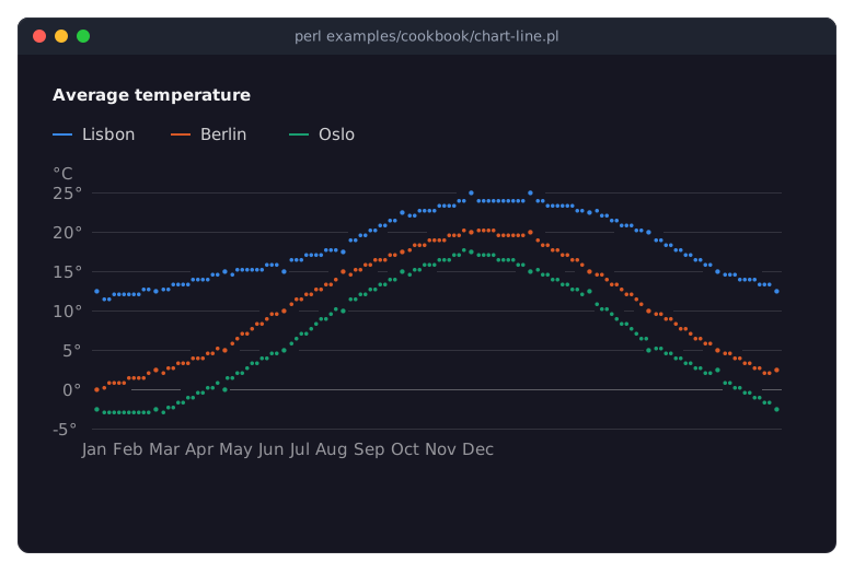
The program is in "Draw a line chart with labels and points (LineChart)" in Term::Fabulous::Cookbook::Charts.
AXES
What the x values are
The x axis is a category, a linear, a logarithmic or a time axis. By default (x_axis => { type => 'auto' }) the chart reads it from the data:
With
labels, or when the points have no x values and a series draws bars, the axis is a category axis: one slot per label (or per position), in order. Points with x values on a category axis name their category; new labels are appended in the order they appear.When every x value is a number, the axis is linear: points are placed by value, lines run from the smallest x to the largest (the points are sorted), and bars are centered on their x and as wide as the smallest distance between two bars.
When every x value is a date, the axis is a time axis. A date is a string like
2026-06,2026-06-01,2026-06-01 14:30or2026-06-01T14:30:15(local time; with a trailingZafter the time, as in2026-06-01 14:30Z, UTC; the exact forms are listed in "date_interval" in Term::Fabulous::Widget::Table::Value), or any object with anepochmethod (DateTime, Time::Piece, Time::Moment). Epoch seconds are numbers, so they make a linear axis unless the axis type istime. See "Time axes".Points without x values and no bars make a linear axis of the point positions 0, 1, 2, ... (lines and areas with many points, such as samples).
Set type in x_axis to decide yourself: category, linear, log or time. A value the axis cannot show then dies when the frame is drawn (a label on a linear axis), with the series and the value in the message. On a category axis every x value is a label: numbers too, and a date object becomes its YYYY-MM-DD date in local time.
Axis keys
x_axis and y_axis are hashes; every key is optional. The y axis shows the values; with horizontal bars the two change places on the screen, but the keys keep their meaning: y_axis still describes the values. Some keys apply only to some kinds of axis, as noted; on other axes they are accepted and have no effect. An unknown key or an invalid value dies when the hash is given, with the known keys in the message.
type-
x:
auto(the default),category,linear,logortime. y:linear(the default) orlog. min,max-
Fixed ends: numbers on a linear or logarithmic axis (greater than 0 on a logarithmic one), dates or epoch seconds on a time axis, and either on an
autox axis (a date counts as its epoch seconds there, whatever kind the data makes the axis);minmust be less thanmax. An end that breaks these rules dies when the axis is given, so a chart never fails while it is drawn. Without them the axis covers the data, rounded out to the next ticks (seenice); a linear y axis of bars or areas includes 0 (seezero). A category axis has no ends to set. title-
A string: the title of the y axis is written above its values, that of the x axis centered below its labels. With horizontal bars the titles stay with their axes: the y axis title is centered below the values at the bottom, the x axis title stands above the categories at the left.
format-
How tick labels (and the value labels of bars) are written. On a linear or logarithmic axis:
auto(the default),si,integer,percent, asprintfformat with a%, or a code reference. On a time axis: a "strftime" in POSIX format or a code reference. With the x axis typeauto, a format with a%serves as either, whichever kind the axis turns out to be. Category labels are shown as they are. See Term::Fabulous::Chart::Format. ticks-
Linear axes: the number of ticks wanted; the chart takes the nearest number whose ticks are round and fit.
step-
Linear axes: a fixed distance between ticks.
grid-
Grid lines at the ticks:
0or1(solid), orsolid,dashedordotted. Default: solid lines for the value axis, none for the x axis. A category axis with bars has no grid lines (the bars stand between them). Where solid lines of both axes cross, they join. visible-
False hides the tick labels (the plot takes their room; the axis title stays). Default: true.
zero-
Linear y axes: whether the axis includes 0. Default: true when a bar or area series is drawn or series are stacked, else false, so a line of values from 1200 to 1300 fills the plot.
nice-
Linear axes: false keeps the ends of the axis at the data instead of rounding them out to ticks. Default: true (except for histograms, whose bins set the ends).
utc-
Time axes: true labels the ticks in UTC instead of local time, and puts them on UTC boundaries. Default: false.
span-
Linear and time x axes: how much of x is shown, counted back from the newest point (
3600for the last hour of epoch seconds); older points are neither drawn nor counted for the y axis. See "From, to and span". base-
Logarithmic axes: the base, a number greater than 1. Default: 10.
y_axis => { title => 'ms', min => 0, max => 500, ticks => 6, format => 'integer' },
x_axis => { type => 'time', format => '%H:%M', utc => 1, grid => 'dotted' },
Grid lines in all three styles are shown in "Line styles, gaps, bar widths, stack groups and grid lines" in Term::Fabulous::Cookbook::ChartStyles.
Logarithmic axes
y_axis => { type => 'log' },
x_axis => { type => 'log', base => 2 },
type => 'log' on either axis puts every power of base the same distance from the next, for data that spans orders of magnitude or grows by a constant factor. The ticks are the powers (1, 10, 100, 1k, ...); where they would crowd, only every second (third, ...) power is labeled. Values of zero or below have no place on it: lines get a gap there, bars and points are left out. Bars and areas grow from the low end of the axis.
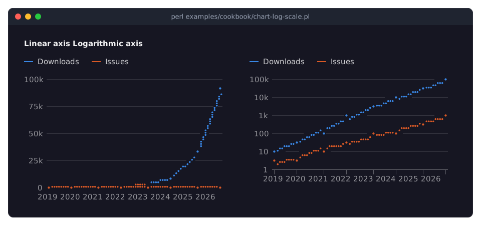
The program is in "Show values of very different sizes (logarithmic axis)" in Term::Fabulous::Cookbook::ChartTechniques.
Time axes
A time axis places points by their moment and labels ticks on calendar boundaries: every few seconds, minutes or hours, days, weeks (Mondays), months or years, whichever the room allows. Without a format the labels fit the interval (06:00, with the date at midnight; Jun 3; Feb, with the year in January; 2026). Ticks are placed and labeled in local time, in UTC with utc => 1. The x values of the points can be date strings, epoch numbers (with type => 'time') or date objects; mixed forms are fine. A time axis needs x values: a series of plain y values dies when the frame is drawn. See Term::Fabulous::Chart::Scale::Time for the tick intervals.
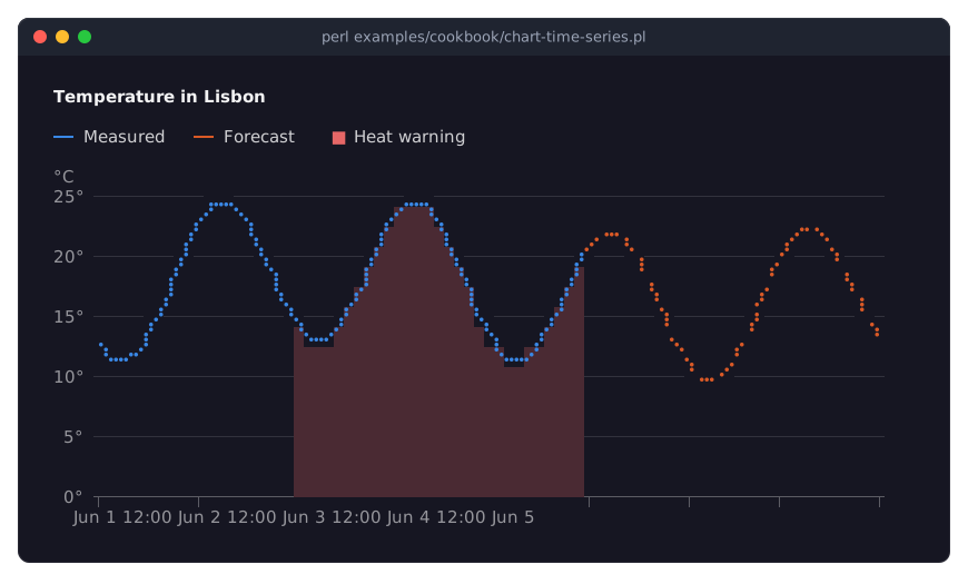
The program is in "Plot values over time (time axis, from and to, a dashed forecast)" in Term::Fabulous::Cookbook::ChartTechniques.
STACKING
stacked => 1,                        # bars on bars, areas on areas
stacked => 'percent',                # every stack is 100%
series  => [ { name => 'a', stack => 'left' }, { name => 'b', stack => 'left' }, { name => 'c', stack => 'right' } ],
With stacked => 1 every bar series stands on the bar series before it and every area series lies on the area series before it, at each x; the y axis covers the totals. Positive and negative values stack in their own directions from the baseline. stacked => 'percent' divides each value by the total of its stack (the sum of the absolute values at that x), so every stack reaches 100%, and the value axis shows percentages. stacked does not stack lines and points.
The stack option of a series puts it in a named group: series of the same type and group stack on each other, whatever stacked says, and bars of different groups stand side by side in their slot. This also stacks line or scatter series that share a group name. With stacked, the bars and areas without a group name form one group of their own. Stacked areas are drawn more opaque (0.8) than single ones.
Hover and the SeriesHover event report a point's own value, not the stacked total; value labels on bars show the total of each stack.
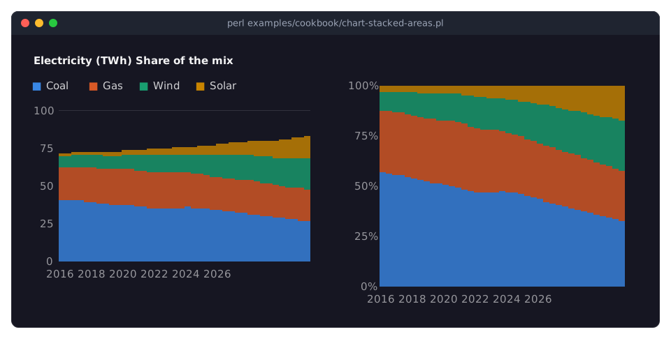
The program is in "Stacked areas and shares of 100% (AreaChart)" in Term::Fabulous::Cookbook::Charts; stacked bars are in "Grouped, stacked and horizontal bars (BarChart)" in Term::Fabulous::Cookbook::Charts, and two named stack groups side by side in "Line styles, gaps, bar widths, stack groups and grid lines" in Term::Fabulous::Cookbook::ChartStyles.
LOOKS
Curves
curve => 'monotone',                       # for all series
series => [ { name => 'a', data => \@a, curve => 'step' } ],
The curve of a line or area series says how the line runs between two points. All curves pass through every point:
linear(the default)-
Straight segments.
step,step-after,step-before,step-middle-
Horizontal and vertical segments, for counters and states. With
step-after(stepfor short) each value holds until the next point, where the line jumps; withstep-beforethe line jumps to the next value right after a point; withstep-middleit jumps halfway between two points. monotone-
A smooth curve that never overshoots and is flat at every high and low: the best smooth curve for data.
catmull-rom,natural-
Smooth splines through the points; they may overshoot.
tension(0 to 1, default 0) tightenscatmull-rom; 1 gives straight lines. - an easing name or a code reference
-
Each segment follows an easing function (
ease-in-out-sine,ease-out-bounce, ... from Term::Fabulous::Chart::Easing) or your own function fromt(0 to 1) to the share of the change:curve => sub ($t) { $t ** 2 }.
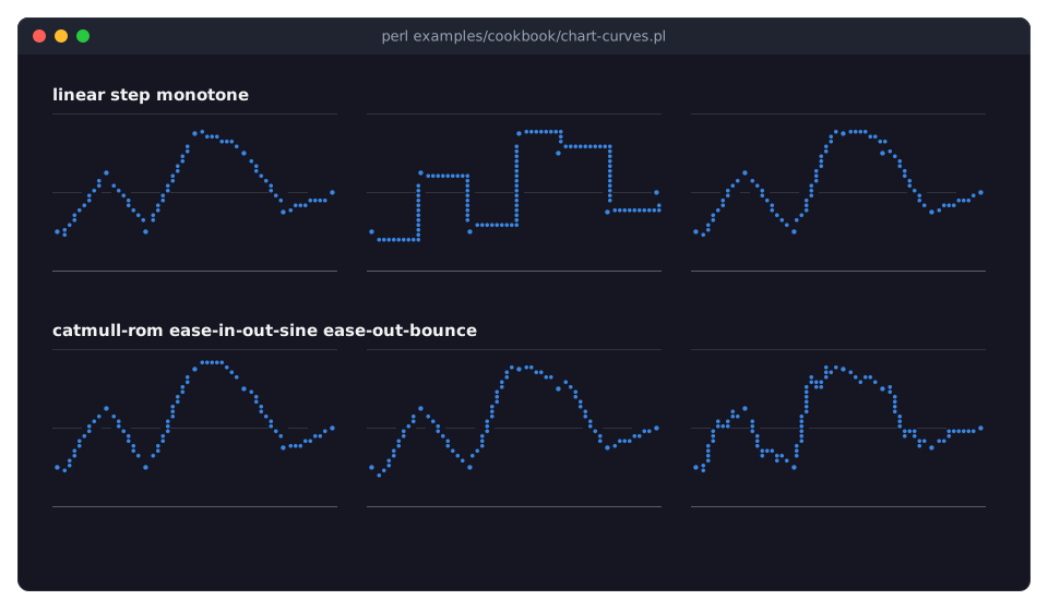
Details and the full list are in Term::Fabulous::Chart::Curve; the program is in "Connect points with curves and easings (curve)" in Term::Fabulous::Cookbook::ChartStyles.
Rendering styles
marker => 'braille',                          # for all series
series => [ { name => 'a', type => 'bar', marker => 'sextant' } ],
A chart draws into subpixels, several per terminal cell, and turns each cell into one character with two colors. The marker of a series picks the character set and so the resolution:
braille-
2 x 4 subpixels per cell, the finest: the default for lines and points. One foreground color per cell, so where lines cross, the cell takes the color of the line drawn last.
block-
1 x 8 subpixels (horizontal bars: 8 x 1): eighth blocks, the default for areas and bars, whose tops are placed to an eighth of a cell.
half,quadrant,sextant-
1 x 2, 2 x 2 and 2 x 3 subpixels, two colors per cell: for fills in terminals without a font that joins Braille dots, or for a coarser, pixel look. Not every font has the sextants.
box-
For lines: box drawing characters, one row per column, as text charts have been drawn for decades. Coarse, but every terminal and font shows it. Like the other markers it stays inside the plot, also when a fixed x range or a span leaves points outside.
Lines take braille, half, quadrant, sextant and box; areas and bars block, braille, half, quadrant and sextant; points everything but block and box. A marker set on the chart applies to the series that can draw with it; the others keep their default. A series' own marker must suit its type, or it dies. The line along the top of an area (line) and the points of lines and areas are always drawn in Braille. More on how cells get their colors: Term::Fabulous::Chart::Marker.
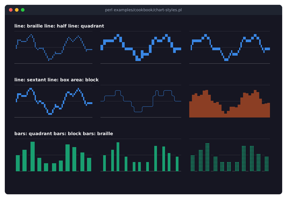
The program is in "Draw with Braille, blocks or box lines (marker)" in Term::Fabulous::Cookbook::ChartStyles.
Points
points => 1,                                     # mark the points of every line and area
series => [ { name => 'a', points => 1, point => 'x' } ],
Term::Fabulous::Widget::ScatterPlot->new( point => 'dot', ... );
points marks the data points of a line or area series; a scatter series is nothing but points. The mark is the series' point: dot (one Braille dot), square (four dots, placed to a quarter cell: the default of scatter series) or any single character one column wide (x, +, o; a bullet is the default of lines and areas). Characters are placed on the cell their point falls in; dots and squares at the subpixel. The legend shows a scatter series by its character, or by a circle for dots and squares.
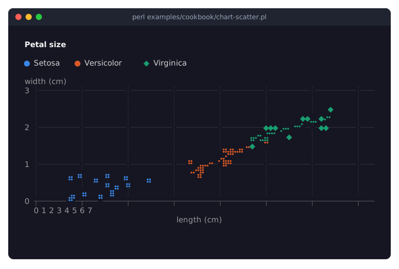
Points on lines are shown in "Draw a line chart with labels and points (LineChart)" in Term::Fabulous::Cookbook::Charts, the scatter plot above in "A scatter plot with trend lines (ScatterPlot)" in Term::Fabulous::Cookbook::Charts.
Line styles
series => [ { name => 'forecast', data => \@forecast, line_style => 'dashed' } ],line_style draws a line solid (the default), dashed or dotted; the pattern runs on from segment to segment. A trend line (trend) is always dashed, with a longer pattern than dashed, so the two can be told apart.
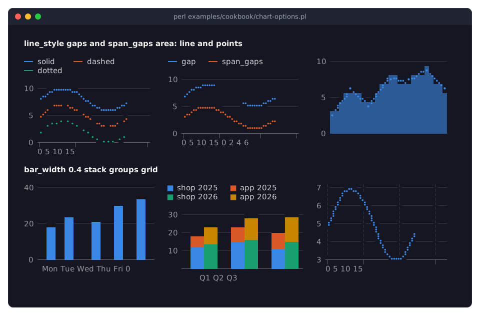
The picture also shows gaps and span_gaps, an area with line and points, a narrow bar_width, two stack groups and grid lines; the program is in "Line styles, gaps, bar widths, stack groups and grid lines" in Term::Fabulous::Cookbook::ChartStyles.
Value labels
value_labels => 1,Writes the value of every bar over its top (right of its end, when horizontal; below the end of a negative bar), of a stack its total, in the format of the value axis. Without a format, all labels of a chart have as many decimals as the value that needs the most (48.0 beside 51.2). A plot of six rows or more keeps a row free above it for the labels of the highest bars. Labels that would touch a neighbor are left out, so narrow bars show every other value. Lines, areas and points have no value labels; use "HOVER".
Horizontal bars
Term::Fabulous::Widget::BarChart->new( horizontal => 1, labels => \@names, ... );Turns the chart on its side: categories down the left, values along the bottom, bars growing to the right. For long category names, and when there are many categories. A horizontal chart shows bar series only: adding a series of another type dies, and so does turning a chart with such a series horizontal (the chart stays as it was). The axis hashes keep their meaning (y_axis describes the values).
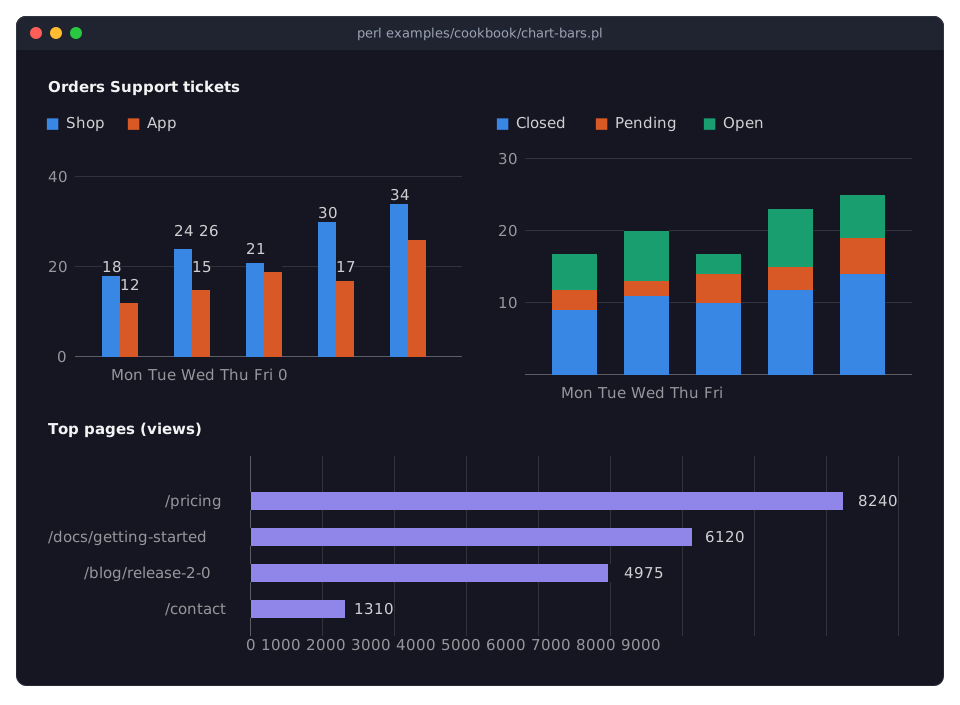
The program, with grouped, stacked and horizontal bars and value labels, is in "Grouped, stacked and horizontal bars (BarChart)" in Term::Fabulous::Cookbook::Charts.
Bar width
bar_width => 0.4,bar_width (0 to 1, default 0.7) is the share of a category slot the bars of the slot take together; the rest is the gap between slots. Grouped bars (several bar series) divide the share equally and are all a whole number of subpixels wide. Every bar is at least one subpixel wide. On a numeric or time x axis the slot is the smallest distance between two bars. The picture under "Line styles" shows bars with a bar_width of 0.4.
DATA
Preparing data
transform => 'cumulative',                                        # for all series
series => [
	{ name => 'raw',      data => \@samples },
	{ name => 'smoothed', data => \@samples, transform => [ [ 'moving_average', 7, 'center' ] ] },
	{ name => 'indexed',  data => \@prices,  transform => [ 'sort', [ 'index', 100 ] ] },
],
A transform lists steps that prepare the points before a frame is drawn: normalize, share, zscore, index, cumulative, difference, rate, moving_average, exponential, median, gaussian, scale, offset, clip, abs, sort, resample, downsample, regression, or a code reference of your own. The steps run again whenever the data changes, so live data stays prepared. A series with a transform of its own does not run the chart's. Every step, with its arguments and an example, is described in "Steps" in Term::Fabulous::Chart::Transform.
The steps get the x values as numbers: the positions 0, 1, 2, ... of points without x, the category numbers on a category axis, epoch seconds on a time axis. On numeric and time axes the points of lines and areas are sorted by x before the steps run. Stacking happens after the steps, so a stack adds up the prepared values.
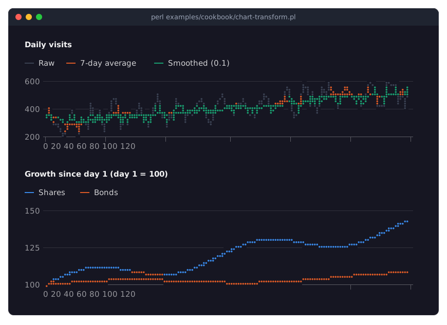
The chart has no second y axis: two scales on one plot invite misreading. To compare series of different sizes, use the index transform (both start at 100), normalize or zscore, or put two charts side by side. The program in the picture is in "Smooth noisy data and index it to 100 (transforms)" in Term::Fabulous::Cookbook::ChartTechniques.
From, to and span
series => [ { name => 'forecast', data => \@all, from => '2026-07-01', line_style => 'dashed' } ],
x_axis => { span => 300 },     # the last five minutes
from and to of a series cut it to that range of x. Lines and the tops of areas are cut with the ends interpolated, so a dashed forecast can start exactly where the measured data ends; bars and points outside the range are left out. The points outside do not count for the axes. The picture under "Time axes" shows a forecast and a shaded area cut this way.
span of the x axis shows only the last so much of x (in the unit of the axis: seconds for a time axis), counted from the newest point of all series, so a live chart scrolls with its data; the points that scrolled out do not count for the y axis either, so a peak leaves the axis when it leaves the plot. The points stay in the series, where they take memory but little drawing time (lines and areas are drawn only where they reach into the plot); use max_points to drop them.
Live data
my $chart = Term::Fabulous::Widget::LineChart->new(
	x_axis     => { type => 'time', span => 60 },
	max_points => 240,
	series     => [ { name => 'cpu' }, { name => 'mem' } ],
);

# In a timer, four times a second:
$chart->append( Time::HiRes::time(), { cpu => cpu_load(), mem => memory_use() } );
append adds one point to several series at once, at the same x (or at the next position, with undef); add_points adds to one series. max_points (of the chart or a series) drops the oldest points, so the chart does not grow without end; span on the x axis keeps the plot on the newest points. Every change marks the chart for the next frame; only the cells that changed are sent to the terminal, so a chart can take many updates per second. For charts that need a given time window even when no data arrives, set min and max of the x axis from the timer instead. A complete program is in "A live chart that follows new data (append, max_points, span)" in Term::Fabulous::Cookbook::ChartTechniques.
HOVER
While the mouse pointer is on a series, the chart emphasizes it and fades the others, and fires a SeriesHover event with the series, the nearest data point, its label and its value. The label is the category on a category axis, the moment in the axis' format on a time axis (%Y-%m-%d %H:%M without a string format), and the x value as a plain number otherwise. The value is the point's own value after the transforms, not a stacked total. Thin lines are hit from the neighboring cell too. highlight emphasizes a series from the program. How it works and how to turn it off: "Hover and emphasis" in Term::Fabulous::Widget::Chart and Term::Fabulous::Event::SeriesHover.
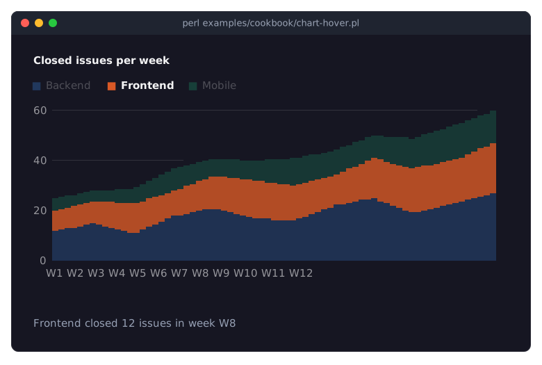
The program is in "Show details of the point under the pointer (SeriesHover, highlight)" in Term::Fabulous::Cookbook::ChartStyles.
CONSTRUCTOR
new
my $chart = Term::Fabulous::Widget::LineChart->new(%parameters);All parameters are optional. Besides those of "CONSTRUCTOR" in Term::Fabulous::Widget::Chart (title, legend, palette, theme, the colors, hover, highlight, and the Box parameters), the XY charts take:
series-
An array reference of series hashes; see "Series keys". Default: none.
labels-
An array reference of strings: the categories of the x axis, in order. Makes the x axis a category axis. Default:
undef(no labels; a category axis then takes its labels from the data, see "What the x values are"). x_axis,y_axis-
Hash references with the keys of "Axis keys". Default:
{}. Unknown keys and invalid values die.x_axis => { type => 'time', format => '%H:%M' }, y_axis => { title => 'req/s', min => 0 }, stacked-
0 (the default), 1 or
percent; see "STACKING". horizontal-
A boolean. Default: false. See "Horizontal bars".
bar_width-
A number from 0 to 1. Default: 0.7.
marker,curve,tension,line,line_style,points,point,fill_opacity,transform,max_points,span_gaps,value_labels-
The series options of the same names, for every series without one of its own; see "Series keys". A value a series type cannot use is kept for the series that can (a
curveapplies to lines and areas, not to bars). Amarkermust be one that some series type can draw with. Default: none, so each series uses its own value or the default of the option.
METHODS
Every parameter except series has an accessor of the same name: without an argument it returns the value, with one it checks and sets it, returns the new value, and the chart redraws in the next frame. An invalid value dies and leaves the chart as it was.
$chart->stacked('percent');
$chart->curve('monotone');          # for every series without a curve of its own
my $axis = $chart->x_axis; # a copy, with type filled inlabels, x_axis and y_axis return copies; x_axis and y_axis replace the whole hash (merge yourself: $chart->y_axis( { %{ $chart->y_axis }, max => 10 } )). transform only sets, and returns nothing. The series accessors (curve, marker, ...) return the chart-wide value or undef; undef removes it.
The series methods come from Term::Fabulous::Role::HasSeries:
Adding and removing series: add_series, remove_series and clear_series.
Reading them: series_names and has_series, series.
Changing a series and its data: set_series, set_data, add_points and clear_data, append.
Showing and hiding: show_series, hide_series and is_series_visible.
Options and series objects: series_default, series_option, all_series and visible_series.
and hovered, revision and effective_background from Term::Fabulous::Widget::Chart.
EVENTS
SeriesHover (Term::Fabulous::Event::SeriesHover) when the pointer moves onto another series, point or legend entry, or off them; and the canvas events CanvasResize, Mouse and MouseMove.
KDL PROPERTIES
In a KDL layout (see "KDL LAYOUT FILES" in Term::Fabulous::Manual::KDL) an XY chart takes the properties of "KDL PROPERTIES" in Term::Fabulous::Widget::Chart and these:
use Term::Fabulous::Widget::LineChart as LineChart

LineChart "load" {
	title "System load"
	labels "Mon" "Tue" "Wed" "Thu" "Fri"
	stacked #false
	curve "monotone"
	points #true
	max_points 100
	x_axis grid="dotted"
	y_axis title="load" min=0 format="%.1f"
	transform "moving_average" 3
	series "web" color="#61afef" line_style="dashed" {
		data 1.2 1.5 1.1 1.8 1.6
	}
	series "api" type="area" {
		point "Mon" 0.4
		point "Tue" 0.6
		transform "cumulative"
	}
}
labels "a" "b" ...-
The categories, as the
labelsparameter. x_axis key=value ...,y_axis key=value ...-
The axis keys as properties (
title,min,max,format,ticks,step,grid,visible,zero,utc,span,base,nice,type). Several nodes merge. stacked,horizontal,bar_width,marker,curve,tension,line_style,line,points,point,fill_opacity,max_points,span_gaps,value_labels-
As the parameters; booleans as
#trueor#false,stackedalso as"percent". On the chart,pointis the mark of the points (point "dot"); inside aseriesblock apointnode is a data point. transform "step" args...-
One step of the chart's transform; repeat the node for several steps, in order.
series "name" type="..." color="..." option=value ... { ... }-
A series: its name as the argument,
type,colorand the series options of "Series keys" as properties (stack="a",from="2026-06-01",trend=#true, ...), and in its block any number ofdatanodes (y values;#nullis a gap),point x ynodes andtransform "step" args...nodes, in order.
Axes and labels are applied before the series, whatever their order in the file, so the series' x values are read the way the axis says. Data that comes from the program (live values, code references) is added afterwards with the methods.
A horizontal bar chart of shares:
use Term::Fabulous::Widget::BarChart as BarChart

BarChart "tickets" {
	stacked "percent"
	horizontal #true
	labels "Mon" "Tue" "Wed"
	y_axis grid="dashed"
	series "open" { data 3 #null 4; }
	series "closed" color="#199e70" { data 5 6 7; }
}
A complete program with charts from a layout is in "Describe charts in a KDL layout (series, slices, transforms)" in Term::Fabulous::Cookbook::ChartTechniques.
SUBCLASS INTERFACE
The four chart classes provide only default_series_type. A chart with other needs (Term::Fabulous::Widget::Histogram, Term::Fabulous::Widget::Sparkline) overrides:
prepare_series()-
Returns the x kind (
category,linear,log,time), the category labels, and the prepared series as hashes withseries,name,type,xs,ys(numbers orundef), and afterstack_serieslowsandhighs; optionallyedges(the[ from, to ]of each bar on the x axis) andlabels(what hover calls each point). stack_series(\@prepared)-
Adds
lows,highsandgroupto the prepared series. fit_prepared( $width, $kind, $categories, $prepared )-
Gets what
prepare_seriesreturned and the width of the plot area, returns the same three values, changed: a sparkline shows the newest bars that fit. value_axis_edges()-
True to map the value axis to the edges of the plot instead of the centers of its first and last cell (charts without axis labels).
draws_baseline()-
False leaves the baseline out.
default_bar_opacity(\@bars)-
The opacity of bars without a
fill_opacity; a histogram makes overlapping bins translucent. value_format()-
The format of the value axis and the value labels;
percentfor percent stacks by default. check_series_type( $name, $type )-
Dies when the chart cannot show a series of that type now; called before a series is added or changes its type.
together with "SUBCLASS INTERFACE" in Term::Fabulous::Widget::Chart.
SEE ALSO
Term::Fabulous::Widget::Chart, Term::Fabulous::Widget::LineChart, Term::Fabulous::Widget::AreaChart, Term::Fabulous::Widget::BarChart, Term::Fabulous::Widget::ScatterPlot, Term::Fabulous::Widget::Histogram, Term::Fabulous::Widget::Sparkline, Term::Fabulous::Role::HasSeries, Term::Fabulous::Chart::Transform, Term::Fabulous::Chart::Curve, Term::Fabulous::Chart::Marker, Term::Fabulous::Chart::Format, "CHARTS" in Term::Fabulous::Manual::Charts, Term::Fabulous::Cookbook::Charts, Term::Fabulous::Cookbook::ChartTechniques, Term::Fabulous::Cookbook::ChartStyles.