NAME
Term::Fabulous::Manual::Layout - Widgets, the widget tree and layout
DESCRIPTION
This page is part of Term::Fabulous::Manual. Previous page: Term::Fabulous::Manual. Next page: Term::Fabulous::Manual::Looks.
This page explains how a screen is put together: the widgets, the tree they form, the ids that name them, and the layout options that decide where each widget goes and how big it is. Every layout option is shown with a picture, with the Perl code and with the form it takes in a KDL layout file. The last sections cover the widgets that structure a screen: dividers, accordions, tabs and document tabs.
The reference pages for this topic are Term::Fabulous::Widget (the parameters and methods all container widgets share), Term::Fabulous::Widget::Box and Term::Fabulous::Widget::ScrollBox. Complete programs are in Term::Fabulous::Cookbook::Layout.
WIDGETS AND THE WIDGET TREE
The screen is described by a tree of widgets. The root widget is passed to Term::Fabulous->new; every other widget is a child, grandchild and so on of the root. Children are drawn on top of their parent, in the order they were added.
The widgets
- Term::Fabulous::Widget::Box
-
A container with an optional background, border and padding. Most layouts are boxes inside boxes.
- Term::Fabulous::Widget::Text
-
Text. It wraps at word boundaries when it does not fit. It cannot have children.
- Term::Fabulous::Widget::Button
-
A box that can take the keyboard focus and fires
Activatewhen it is clicked or Enter or Space is pressed on it. It shows the focus with its border color and the press with inverted colors. - Term::Fabulous::Widget::Dialog
-
A box that opens over the whole screen, centered, behind a dimming backdrop; Tab stays inside it and Escape closes it.
- Term::Fabulous::Widget::ScrollBox
-
A box whose content can be larger than the box itself and is scrolled with the mouse wheel and its scrollbars (see "Scrolling content").
- Term::Fabulous::Widget::Divider
-
A horizontal or vertical line between widgets, with an optional text (see "DIVIDERS").
- Term::Fabulous::Widget::Accordion
-
Sections with headers that open and close, one at a time or several (see "ACCORDIONS").
- Term::Fabulous::Widget::Tabs
-
Pages behind a row of tabs, on any side of the page (see "TABS").
- Term::Fabulous::Widget::DocumentTabs
-
A row of tabs for the open documents of a program, which the program fills and steers (see "Document tabs").
- Term::Fabulous::Widget::Canvas
-
A box with a buffer of character cells you draw into freely: charts, maps, game boards.
- Term::Fabulous::Widget::PixelCanvas
-
A canvas that draws pixels, two per cell, with lines, rectangles and circles.
- Term::Fabulous::Widget::Table
-
Rows and columns of data: sorting, filtering, grouping, trees, pages, selection, any widget as a cell. See "TABLES" in Term::Fabulous::Manual::Tables.
- The chart widgets
-
Term::Fabulous::Widget::LineChart, Term::Fabulous::Widget::AreaChart, Term::Fabulous::Widget::BarChart, Term::Fabulous::Widget::ScatterPlot, Term::Fabulous::Widget::Histogram, Term::Fabulous::Widget::Sparkline, Term::Fabulous::Widget::PieChart, Term::Fabulous::Widget::DonutChart, Term::Fabulous::Widget::PolarAreaChart and Term::Fabulous::Widget::RadarChart: canvases that draw themselves from data. See "CHARTS" in Term::Fabulous::Manual::Charts.
- The input widgets
-
Term::Fabulous::Widget::TextField, Term::Fabulous::Widget::TextArea, Term::Fabulous::Widget::Checkbox, Term::Fabulous::Widget::RadioGroup with Term::Fabulous::Widget::RadioButton, Term::Fabulous::Widget::Dropdown and Term::Fabulous::Widget::Slider. See "FORMS AND INPUT WIDGETS" in Term::Fabulous::Manual::Forms.
Every widget except Text is a Box with extra behavior, so everything this page says about boxes (layout, background, border, children) holds for all of them.
Building the tree
Create widgets with new and attach them with add_child, which takes one or more widgets and returns the parent, so calls can be chained:
my $header = Term::Fabulous::Widget::Box->new;
my $body   = Term::Fabulous::Widget::Box->new;
my $footer = Term::Fabulous::Widget::Box->new;
$root->add_child($header)->add_child( $body, $footer );
You can build the whole tree before calling run, or change it at any time while the program runs, for example from a listener. The change shows in the next frame.
Instead of building the tree in Perl, you can also describe it in a KDL file and let Term::Fabulous::Layout build it (see "KDL LAYOUT FILES" in Term::Fabulous::Manual::KDL).
Widget ids
Every widget accepts an optional id, a non-empty string:
my $log = Term::Fabulous::Widget::ScrollBox->new( id => 'log' );Ids serve three purposes. Clay uses them to keep per-widget state between frames (a Term::Fabulous::Widget::ScrollBox therefore requires one). remove_child_with_id removes children by id (except Text widgets, see "Changing the tree"). And your own code uses them to find a widget again, or to tell widgets apart in a listener ($event->target->id).
Rules for ids:
Two widgets in the same tree must not have the same id. Drawing a frame with duplicate ids dies with
Clay error: An element with this ID was already previously declared during this layout.Ids starting with
anon:are reserved: widgets without an id get an automatic one of that form. Passing such an id dies.The id cannot be changed after construction.
Finding widgets by id
Every widget except Text has a find_by_id method. It searches the widget itself and everything below it, depth first, and returns the first widget whose id is the argument (Text widgets included), or undef when there is none:
my $status = $root->find_by_id('status');$ui->find_by_id searches from the root. The search walks the tree on every call, so keep the result in a variable instead of searching in every event. This is how a program gets at the widgets of a KDL layout. See "find_by_id" in Term::Fabulous::Widget.
Changing the tree
The methods that change the children (from Clay::UI::Role::Core::Container):
$box->add_child(@widgets);                          # append, returns $box
$box->remove_child(@widgets);                       # remove these children
$box->remove_child_with_id('status');               # remove children with that id (not Text widgets)
$box->remove_children_with( sub ($child) { ... } ); # remove where the code returns true
$box->clear_children;                               # remove all children
my $children = $box->children;                      # arrayref (a copy)
my $is_child = $box->has_child($widget);            # 1 or 0
my $parent   = $widget->parent;                     # undef for the root
remove_child takes the widgets themselves and ignores those that are not children of the box; it dies for an id. remove_child_with_id never removes Text widgets, even when they have that id; remove them with remove_child, or with remove_children_with, for example $box->remove_children_with( sub ($child) { ( $child->id // '' ) eq 'status' } ).
A widget has at most one parent at a time. Adding a widget that is still a child of another widget dies with Clay::UI: widget ... is still attached to a parent; remove it first. Remove it from its parent first, then add it wherever you like, to the same parent or another one. A removed widget keeps its children and its state. The rule is enforced by Clay::UI::Role::Layout::HasParent.
Removing a widget that has the keyboard focus clears the focus first, and the widget receives OnBlur.
LAYOUT
Every widget that can have children (Box and everything based on it) takes a layout hash. Its keys decide how big the widget is and how it arranges its children. All sizes are in terminal cells.
use Clay::XS qw(sizing_grow sizing_fit CLAY_TOP_TO_BOTTOM CLAY_ALIGN_X_CENTER CLAY_ALIGN_Y_TOP);

my $box = Term::Fabulous::Widget::Box->new(
	layout => {
		layout_direction => CLAY_TOP_TO_BOTTOM,
		sizing           => { width => sizing_grow(), height => sizing_fit() },
		padding          => { left => 1, right => 1, top => 0, bottom => 0 },
		child_gap        => 1,
		child_alignment  => { x => CLAY_ALIGN_X_CENTER, y => CLAY_ALIGN_Y_TOP },
	},
);
The same box in a KDL layout:
Box {
	layout direction=down gap=1
	sizing width=grow height=fit
	padding left=1 right=1
	child_alignment x=center y=top
}
Every key is optional. An unknown key or a value of the wrong shape dies when the hash is set, naming the key, for example Clay::UI: 'layout' has unknown key 'gap' (known keys: sizing, padding, child_gap, child_alignment, layout_direction, line_gap, line_sizing). The helper functions and constants come from Clay::XS; import the ones you use, or all of them with use Clay::XS qw(:all).
The layout keys
Perl key            KDL                          Section
------------------  ---------------------------  -------------------------------
layout_direction    layout direction=...         Direction, Flow, Stack
sizing              sizing width=... height=...  Sizing
padding             padding left=N ...           Padding
child_gap           layout gap=N                 Gap between children
child_alignment     child_alignment x=... y=...  Aligning and centering children
line_gap            layout line_gap=N            Flow layout
line_sizing         layout line_sizing=...       Flow layout
Three more constructor parameters take part in the layout: floating (see "Floating widgets"), bordered (see "Borders take space") and width_group/height_group (see "Equal sizes across the tree").
Direction
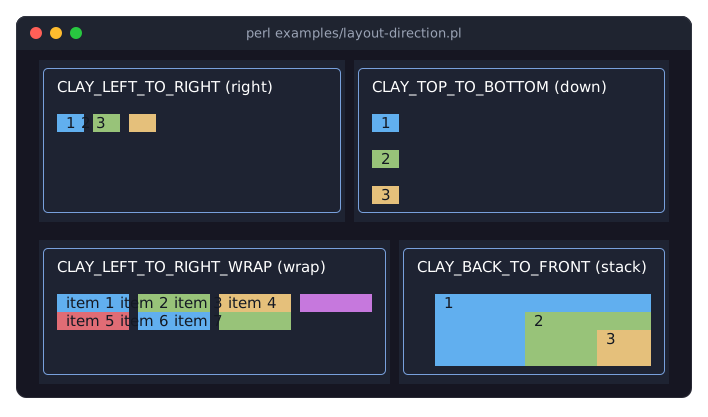
layout_direction decides how the children are arranged:
CLAY_LEFT_TO_RIGHT(the default; KDL:right)-
Children are placed next to each other, from left to right.
CLAY_TOP_TO_BOTTOM(KDL:down)-
Children are stacked from top to bottom.
CLAY_LEFT_TO_RIGHT_WRAP(KDL:wrap)-
Children are placed from left to right and wrap onto a new line when the row is full. See "Flow layout".
CLAY_BACK_TO_FRONT(KDL:stack)-
Children are placed on top of each other, later ones over earlier ones. See "Stack layout".
use Clay::XS qw(CLAY_TOP_TO_BOTTOM);

my $column = Term::Fabulous::Widget::Box->new( layout => { layout_direction => CLAY_TOP_TO_BOTTOM } );
In KDL: layout direction=down. KDL also accepts the longer names ttb and top_to_bottom, ltr and left_to_right, ltr_wrap and left_to_right_wrap, back_to_front and btf.
The picture shows the four directions with the same kind of children; the program is examples/layout-direction.pl.
A column of form rows, each row a left-to-right box of a label and an input, is the typical combination.
Sizing
sizing holds a width and a height rule. A missing rule is sizing_fit().
sizing_fit()(KDL:fit)-
As small as the content: the children, the gaps between them, the padding and the border. Text counts with its unwrapped width, as far as the parent allows; when the parent is narrower, the text wraps.
sizing_grow()(KDL:grow)-
Takes the room the parent has left after its other children got their size. Several growing siblings share that room so that they end up equally large, as far as their limits allow.
sizing_fixed($cells)(KDL:"fixed(N)")-
Exactly
$cellscolumns or rows. sizing_percent($fraction)(KDL:"percent(N)")-
A fraction of the room inside the parent's padding, from 0 to 1:
sizing_percent(0.5)is half. A fraction above 1 makes drawing die with aClay error. In KDL the number is a percentage from 0 to 100:"percent(50)"is half.
sizing_fit and sizing_grow take an optional minimum and maximum in cells: sizing_grow(10, 40) grows, but stays between 10 and 40 cells; sizing_fit(30) is at least 30 cells wide. A maximum of 0 or a missing maximum means no maximum. In KDL, write "grow(10, 40)", "fit(30)" or "fit(MIN, MAX)"; a minimum greater than the maximum dies. Values with parentheses must be quoted in KDL.
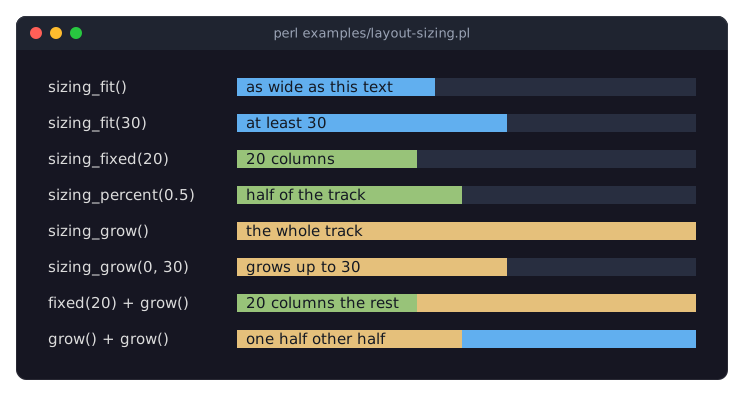
The picture shows each rule in a track as wide as the terminal; the program is examples/layout-sizing.pl. A sidebar of 20 columns and a main area that takes the rest look like this:
use Clay::XS qw(sizing_grow sizing_fixed);

my $columns = Term::Fabulous::Widget::Box->new(
	layout => { sizing => { width => sizing_grow(), height => sizing_grow() } },
);
my $sidebar = Term::Fabulous::Widget::Box->new(
	background_color => [ 30, 30, 40, 255 ],
	layout           => { sizing => { width => sizing_fixed(20), height => sizing_grow() } },
);
my $main = Term::Fabulous::Widget::Box->new(
	layout => { sizing => { width => sizing_grow(), height => sizing_grow() } },
);
$columns->add_child( $sidebar, $main );
In KDL:
Box {
	sizing width=grow height=grow
	Box "sidebar" {
		sizing width="fixed(20)" height=grow
		background_color "rgb(30, 30, 40)"
	}
	Box "main" { sizing width=grow height=grow; }
}
The root widget usually uses sizing_grow() in both directions, so that it fills the terminal.
When the children need more room than their parent has, Clay shrinks the fit and grow children (never below their minimum) and wraps text. Children that still do not fit, such as fixed ones, stick out of the parent and are drawn beyond its edge. Only a Term::Fabulous::Widget::ScrollBox cuts off its content at its edges (see "Scrolling content").
Padding
padding is empty space inside the widget, between its edge (or border) and its children: a hash with any of the keys left, right, top and bottom, each a number of cells. Missing sides are 0. padding_all(1) from Clay::XS builds a hash with the same value on all four sides.
use Clay::XS qw(padding_all);

my $card = Term::Fabulous::Widget::Box->new(
	background_color => [ 60, 68, 92, 255 ],
	layout           => { padding => { left => 2, right => 2, top => 1, bottom => 1 } },
);
my $tight = Term::Fabulous::Widget::Box->new( layout => { padding => padding_all(1) } );
In KDL: padding left=2 right=2 top=1 bottom=1; there is no short form for all four sides.
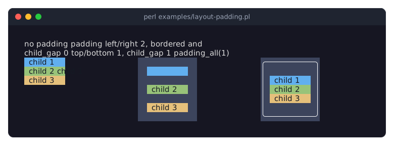
The picture shows the same three children without padding, with padding and a gap, and with a border and padding; the boxes have a background, so their padding is visible. The program is examples/layout-padding.pl.
Gap between children
child_gap is the number of empty cells between two neighboring children, in the layout direction: columns in a left-to-right box, rows in a top-to-bottom box. There is no gap before the first or after the last child; use padding for that.
my $toolbar = Term::Fabulous::Widget::Box->new( layout => { child_gap => 2 } );In KDL: layout gap=2. child_gap is accepted as a longer name for gap; giving both dies.
Borders take space
A border is drawn on the outermost cells of a widget, inside its box. Term::Fabulous adds a cell to the padding of every side with a border, so the children always start inside the border: a box with bordered => 1 and padding => { left => 1 } has its first child at the third column (see the third box in the picture above). A box without a sizing rule grows by the border, so its content keeps its size. A side with the Hidden border style takes no space and draws nothing. See "BORDERS" in Term::Fabulous::Manual::Looks for border styles and colors.
Aligning and centering children
child_alignment positions the children inside the widget when they do not fill it: x is one of CLAY_ALIGN_X_LEFT (the default), CLAY_ALIGN_X_CENTER and CLAY_ALIGN_X_RIGHT; y is one of CLAY_ALIGN_Y_TOP (the default), CLAY_ALIGN_Y_CENTER and CLAY_ALIGN_Y_BOTTOM. Either key may be left out.
use Clay::XS qw(sizing_grow CLAY_ALIGN_X_RIGHT);

# A status bar: its text pushed to the right edge.
my $status = Term::Fabulous::Widget::Box->new(
	layout => {
		sizing          => { width => sizing_grow() },
		child_alignment => { x => CLAY_ALIGN_X_RIGHT },
	},
);
In KDL, write child_alignment x=right: x is left, center or right, y is top, center or bottom, and either may be left out.
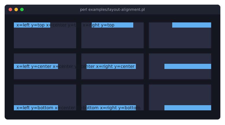
The picture shows all nine combinations; the program is examples/layout-alignment.pl. Alignment only moves children within room they do not use: a box with sizing_fit() has no spare room, and a grow child takes all of it. To push one child to the far end of a row and keep the others at the start, put a grow box between them, as the title bar of examples/kdl-layout.pl does.
Flow layout
With layout_direction => CLAY_LEFT_TO_RIGHT_WRAP a widget places its children from left to right, like CLAY_LEFT_TO_RIGHT, but starts a new line below whenever the next child does not fit into the remaining width. Tag lists, toolbars and button rows that should adapt to the terminal width need no code of their own:
use Clay::XS qw(sizing_grow CLAY_LEFT_TO_RIGHT_WRAP CLAY_LINE_SIZING_FIT);

my $tags = Term::Fabulous::Widget::Box->new(
	layout => {
		layout_direction => CLAY_LEFT_TO_RIGHT_WRAP,
		sizing           => { width => sizing_grow() },
		child_gap        => 1,
		line_gap         => 0,
		line_sizing      => CLAY_LINE_SIZING_FIT,
	},
);
$tags->add_child( Term::Fabulous::Widget::Text->new( text => $_, text_color => [ 220, 220, 220, 255 ] ) )
	foreach qw(perl terminal layout flow);
In KDL:
Box "tags" {
	layout direction=wrap gap=1 line_gap=0 line_sizing=fit
	sizing width=grow
}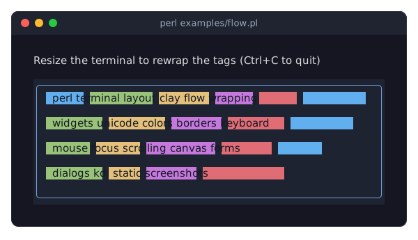
The picture shows examples/flow.pl, a tag list that rewraps when the terminal is resized. The rules:
child_gapis the number of columns between neighbors on a line,line_gapthe number of rows between two lines (default 0).Lines break at the children's preferred widths. A child wider than the widget gets a line of its own and is narrowed to fit.
Give the widget a
grow,fixedorpercentwidth. Withsizing_fit()it prefers a single line and only wraps when its parent is too narrow for that line.When the widget is taller than its lines,
line_sizingdecides what happens to the leftover rows:CLAY_LINE_SIZING_GROW(the default; KDL:grow) shares them equally between the lines,CLAY_LINE_SIZING_FIT(KDL:fit) keeps every line as tall as its tallest child.child_alignmentxaligns every line on its own.yaligns each child within its line and, withCLAY_LINE_SIZING_FIT, the block of lines within the widget.A
growchild takes the rest of its own line.
Wrapping is horizontal only; there is no top-to-bottom variant.
Stack layout
With layout_direction => CLAY_BACK_TO_FRONT a widget places all its children on top of each other inside its padding. Later children are drawn over earlier ones, so a background, the content and a badge in the corner are three children in that order:
use Clay::XS qw(sizing_grow CLAY_BACK_TO_FRONT CLAY_ALIGN_X_RIGHT CLAY_ALIGN_Y_TOP);

my $card = Term::Fabulous::Widget::Box->new(
	layout => {
		layout_direction => CLAY_BACK_TO_FRONT,
		child_alignment  => { x => CLAY_ALIGN_X_RIGHT, y => CLAY_ALIGN_Y_TOP },
	},
);
$card->add_child(
	Term::Fabulous::Widget::Box->new(
		background_color => [ 30, 35, 50, 255 ],
		layout           => { sizing => { width => sizing_grow(), height => sizing_grow() }, padding => { left => 1, top => 1 } },
	)->add_child( Term::Fabulous::Widget::Text->new( text => 'Inbox', text_color => [ 255, 255, 255, 255 ] ) ),
	Term::Fabulous::Widget::Box->new(
		background_color => [ 224, 108, 117, 255 ],
		layout           => { padding => { left => 1, right => 1 } },
	)->add_child( Term::Fabulous::Widget::Text->new( text => '3', text_color => [ 20, 25, 35, 255 ] ) ),
);
In KDL:
Box "card" {
	layout direction=stack
	child_alignment x=right y=top
	Box {
		sizing width=grow height=grow
		padding left=1 top=1
		background_color "rgb(30, 35, 50)"
		Text { text "Inbox"; text_color "#ffffff"; }
	}
	Box {
		padding left=1 right=1
		background_color "rgb(224, 108, 117)"
		Text { text "3"; text_color "rgb(20, 25, 35)"; }
	}
}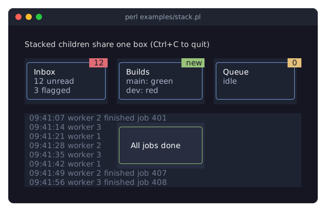
The picture shows examples/stack.pl: cards with badges and a message centered over a log. The rules:
With
sizing_fit()the stack is as wide as its widest child and as tall as its tallest one.growchildren fill it.child_alignmentplaces every child on its own, on both axes. A stack has only onechild_alignment; to put children in different corners, wrap each one in agrowstack with its own alignment.child_gaphas no effect.Where children overlap, the one drawn on top gets the
Mouseevent, the focus and theOnPress. Uncovered parts of the children below still receive the mouse as usual.
Unlike floating widgets, the children of a stack take part in the layout: the stack, and so its parent, grows with its largest child.
Floating widgets
A widget with a floating hash is taken out of its parent's layout: it takes no room there and is drawn on top of the other widgets, at a position relative to its parent, to the whole screen or to any other widget. Menus, tooltips, badges and notifications are floating widgets. Term::Fabulous::Widget::Dialog uses the same mechanism.
use Clay::XS qw(Clay_GetElementId CLAY_ATTACH_TO_ELEMENT_WITH_ID
	CLAY_ATTACH_POINT_LEFT_TOP CLAY_ATTACH_POINT_LEFT_BOTTOM);

# A menu below the button with the id 'file-button'.
my $menu = Term::Fabulous::Widget::Box->new(
	background_color => [ 40, 46, 64, 255 ],
	floating         => {
		attach_to     => CLAY_ATTACH_TO_ELEMENT_WITH_ID,
		parent_id     => Clay_GetElementId('file-button')->{id},
		attach_points => { element => CLAY_ATTACH_POINT_LEFT_TOP, parent => CLAY_ATTACH_POINT_LEFT_BOTTOM },
		z_index       => 10,
	},
);
$root->add_child($menu);
In KDL the keys have shorter names and parent_id takes the widget's id directly:
Box "file-menu" {
	floating attach_to=element parent_id="file-button" element=left_top parent=left_bottom z_index=10
	background_color "rgb(40, 46, 64)"
}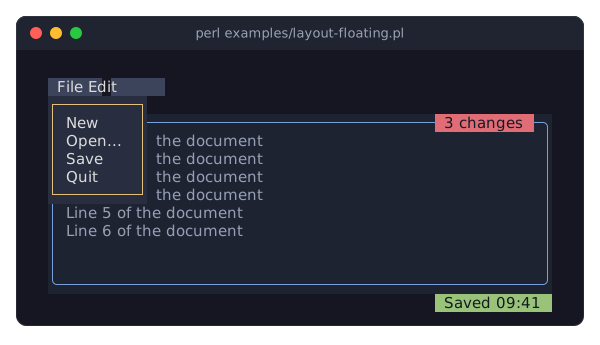
The picture shows examples/layout-floating.pl: a menu attached to a button, a badge attached to its parent panel and a message attached to the root. The keys:
attach_to-
What the widget is positioned against:
CLAY_ATTACH_TO_PARENT(KDL:parent, the default in KDL),CLAY_ATTACH_TO_ROOT(root, the whole screen) orCLAY_ATTACH_TO_ELEMENT_WITH_ID(element, the widget named byparent_id). In Perl, afloatinghash withoutattach_todoes not make the widget float. parent_id-
With
CLAY_ATTACH_TO_ELEMENT_WITH_ID: in Perl, the Clay element id number of the widget,Clay_GetElementId($id)->{id}; in KDL, the widget's id string. The widget does not have to be an ancestor. attach_points-
{ element => $point, parent => $point }: the point of the floating widget (element) that is placed on the point of the widget it is attached to (parent). Points areCLAY_ATTACH_POINT_LEFT_TOP(the default),..._LEFT_CENTER,..._LEFT_BOTTOM,..._CENTER_TOP,..._CENTER_CENTER,..._CENTER_BOTTOM,..._RIGHT_TOP,..._RIGHT_CENTERand..._RIGHT_BOTTOM; in KDLelement=...andparent=...with the names in lowercase (left_top,center_center, ...). offset-
{ x => $columns, y => $rows }added to the position; negative values move left and up. KDL:offset_x=N offset_y=N. z_index-
An integer from -32768 to 32767; floating widgets with a higher value are drawn on top of those with a lower one.
expand,pointer_capture_mode,clip_to-
Rarely needed; see "floating" in Term::Fabulous::Widget.
expandis not available in KDL; the other two arepointer_capture=...andclip_to=....
A floating widget is still a child of the widget you add it to: it is removed with it, and its events bubble to it. To show and hide a floating widget, add and remove it, as the File button of the example does. $widget->floating(undef) puts a widget back into the normal layout.
Scrolling content
A Term::Fabulous::Widget::ScrollBox is a box whose content may be larger than the box: what does not fit is cut off at the box's edges, and the mouse wheel scrolls it. A scrollbar in its last column (and in its last row when it scrolls sideways) shows how far, and scrolls when clicked or dragged; scrollbar => 0 removes it. Its size comes from its own sizing, not from its content, so give it a grow, fixed or percent height. It needs an id.
use Clay::XS qw(sizing_grow CLAY_TOP_TO_BOTTOM);

my $log = Term::Fabulous::Widget::ScrollBox->new(
	id     => 'log',
	layout => {
		layout_direction => CLAY_TOP_TO_BOTTOM,
		sizing           => { width => sizing_grow(), height => sizing_grow() },
	},
);
In KDL:
ScrollBox "log" {
	layout direction=down
	sizing width=grow height=grow
}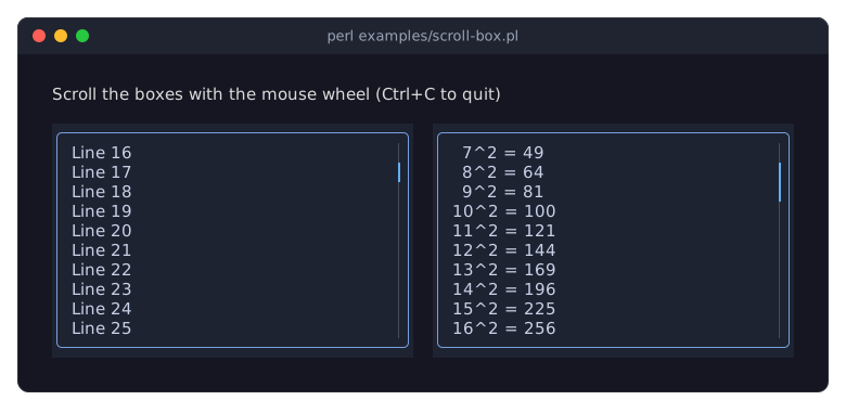
The picture shows examples/scroll-box.pl after a few turns of the mouse wheel. The scrolling section of the events page describes the wheel, sideways scrolling, the OnScroll event and how to read and set the scroll position from code; the recipe Scroll a ScrollBox from code keeps a log at its newest line.
A ScrollBox lays out every child in every frame, visible or not, and Clay measures every text it lays out (see "LIMITATIONS" in Term::Fabulous), so a box with thousands of children scrolls slowly and one with more words than Clay's cache holds dies. For a long document or list, use a Term::Fabulous::Widget::VirtualList: it takes the number of items and a build callback that returns the widget of one item, builds only the items near the viewport and stands in for the rest with spacers, so the scrollbar and the wheel see the whole list while a frame costs what the visible part costs.
my $document = Term::Fabulous::Widget::VirtualList->new(
	id     => 'document',
	count  => scalar @paragraphs,
	build  => sub ($index) { Term::Fabulous::Widget::RichText->new( markup => $paragraphs[$index] ) },
	layout => { sizing => { width => sizing_grow(), height => sizing_grow() }, child_gap => 1 },
);
Equal sizes across the tree
Widgets in different parts of the tree can be made equally wide or high with a sizing group: give them the same positive width_group (or height_group) number. After Clay has computed their natural size, all members of a group get the size of the largest one. This lines up, for example, the labels of a form whose rows are separate boxes:
my $label_a = Term::Fabulous::Widget::Box->new( width_group => 1 );
my $label_b = Term::Fabulous::Widget::Box->new( width_group => 1 );
In KDL: width_group 1. The labels on the left of the sizing picture are in one width group, which is why all tracks start in the same column; the form of examples/kdl-form.pl does the same in KDL, and the recipe Line up labels with equal widths is a complete program.
Only fit and grow sizes take part; fixed and percent sizes are left alone. Group numbers are integers from 1 to 1048575 (0 means no group). See Clay::UI::Role::Layout::HasSizingGroup for the details.
Changing the layout at run time
layout is an accessor. Reading it returns a copy of the current hash; writing replaces the whole hash. To change one key, copy the others:
$box->layout( { %{ $box->layout }, child_gap => 2 } );The new layout applies from the next frame on. The same is true for every other widget property: floating, background_color, bordered, text and so on are accessors that take effect in the next frame. (One exception: border_style exists only as a constructor parameter; the accessors are per side, see "border_style_top" in Term::Fabulous::Widget.) The recipe Change the layout with the terminal size switches a layout between a row and a column when the terminal is resized.
DIVIDERS
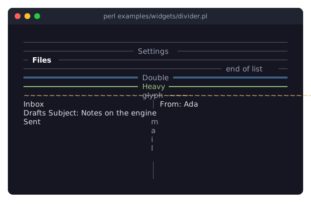
A Term::Fabulous::Widget::Divider draws a line between the widgets above and below it, or, vertical, between the widgets left and right of it. It can carry a text at the start, in the center or at the end of the line, which makes it a section heading that takes one row:
use Term::Fabulous::Widget::Divider;

$panel->add_child(
	Term::Fabulous::Widget::Divider->new( text => 'Network', text_position => 'start', bold => 1 ),
	$hostname_row,
	$port_row,
	Term::Fabulous::Widget::Divider->new,    # a plain line
	$buttons,
);
A divider grows along its line to the space its parent gives it and is one cell thick, so it needs no layout in a column or a row that has a width or height; inside a box that fits its content, give it a fixed length. The line is drawn with the glyph of a border style (Solid by default; Double, Heavy, Dashed, Ascii, ...) or with a glyph of your own, in a color of its own, and the text has its own color and can be bold. A vertical divider writes its text downwards, one character per row. The picture shows the forms (examples/widgets/divider.pl):
In KDL:
Divider { text "Network"; text_position "start"; bold #true; }
Divider { vertical #true; }
ACCORDIONS
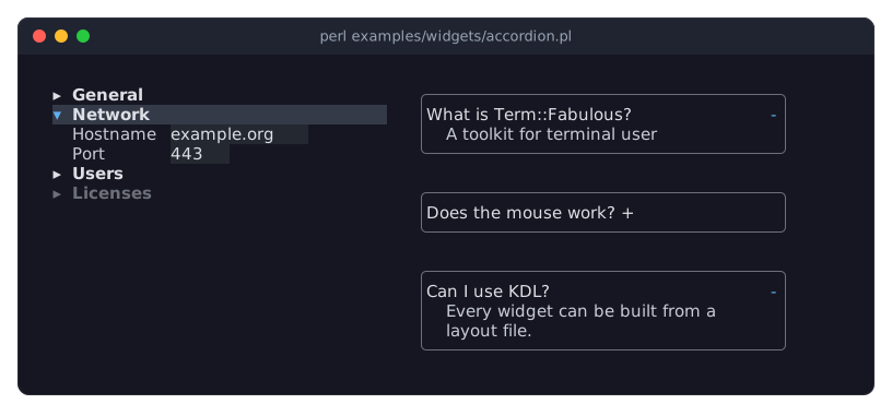
A Term::Fabulous::Widget::Accordion stacks sections that open and close under their headers, so that a long form or a settings page shows one part at a time. Each section is a Term::Fabulous::Widget::Accordion::Item with a title and a body of any widgets; the body is part of the tree only while the item is open, so a closed section takes one row:
use Term::Fabulous::Widget::Accordion;
use Term::Fabulous::Widget::Accordion::Item;

my $settings = Term::Fabulous::Widget::Accordion->new;
foreach my $section ( [ General => \@general_rows ], [ Network => \@network_rows ] ) {
	my $item = Term::Fabulous::Widget::Accordion::Item->new( title => $section->[0] );
	$item->add_child( $section->[1]->@* );
	$settings->add_child($item);
}
$settings->open(0);
The user opens a section with a click on its header or with Enter or Space while the header has the focus; Up and Down move between the headers. Opening a section closes the open one unless the accordion has multiple => 1. The accordion fires Term::Fabulous::Event::Select for every change the user makes, and open, close, open_all and close_all change it from the program. The toggle glyph sits before the title, as in a tree, or at the end of the header (toggle_position), the items can have borders (item_borders), and an item can be disabled. The picture shows both looks (examples/widgets/accordion.pl):
In KDL, the items are Item nodes inside the accordion:
Accordion "settings" {
	Item "general" { title "General"; open #true; Text { text "..."; } }
	Item "network" { title "Network"; Text { text "..."; } }
}
TABS
A Term::Fabulous::Widget::Tabs shows one of several pages at a time, chosen with a row of tabs, so that a settings screen or a tool window keeps every part at hand without scrolling. Each page is a Term::Fabulous::Widget::Tabs::Page with a title and a body of any widgets; only the active page is part of the tree, so the others take no space and their widgets cannot take the focus:
use Term::Fabulous::Widget::Tabs;
use Term::Fabulous::Widget::Tabs::Page;

my $settings = Term::Fabulous::Widget::Tabs->new;
foreach my $section ( [ General => \@general_rows ], [ Network => \@network_rows ] ) {
	my $page = Term::Fabulous::Widget::Tabs::Page->new( title => $section->[0] );
	$page->add_child( $section->[1]->@* );
	$settings->add_child($page);
}
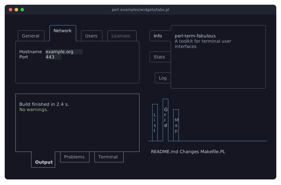
The tabs are drawn as boxes that join the border of the page: the active tab is one cell larger and open toward the page, so that the two are one shape, while the other tabs are closed by the page's line and look as if they stood behind it. The user switches with a click, with Left, Right, Up, Down, Home and End while the active tab has the focus (only the active tab takes the focus, so Tab stops at the bar once), and with Ctrl+PageUp and Ctrl+PageDown from anywhere inside the Tabs. The Tabs fires Term::Fabulous::Event::Select for every change the user makes; select changes the page from the program.
The bar can be on any side of the page (side), the labels can be written from left to right or downwards (orientation), the tabs can sit at the start, in the center or at the end of the bar (tab_alignment), the lines come in any border style with joints (line_style) and the border around the page can be left out (page_border). The picture shows four of these forms (examples/widgets/tabs.pl):
In KDL, the pages are Page nodes inside the Tabs:
Tabs "settings" {
	side "left"
	Page "general" { title "General"; Text { text "..."; } }
	Page "network" { title "Network"; active #true; Text { text "..."; } }
}
The bar and its tabs are widgets of their own, Term::Fabulous::Widget::Tabs::Bar and Term::Fabulous::Widget::Tabs::Button, for a row of tabs that switches something that is not a page, for example whole layouts.
Document tabs
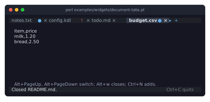
An editor that keeps several documents open shows a tab for each above the text, with the document's title, a dot while it has unsaved changes and a close mark. That row is a Term::Fabulous::Widget::DocumentTabs. Unlike a Tabs, it holds no pages and no widgets: it shows a list of plain hashes, one per document, and the program shows the document itself. A code reference in place of the list is called whenever a frame is drawn, so the tabs always show the documents as they are now:
use Term::Fabulous::Widget::DocumentTabs;

my $tabs = Term::Fabulous::Widget::DocumentTabs->new(
	tabs   => sub { map { { title => $_->{title}, modified => $_->{modified} } } @documents },
	active => 0,
);
$tabs->on( Select   => sub ($event) { show_document( $event->index ); return } );
$tabs->on( TabClose => sub ($event) { close_document( $event->index ); return } );
$tabs->on( TabAdd   => sub ($event) { new_document(); return } );
A tab may also have error, which shows an exclamation mark in place of the dot, and closable => 0, which takes away its close mark. Other keys stay in the hash and come back in the events, so a tab can carry the path of its file.
The tabs never change anything themselves. A click on a tab fires Select with the tab as the item, a click on a close mark or a middle click fires TabClose, and the + button at the end fires TabAdd. The program answers: it shows the document and sets active, asks whether to save a document before it closes it, or makes a new one. Setting active fires nothing. When the tabs do not fit, the row scrolls so that the active tab is shown, and arrows at the ends lead to the hidden ones. Document tabs are one row high, react to the mouse only and never take the focus, so the program gives them keys of its own, such as Alt+PageDown for the next document. The picture shows tabs with unsaved changes and an error, and an arrow to a tab that does not fit (examples/widgets/document-tabs.pl):
The theme family document_tabs colors them: background and text, each with an active state for the active tab, modified for the dot, error for the exclamation mark and button for the + and the arrows (see "Families, slots and states" in Term::Fabulous::Theme). Document tabs are built in Perl only, not in KDL layout files. The recipe "Keep several documents open in tabs (DocumentTabs)" in Term::Fabulous::Cookbook::Menus is a complete program.
SEE ALSO
This page is part of Term::Fabulous::Manual. Previous page: Term::Fabulous::Manual. Next page: Term::Fabulous::Manual::Looks.
Term::Fabulous::Widget::Divider, Term::Fabulous::Widget::Accordion, Term::Fabulous::Widget::Tabs, Term::Fabulous::Widget::DocumentTabs, Term::Fabulous::Widget (the parameters and methods of all container widgets), Term::Fabulous::Widget::Box, Term::Fabulous::Widget::ScrollBox, "KDL LAYOUT FILES" in Term::Fabulous::Manual::KDL, Term::Fabulous::Cookbook::Layout, Clay::XS (the sizing functions and constants).